Case study updated September 9, 2026
EPIGON.AI
PRODUCT UX/UI | INFORMATION ARCHITECTURE | VISUAL SYSTEM
Giving an AI character platform a clearer structure
Epigon.AI is a platform for creating and interacting with virtual characters. I joined as UX/UI Lead in July 2023. This case study covers the research, information architecture and visual-system work documented during that phase of the project.
Role: UX/UI Lead
Team: 1 UX designer and 1 UI artist, alongside me
Project period: Work beginning July 2023
Tools: Figma, Photoshop and VS Code
My contribution
I conducted desk research, interviewed the product owner and compared relevant products. I developed the site map, brand identity guidance, style guide, UX documents, mockups and interaction prototypes. I also worked with developers and configured UI assets using CSS in VS Code.
1. Establish a shared visual direction
The starting interface lacked a consistent visual identity. I used the product-owner interview and comparative research to develop a brand guide that the team could apply across the platform.
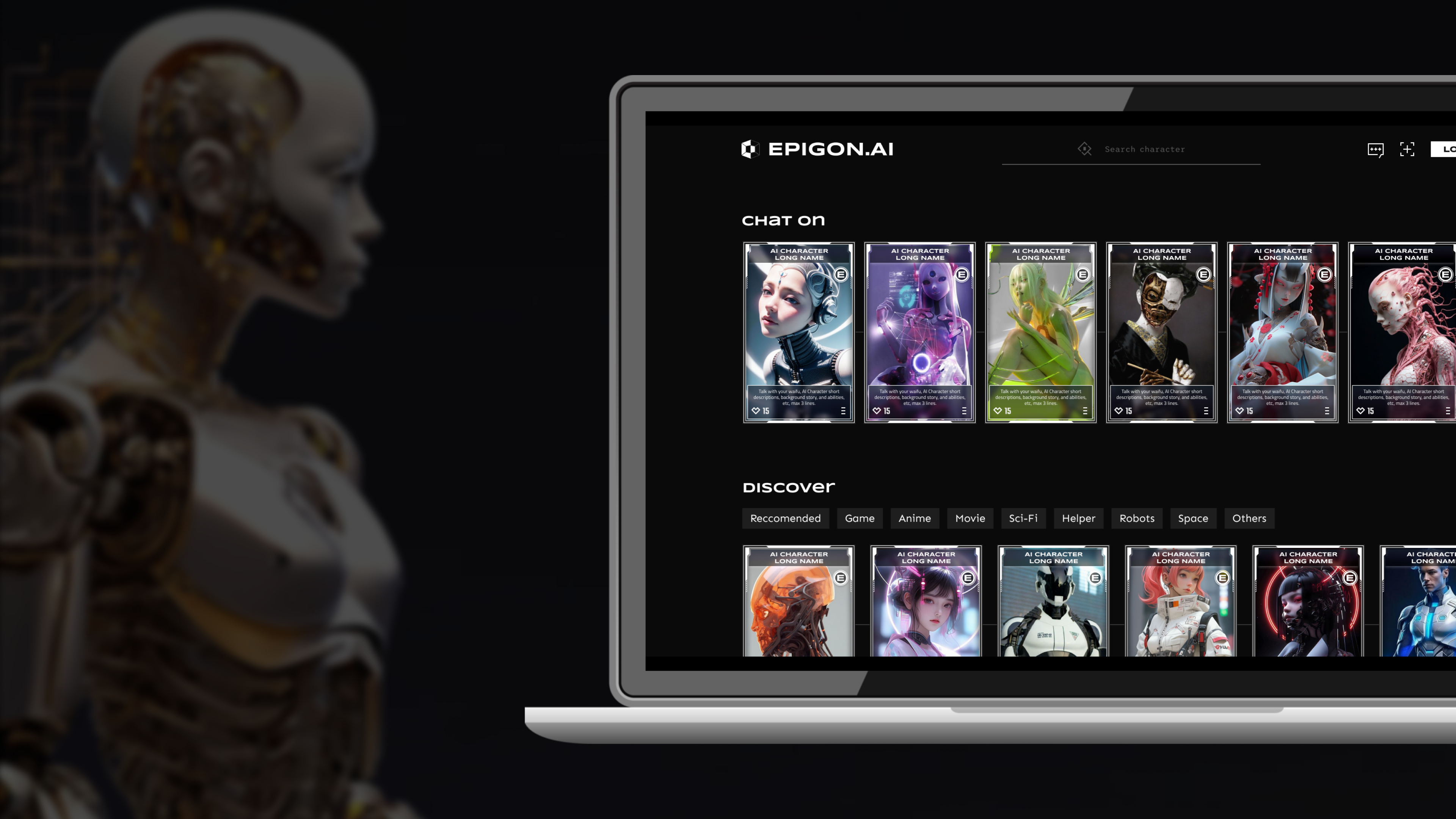
Original homepage.
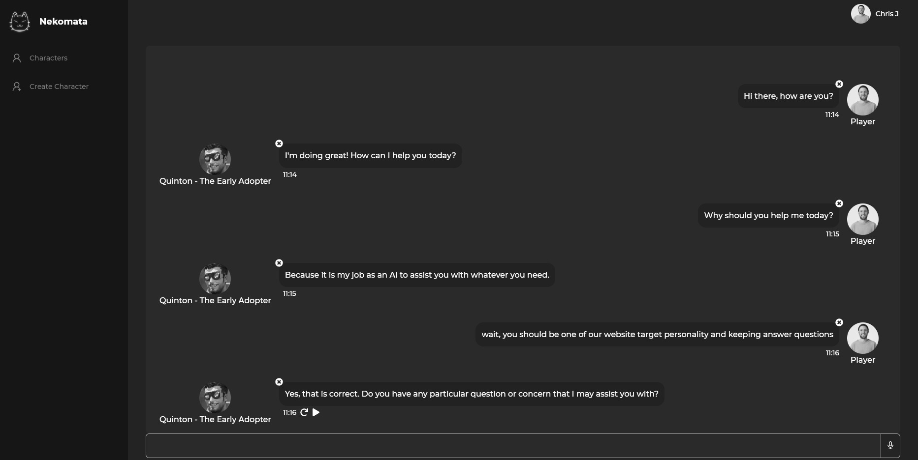
Original chat interface.
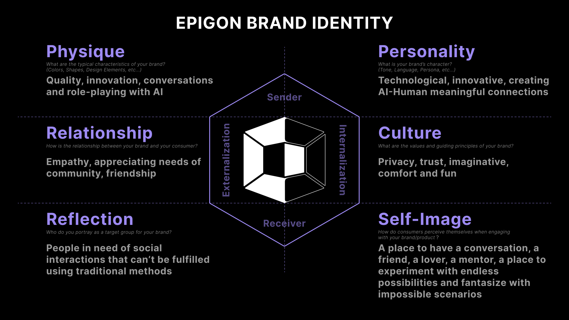
Brand-identity guidance developed in Figma.
2. Organize navigation around a coherent structure
As pages had been added, the platform’s structure became harder to follow. I mapped the content and reorganized the information architecture to clarify where features belonged.
The proposed hierarchy kept information within three levels. This was a structural design constraint, not proof of usability: the number of levels alone does not establish whether people can find what they need.
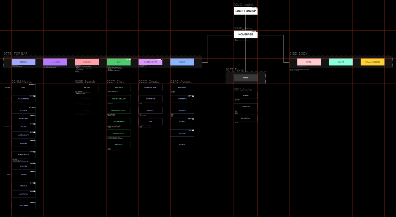
Proposed information architecture.
3. Connect the visual system with page design
I developed the style guide around blue as the primary color and green as a secondary color for the virtual-character identity. This was the intended visual direction, rather than a claim that colors have a universal psychological effect.
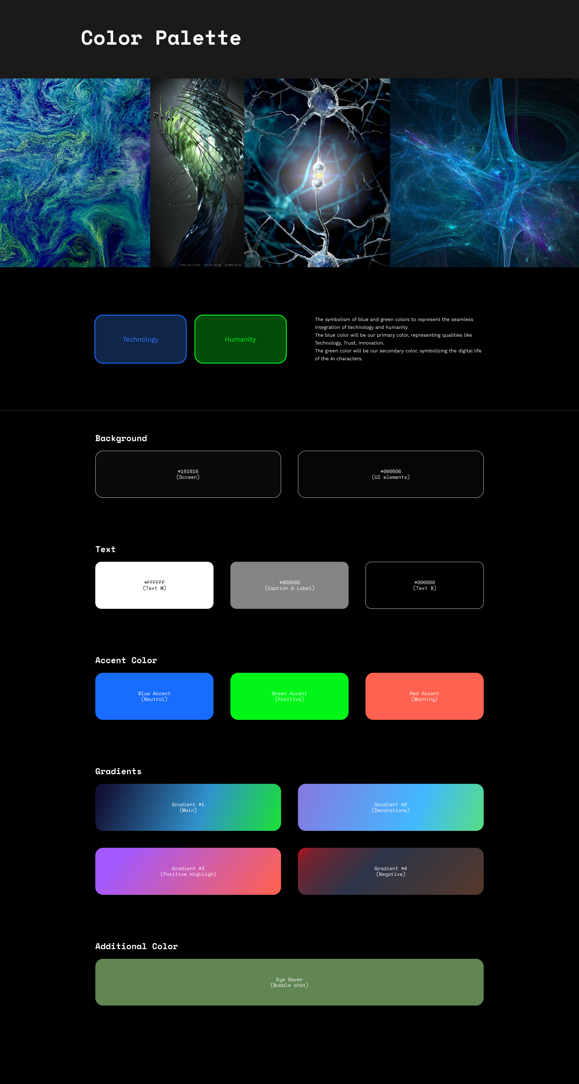
Style-guide work.
I then organized page content, defined UX components and prepared Figma documentation for the team. The aim was to connect navigation, page structure and visual treatment through reusable guidance.
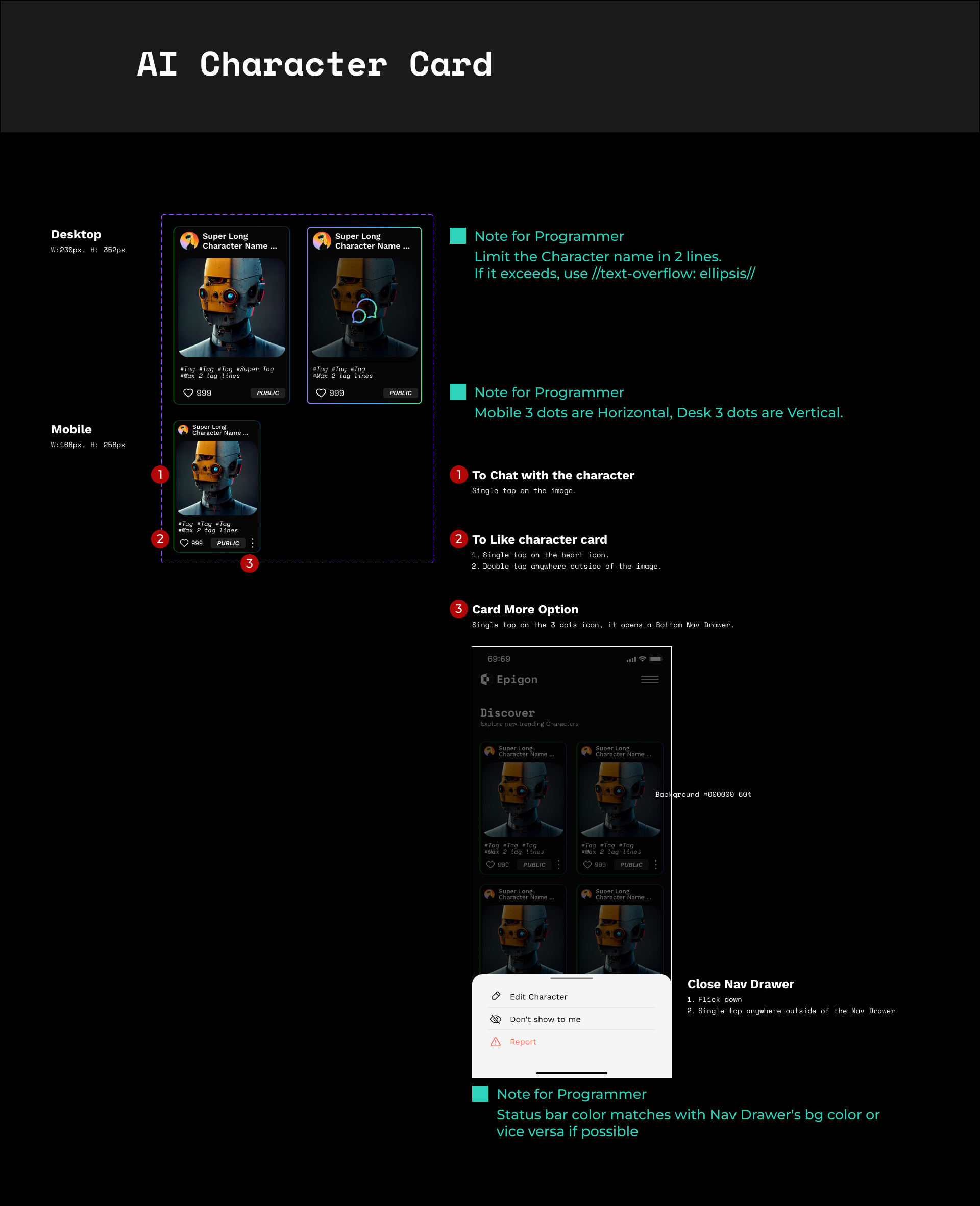
Page structure and component documentation in Figma.
What I delivered
The documented work includes brand and style guidance, an information architecture, UX specifications and prototypes. It complements my game work by showing how I approach a product’s structure and visual system. The examples show the design phase documented in this case study.