Case study updated September 9, 2026
ONCE HUMAN
GAME UX | HUD AND CONTROLS | BATTLE PASS WIREFRAMES
From gameplay analysis to Battle Pass interaction design
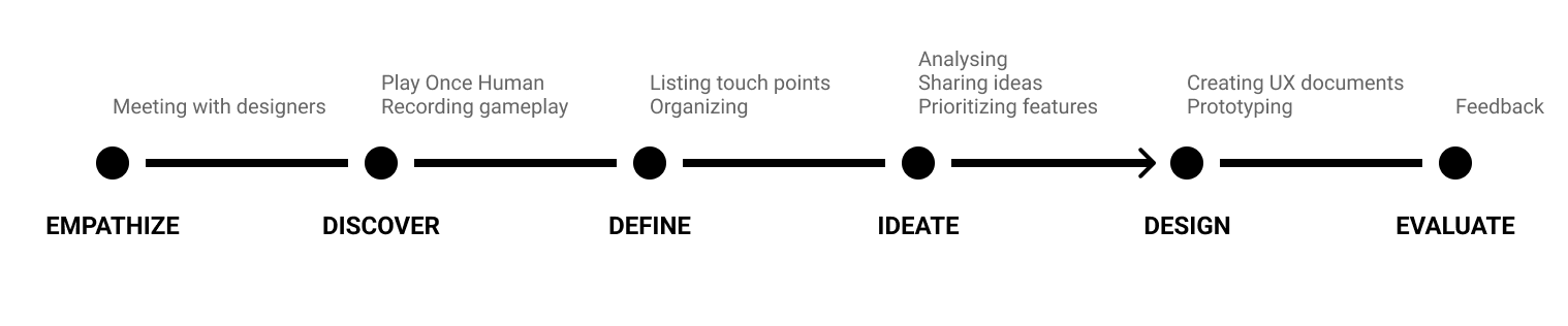
I joined Once Human during development to analyze the player experience and create UX documentation. The work progressed from a broad gameplay review to focused recommendations for the HUD, controls and purchasing flows, followed by Battle Pass wireframes.
Role: UX Designer
Team: 3 other UX designers
Project period: February–May 2023
Tools: Figma, Photoshop and Excel
My contribution
- Produced two rounds of analysis covering gameplay, interface behavior and platform conventions.
- Reviewed PC and mobile HUD layouts, hotkeys and store information hierarchy.
- Created annotated Battle Pass wireframes for UI artists and programmers, with interaction information relevant to VFX and audio.
1. Turn gameplay observations into focused questions
My first review examined interaction, the crafting and building loop, progression and motion-related discomfort. After discussing the findings with the design team, I narrowed the second review to the HUD, controls and purchasing experience.
The work shown here is expert analysis and design documentation. Comparative examples helped frame alternatives; they were not substitutes for testing with Once Human players.
2. Adapt the HUD to the device
I recommended keeping the visual language consistent across PC and mobile while reorganizing the layout for each device. The priorities were readable text and icons, recognizable symbols, contextual information and fewer competing prompts. A smaller screen needed a considered layout, not a reduced copy of the PC interface.
PC HUD review
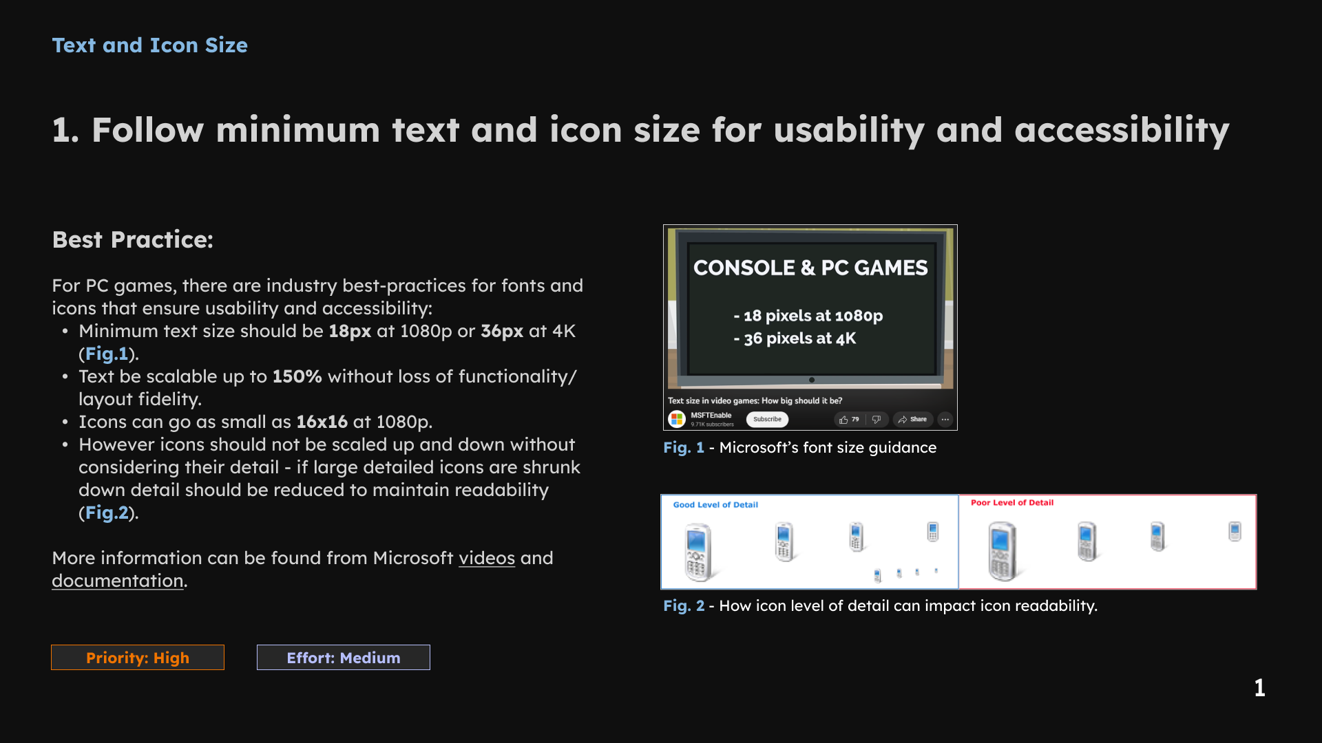
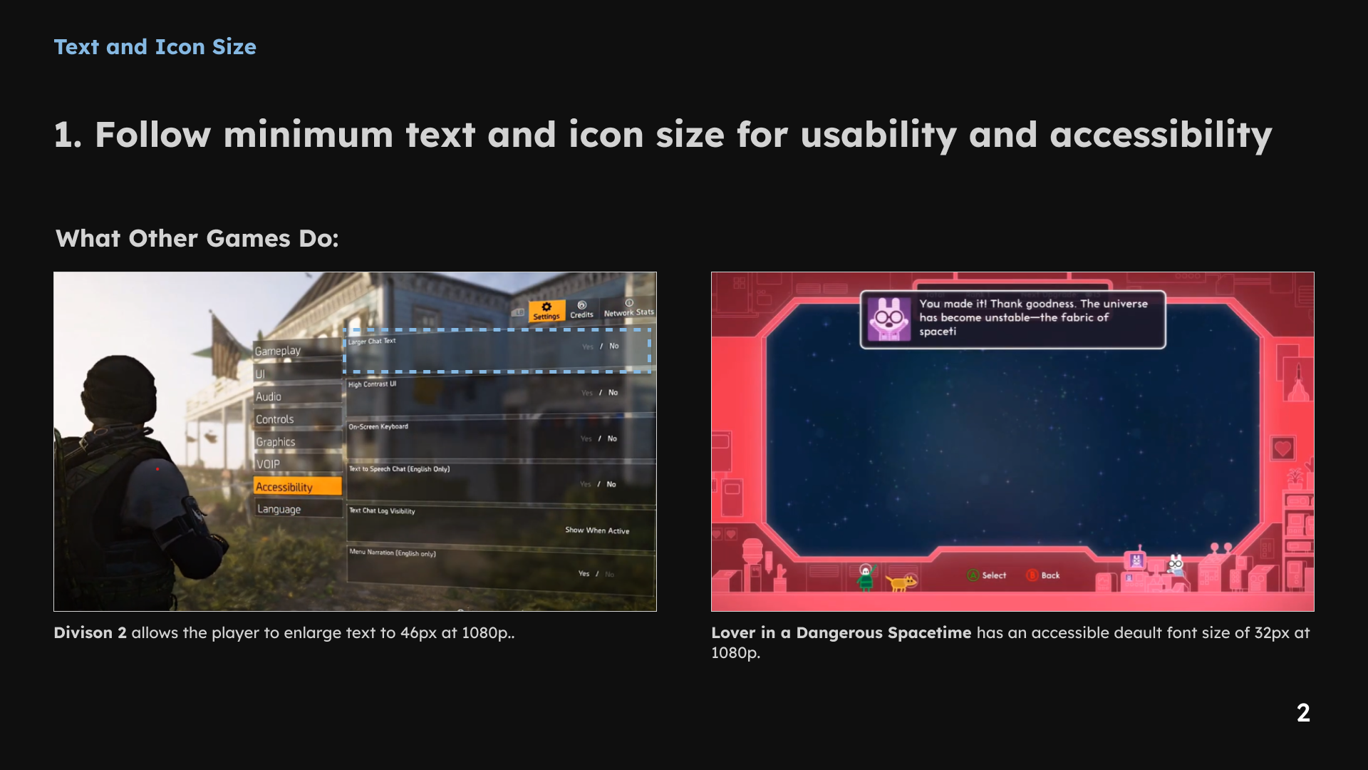
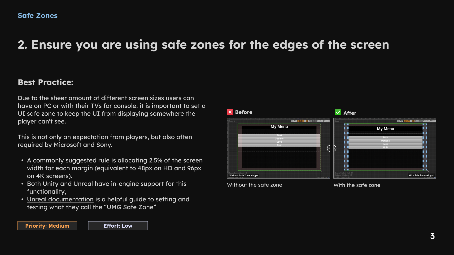
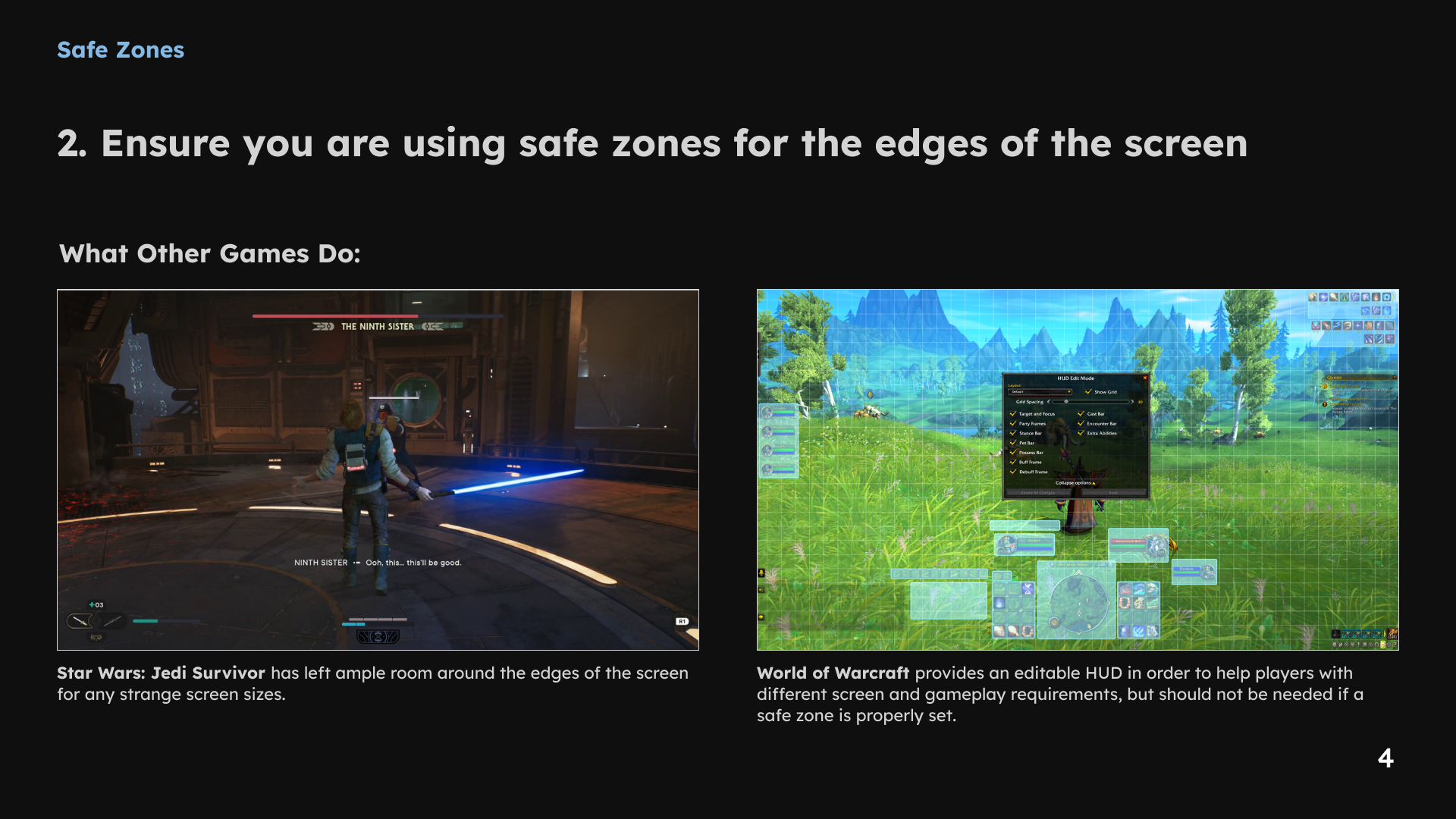
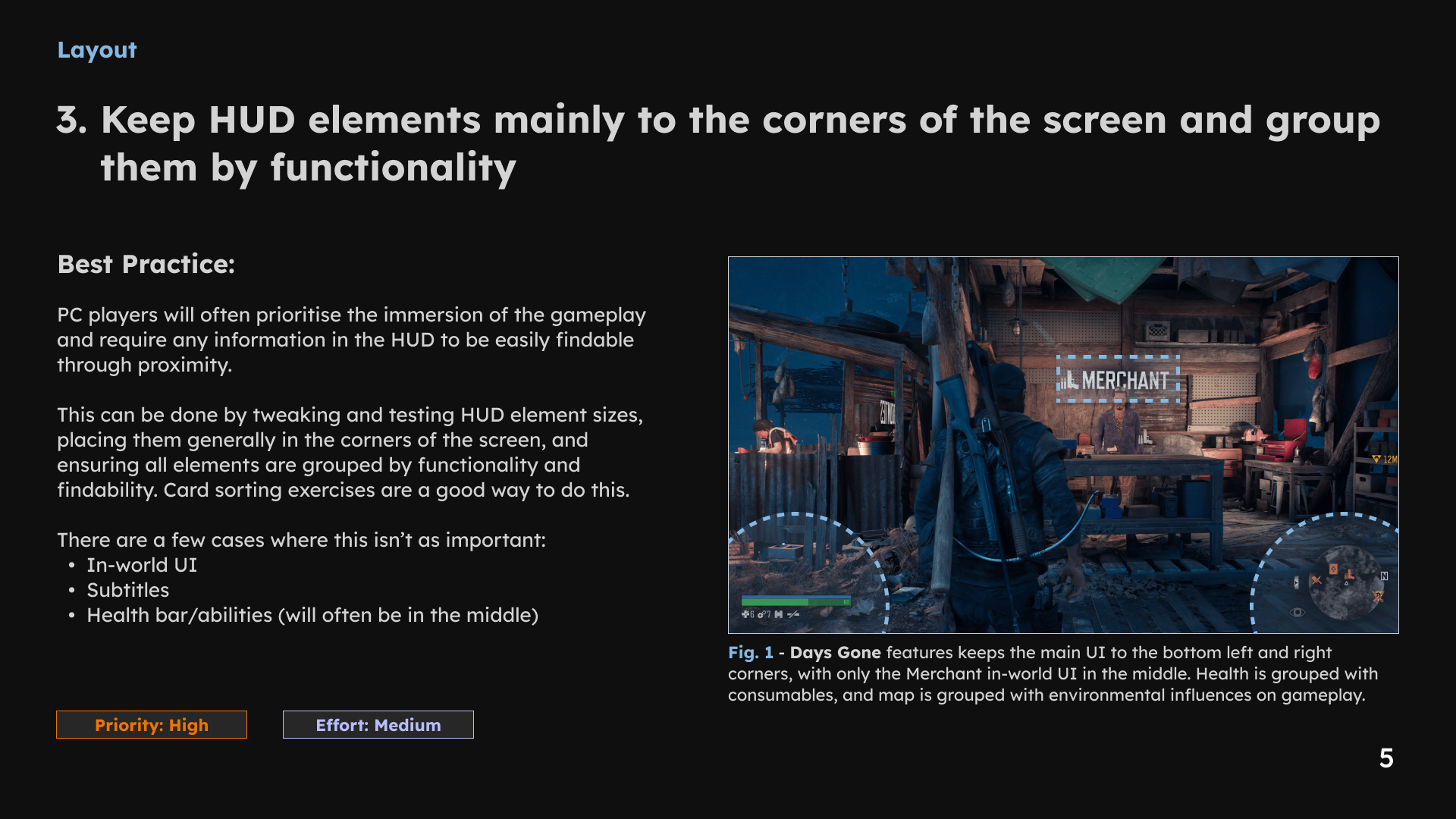
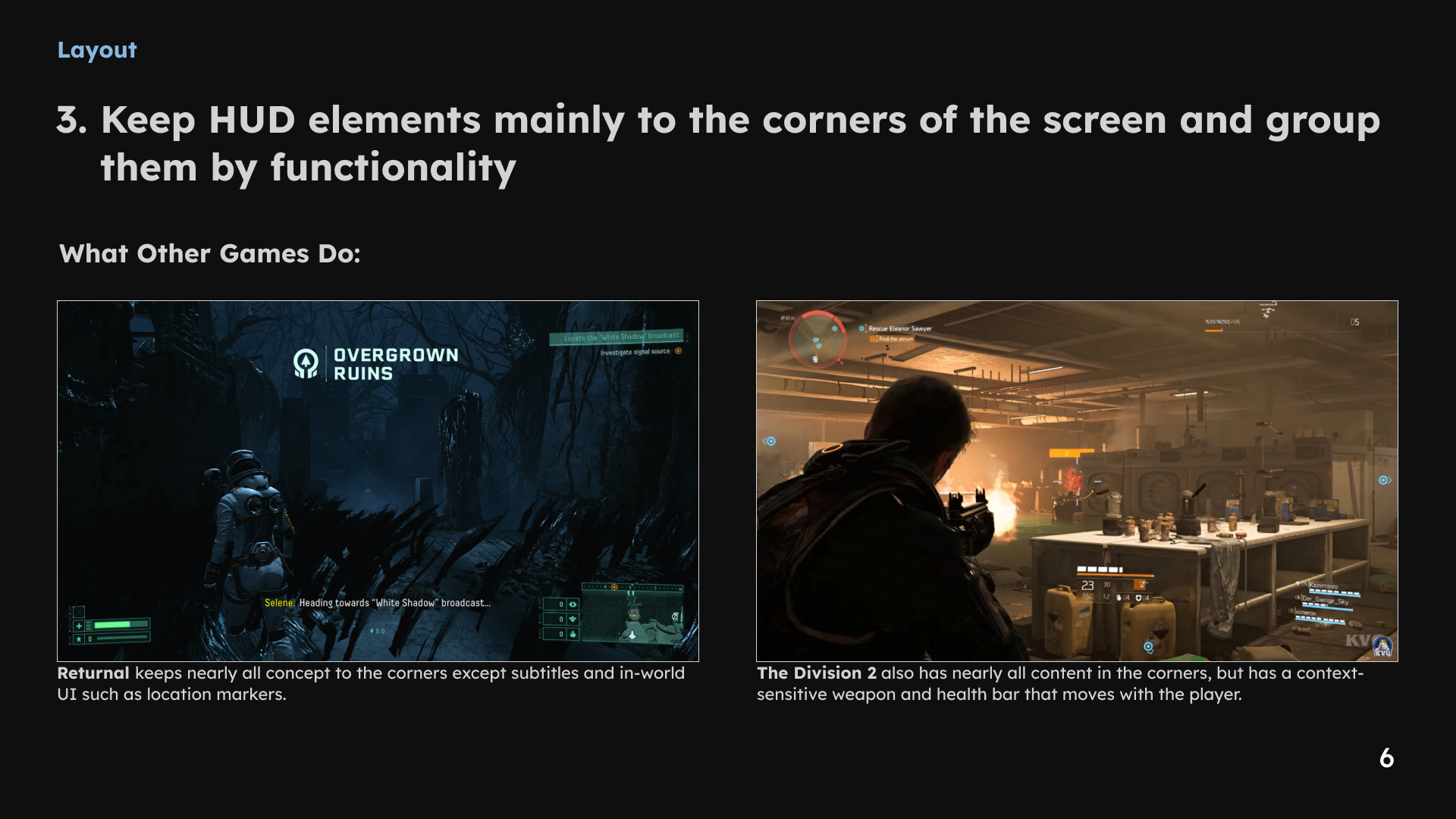
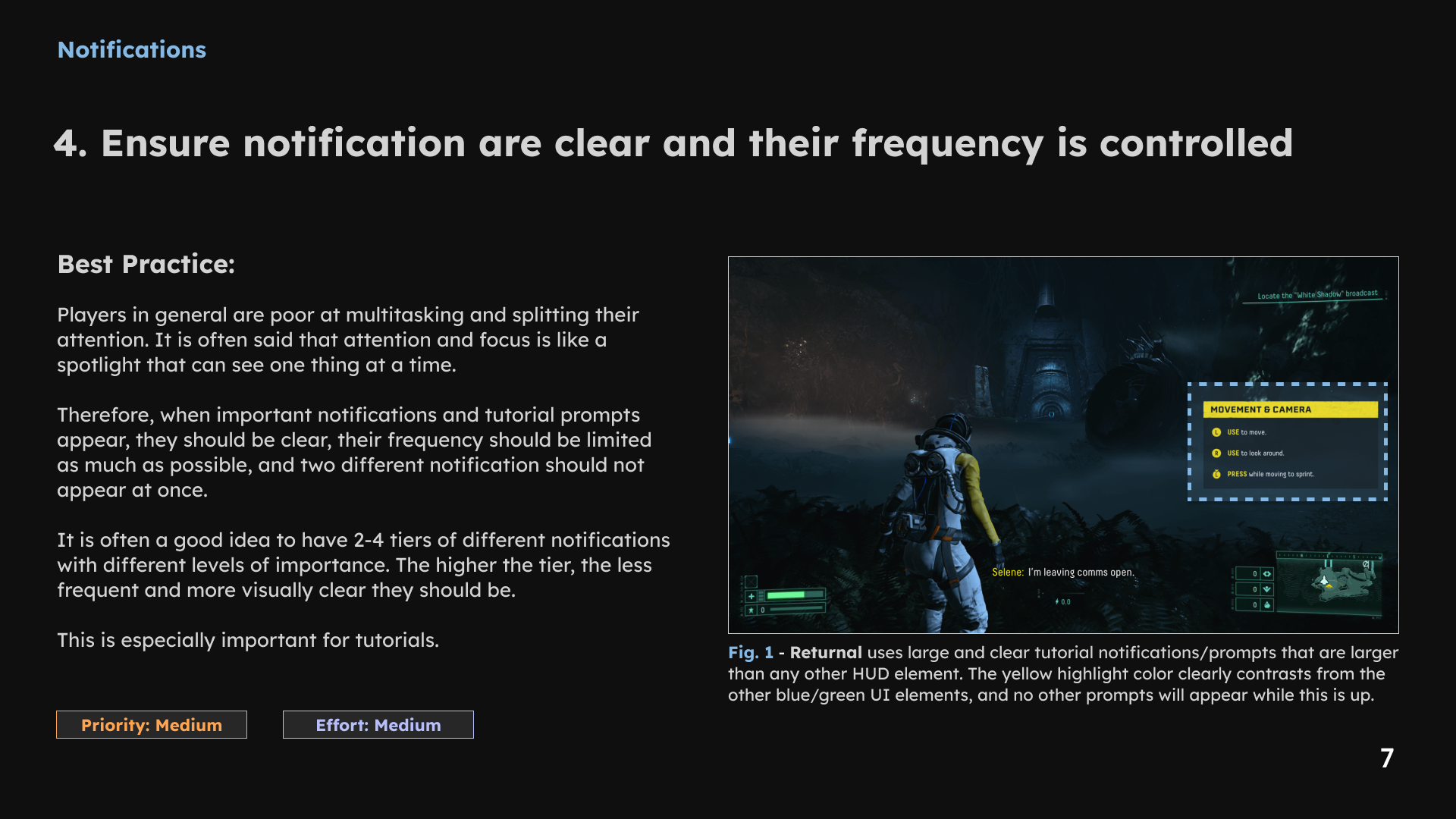
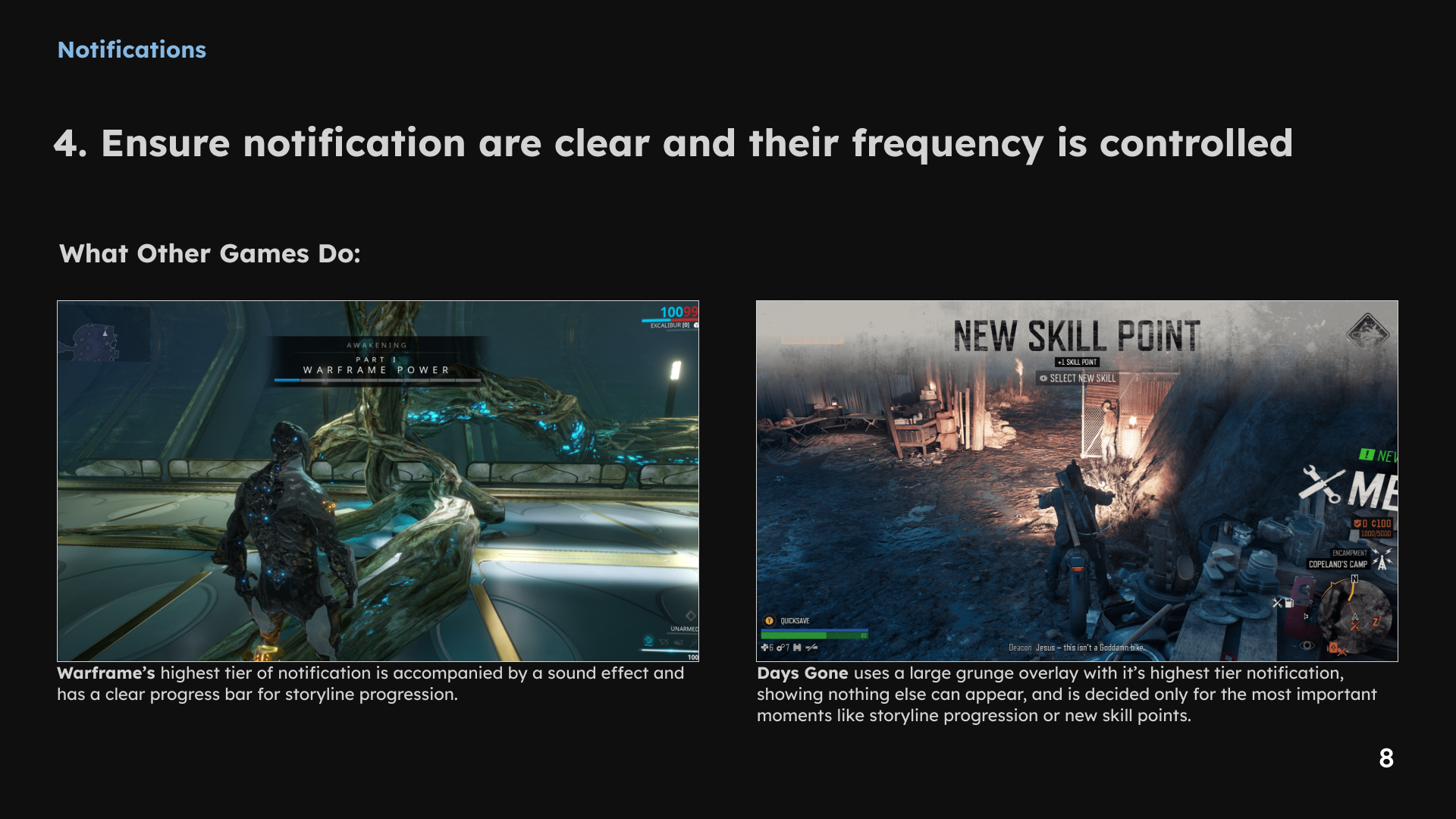
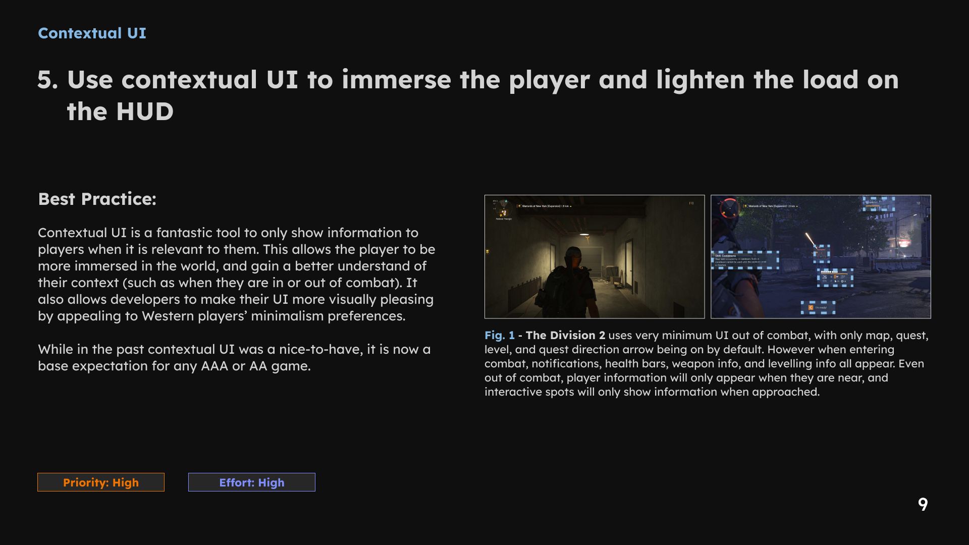
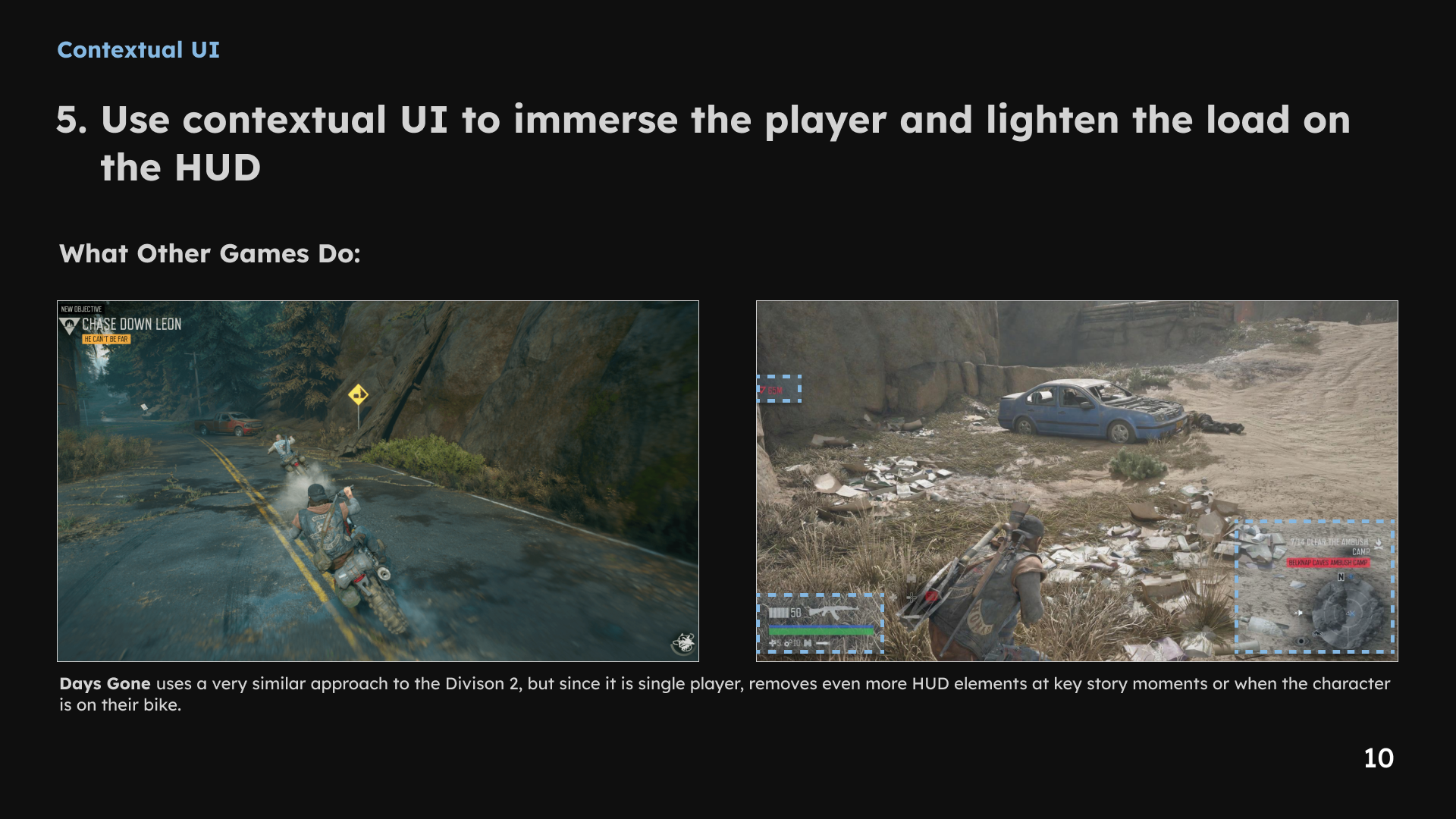
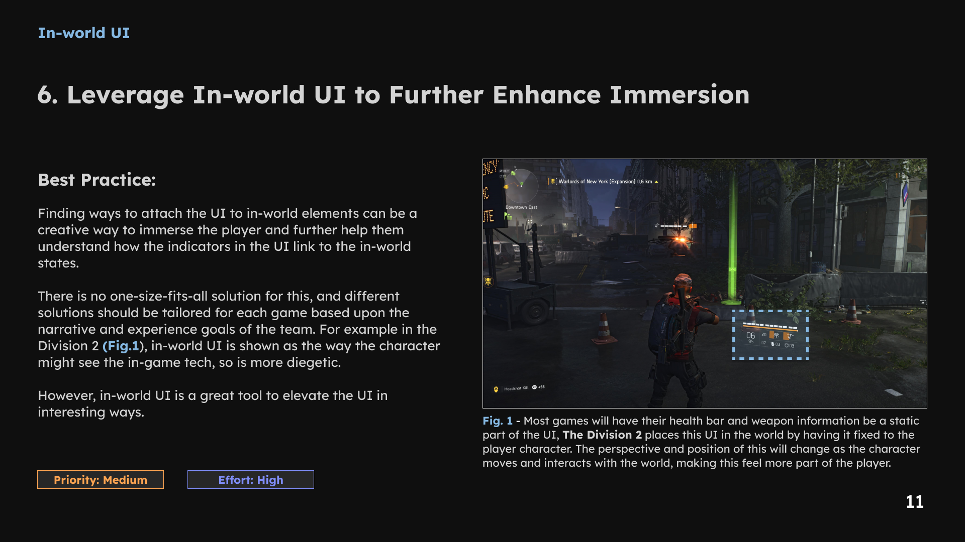
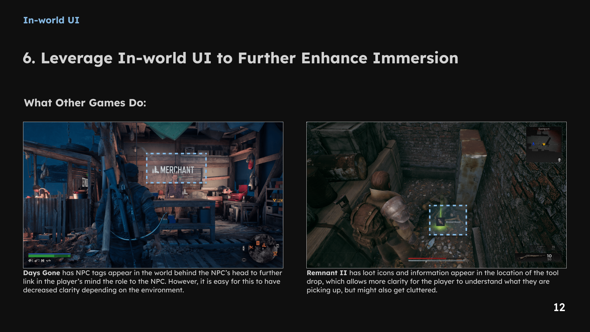
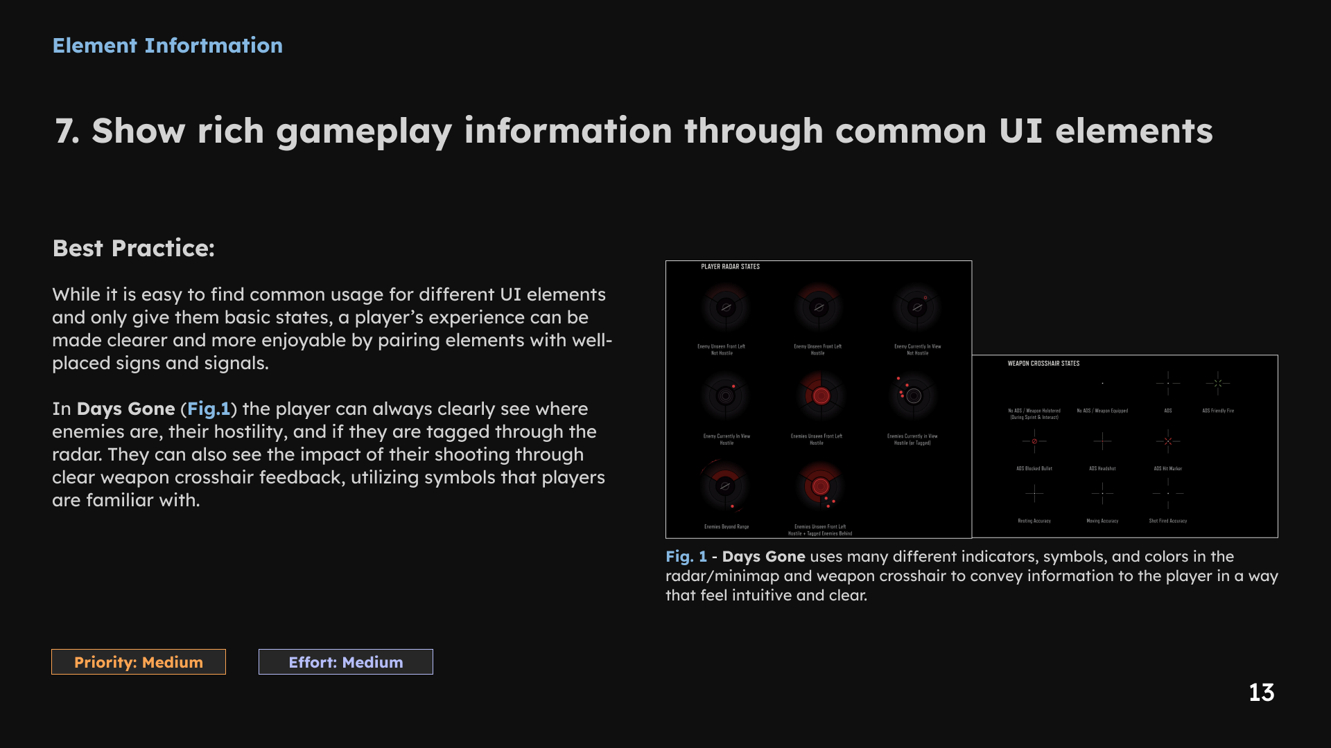
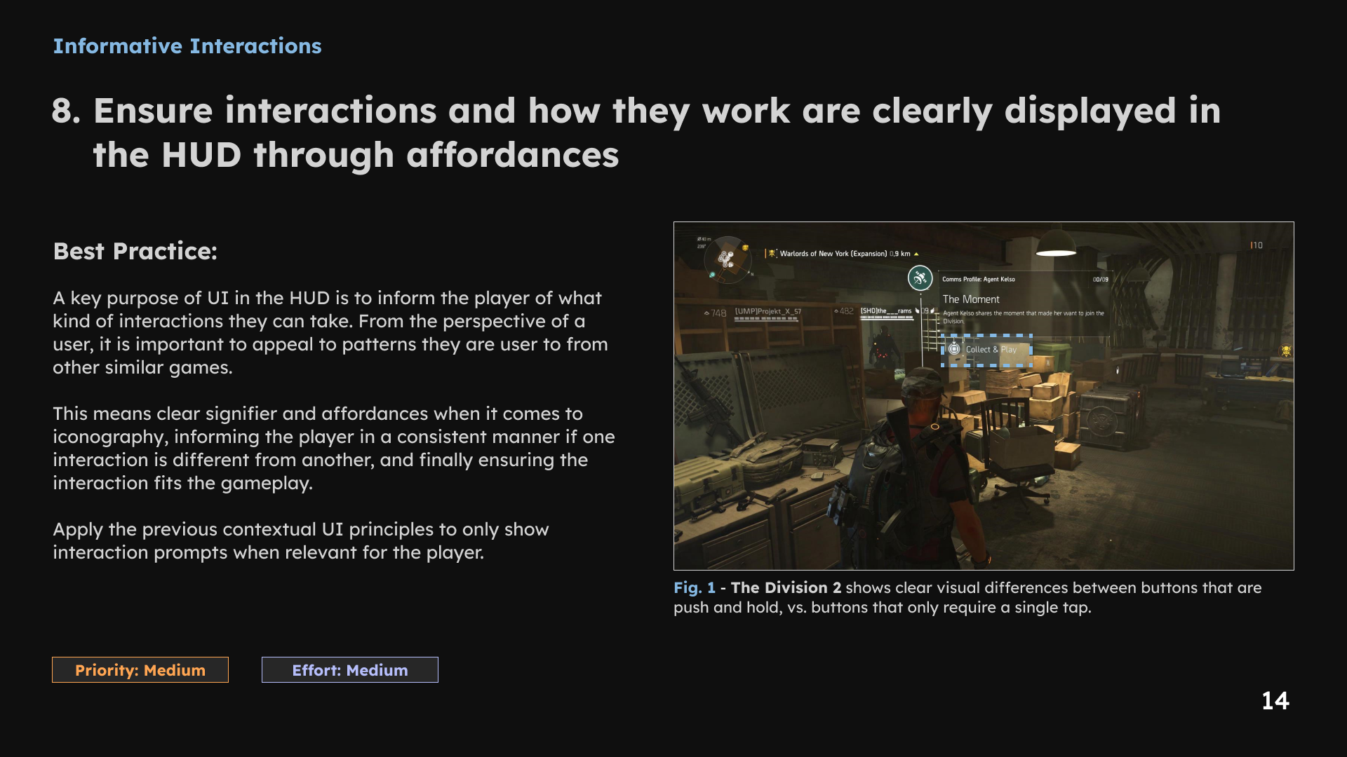
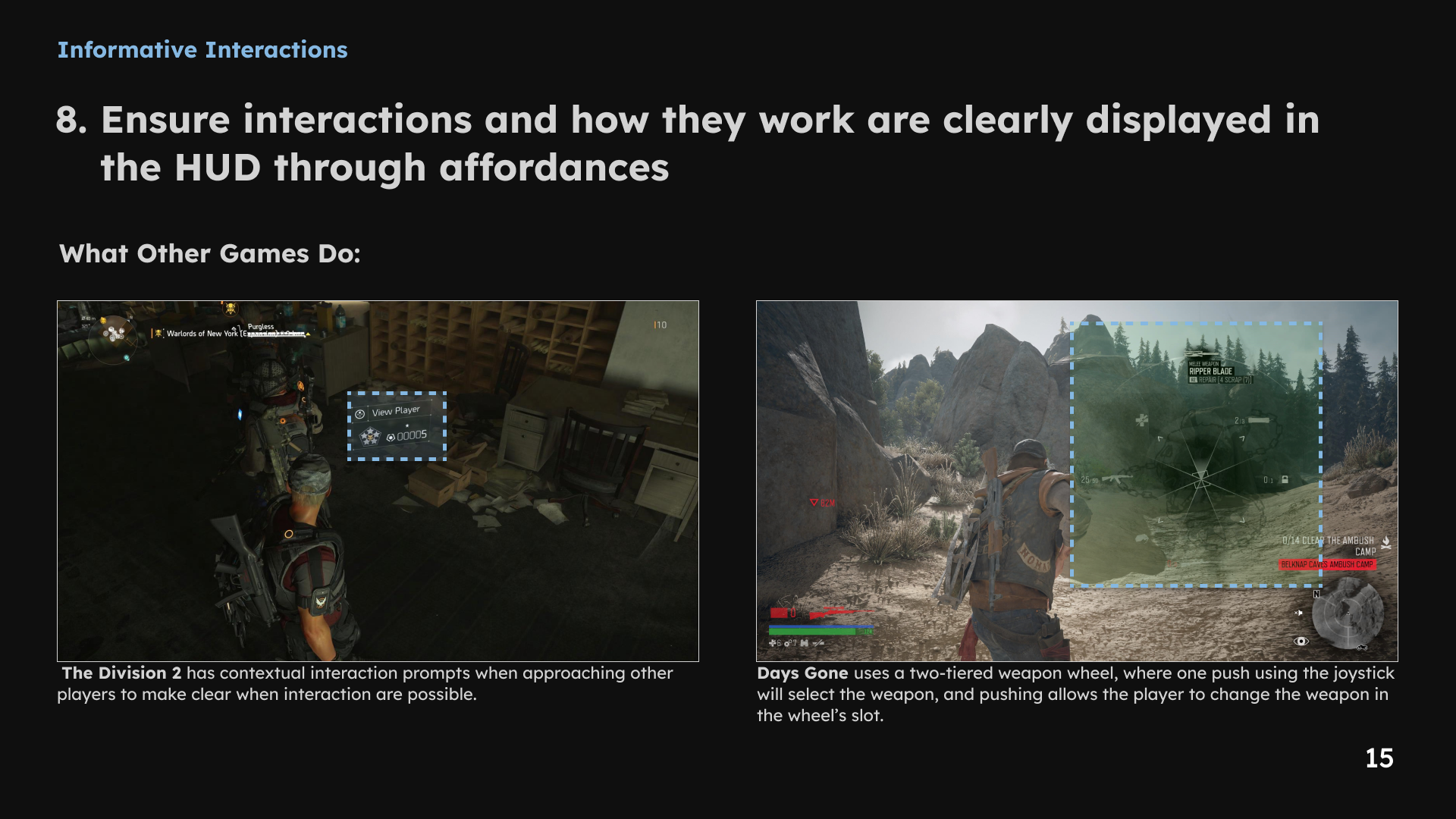
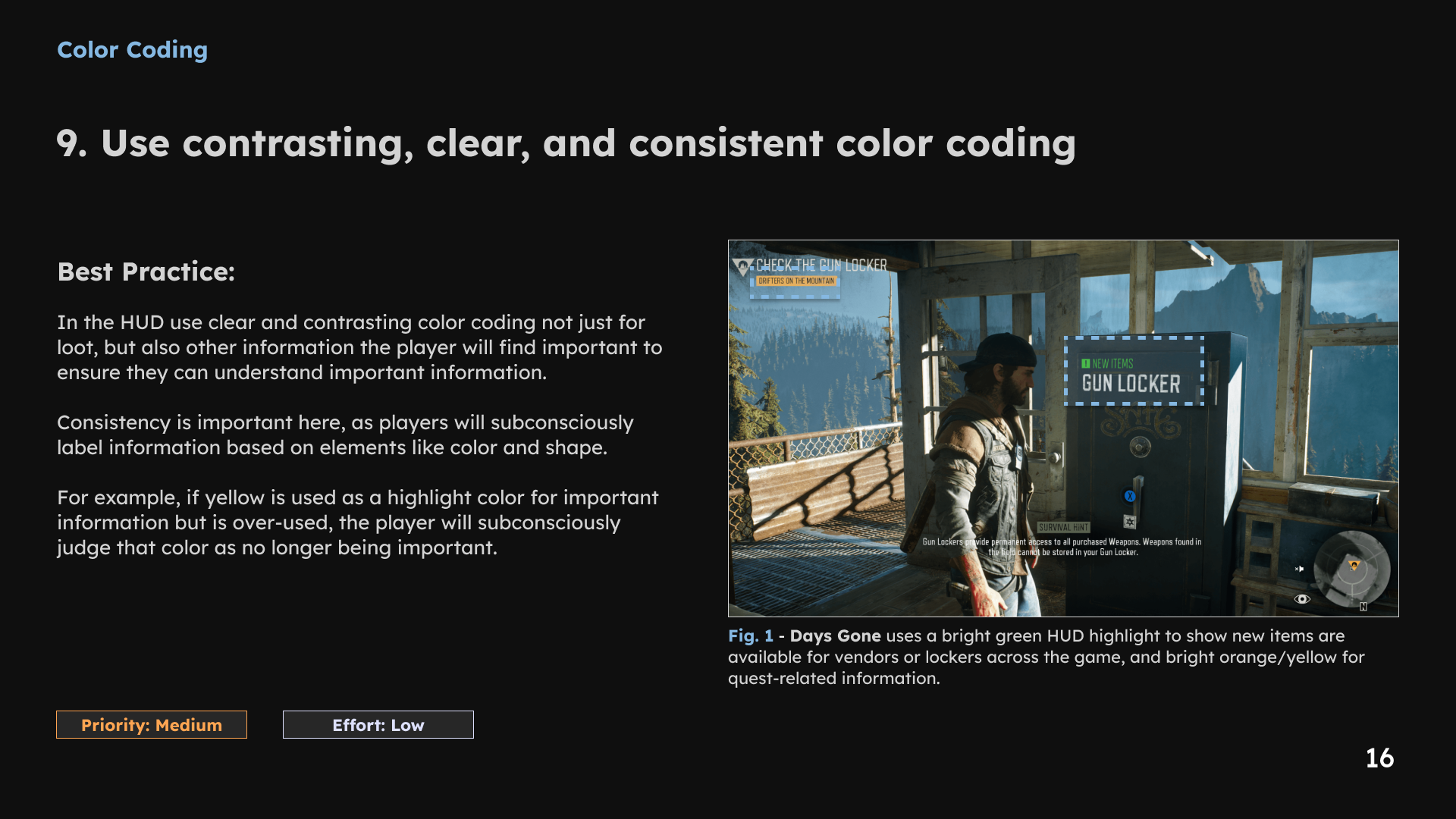
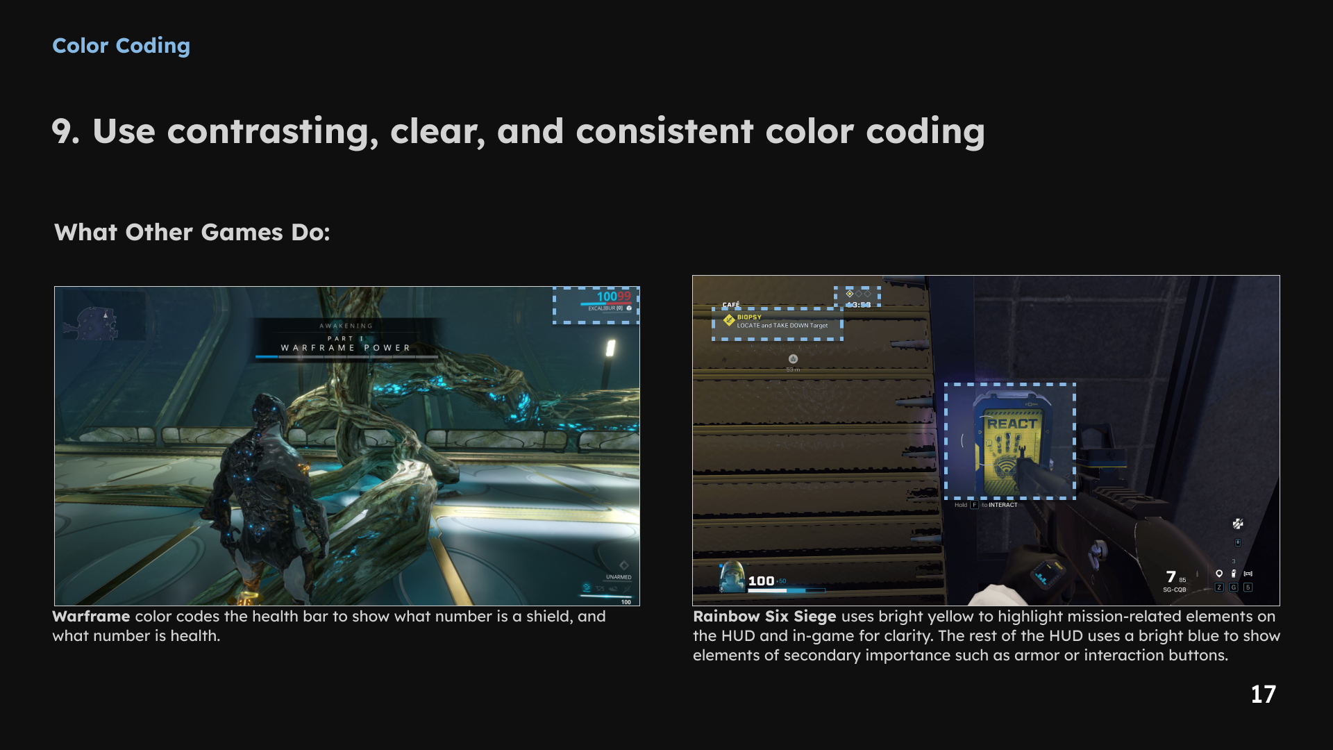
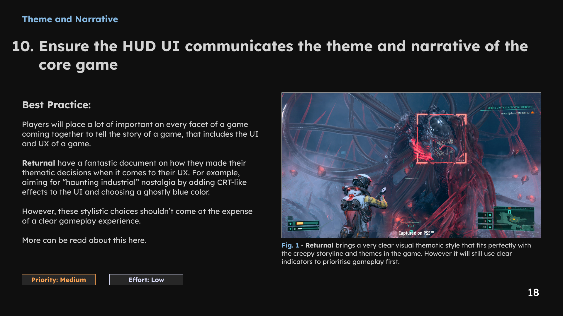
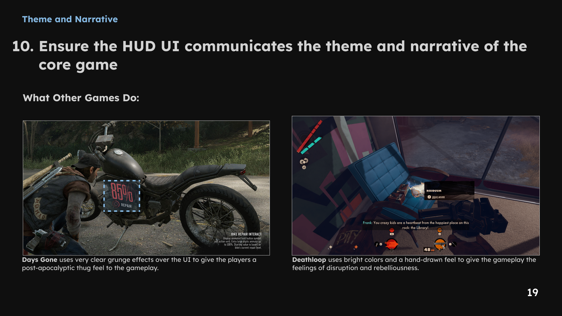
1 / 19 · Select a slide to view full size
PC-to-mobile considerations
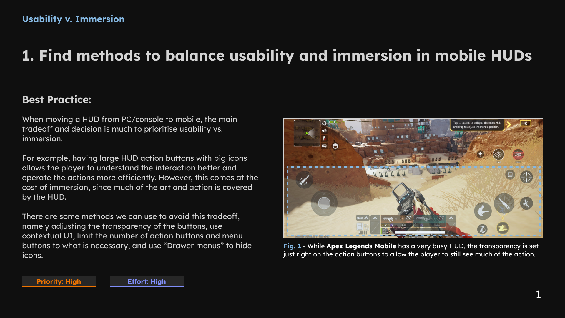
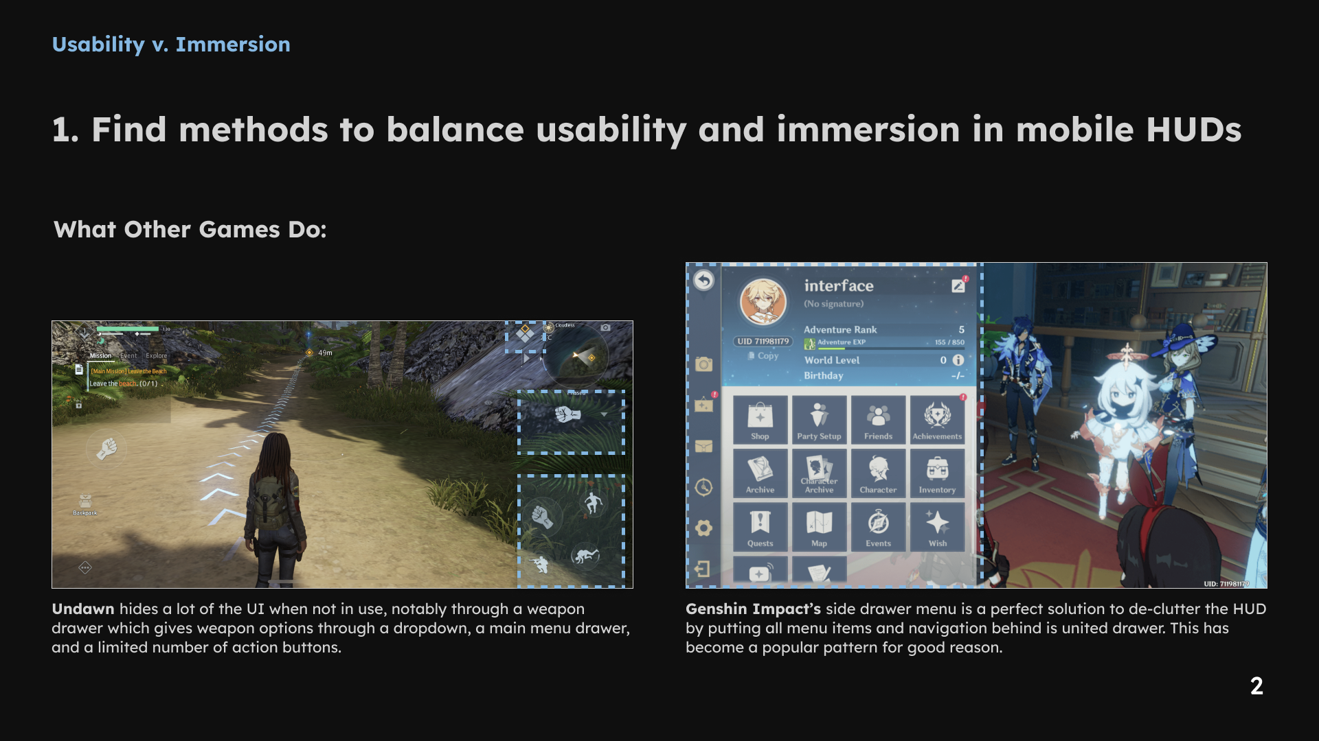
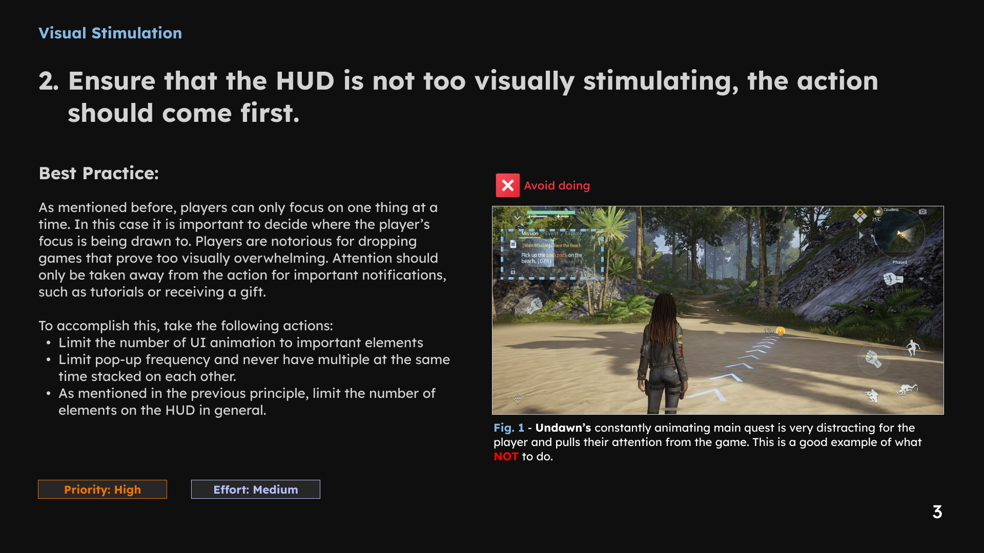
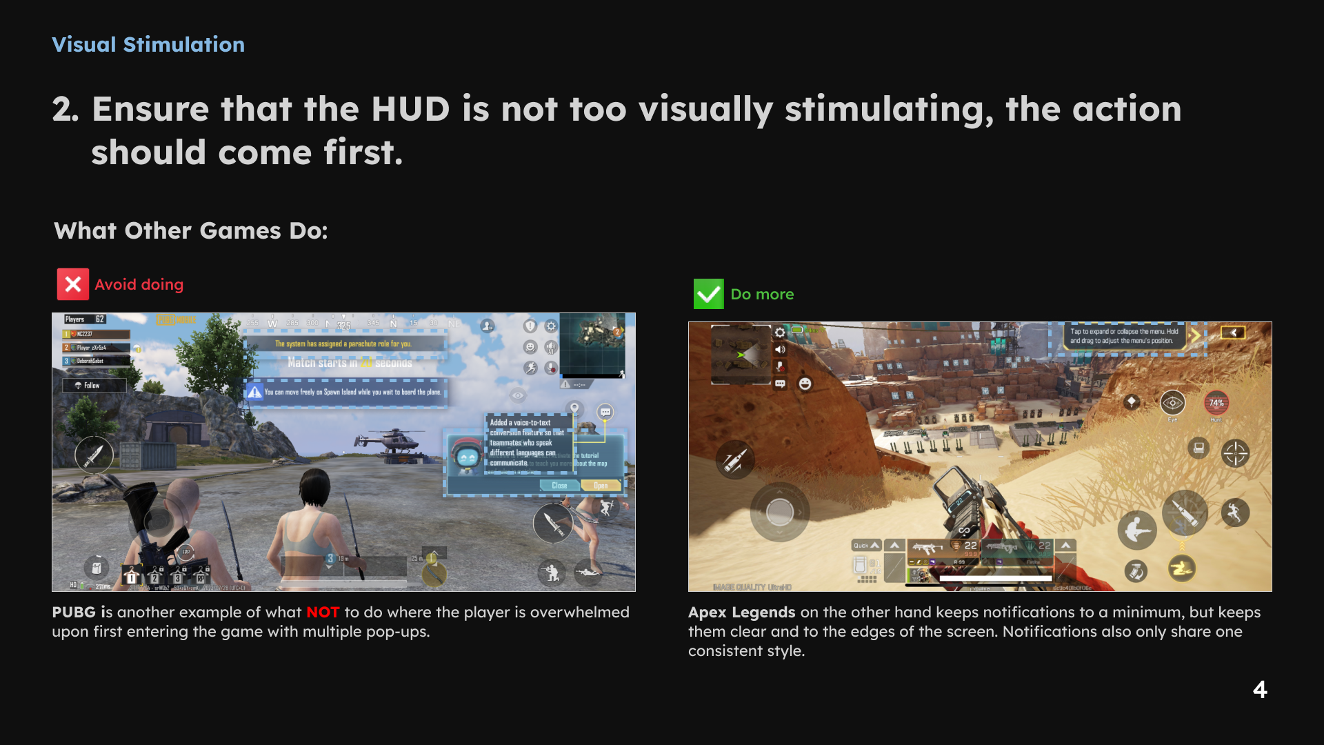
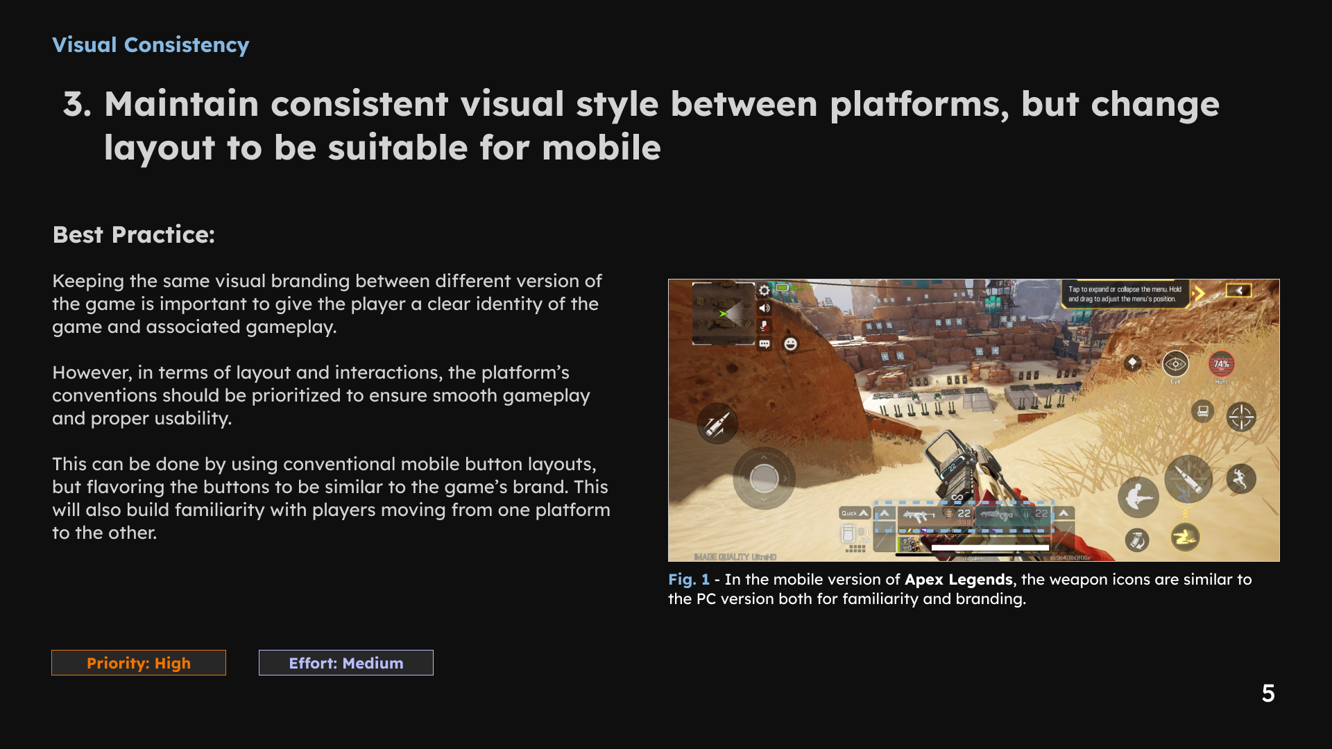
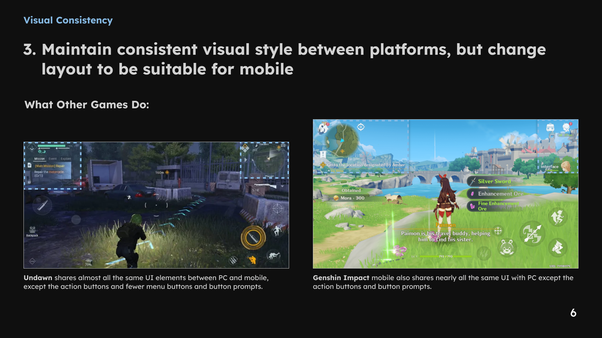
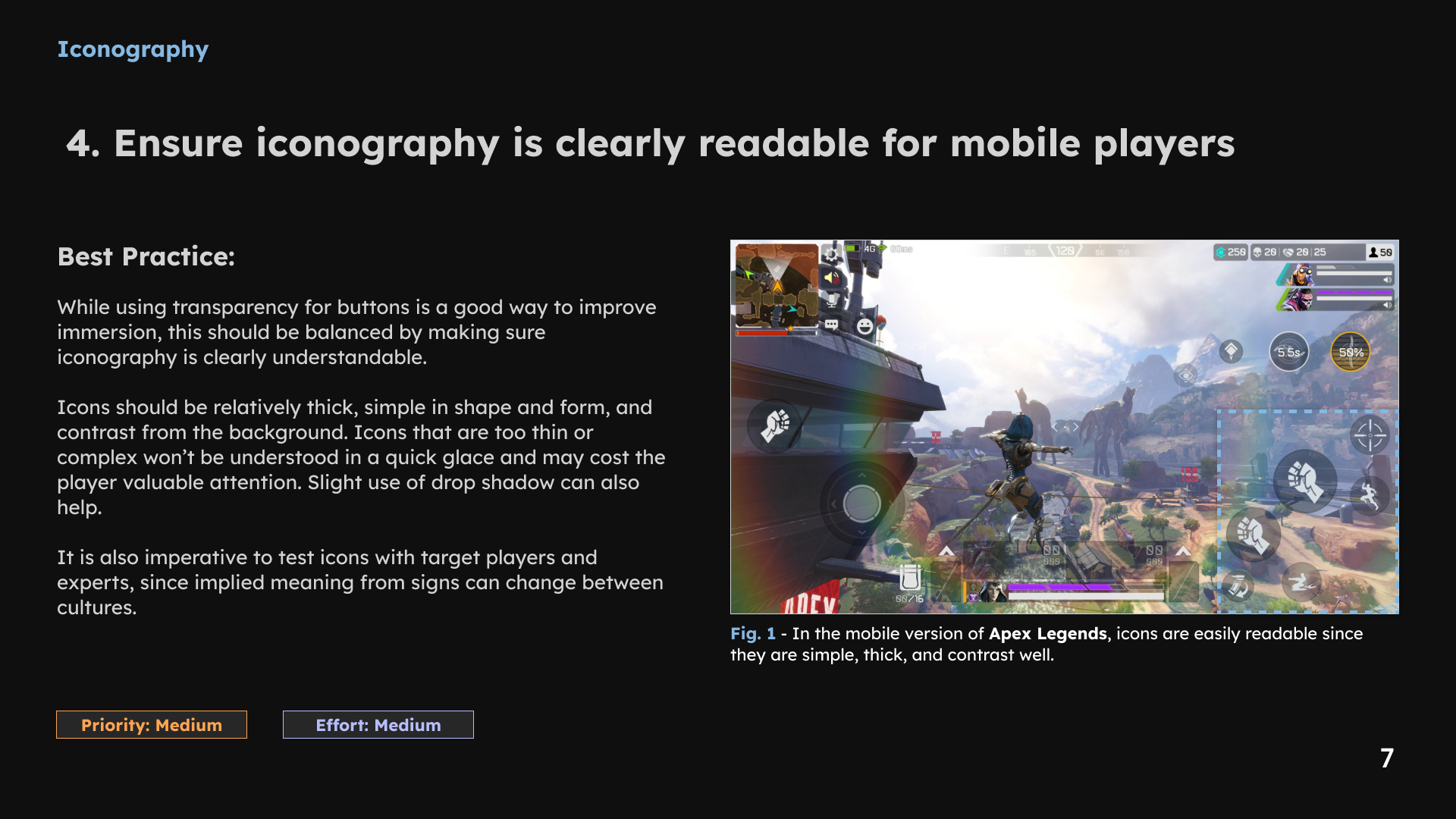
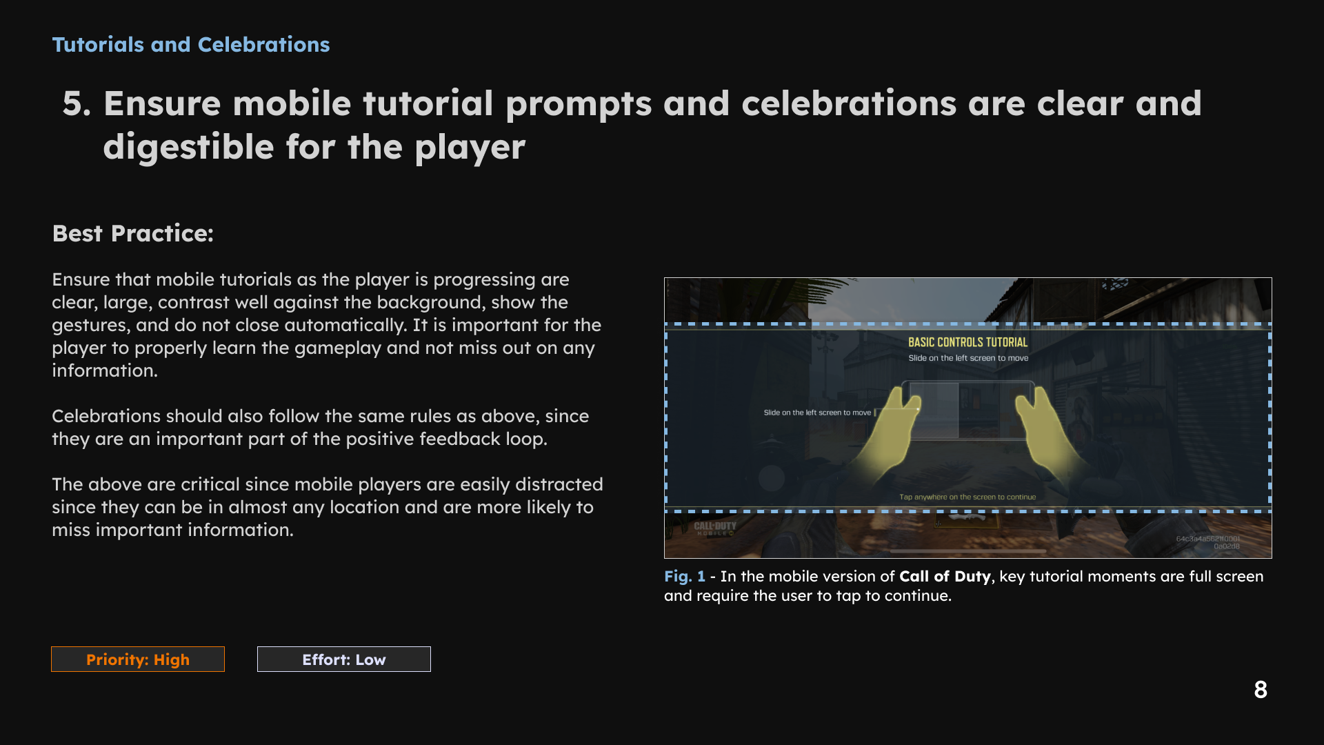
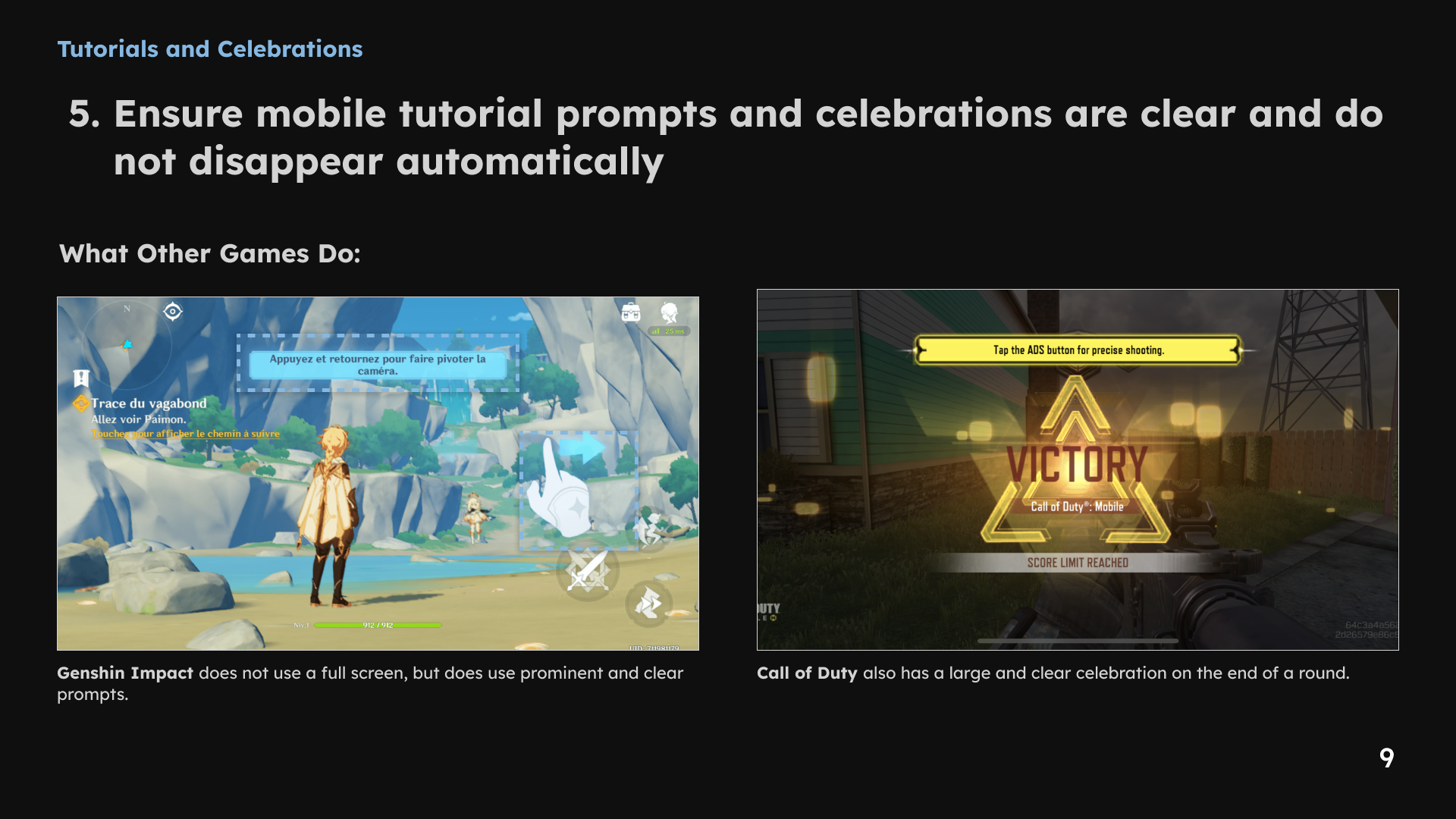
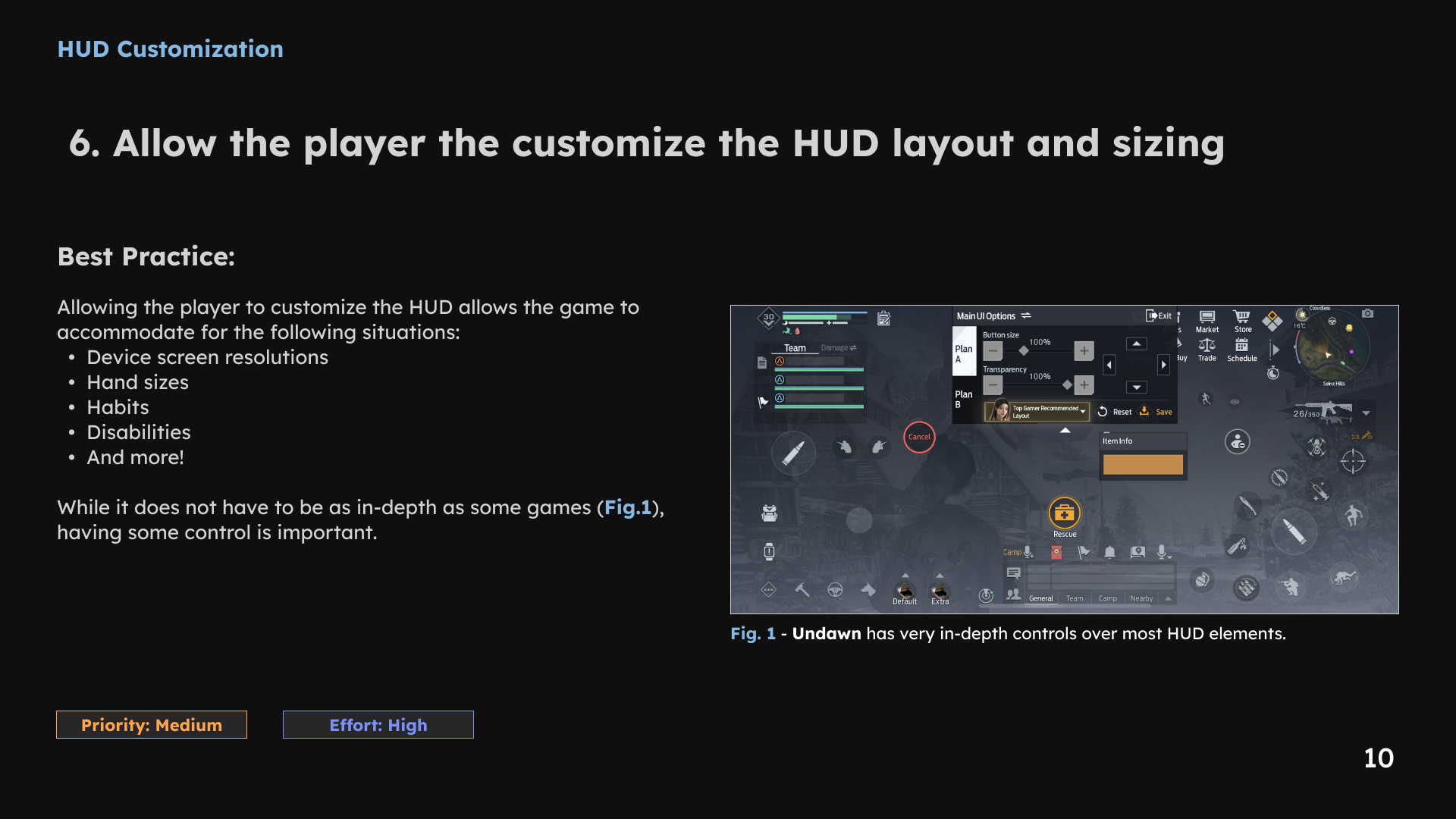
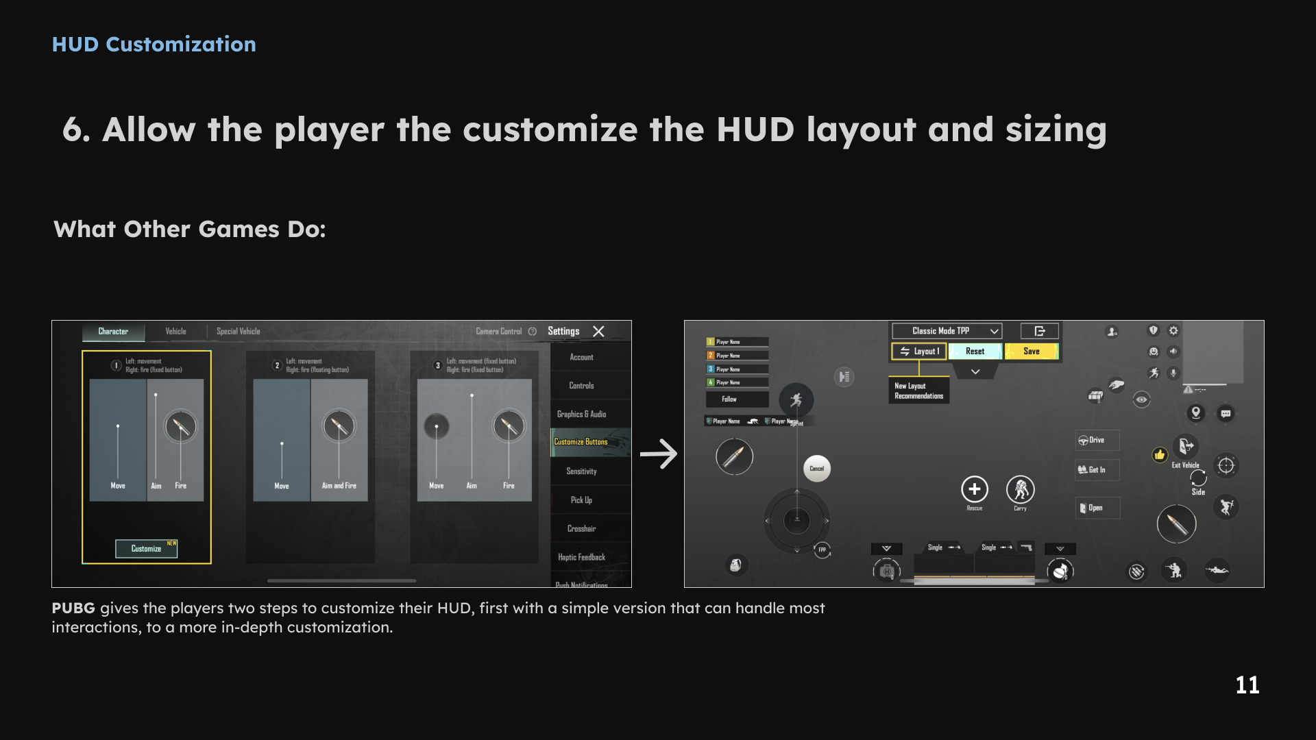
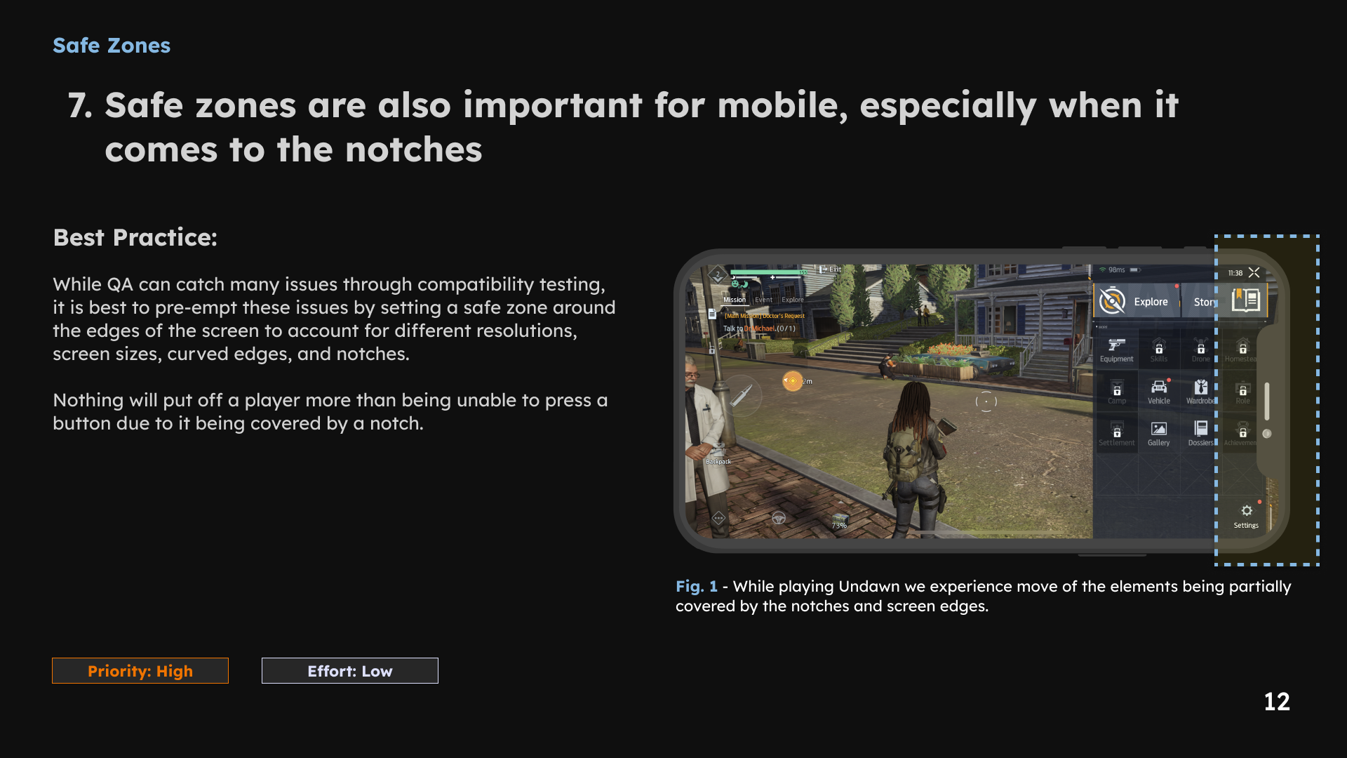
1 / 12 · Select a slide to view full size
3. Make controls consistent and reachable
The hotkey review considered frequency, importance, key proximity and conflicting commands. I recommended consistent mappings for similar actions and alternative ways to access features. The comparisons below document the reasoning and control conventions considered.
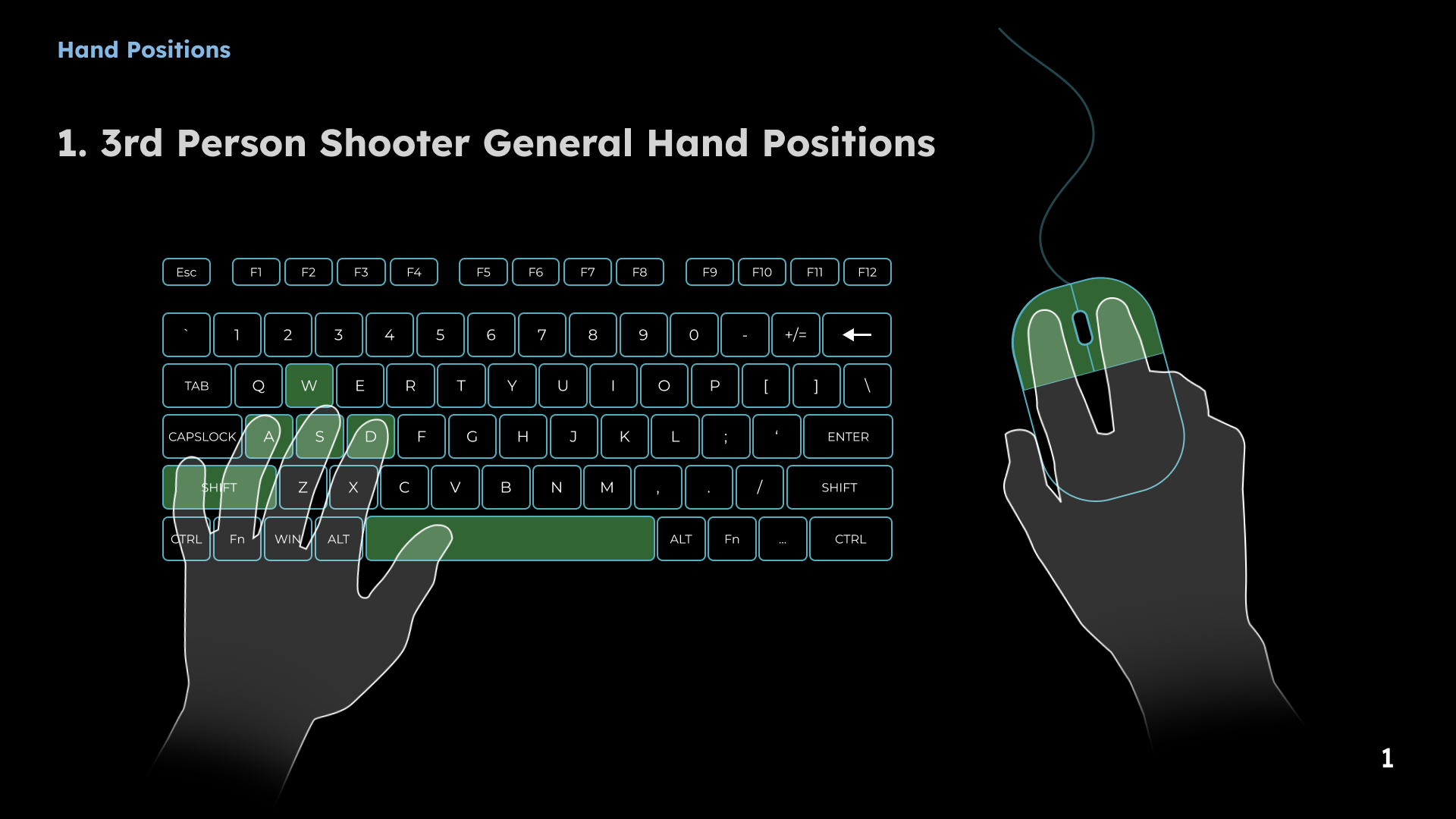
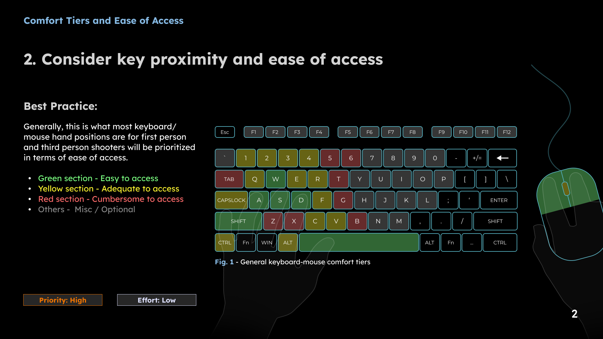
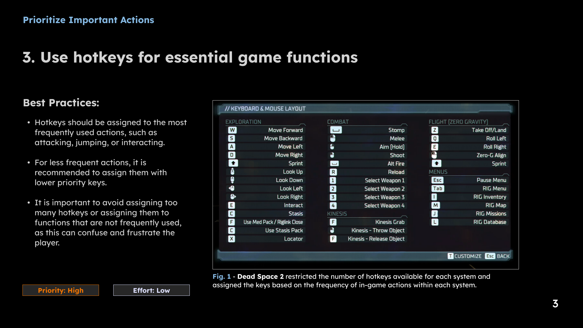
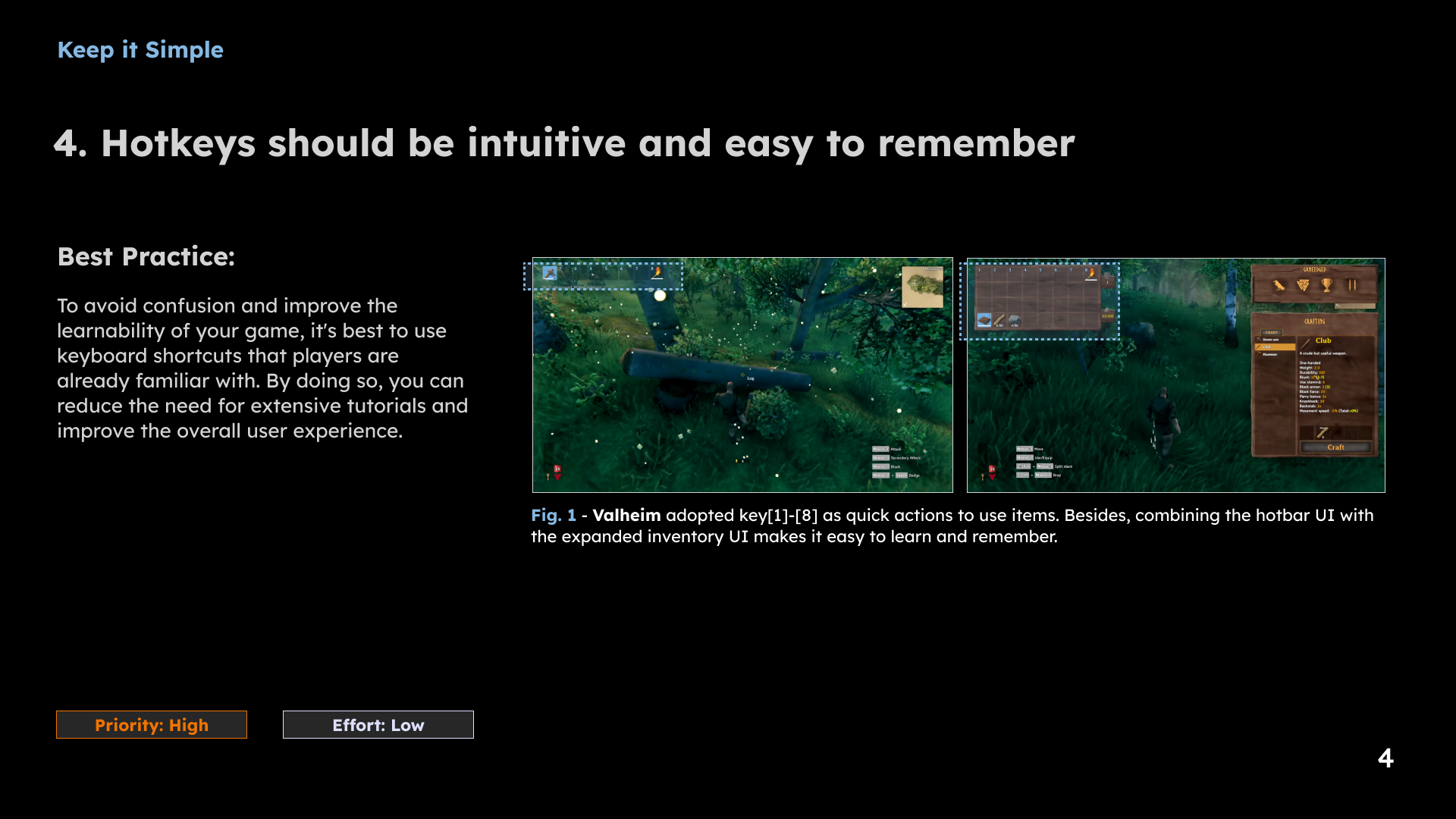
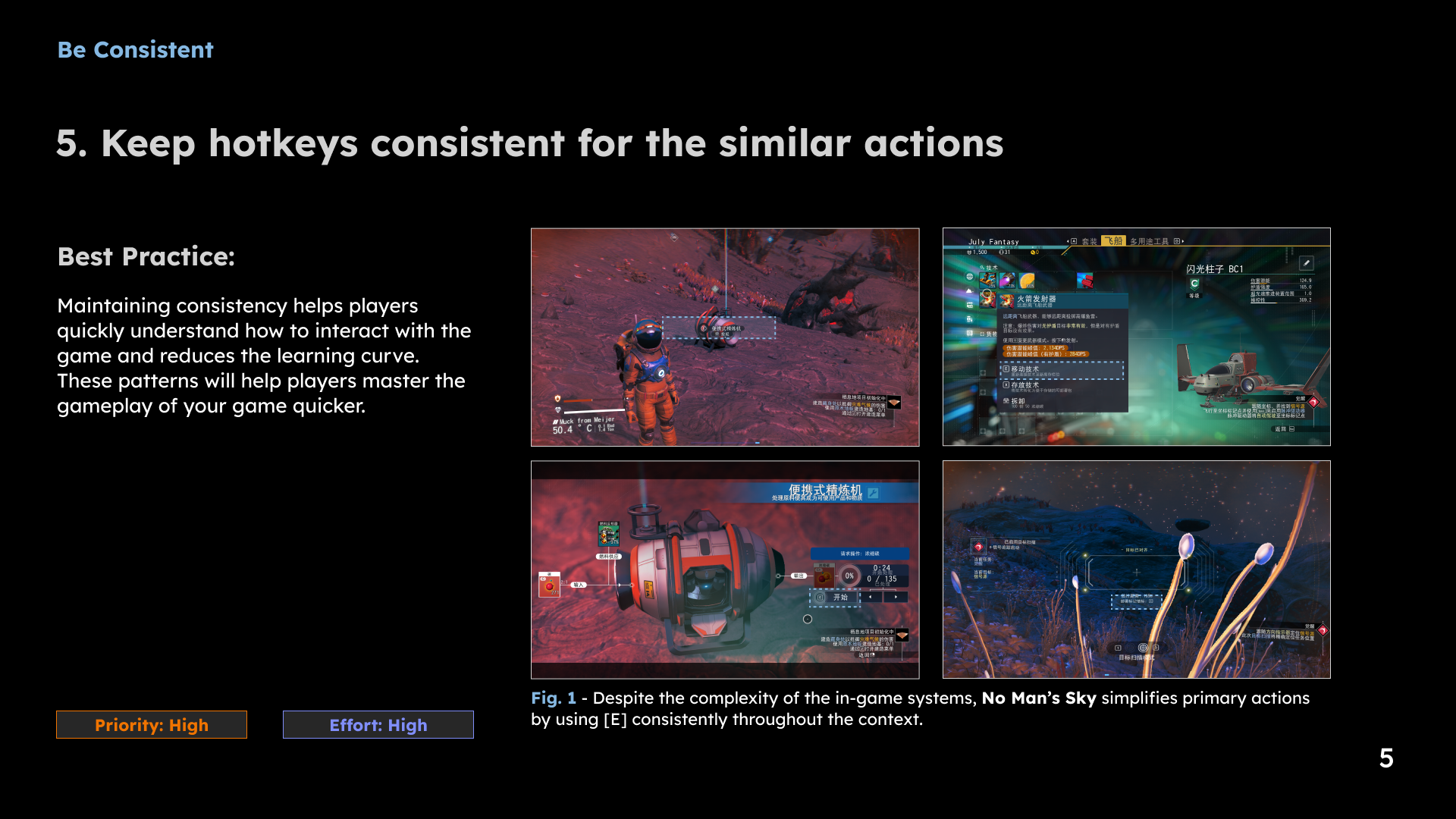
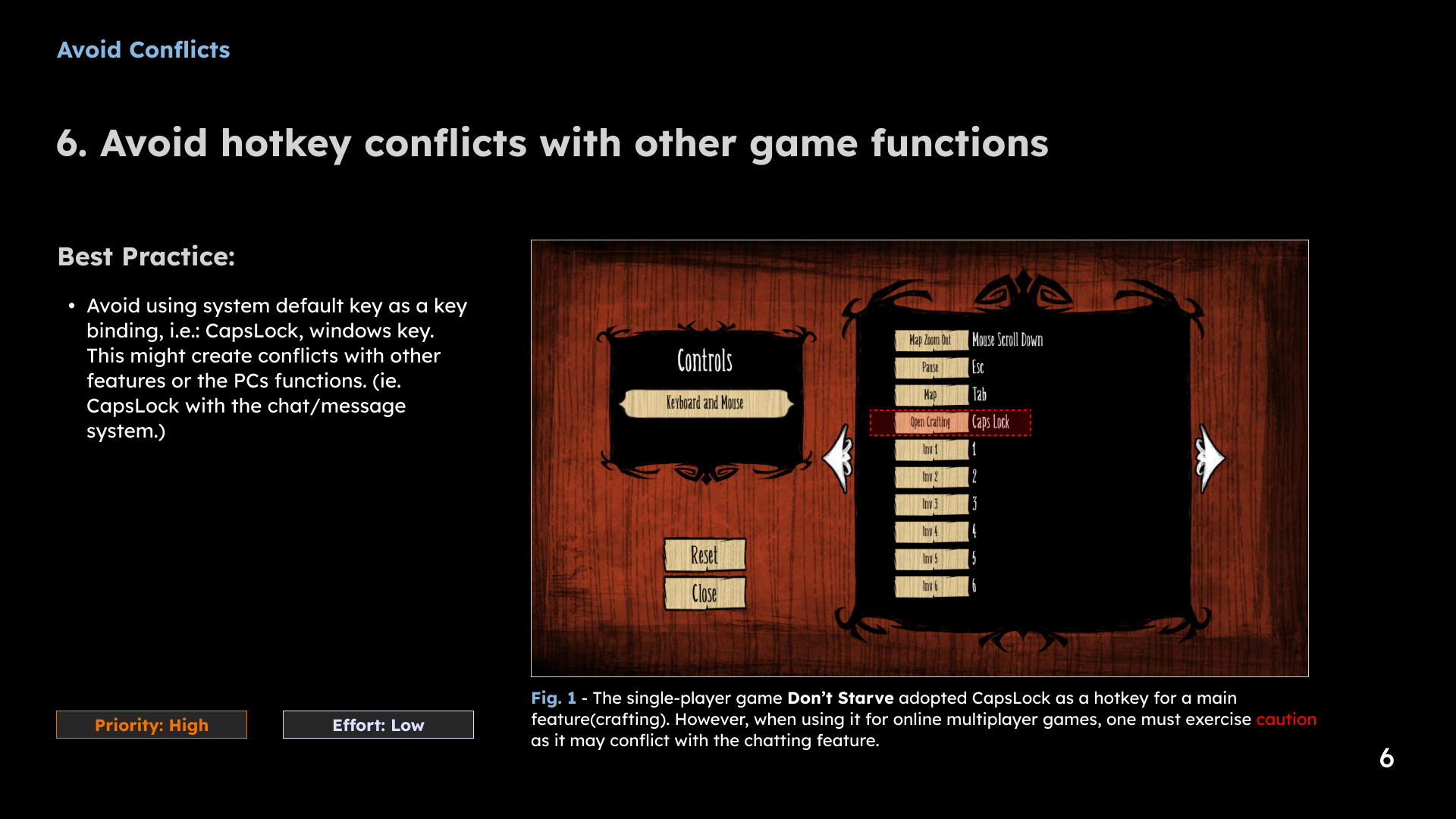
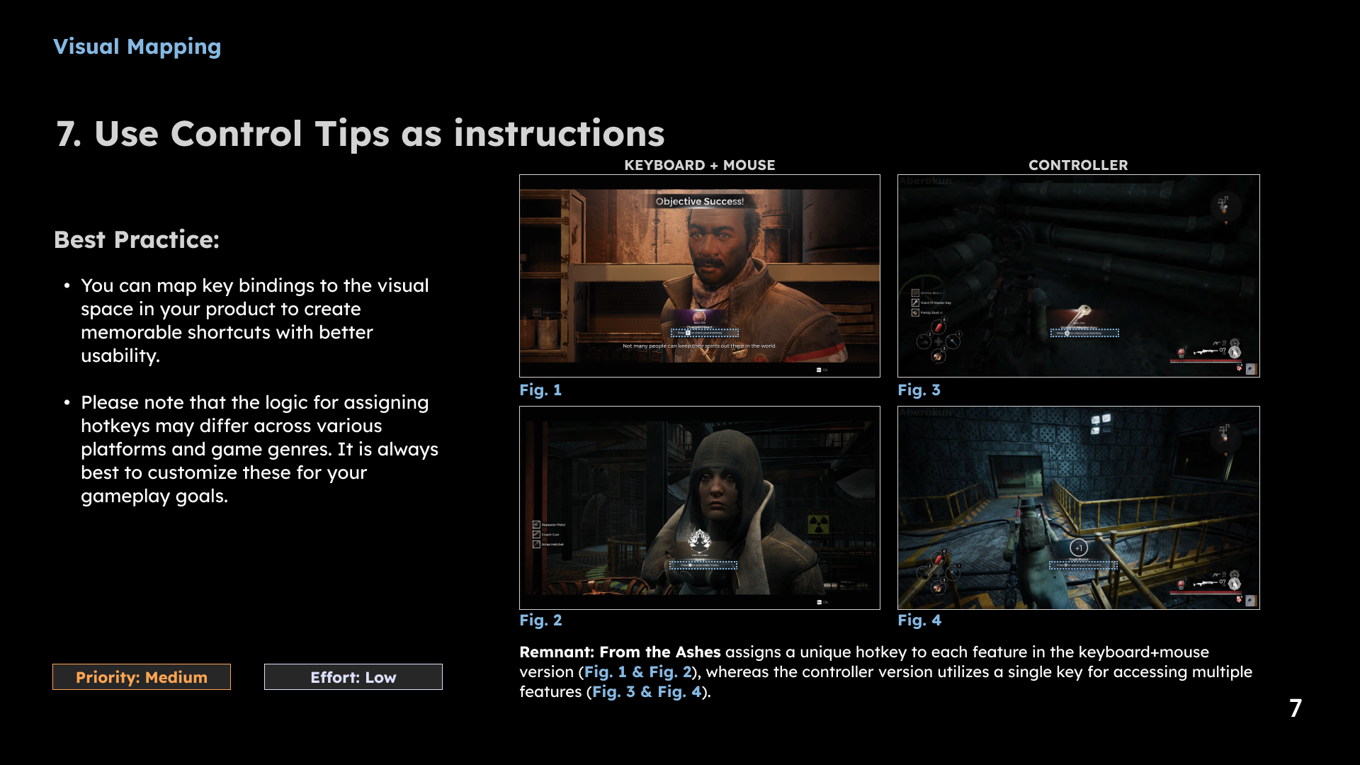
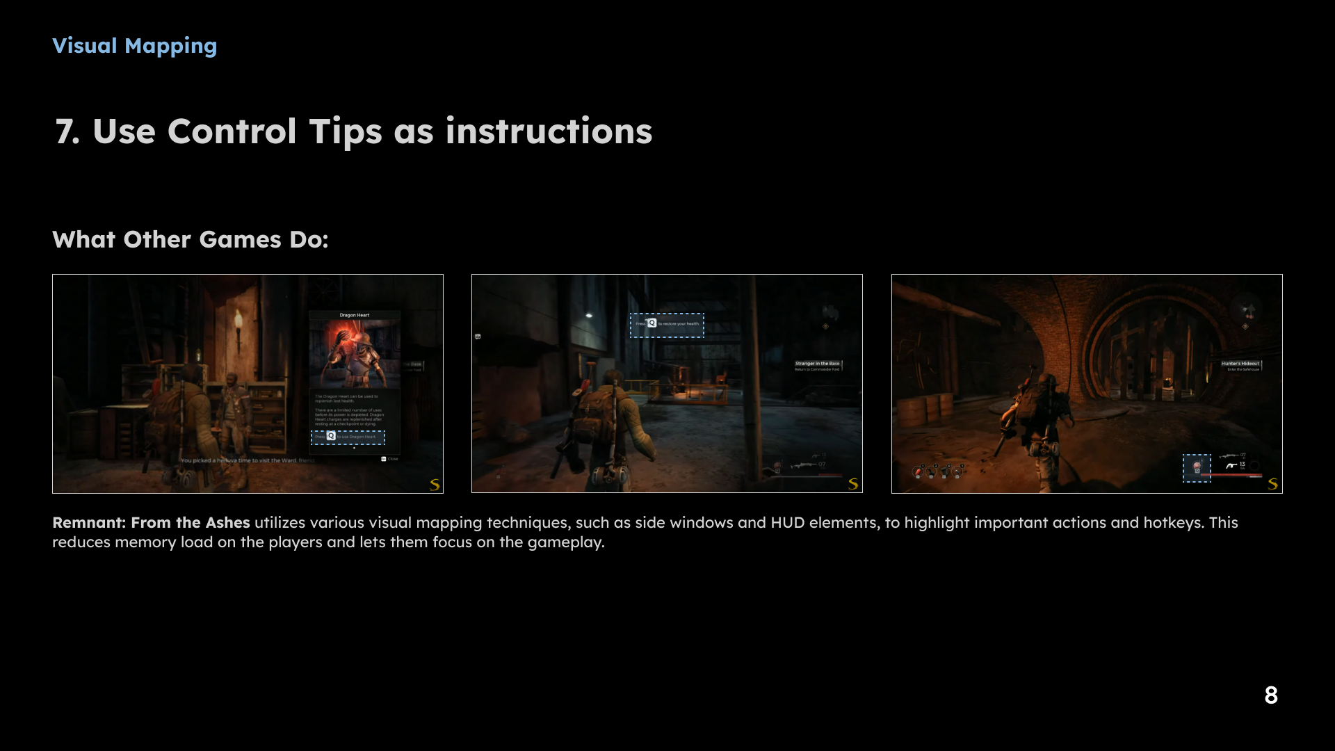
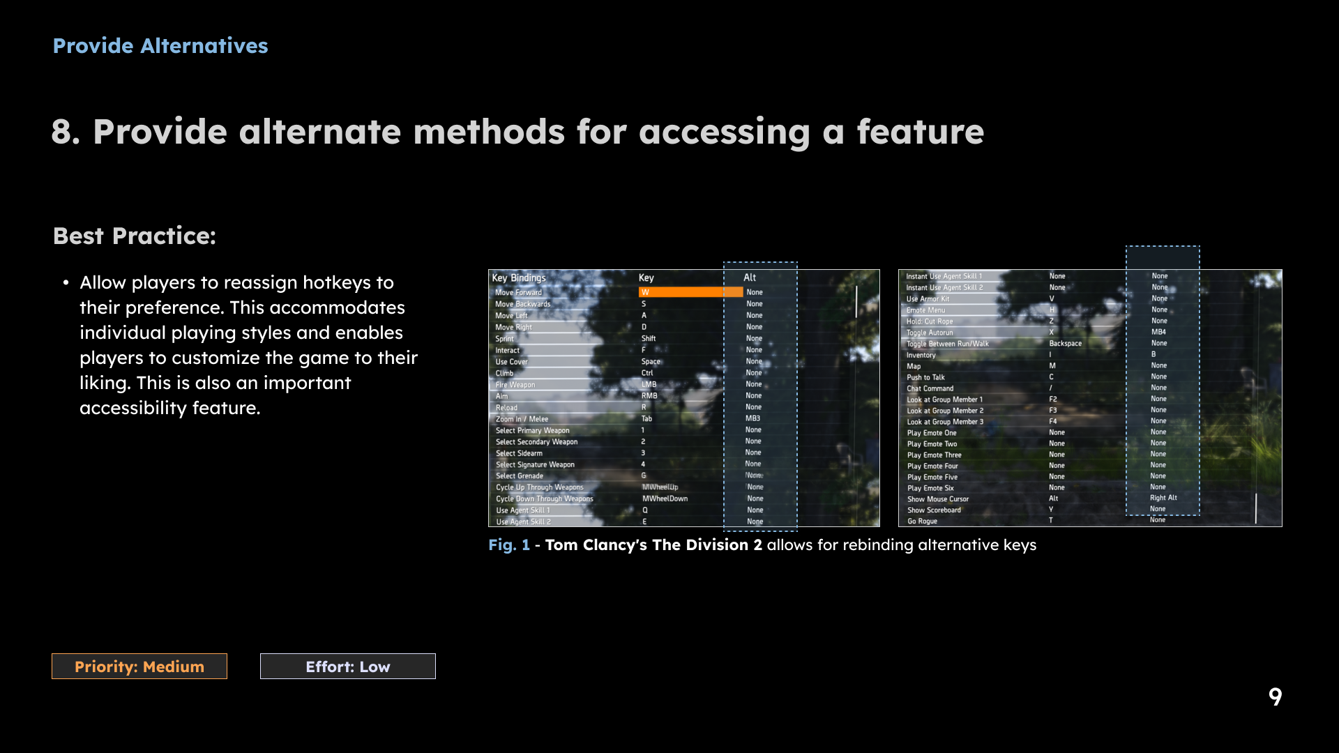
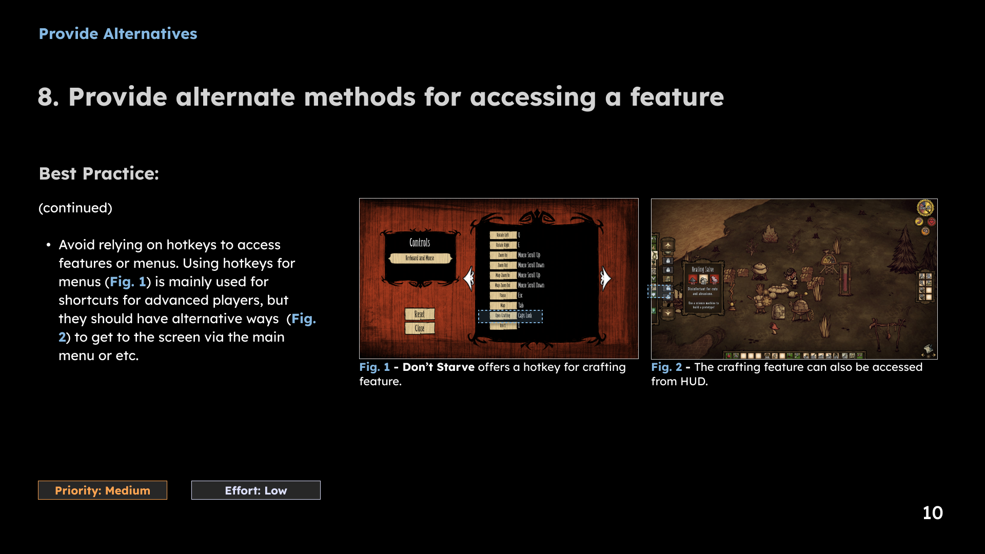
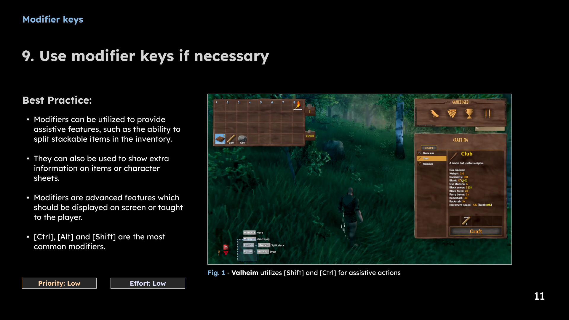
1 / 11 · Select a slide to view full size
Hotkey reference
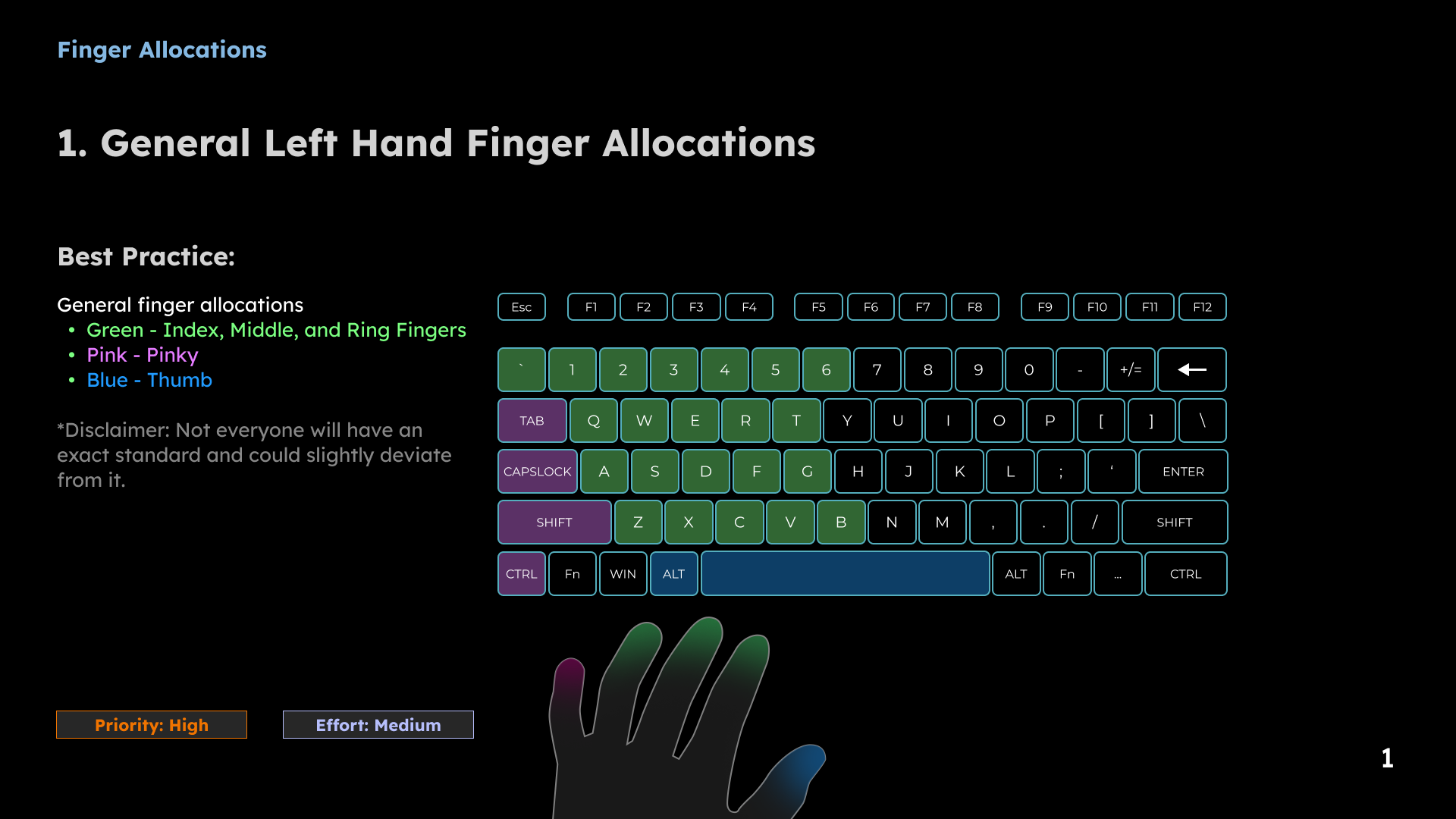
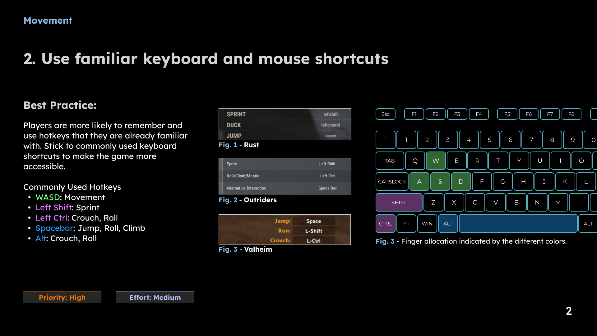
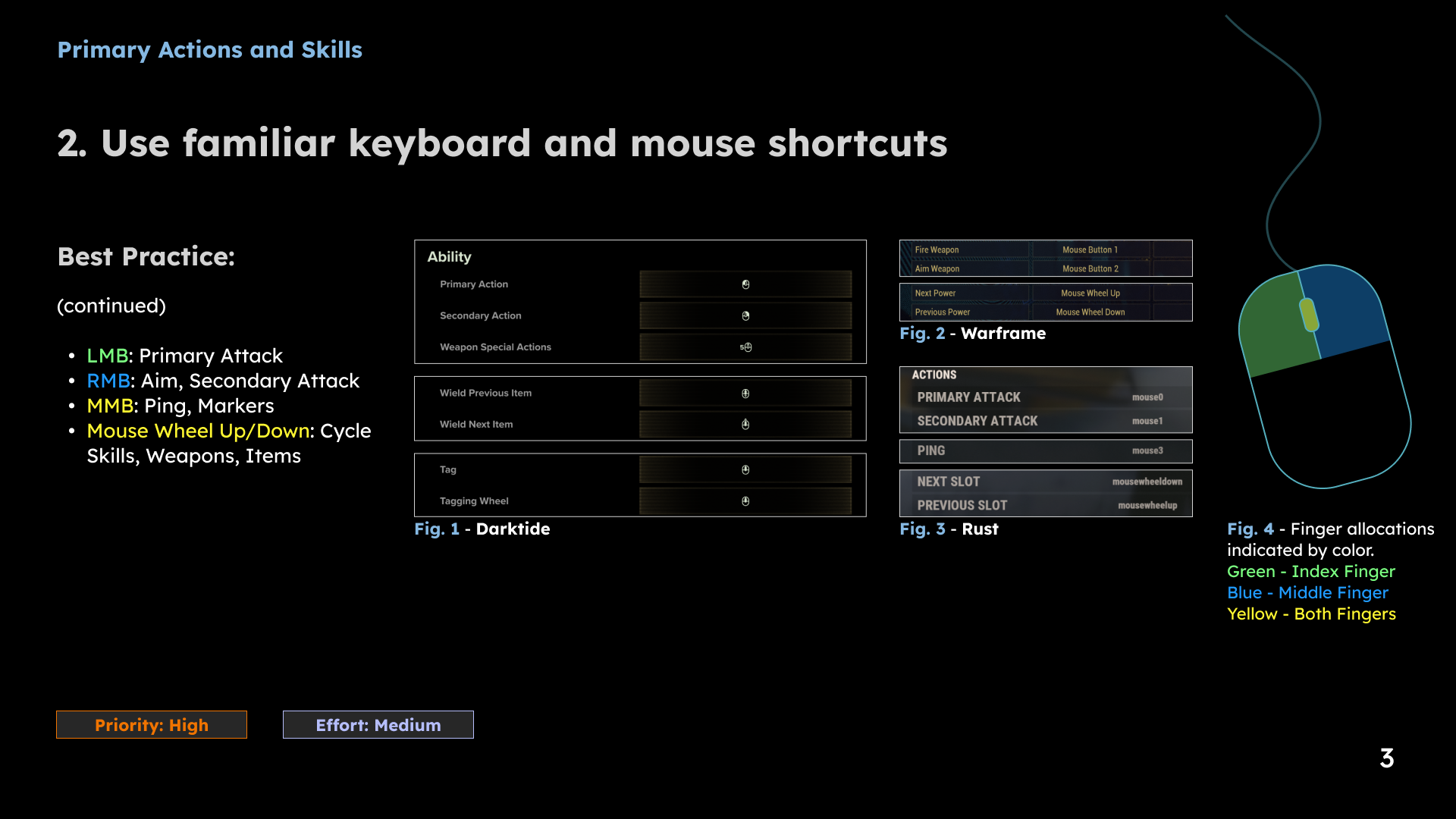
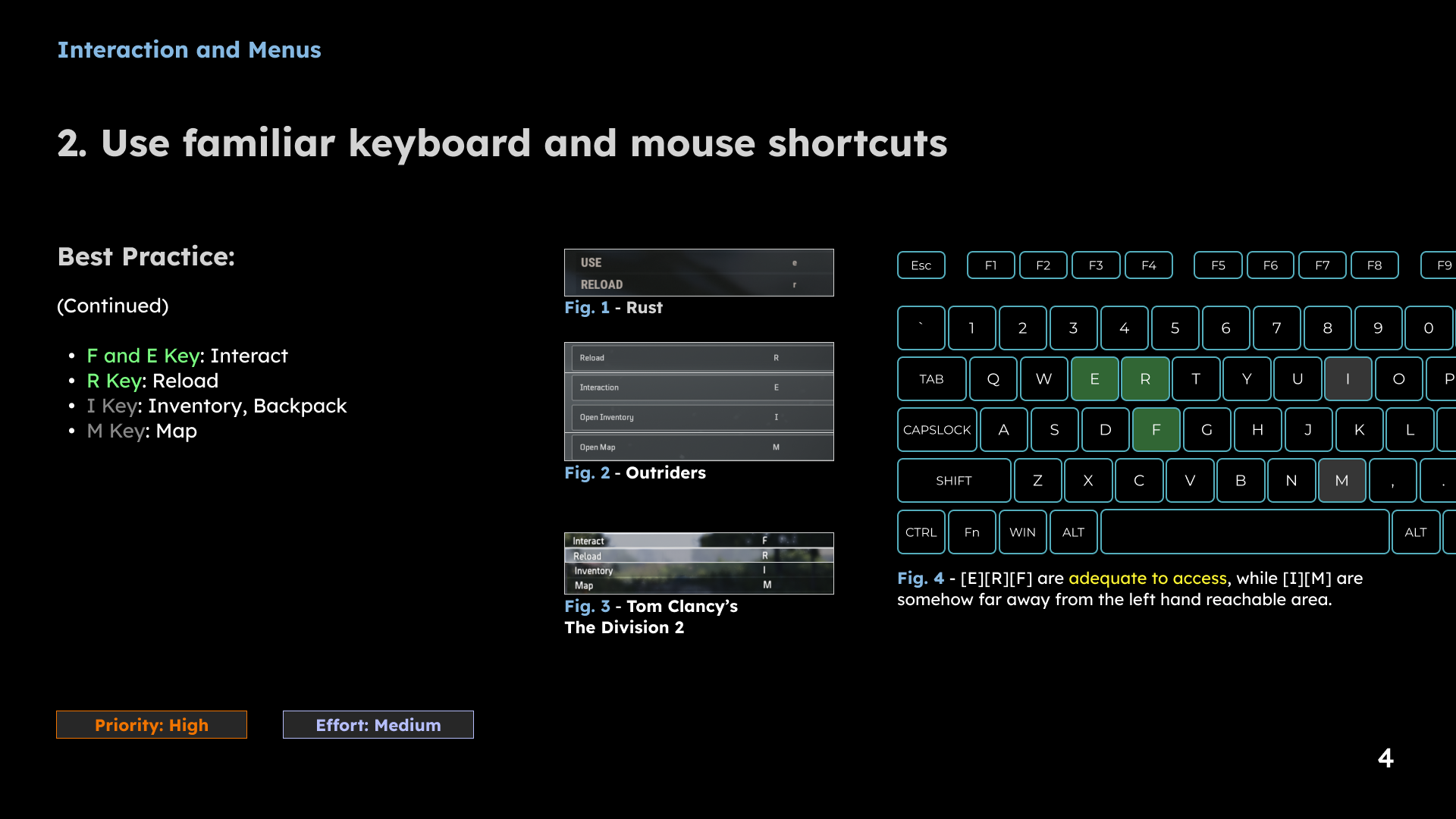
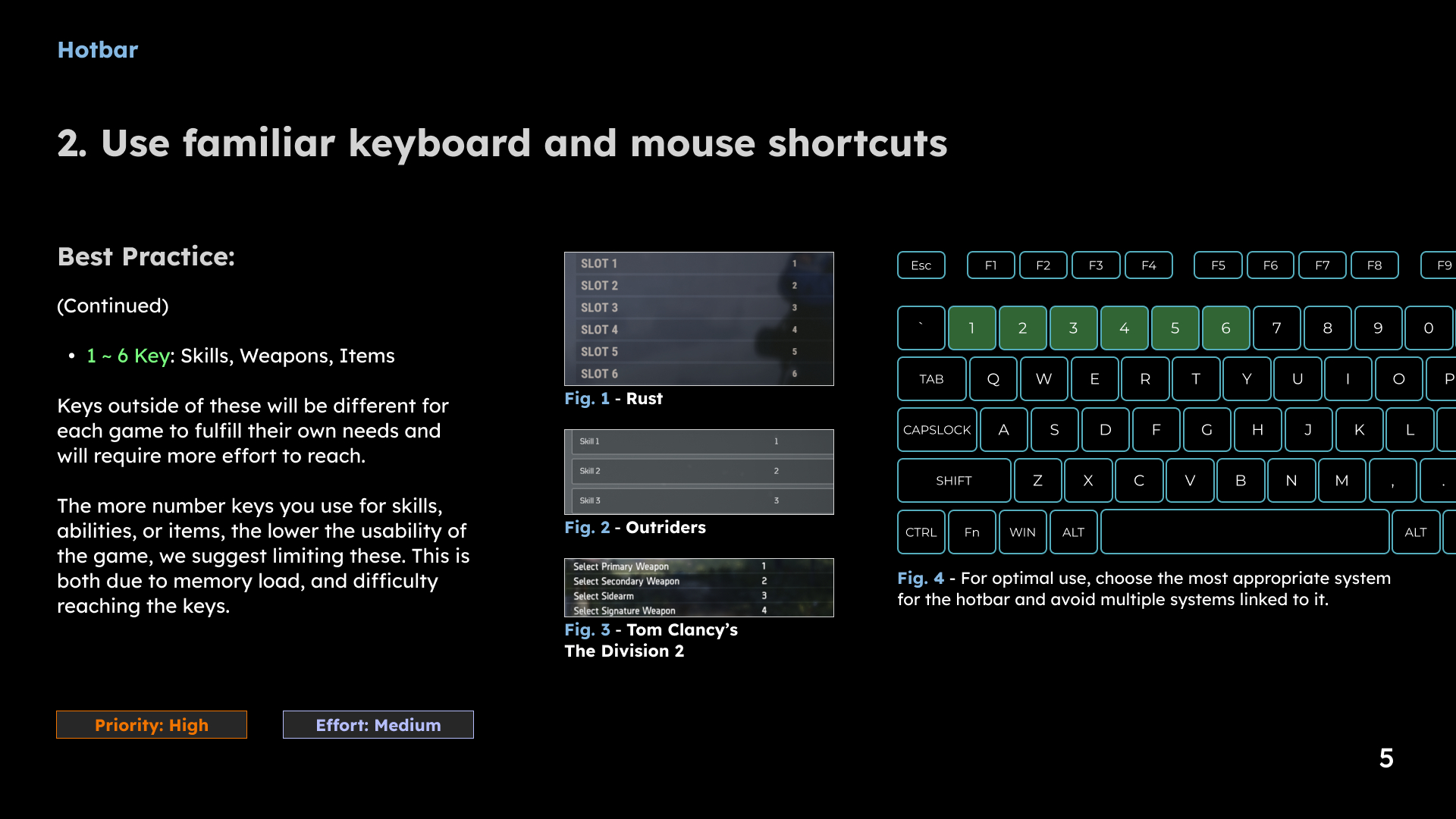
1 / 5 · Select a slide to view full size
4. Clarify purchasing decisions
The store review examined the cognitive load created by multiple currencies and fragmented navigation. I proposed consolidating the store into a core page with subpages, simplifying the hierarchy and considering two currency types. The design intent was to make the available options easier to understand.
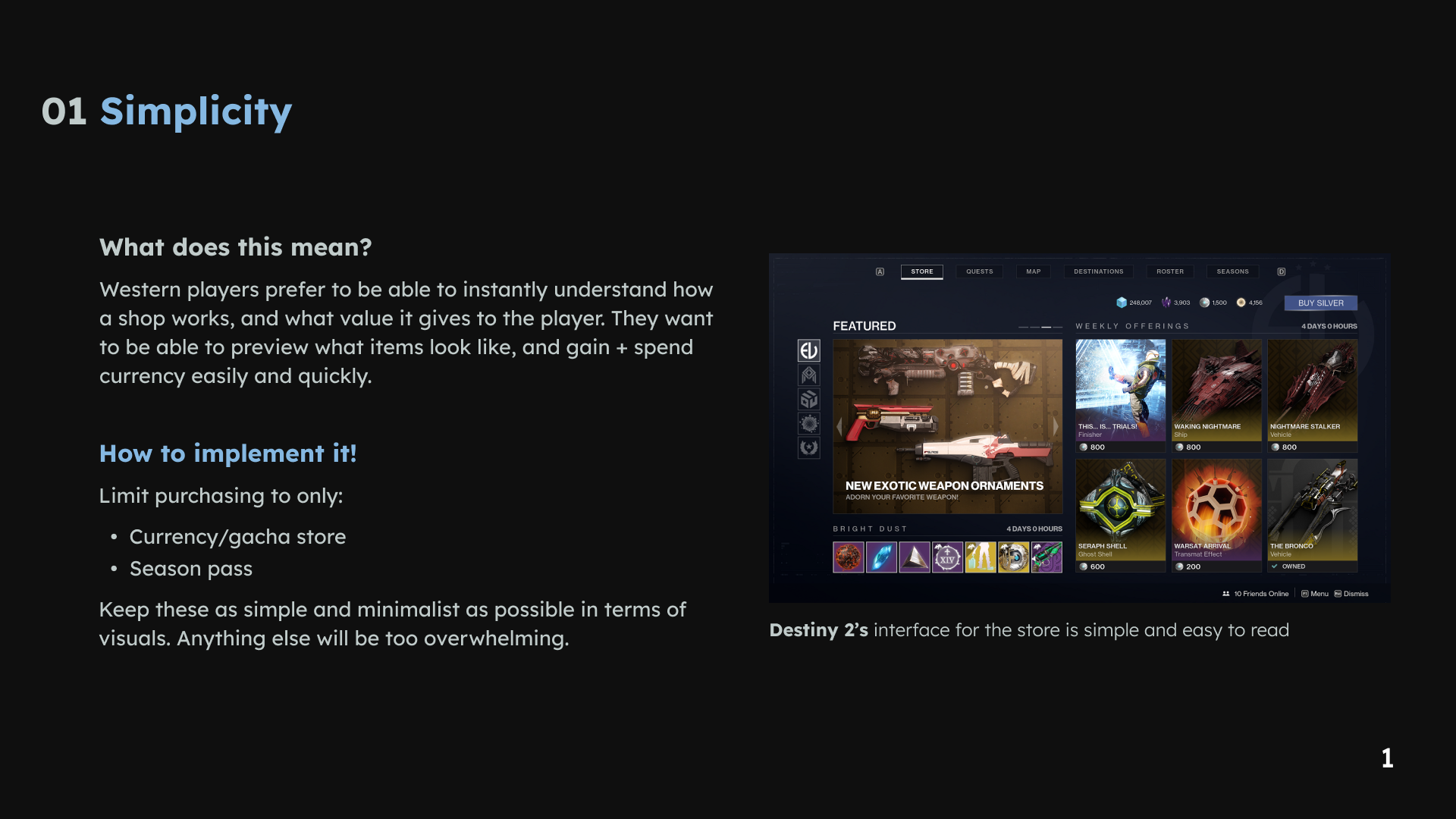
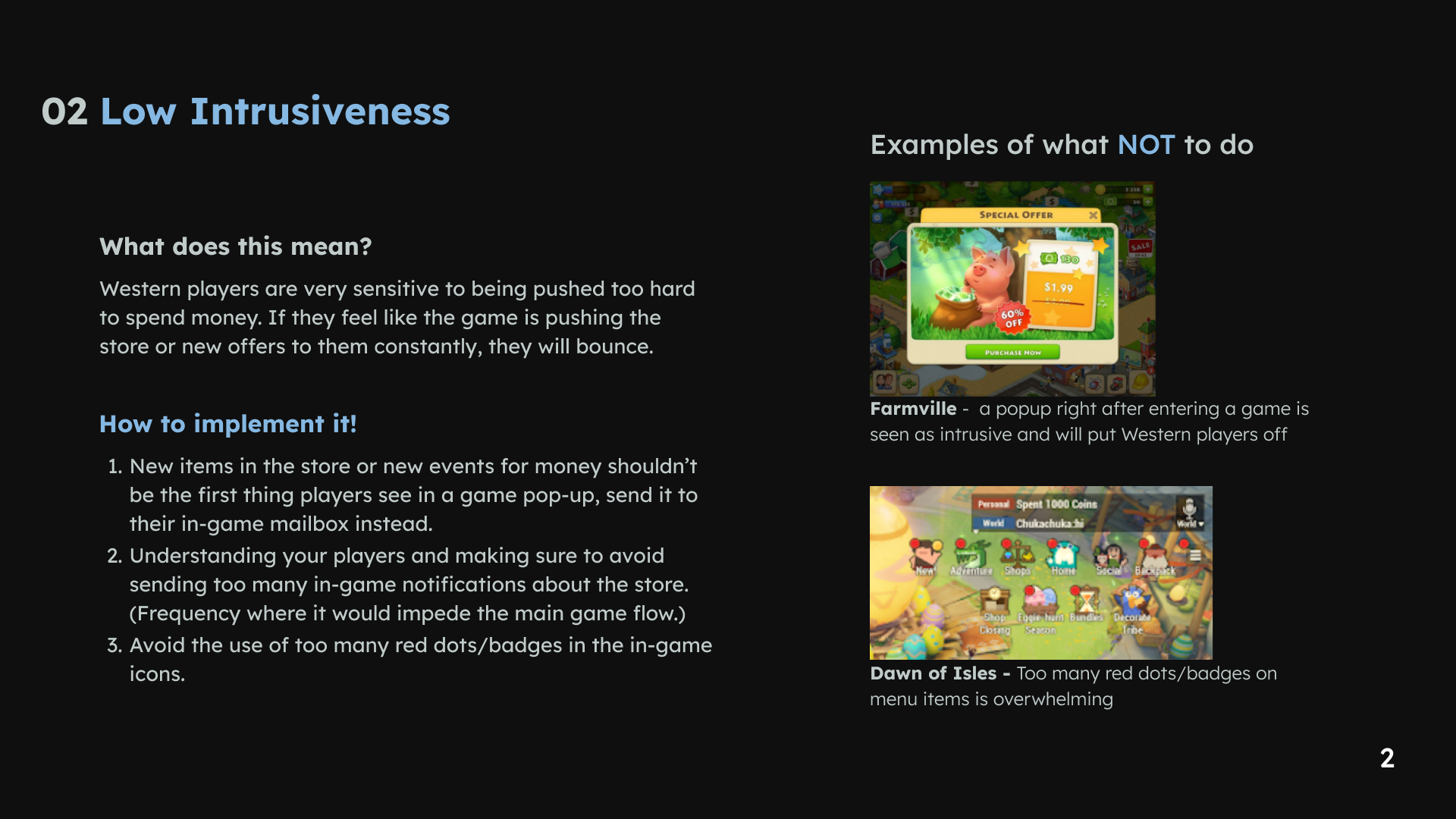
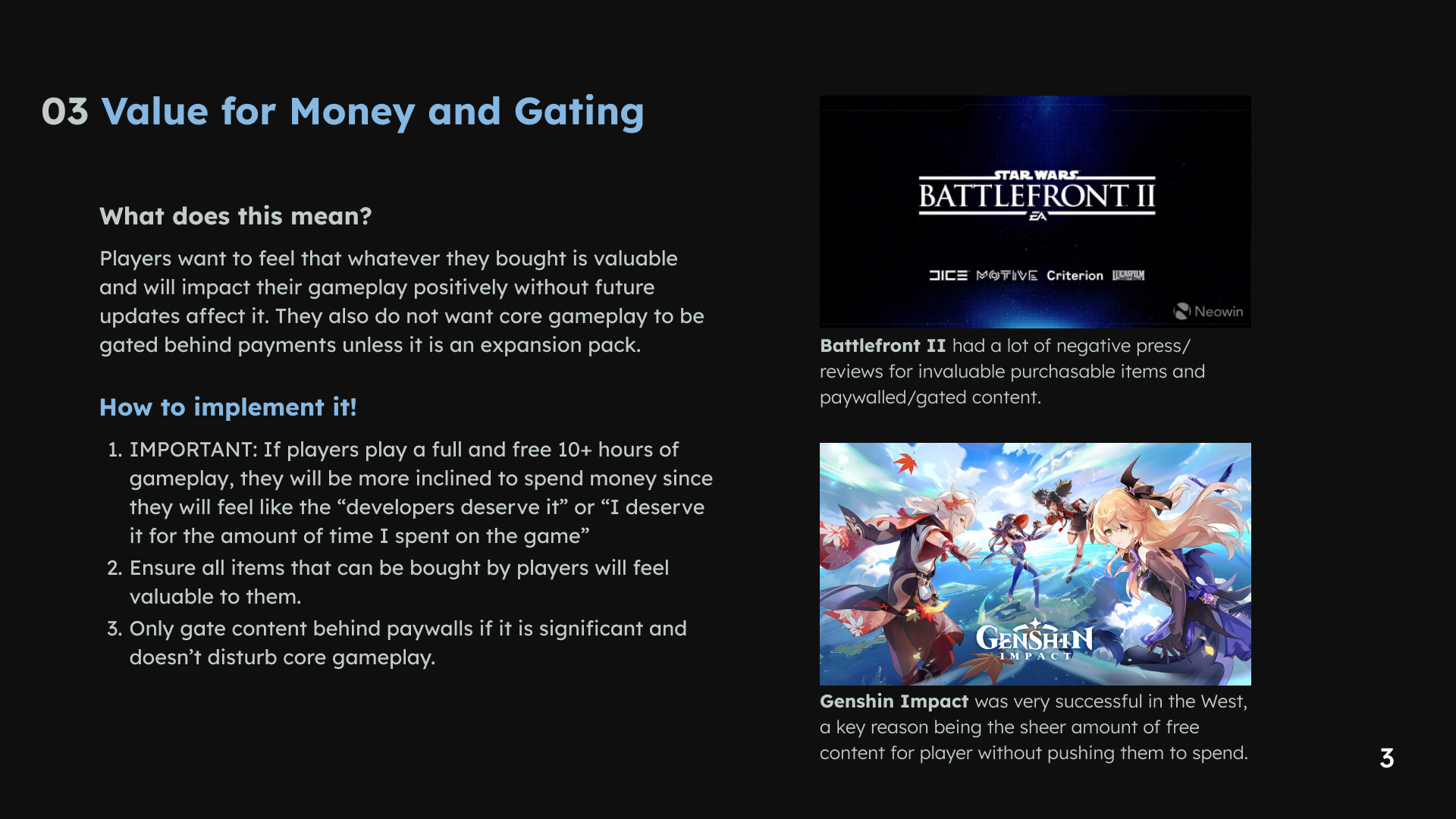
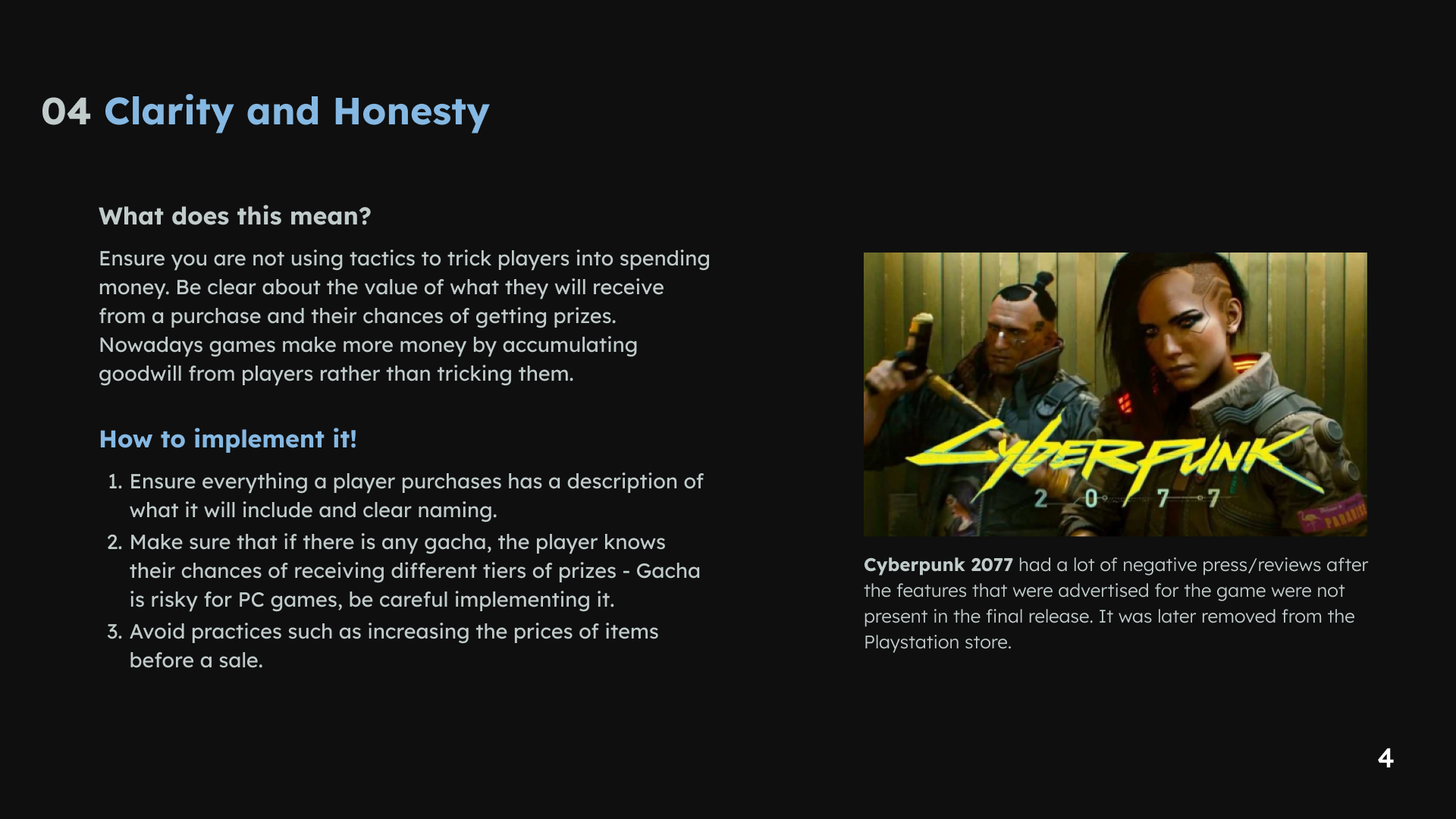
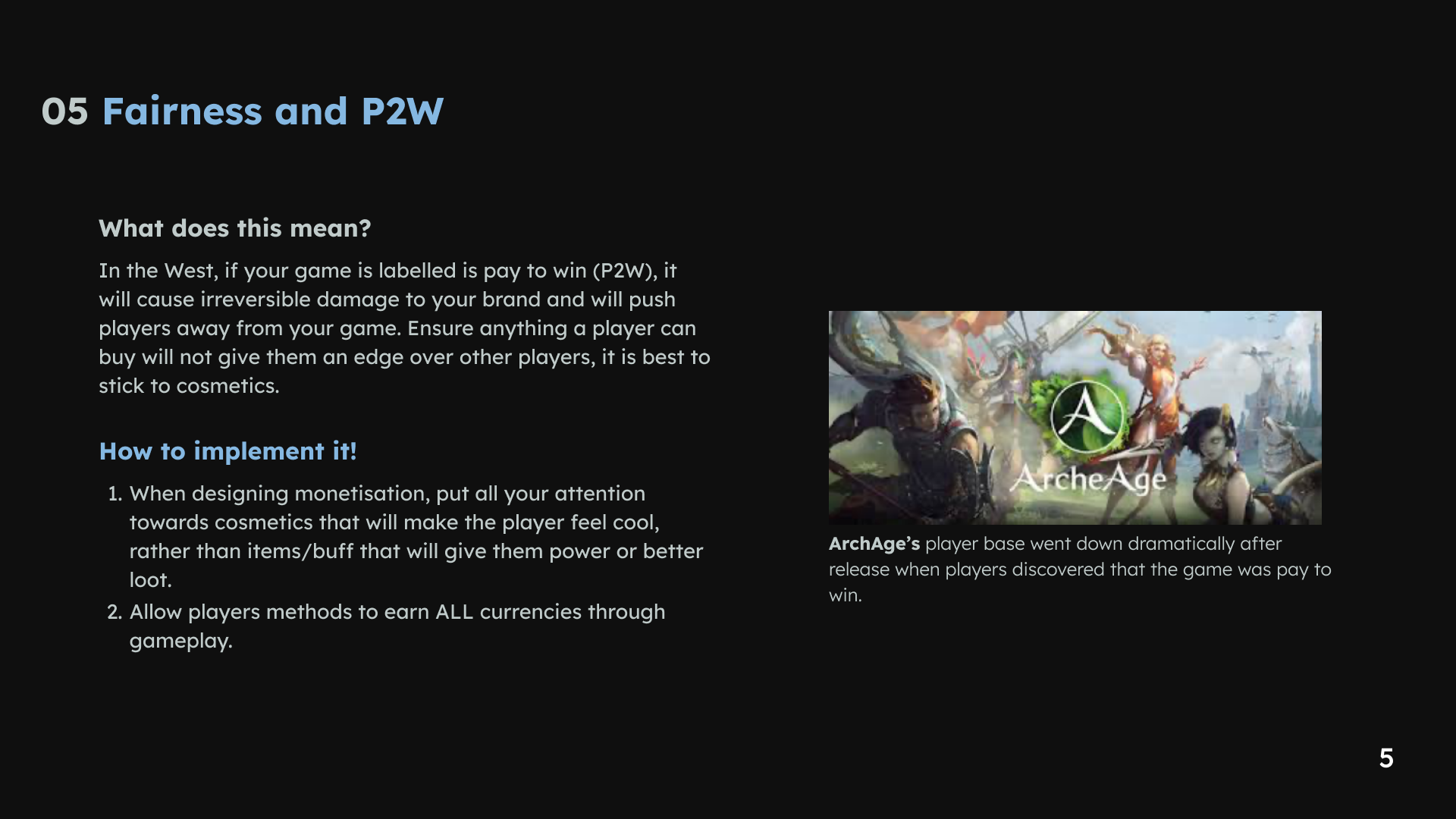
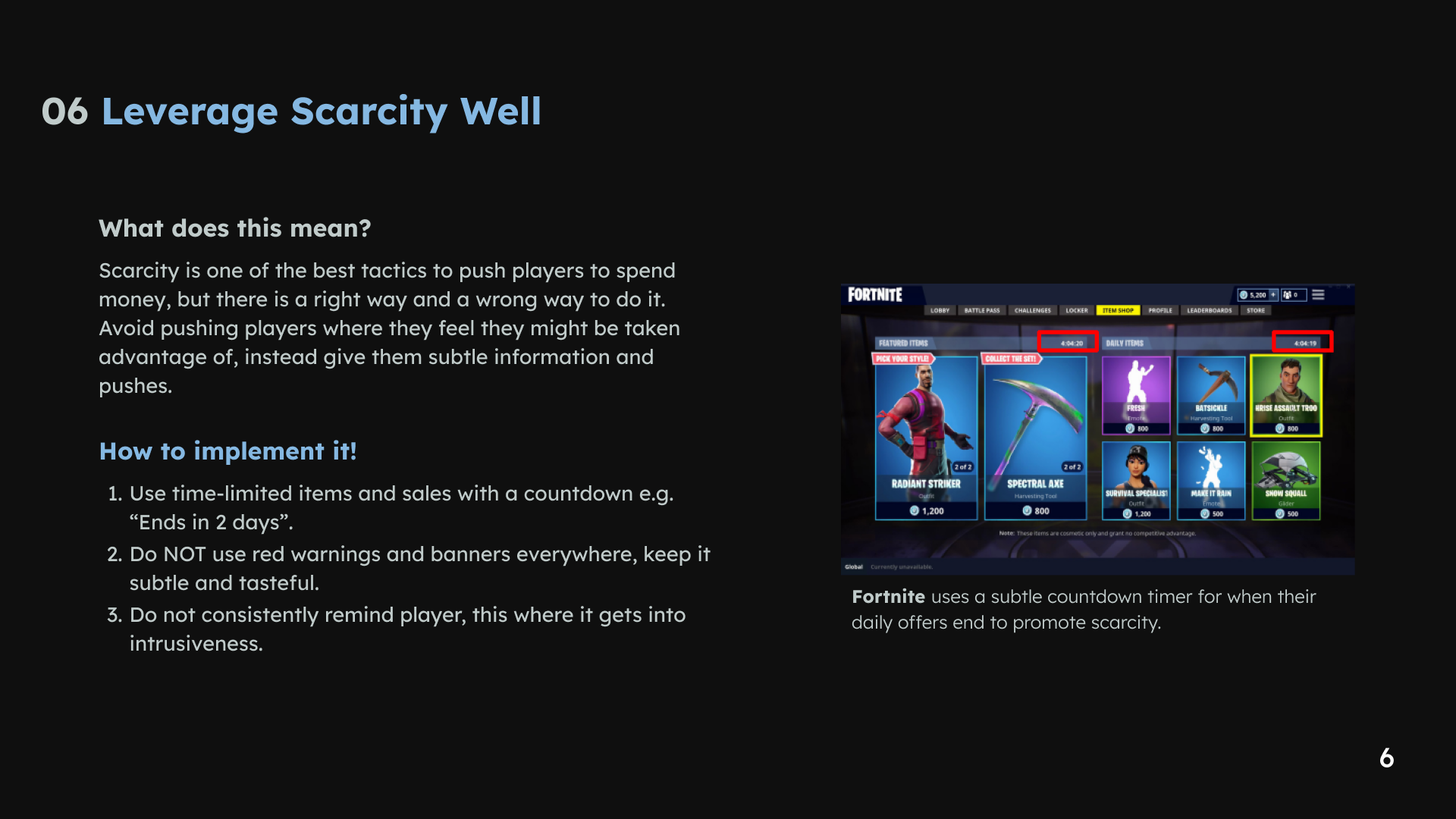
1 / 6 · Select a slide to view full size
5. Specify the Battle Pass interactions
The Battle Pass brief called for a clean interface and annotated wireframes that UI artists and programmers could use. I explored alternatives to the initial Apex Legends reference and documented the interface behavior.
The example covers the main progression screen, reward information, season information and group-related flows. Annotations identify interactions and states so that other disciplines can interpret the wireframes during implementation.

Battle Pass UX specification. This is interaction and wireframe work; the final visual art is a separate contribution.
What I delivered
The deliverables connected a broad UX review with a specific feature specification: two analysis reports and annotated Battle Pass wireframes. The strongest evidence here is the progression from identifying interface questions to documenting how a feature should behave.
Original gameplay analysis
These earlier sections cover interaction, game loops and motion-related observations. Reference-game screenshots illustrate comparisons and remain credited to their respective creators.
Interaction
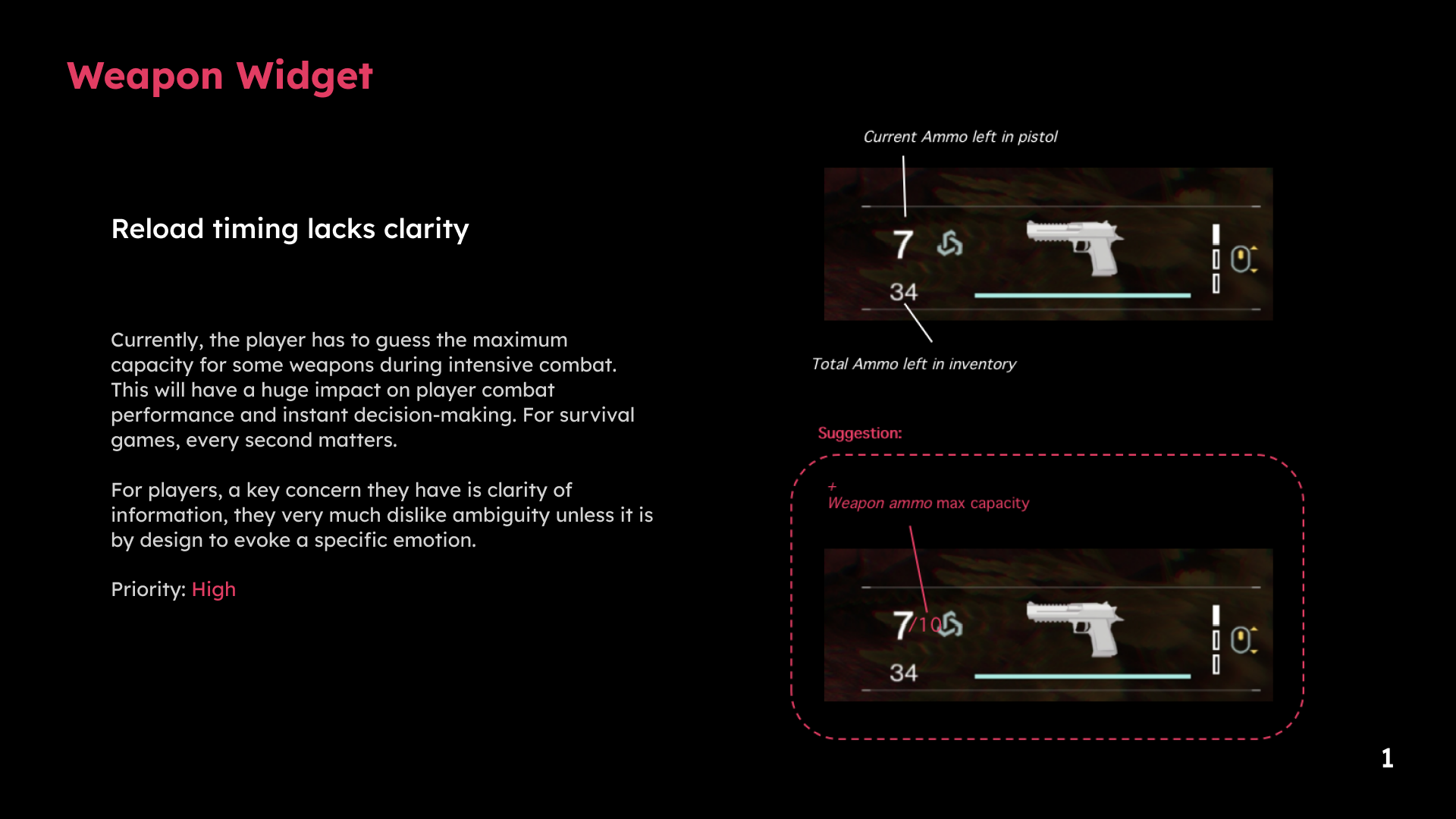
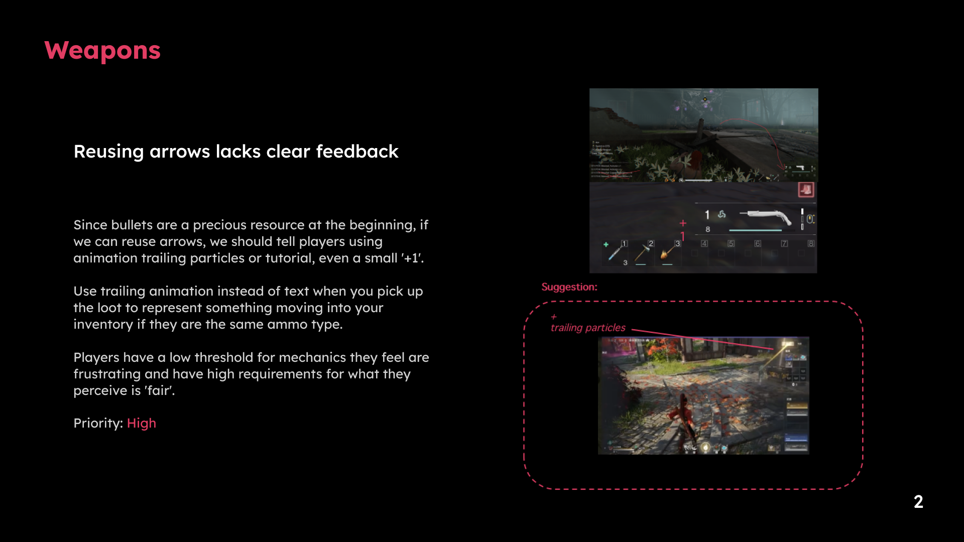
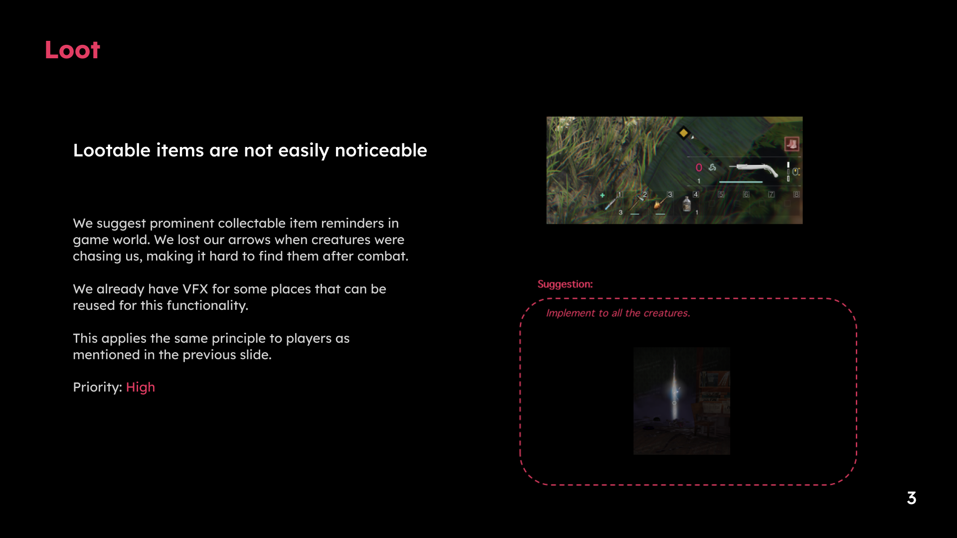
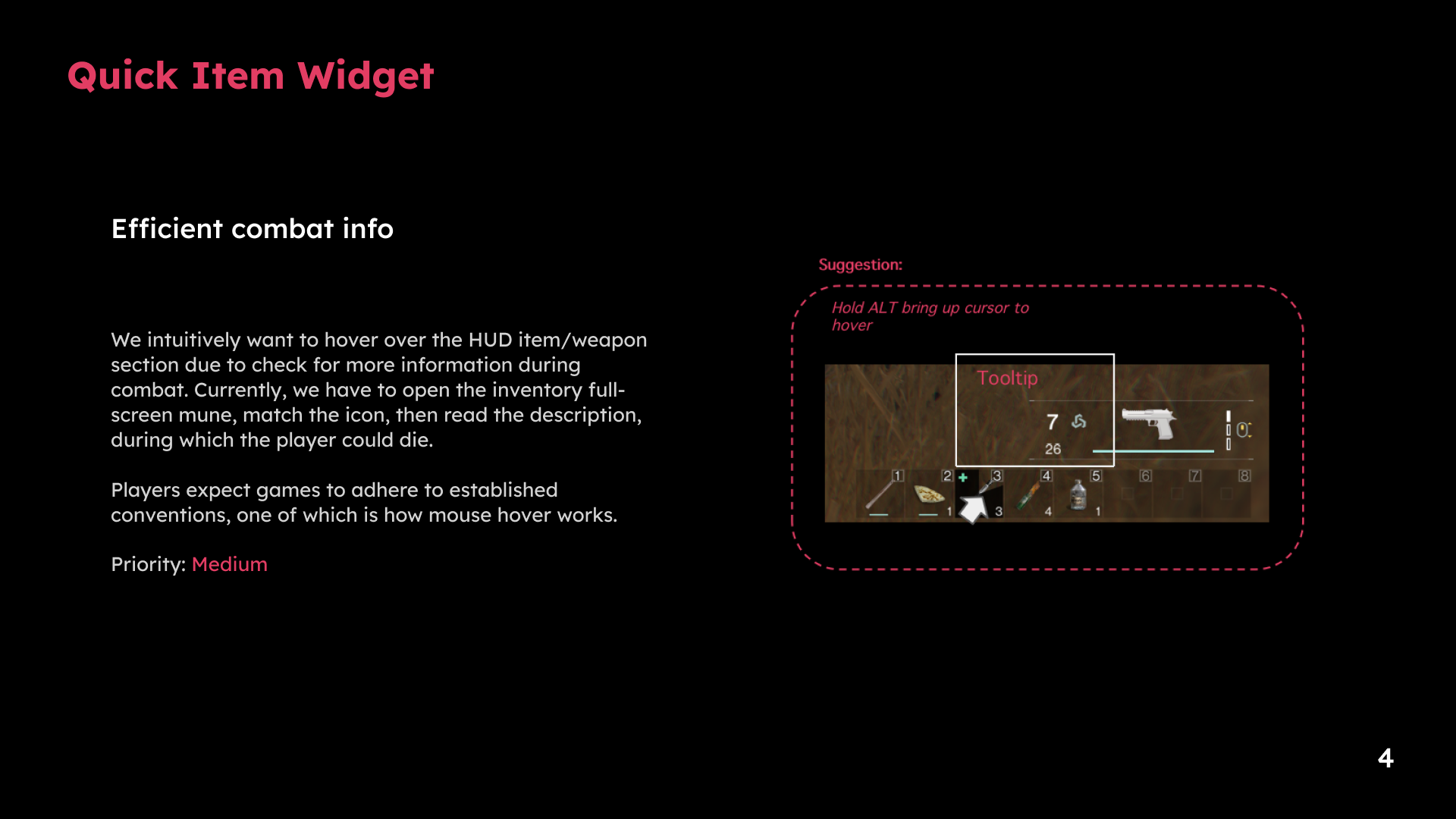
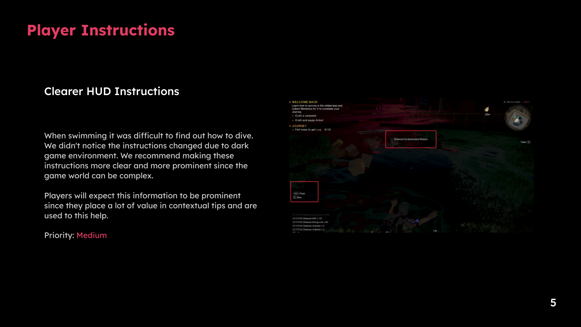
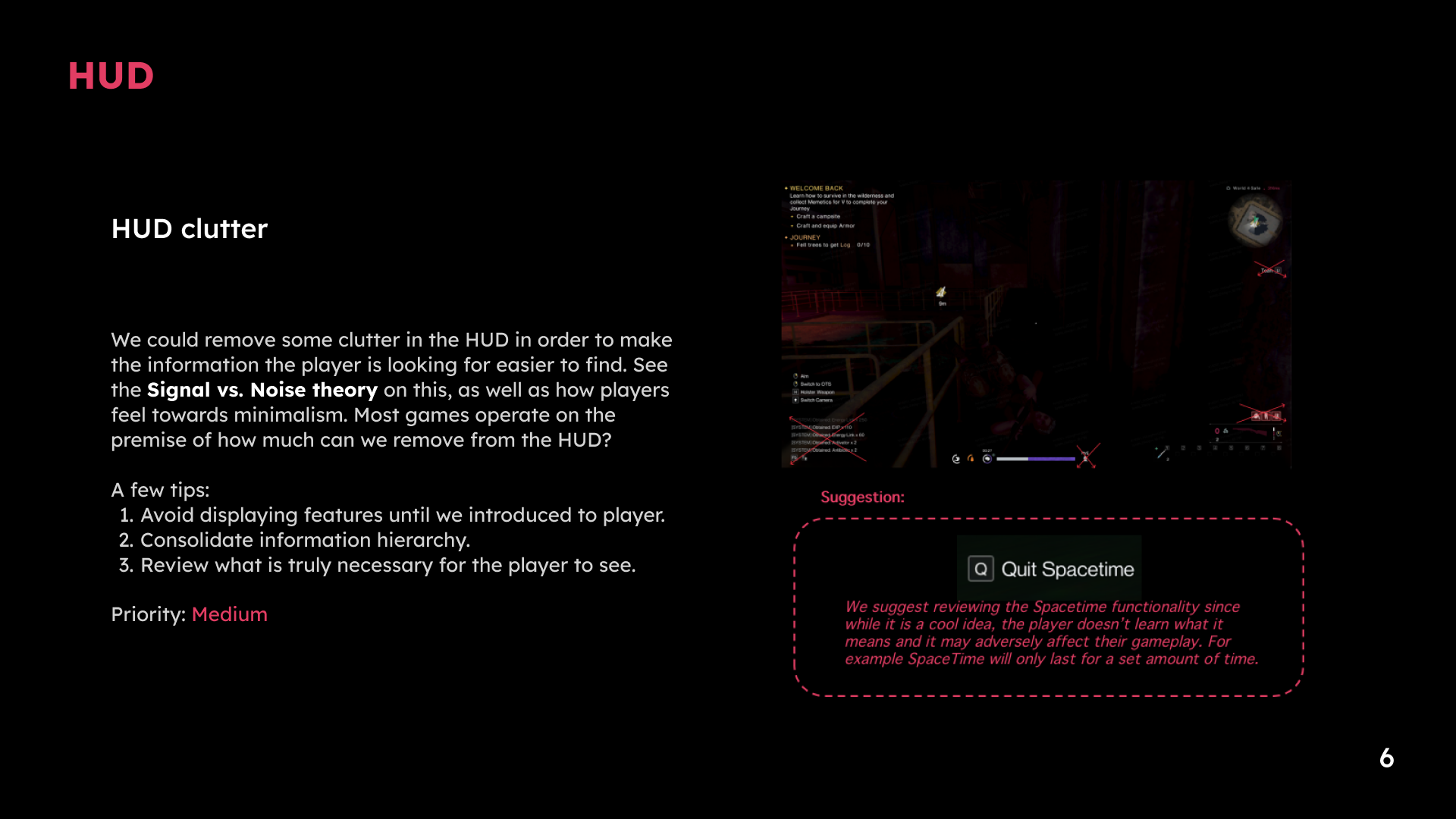
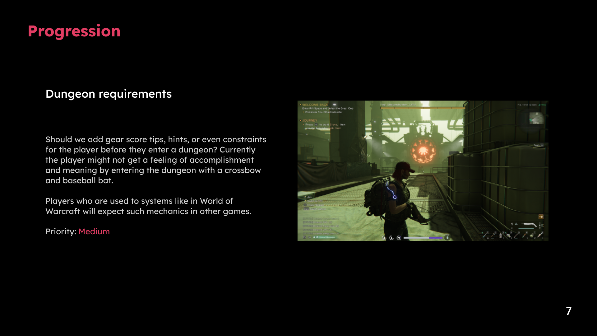
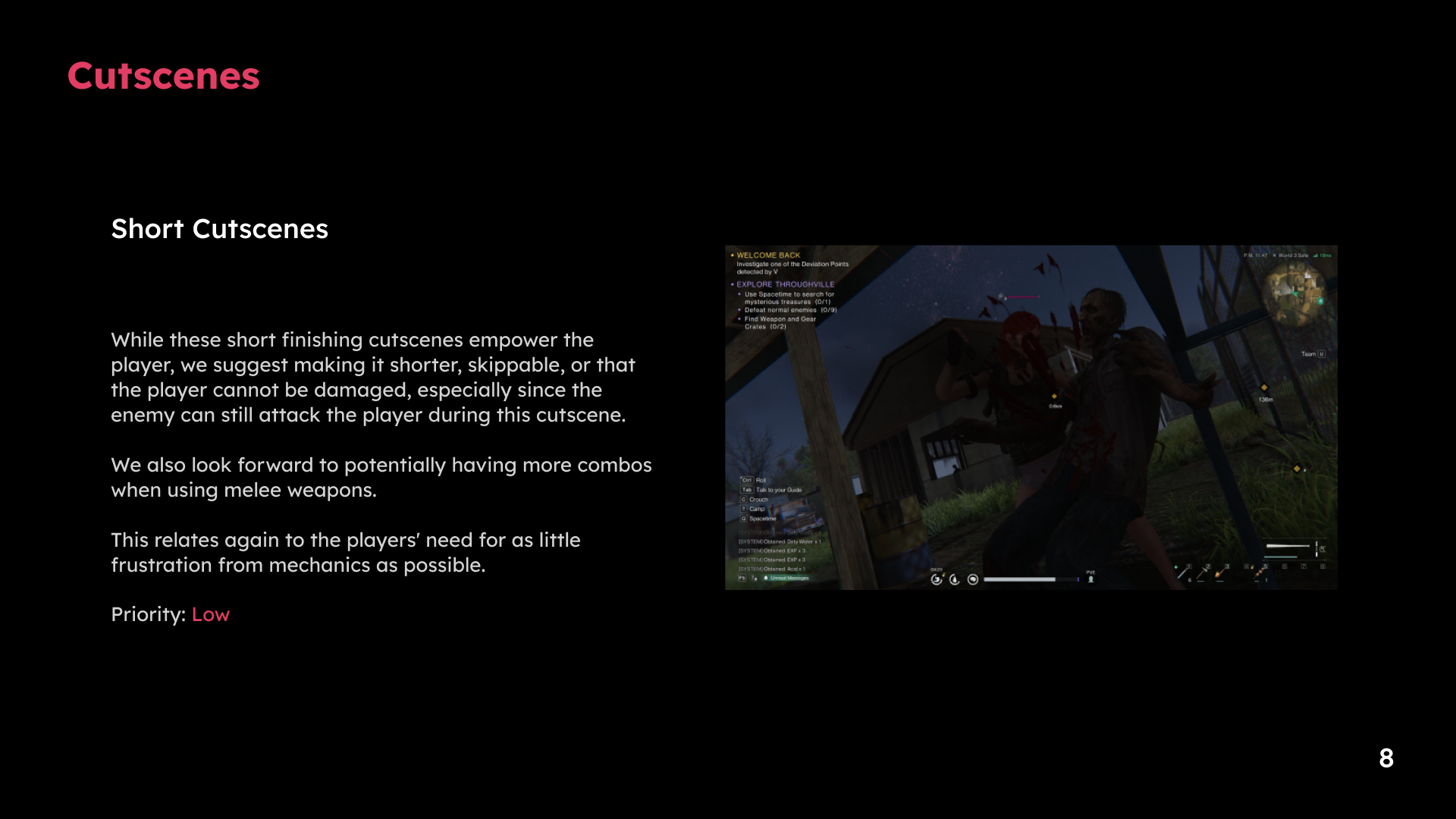
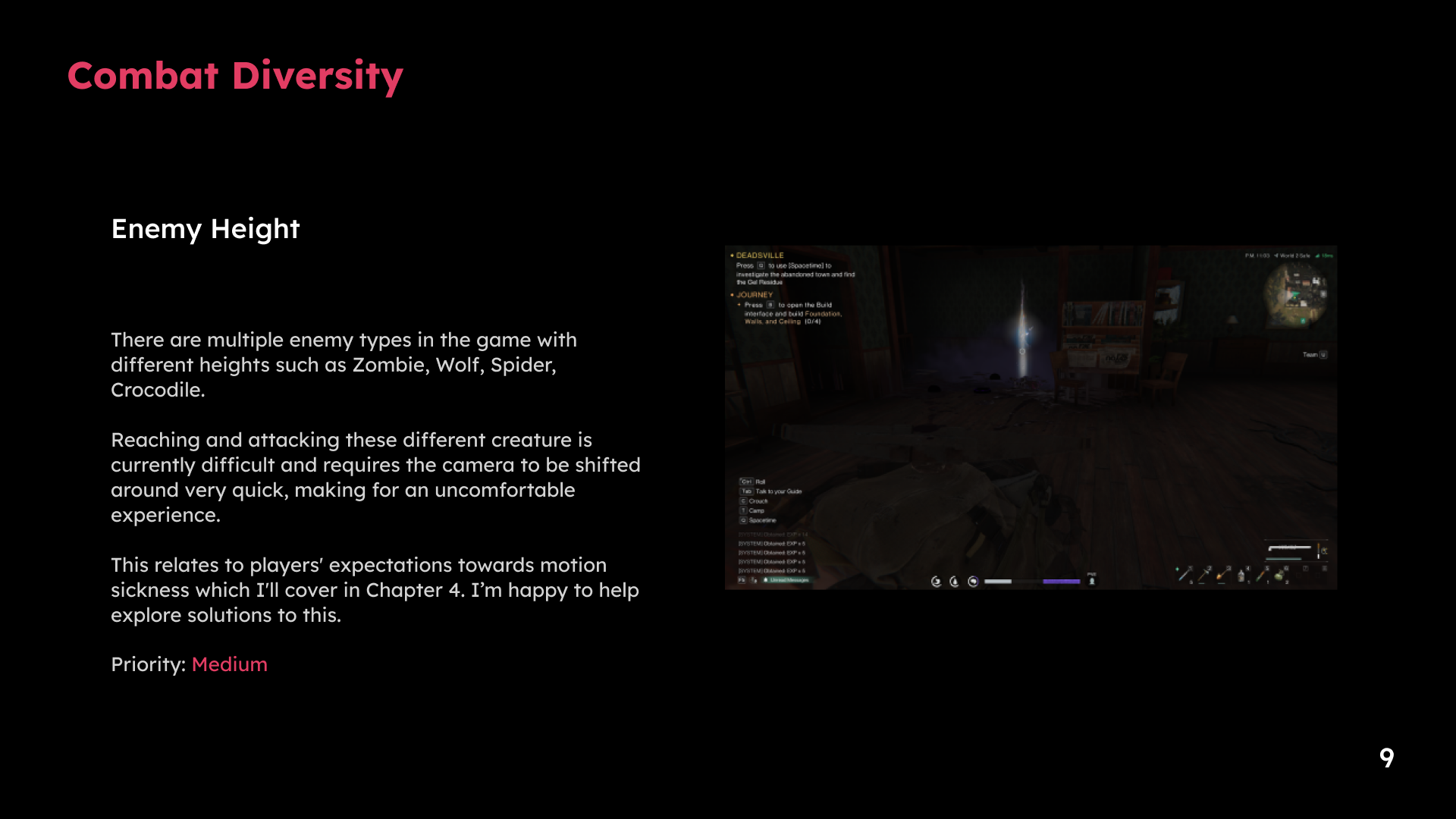
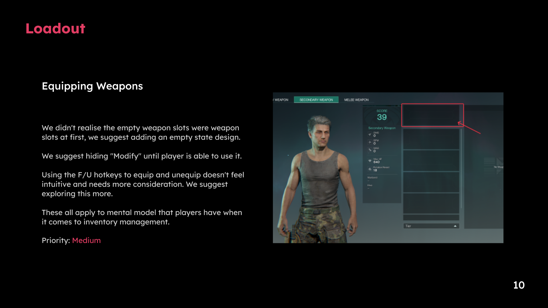
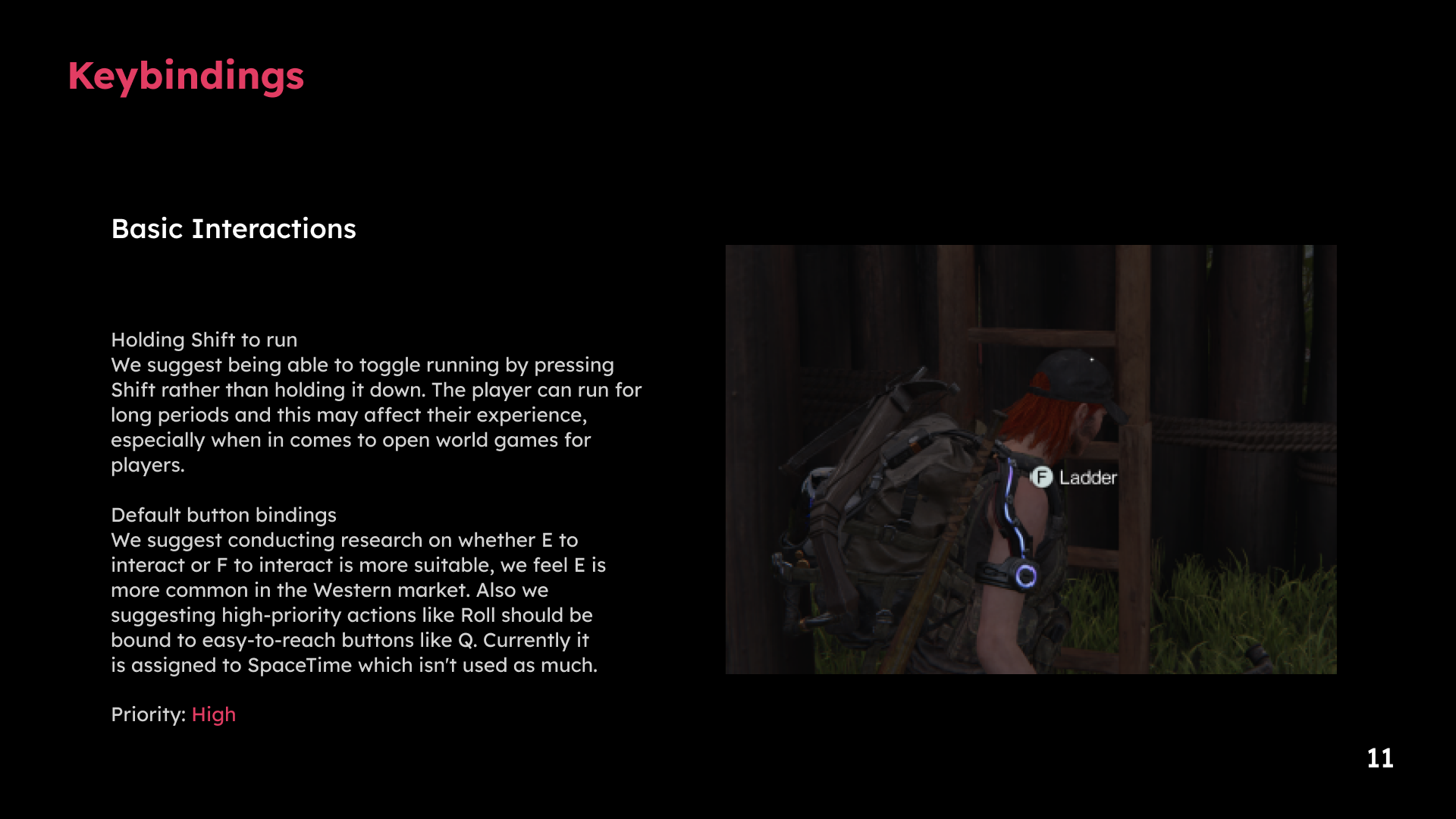
1 / 11 · Select a slide to view full size
Game loop
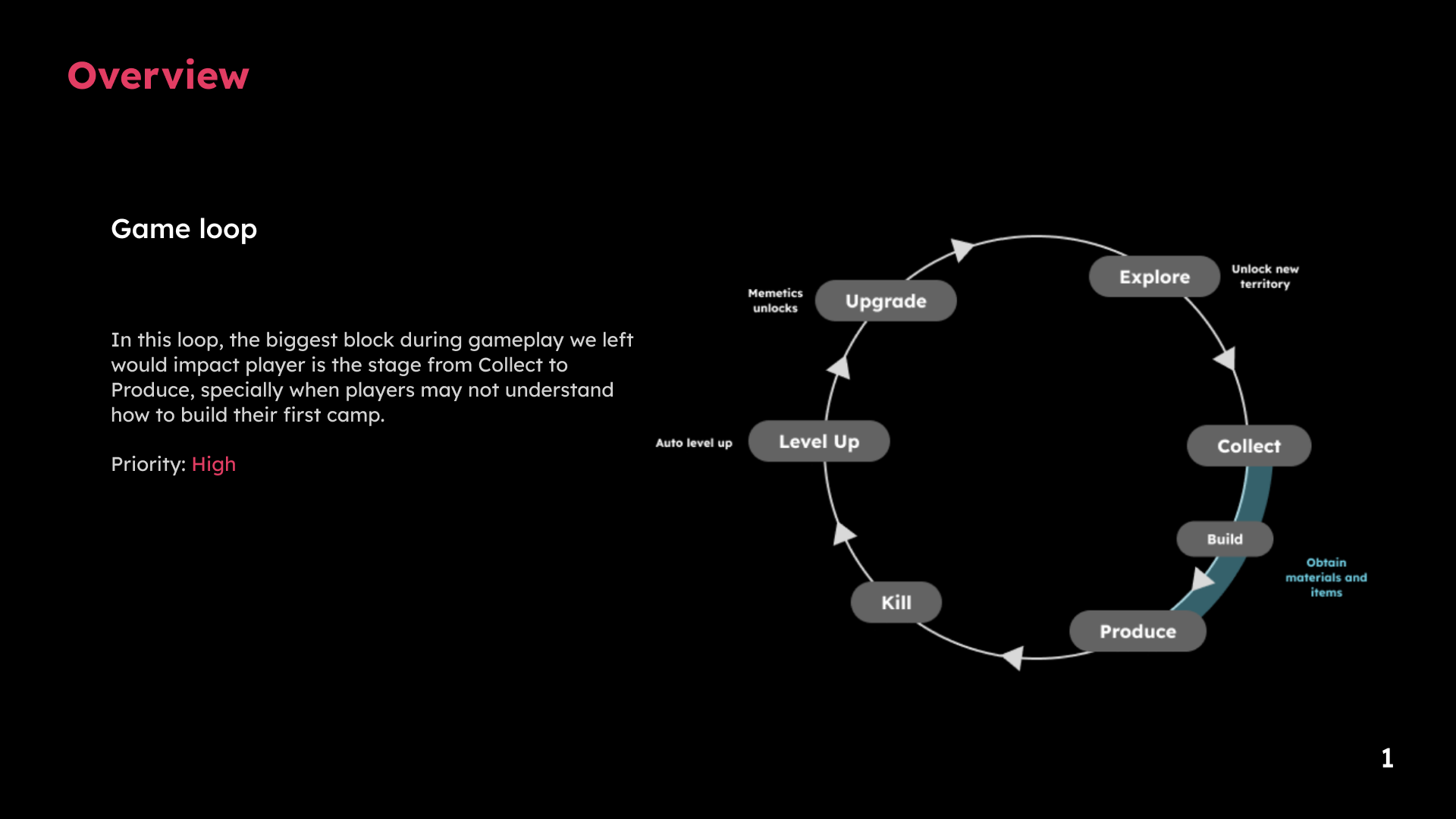
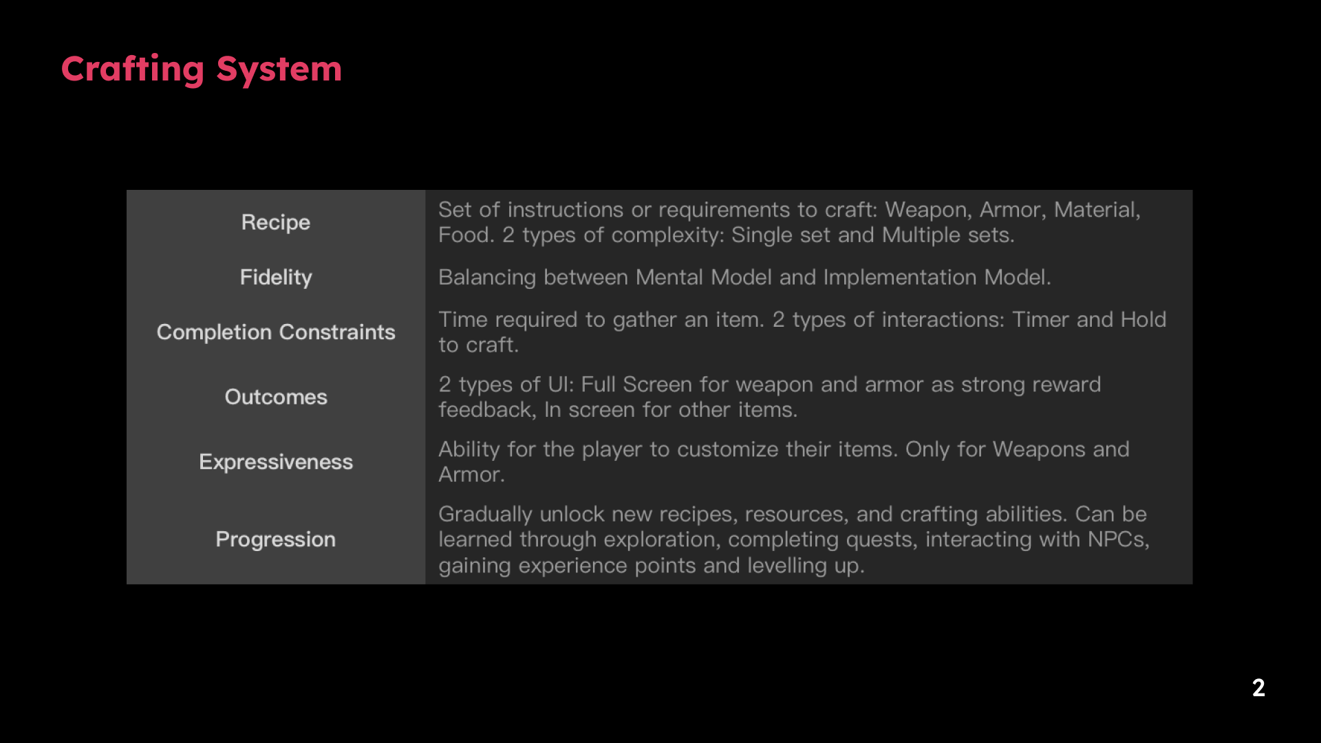
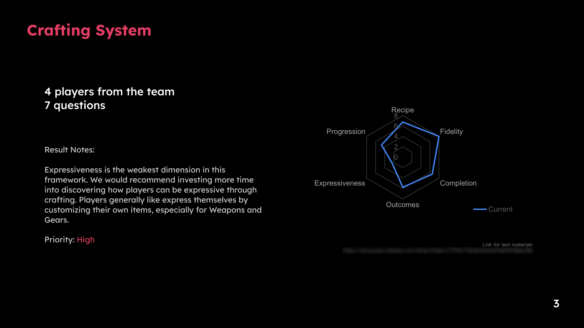
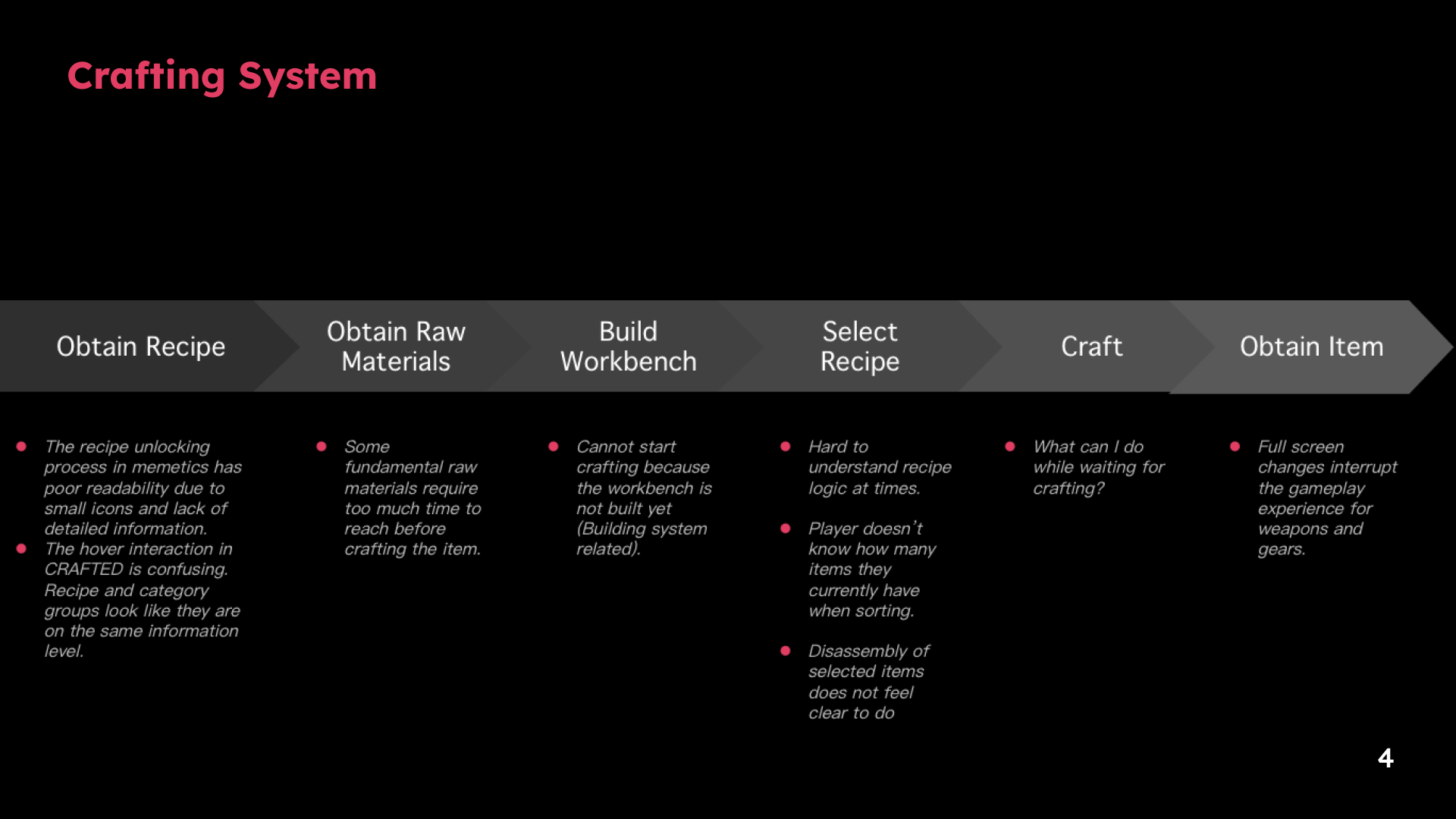
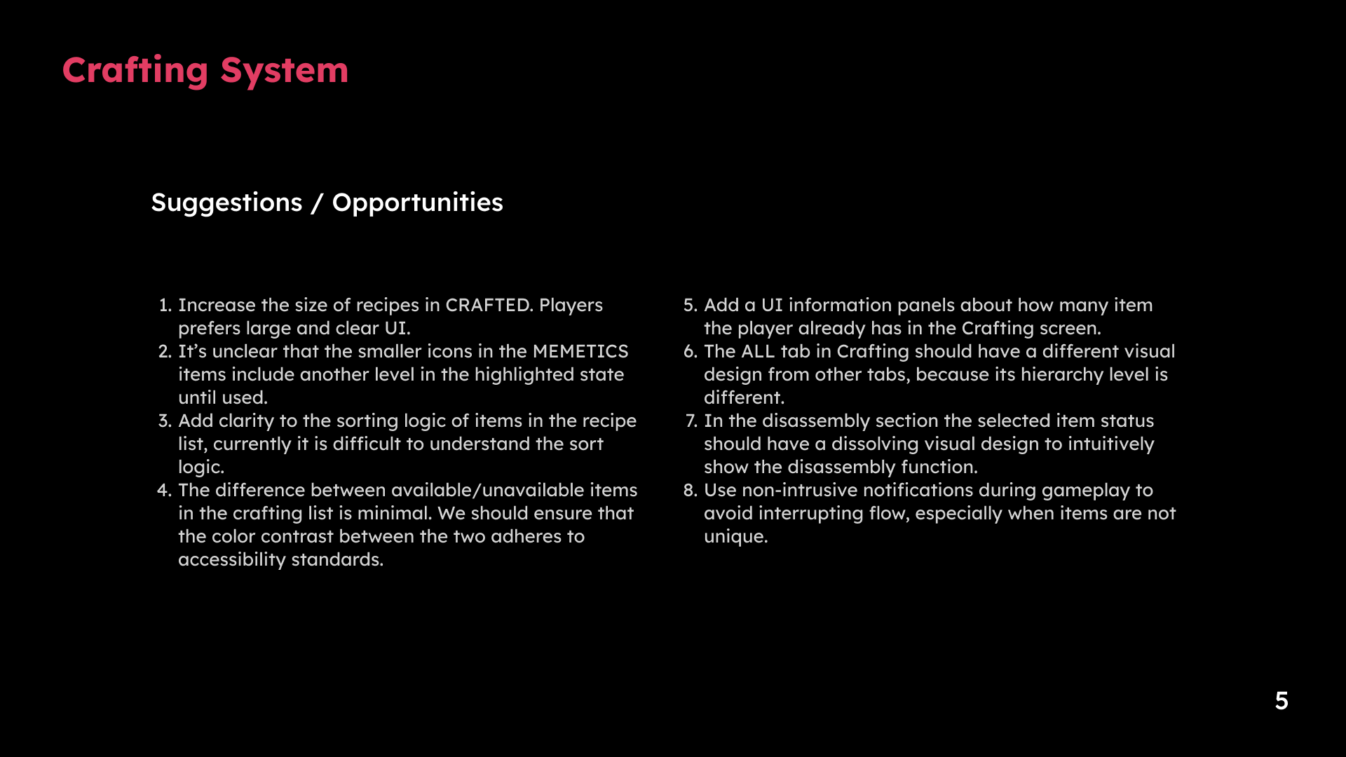
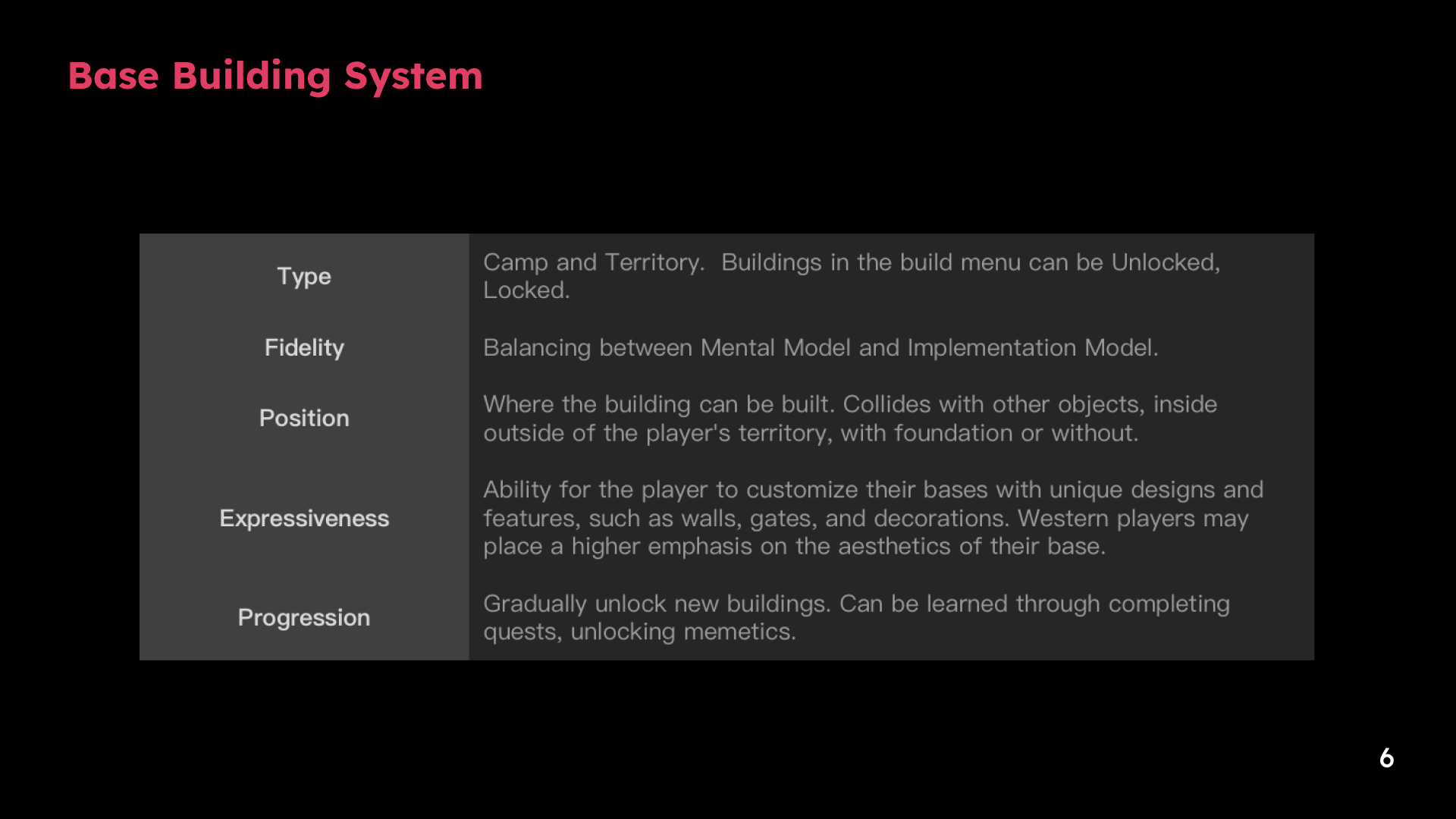
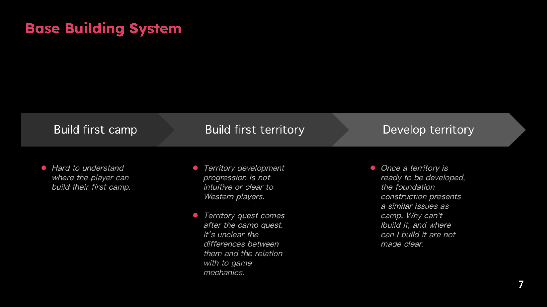
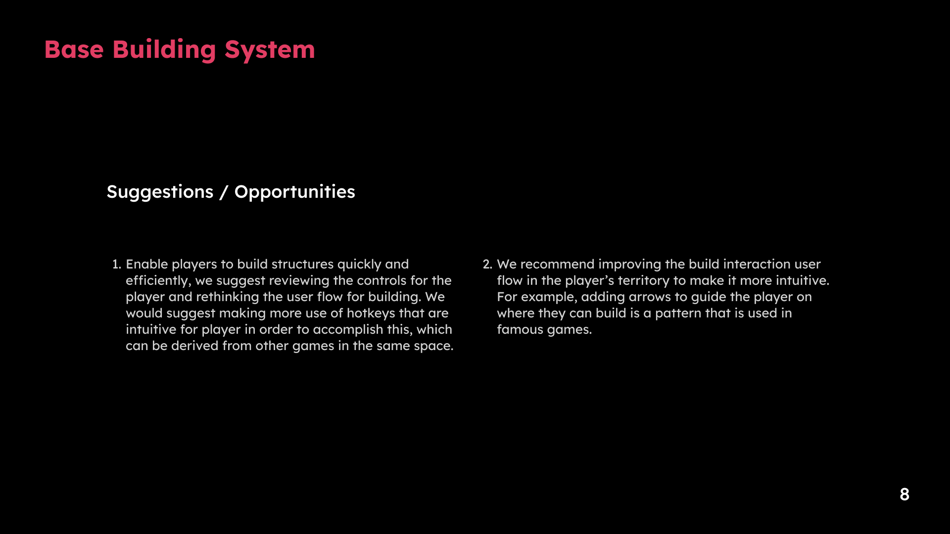
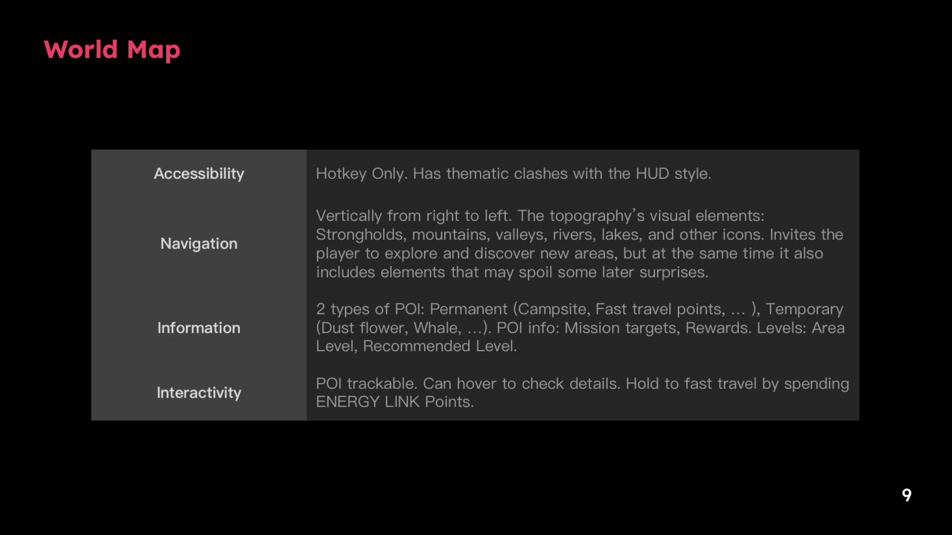
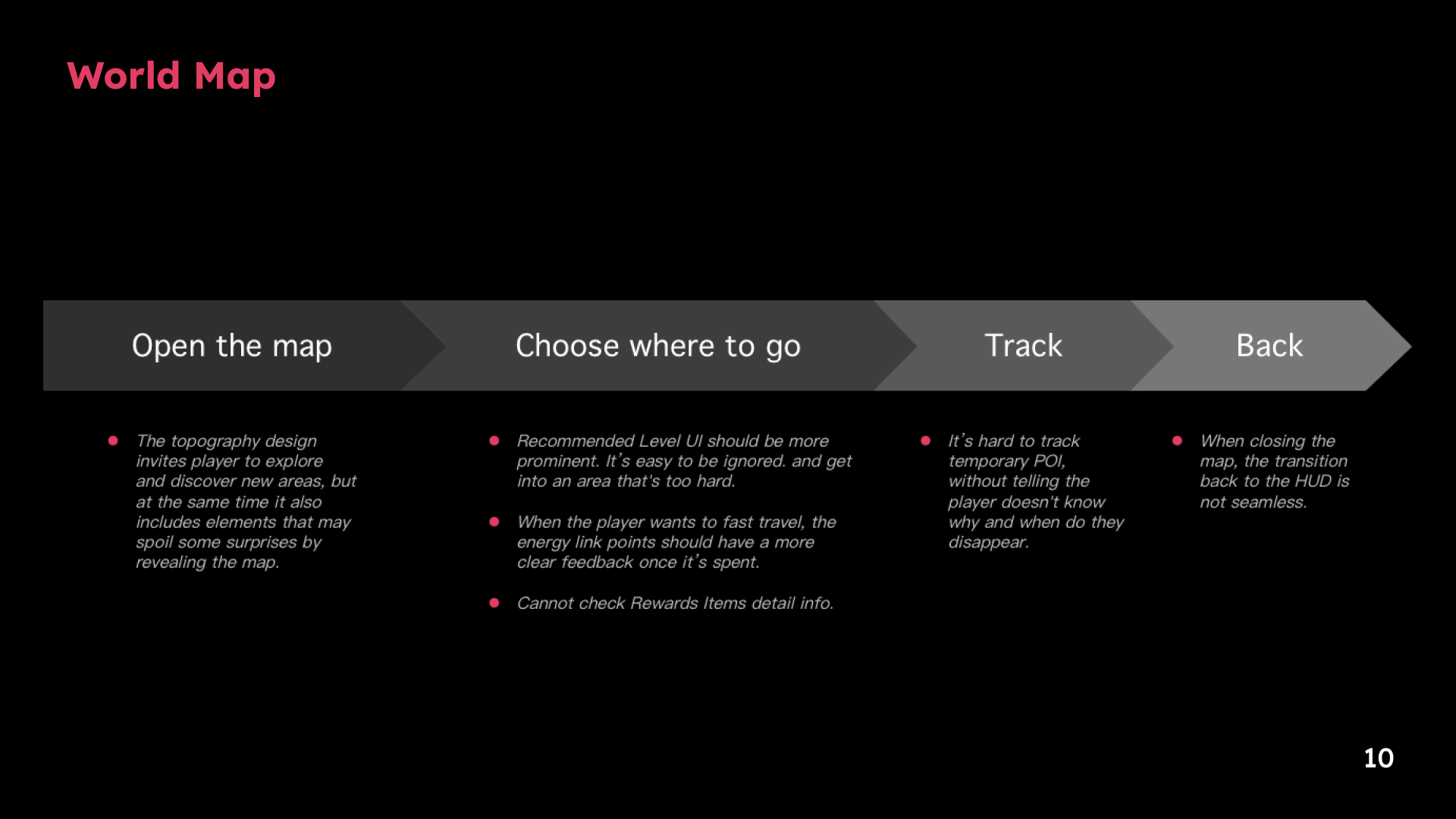
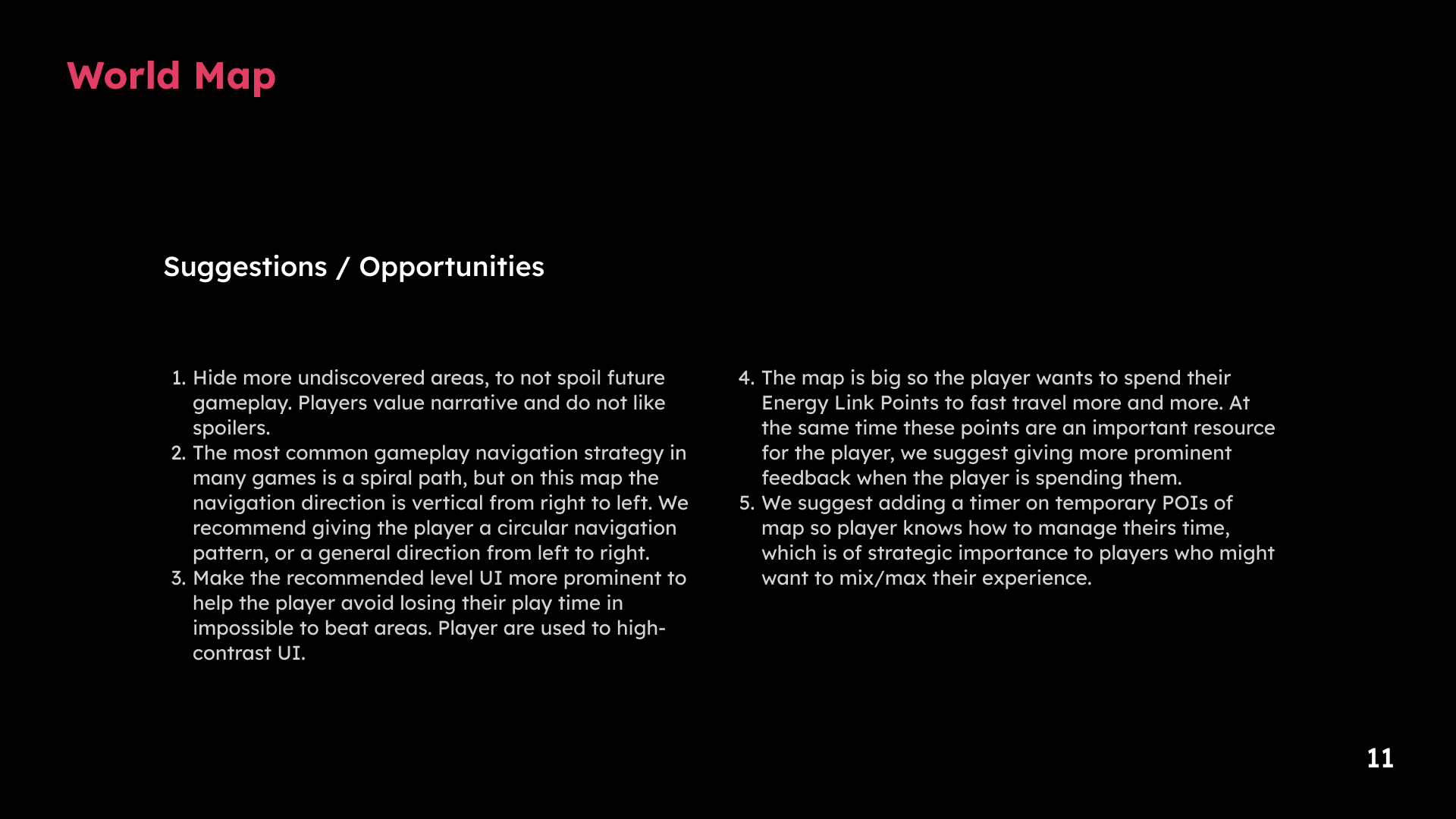
1 / 11 · Select a slide to view full size
Motion considerations
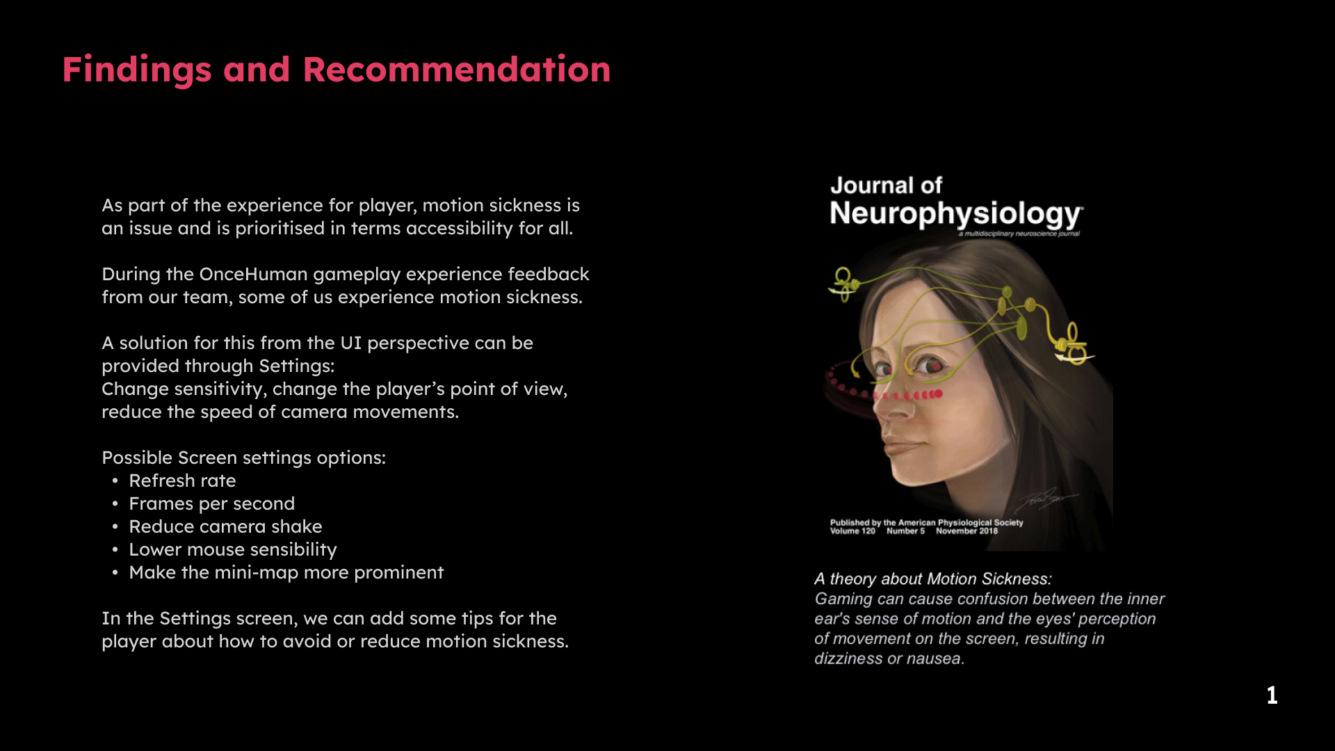
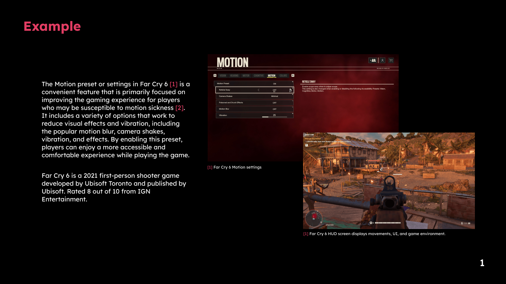
1 / 2 · Select a slide to view full size