Case study updated September 9, 2026
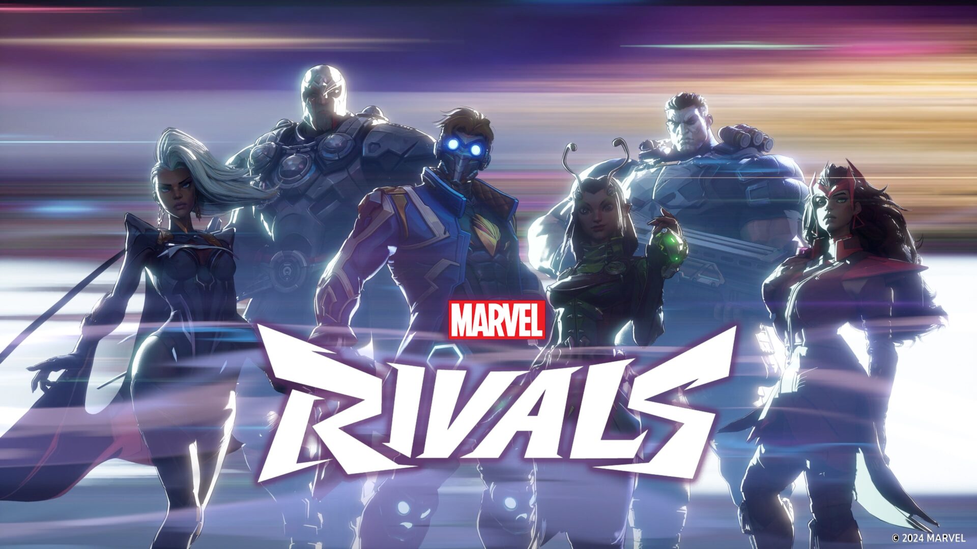
MARVEL RIVALS
GAME UX | INTERACTION REVIEW | ACCESSIBILITY
Reviewing how players navigate, choose and communicate
I contributed to a UX review of Marvel Rivals during development, covering the journey from the lobby to combat. My work focused on interaction flows, information hierarchy, accessibility and platform considerations, supported by comparisons with other games.
Role: UX Designer
Team: 2 other UX designers
Project period: May–July 2023
Tools: Figma, Photoshop and Excel
My contribution
I analyzed interface behavior and documented recommendations for the development team. The material below is a design review: game references illustrate patterns and alternatives, while the recommendations describe proposed changes.
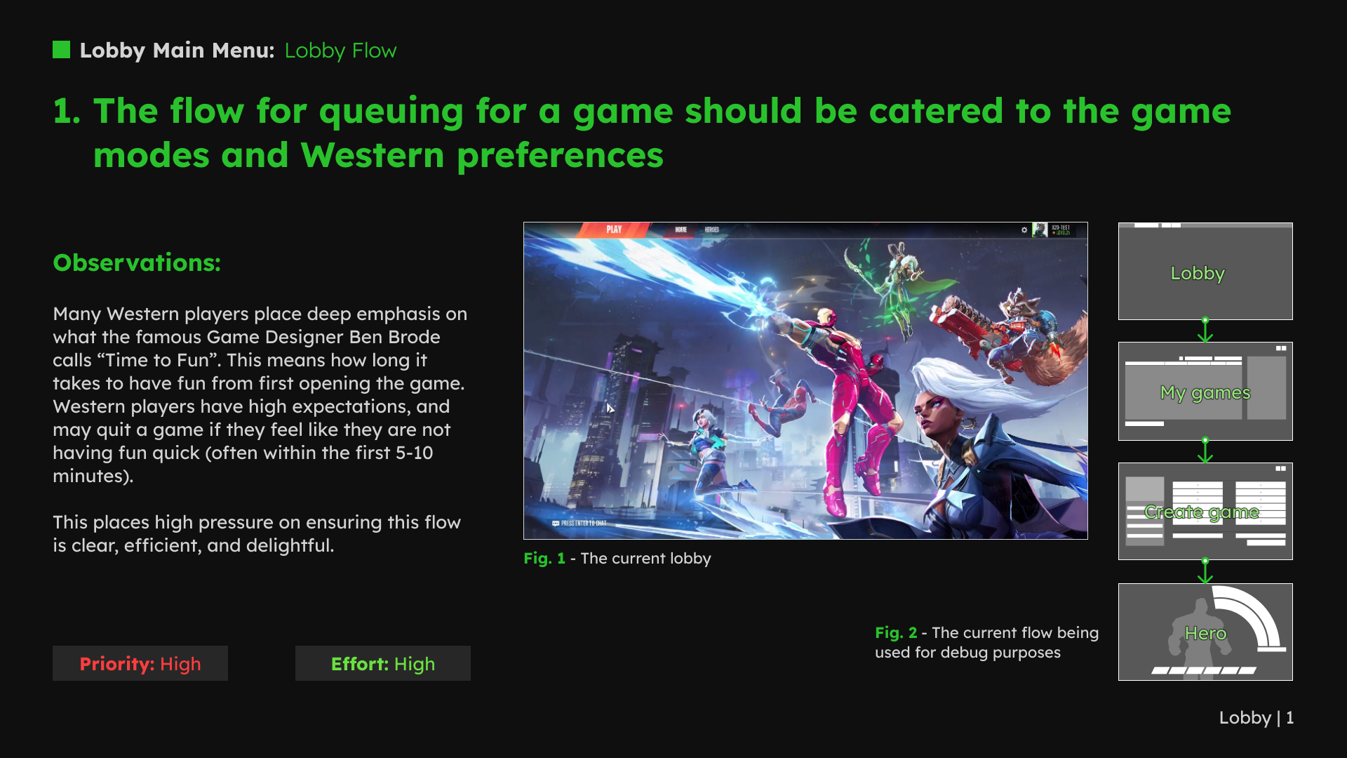
1. Match the lobby flow to the available choices
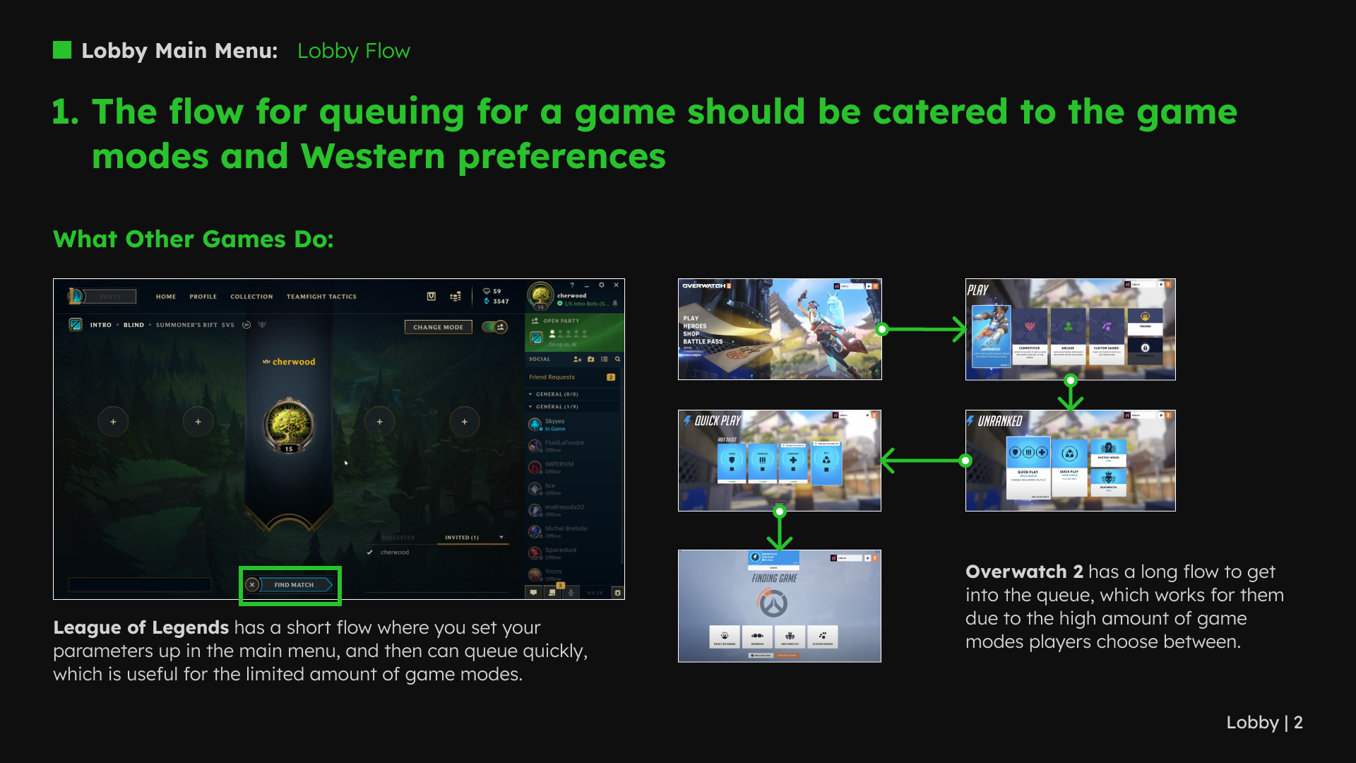
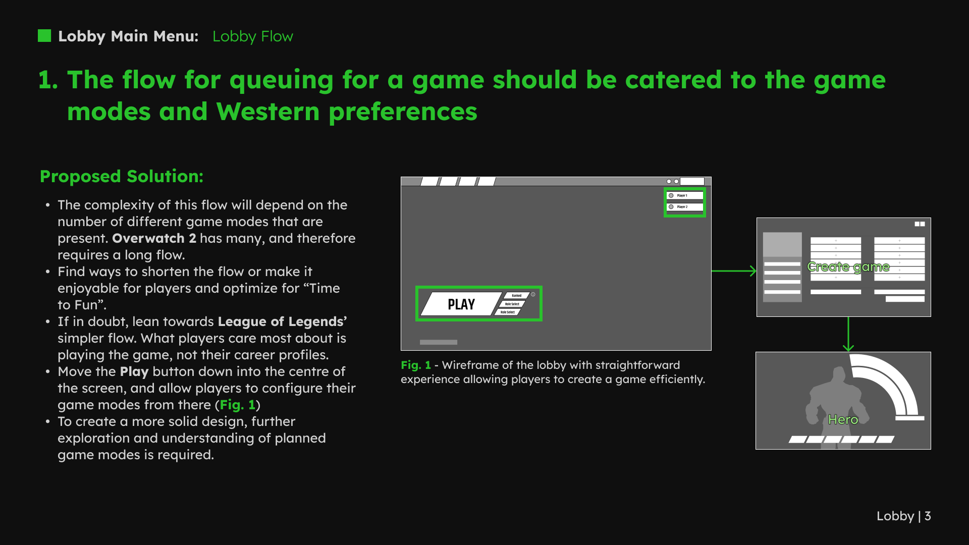
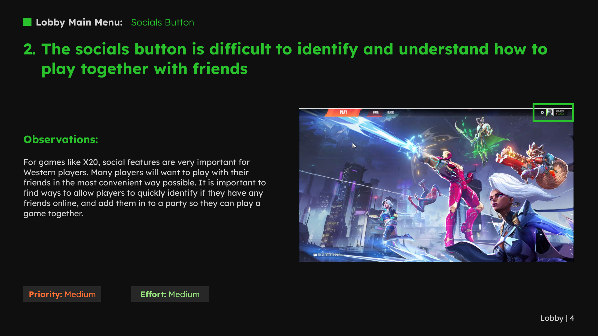
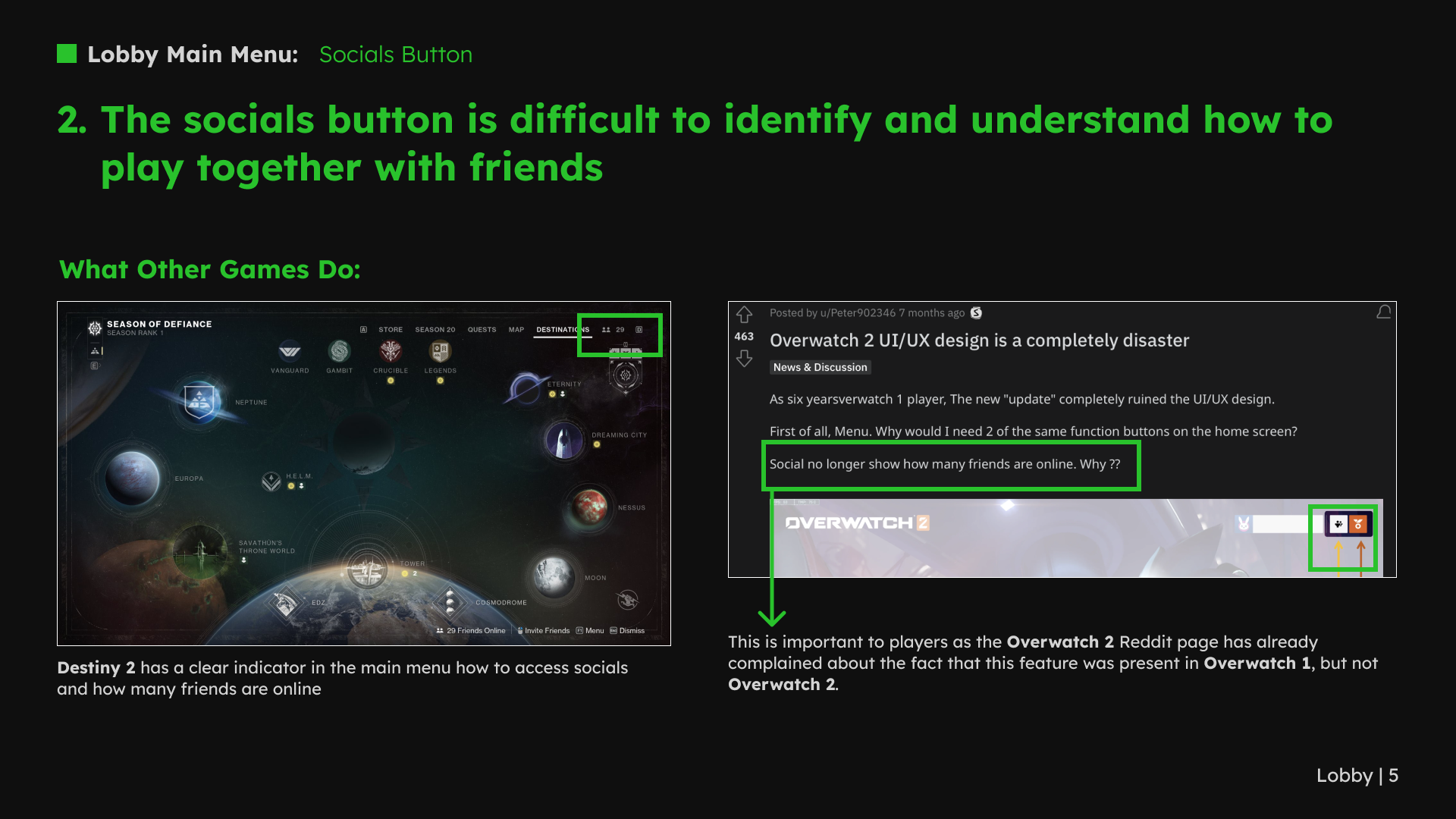
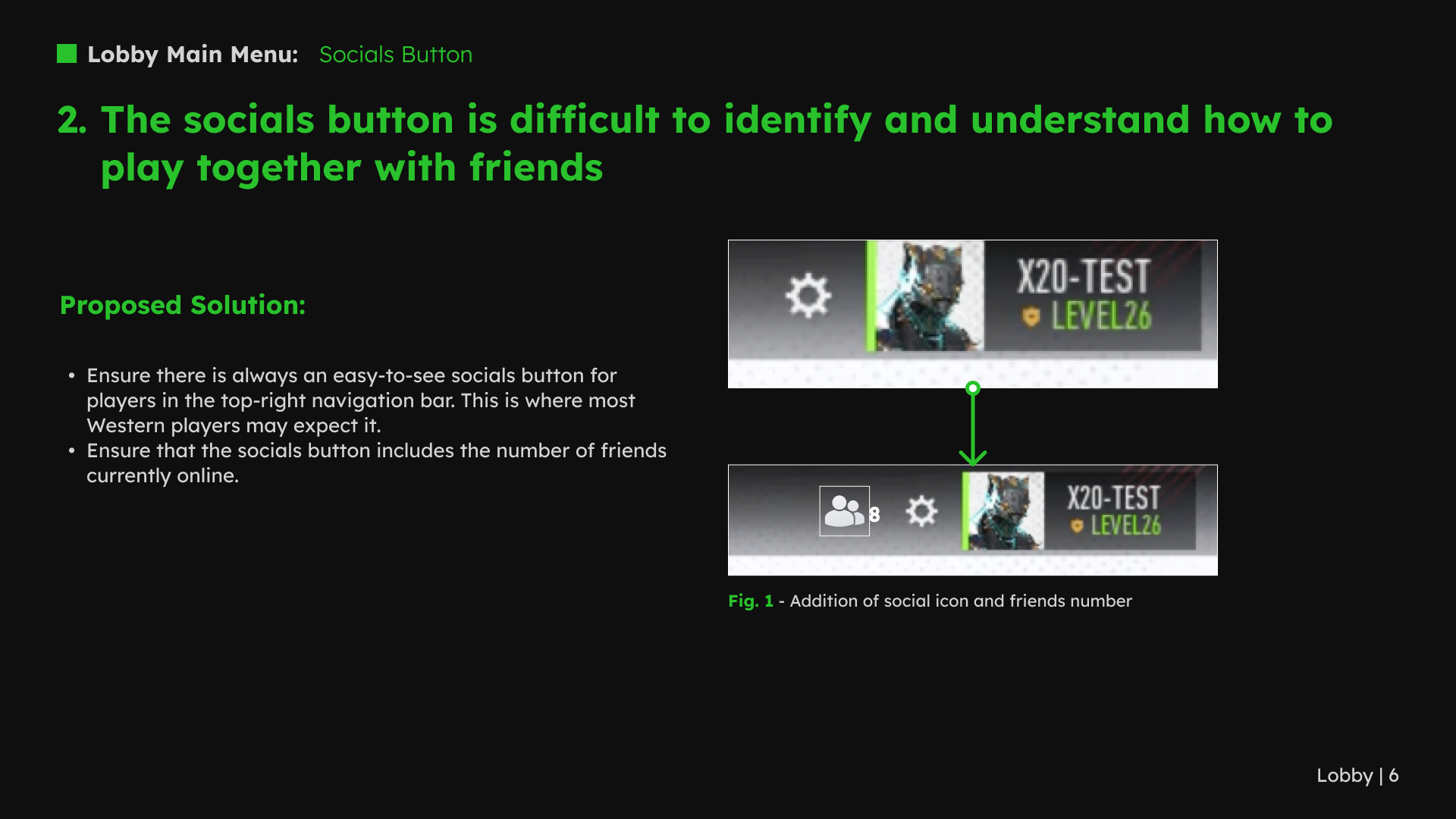
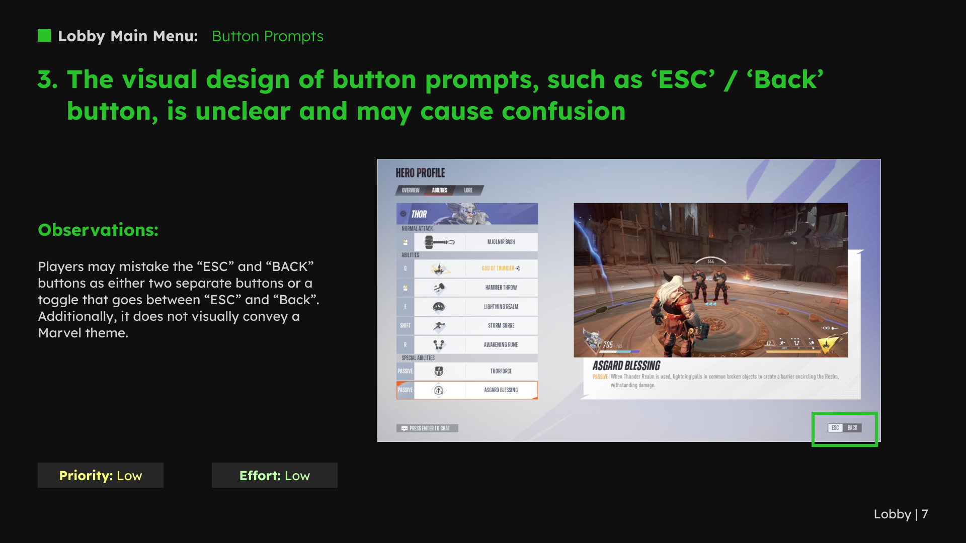
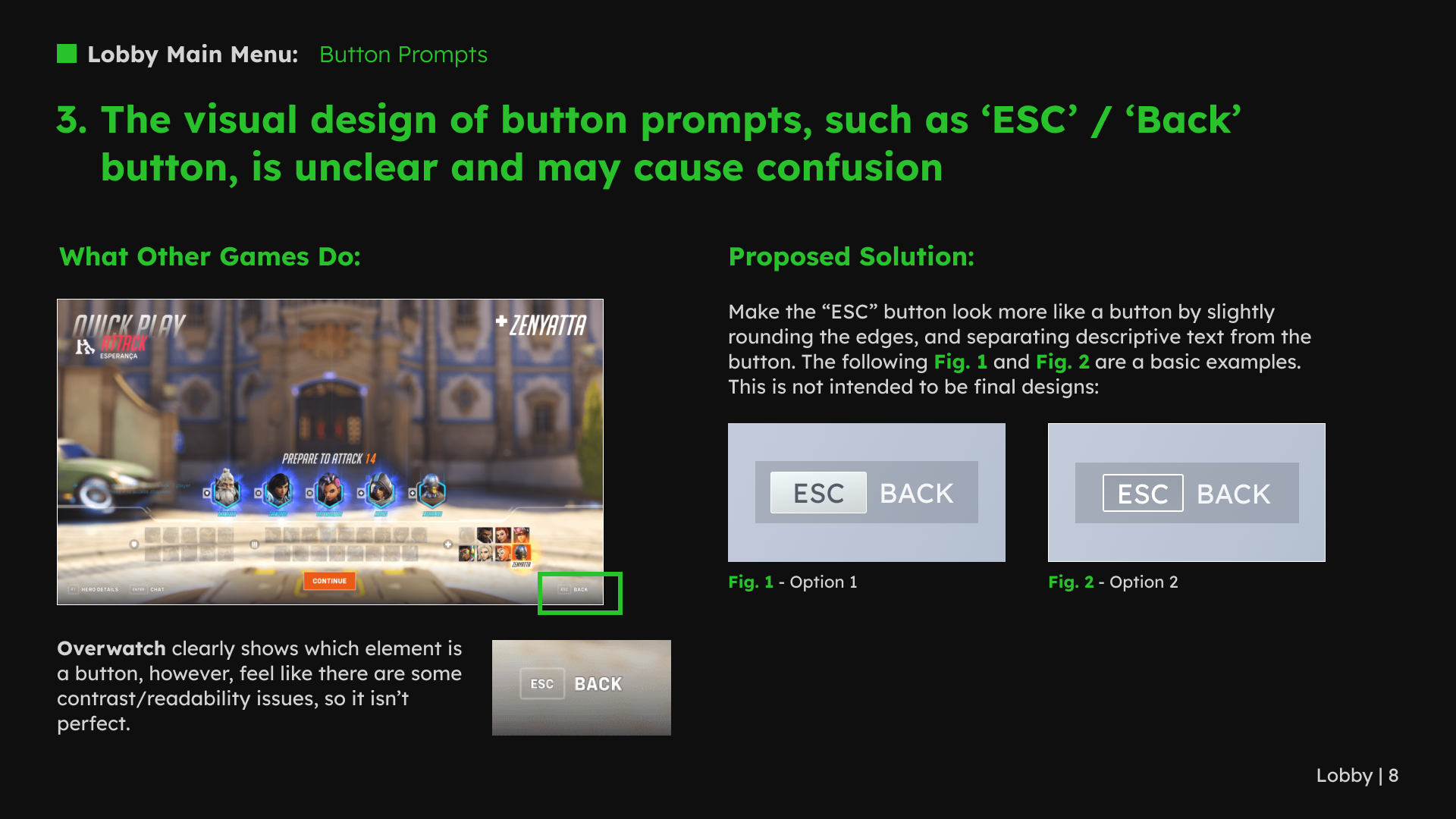
The lobby review compared a short route into matchmaking with a longer mode-selection flow. My recommendation was to choose the structure around the game’s actual modes and decisions, rather than copy another game’s navigation. I also reviewed social entry points and button prompts.
1 / 8 · Select a slide to view full size
2. Make heroes easier to understand
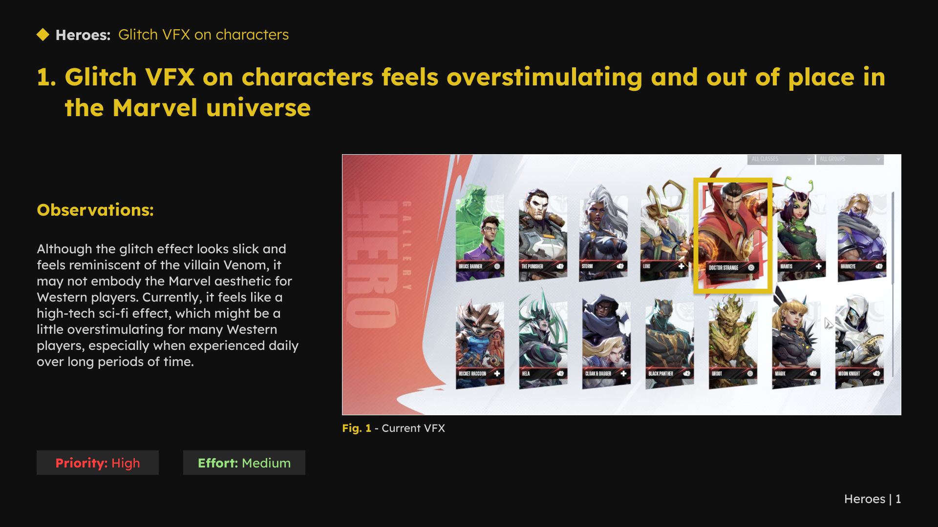
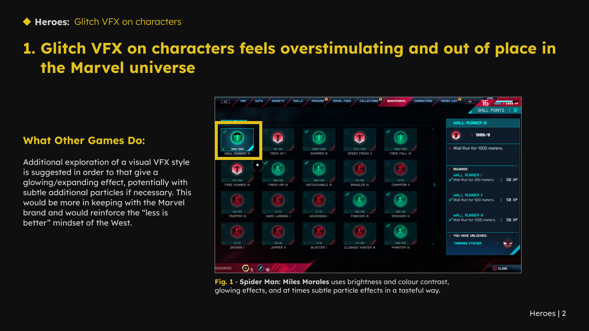
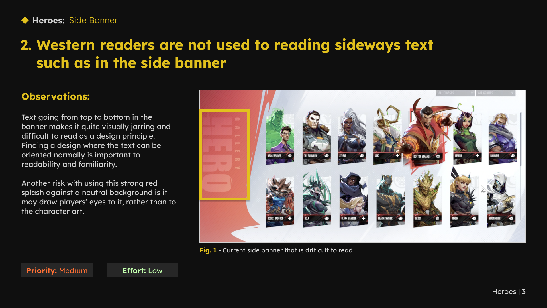
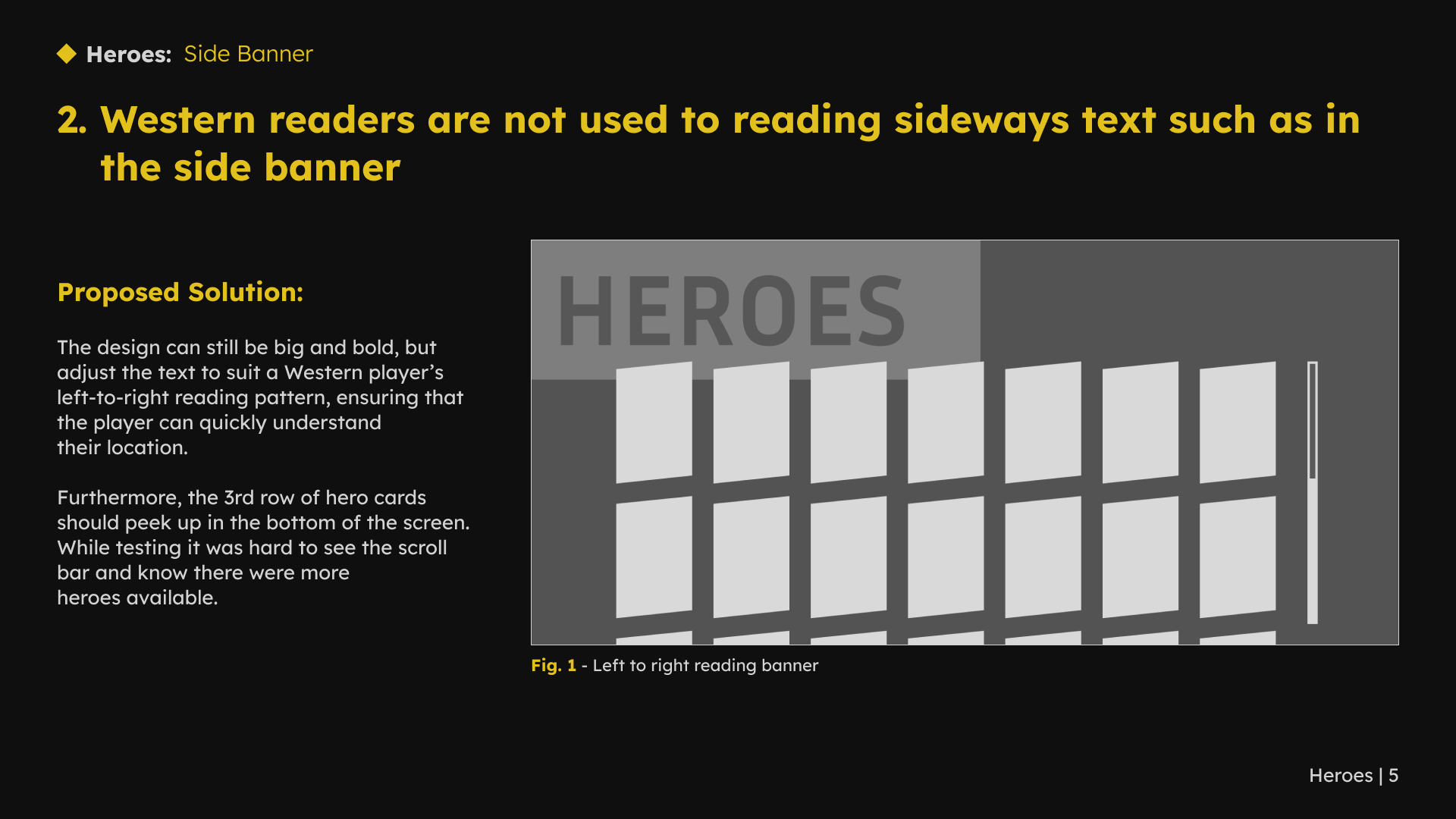
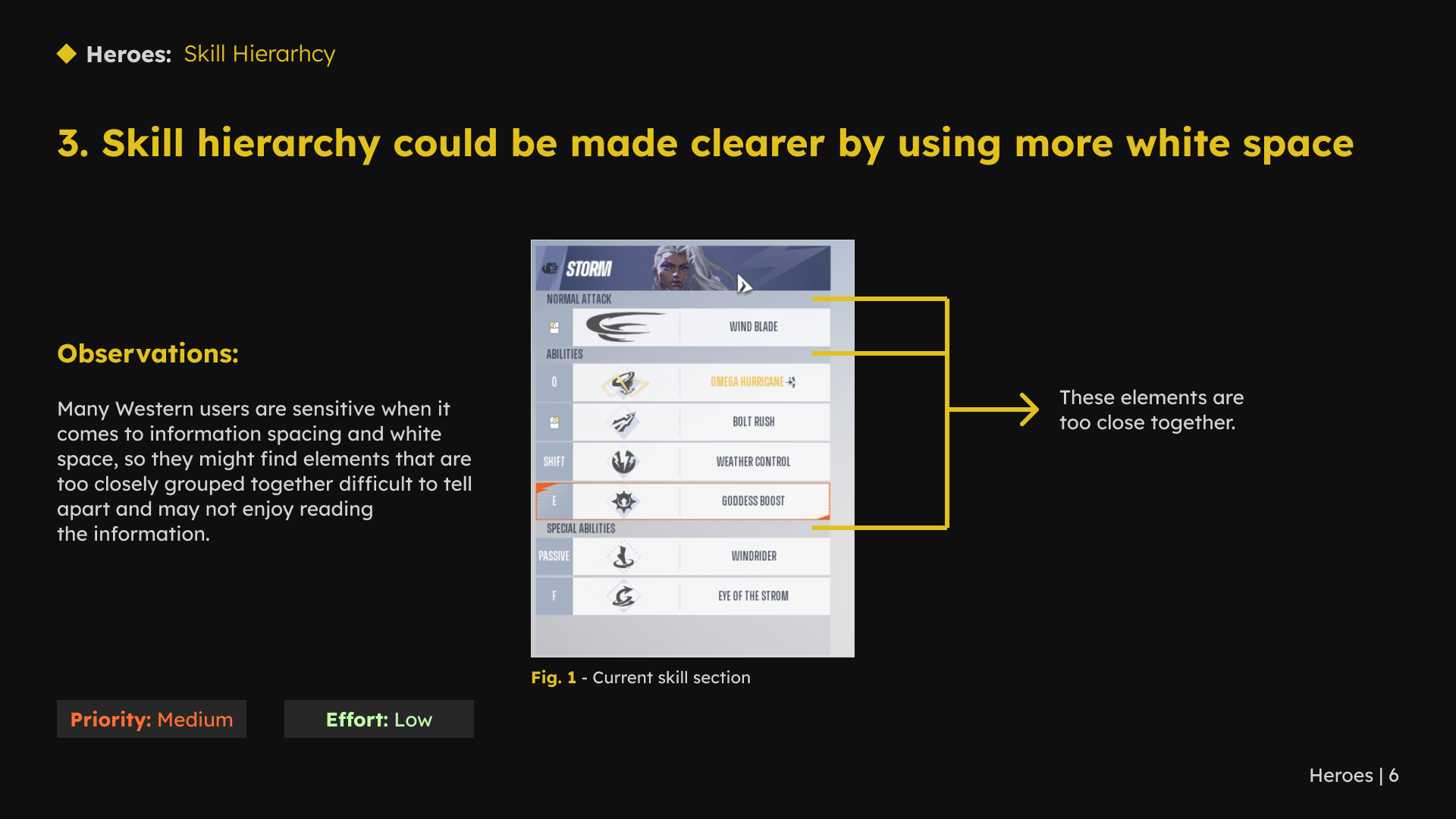
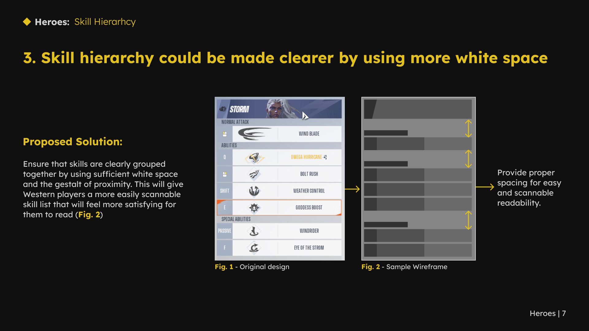
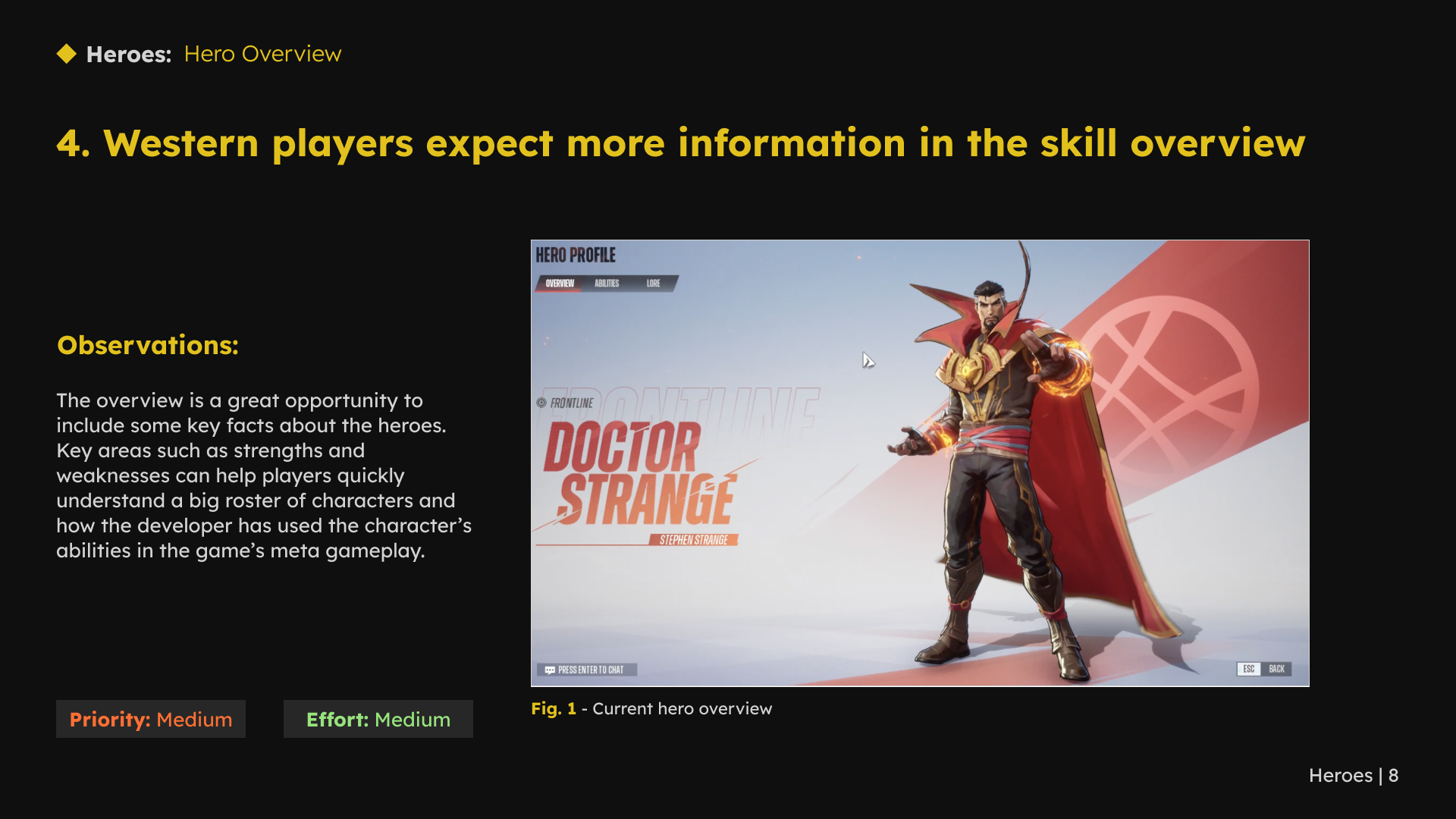
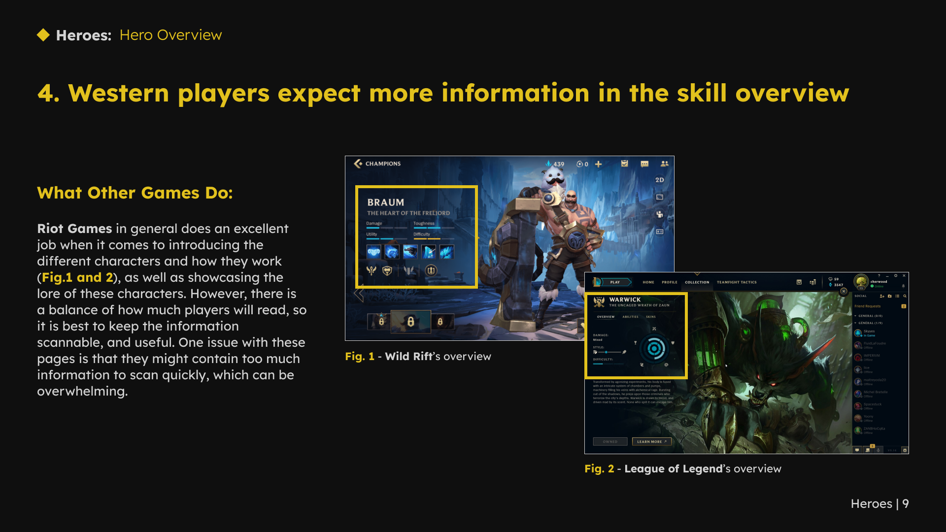
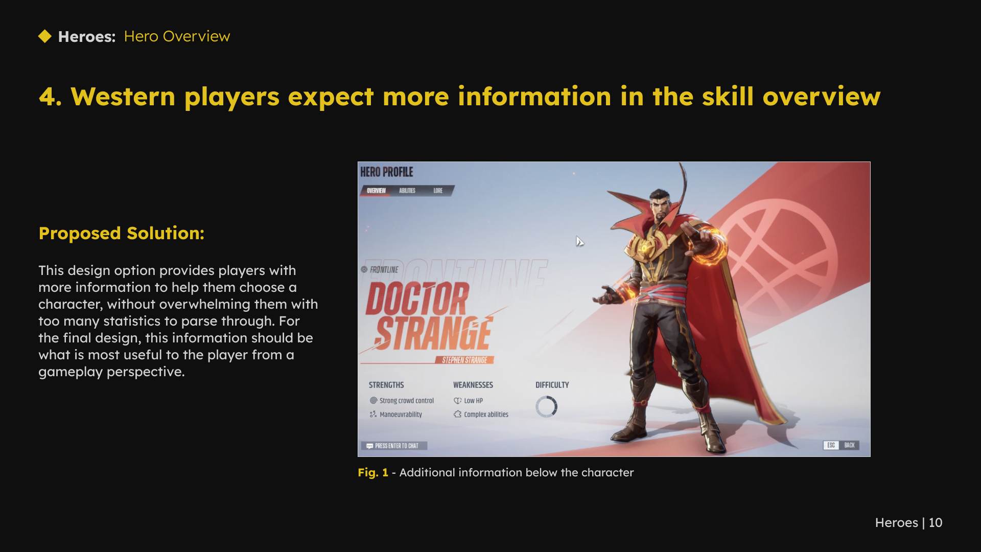
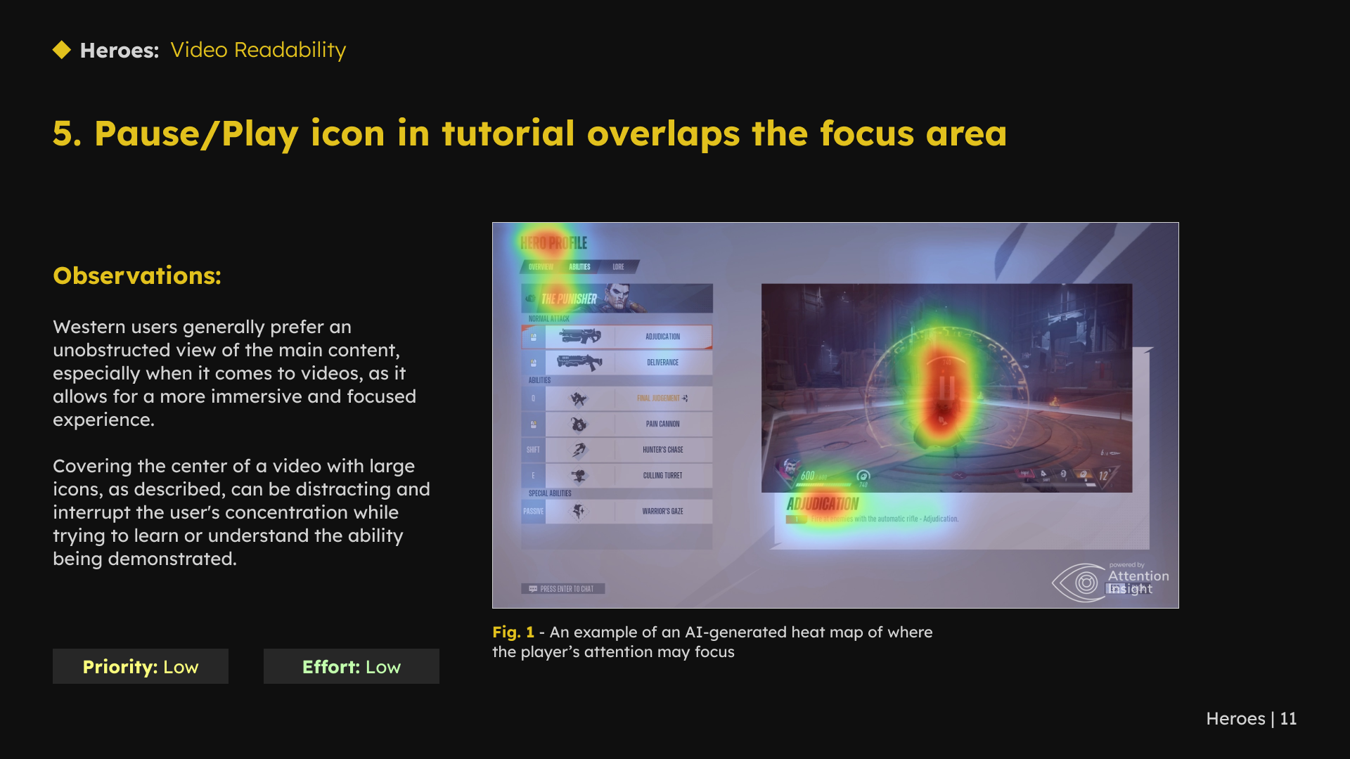
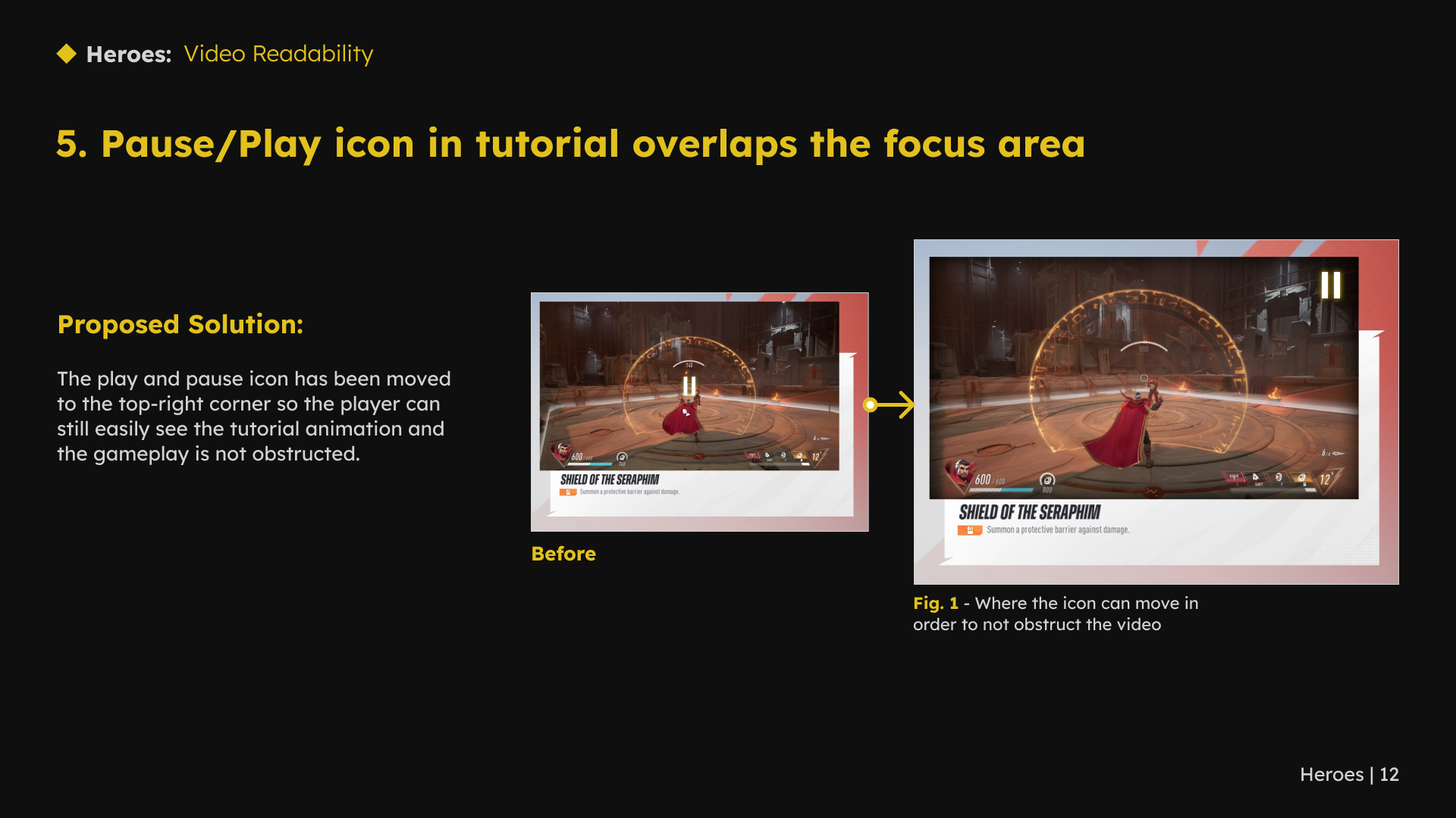
I reviewed how the hero screens introduced characters, skills and abilities. The recommendations covered skill hierarchy, overview content, video presentation and visual effects. For character effects, I proposed exploring a subtler treatment that would preserve emphasis without competing with the information on screen.
1 / 12 · Select a slide to view full size
3. Support a growing roster and readable combat information
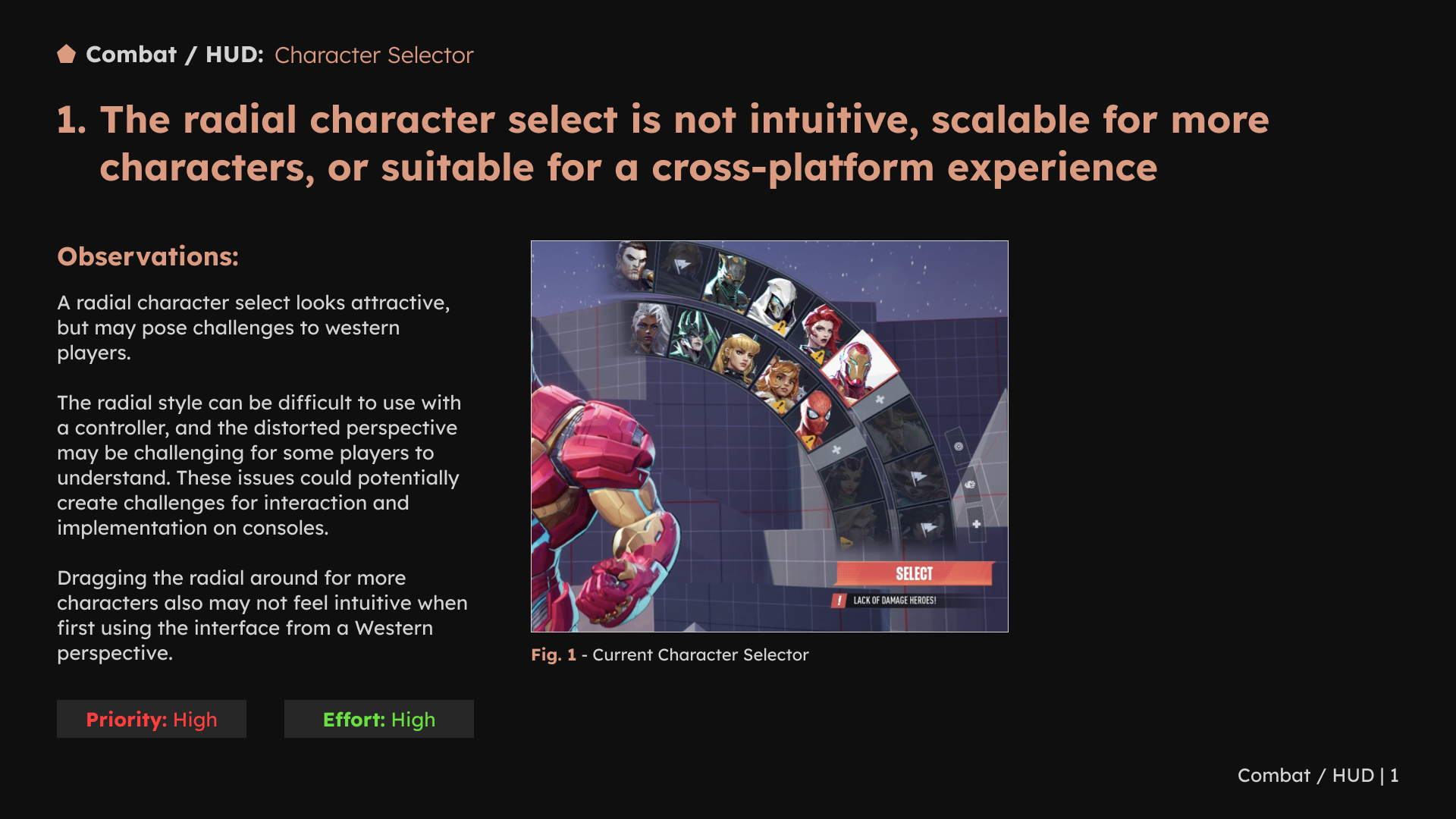
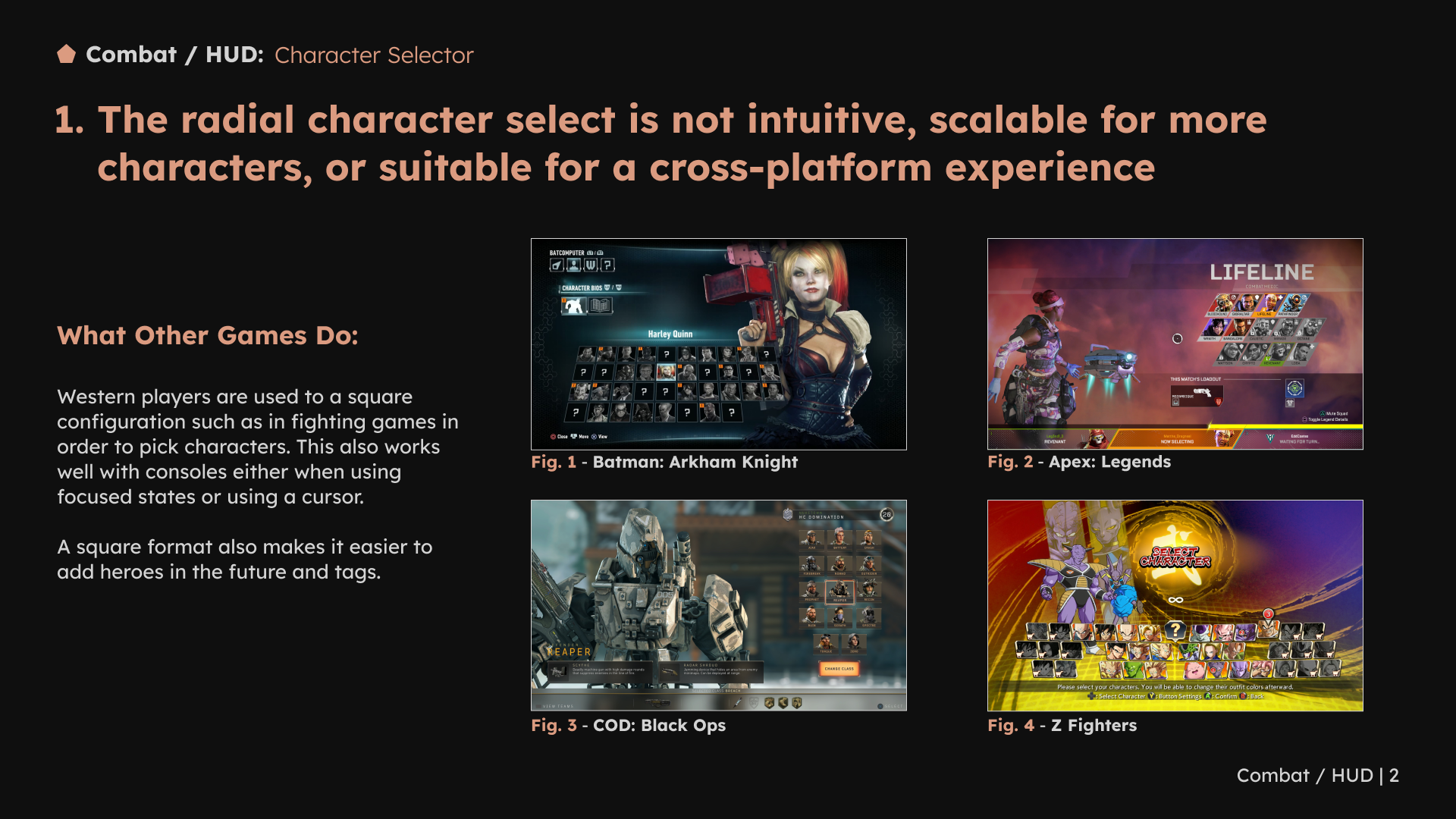
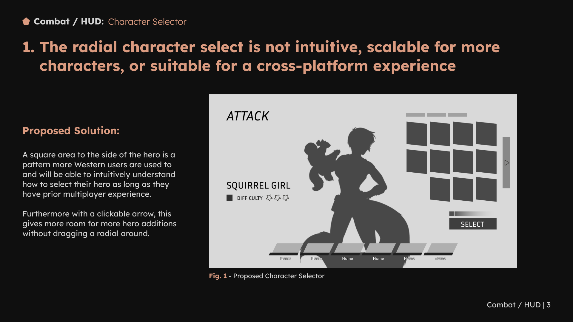
The character-selector review questioned whether a radial layout could support more heroes and work consistently across platforms. I recommended considering a grid, using examples to explain roster growth and controller navigation. The proposal considered both roster growth and controller navigation.
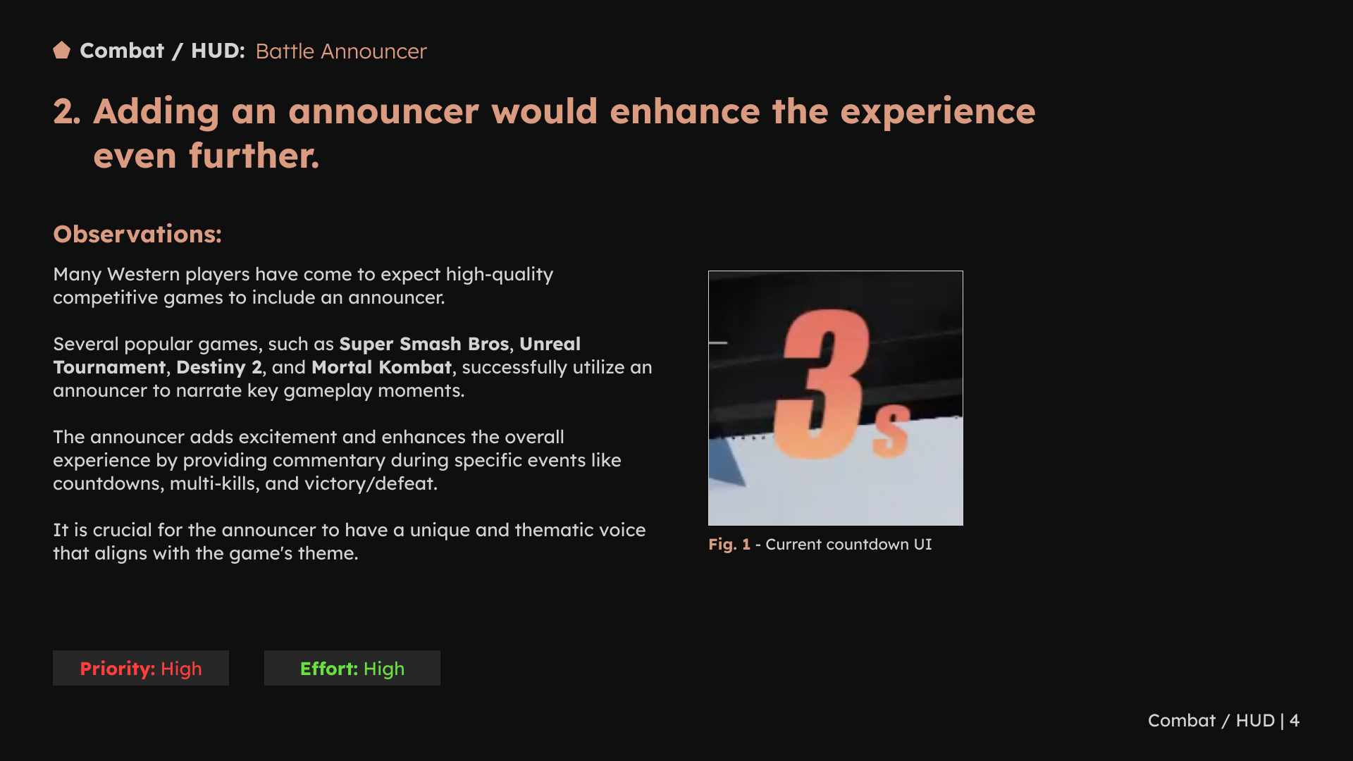
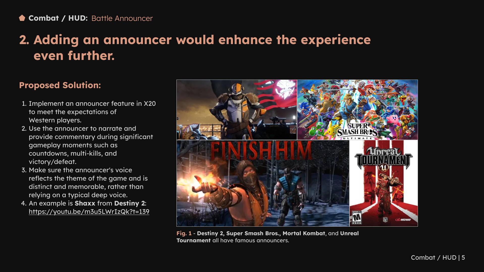
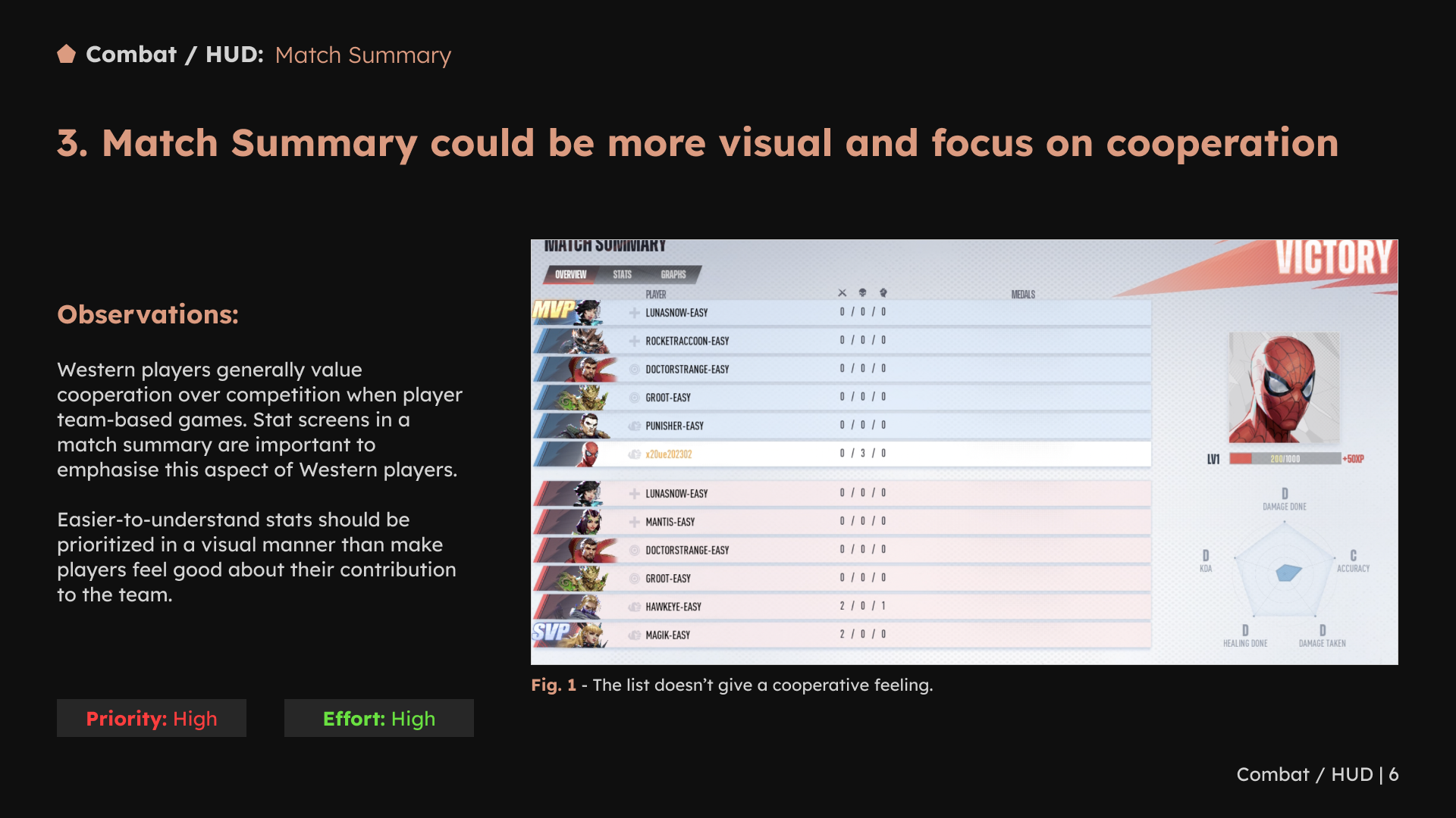
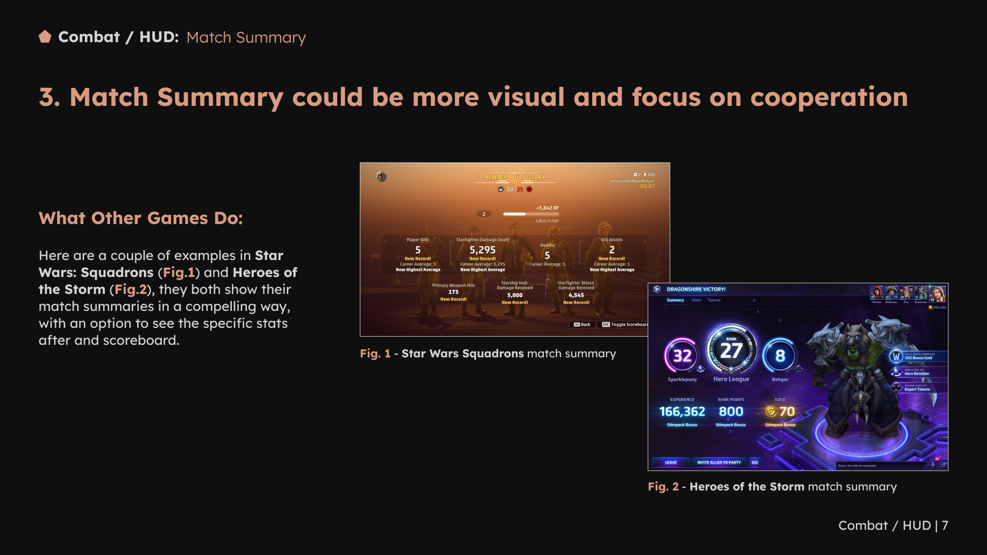
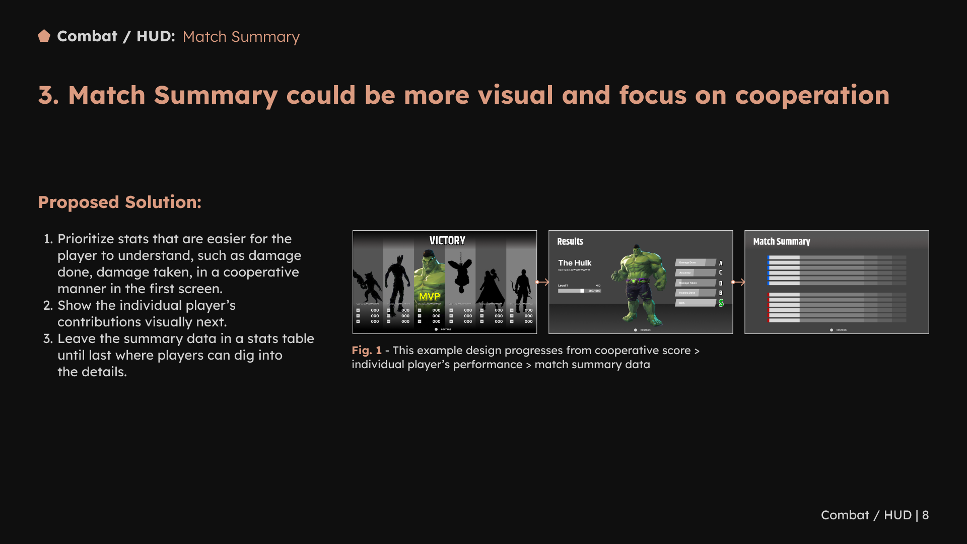
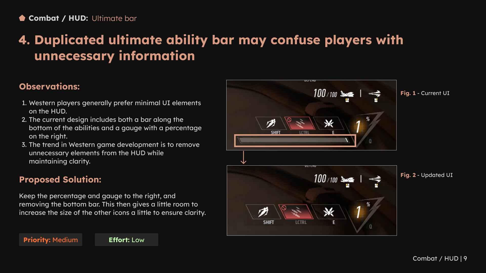
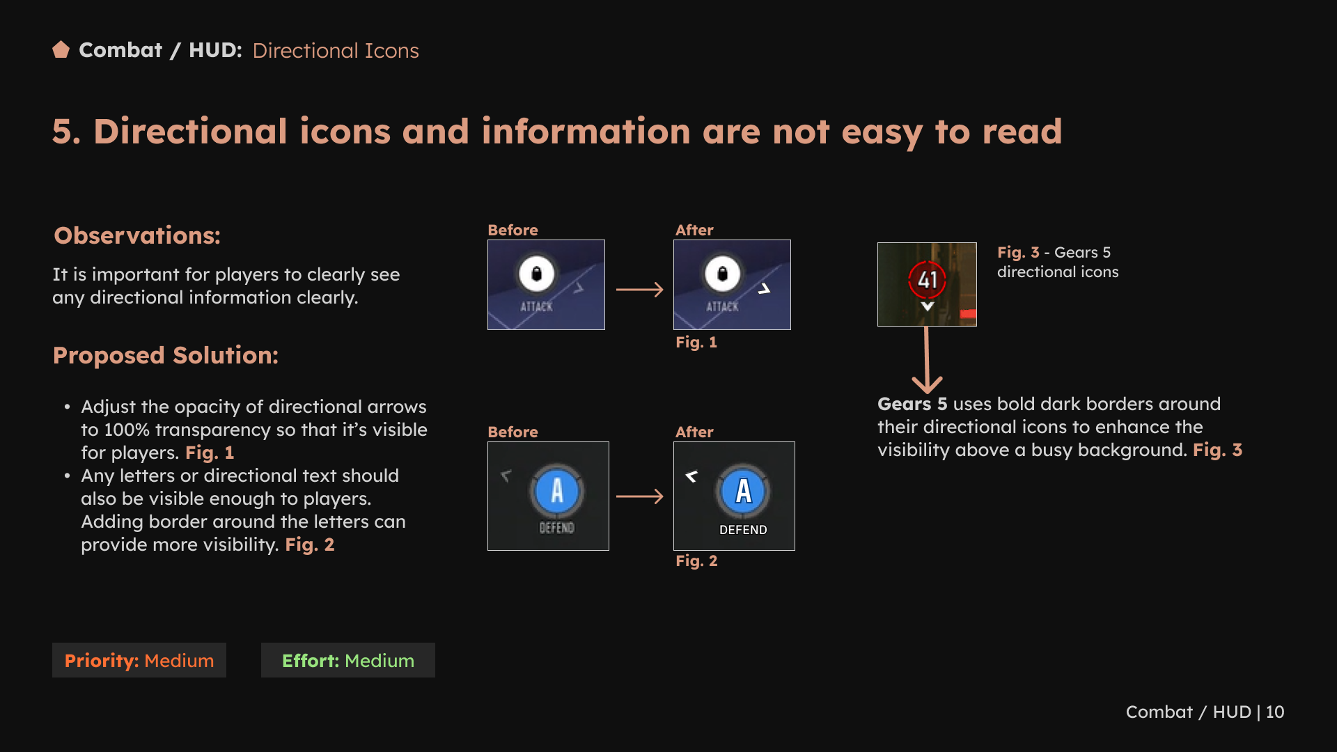
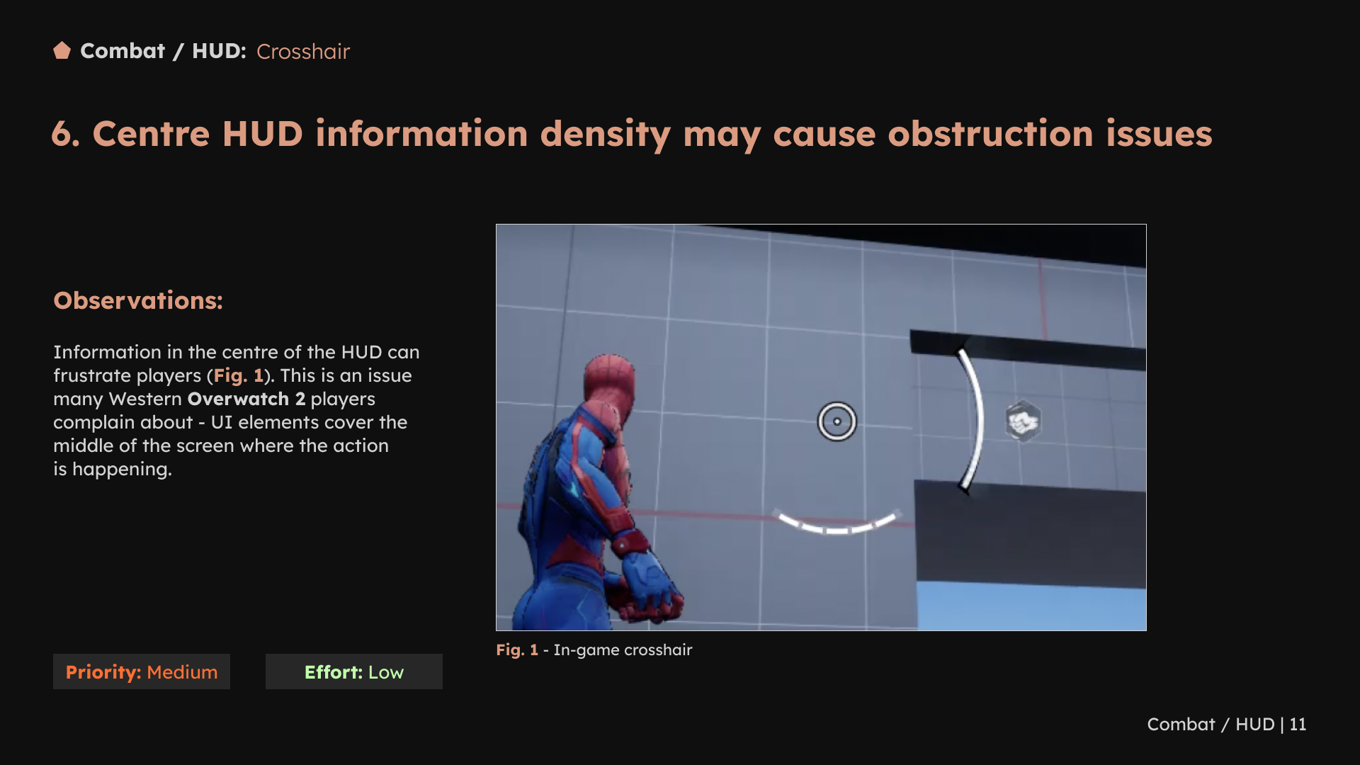
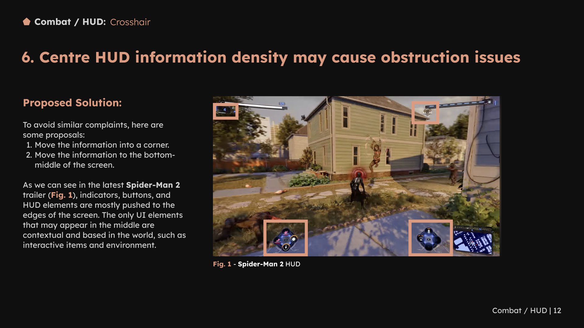
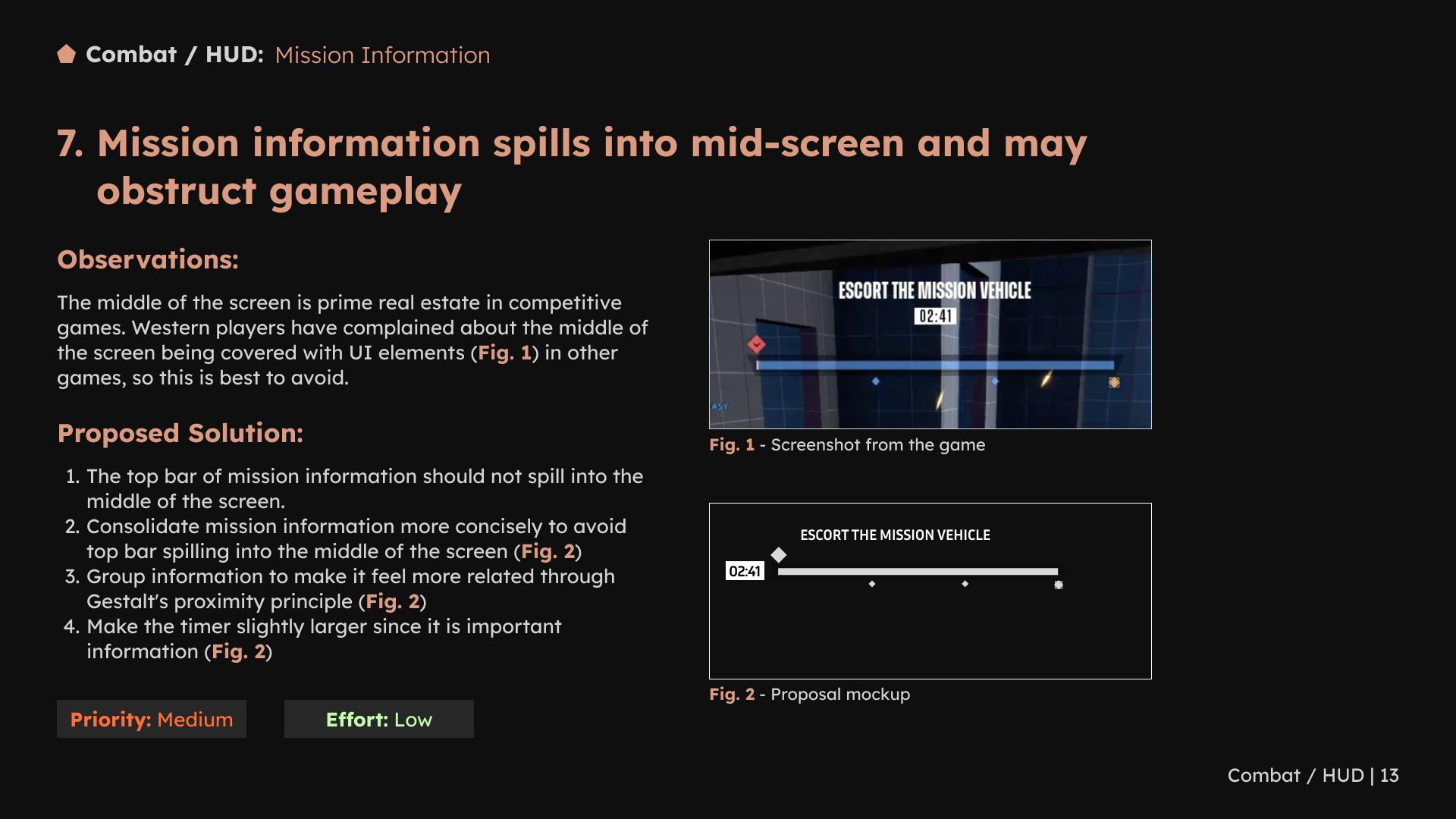
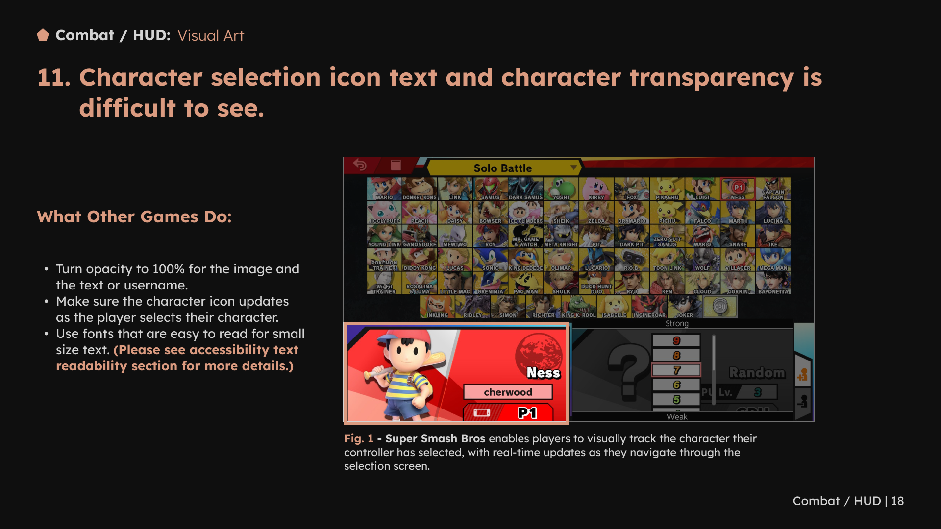
The wider HUD review covered announcer messages, ultimate status, directional cues, crosshairs, objectives and battle statistics. The focus was on helping players distinguish the information they need during play.
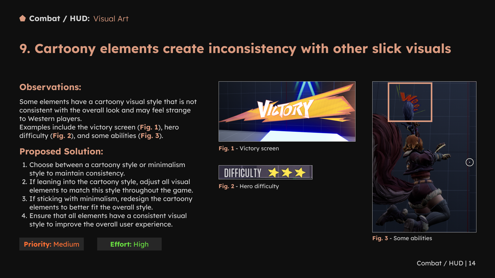
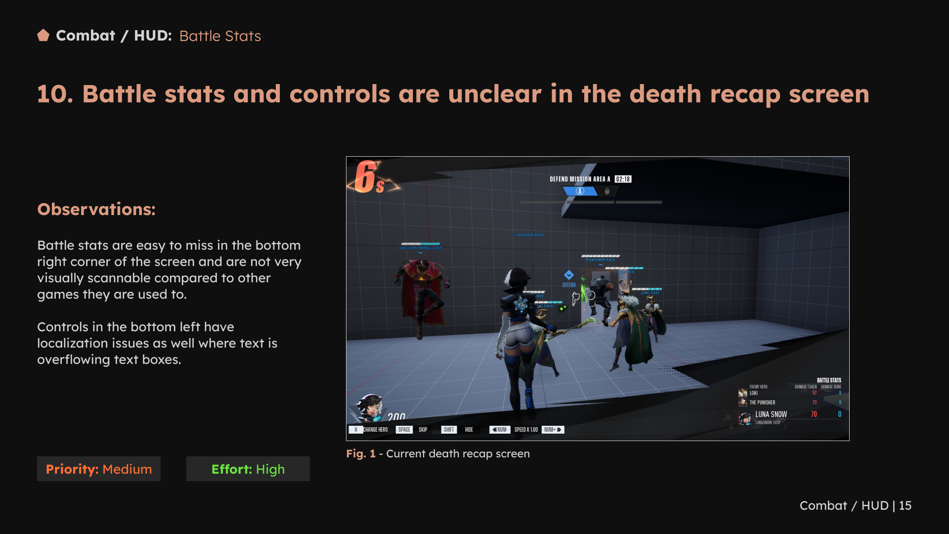
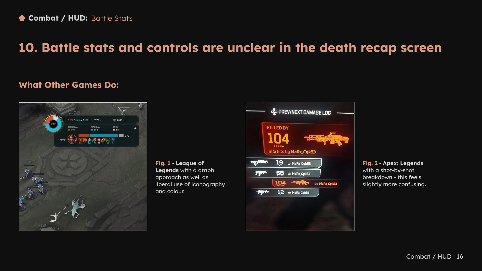
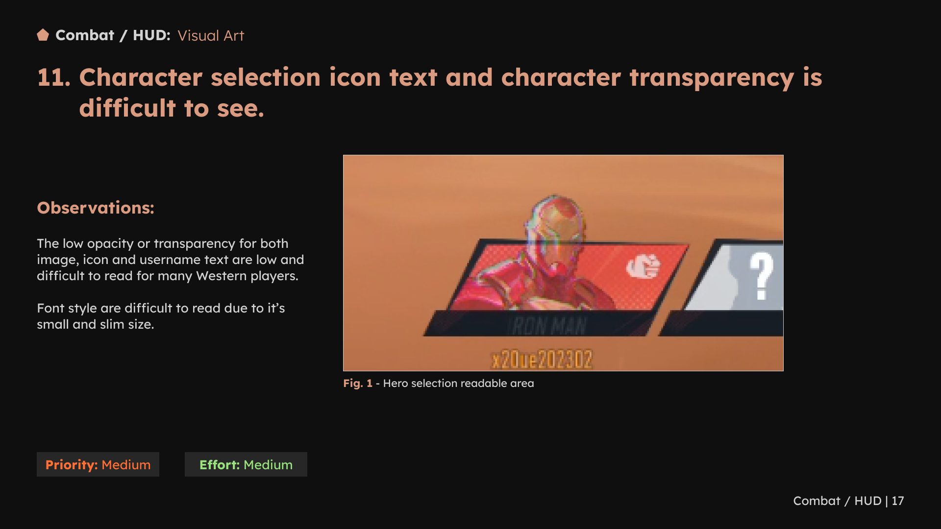
1 / 18 · Select a slide to view full size
4. Make accessibility part of the interface review
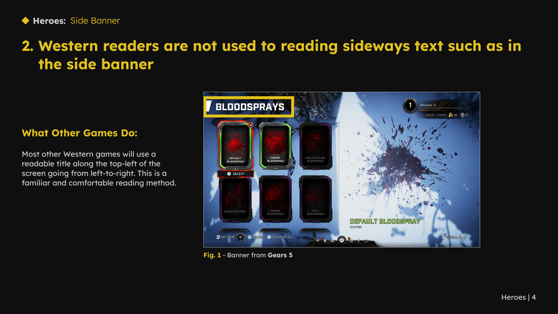
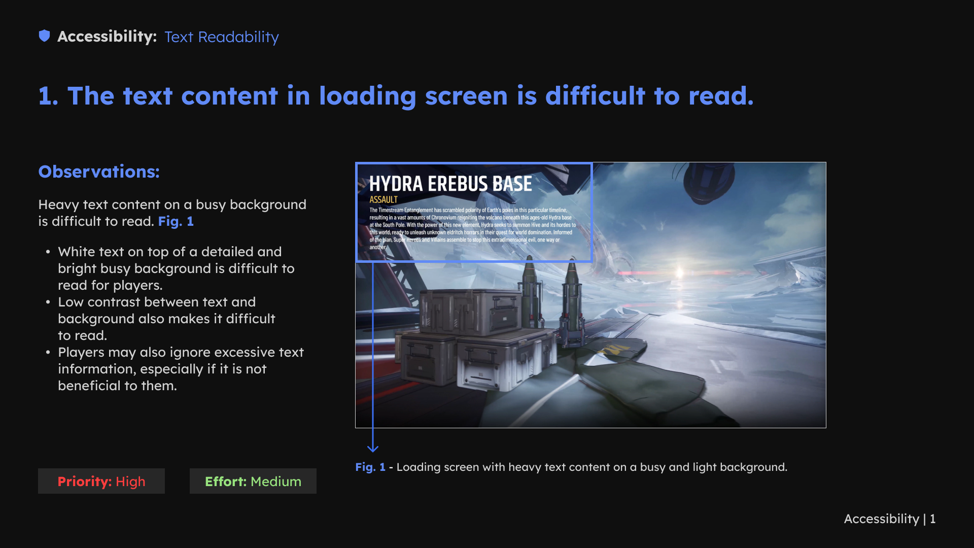
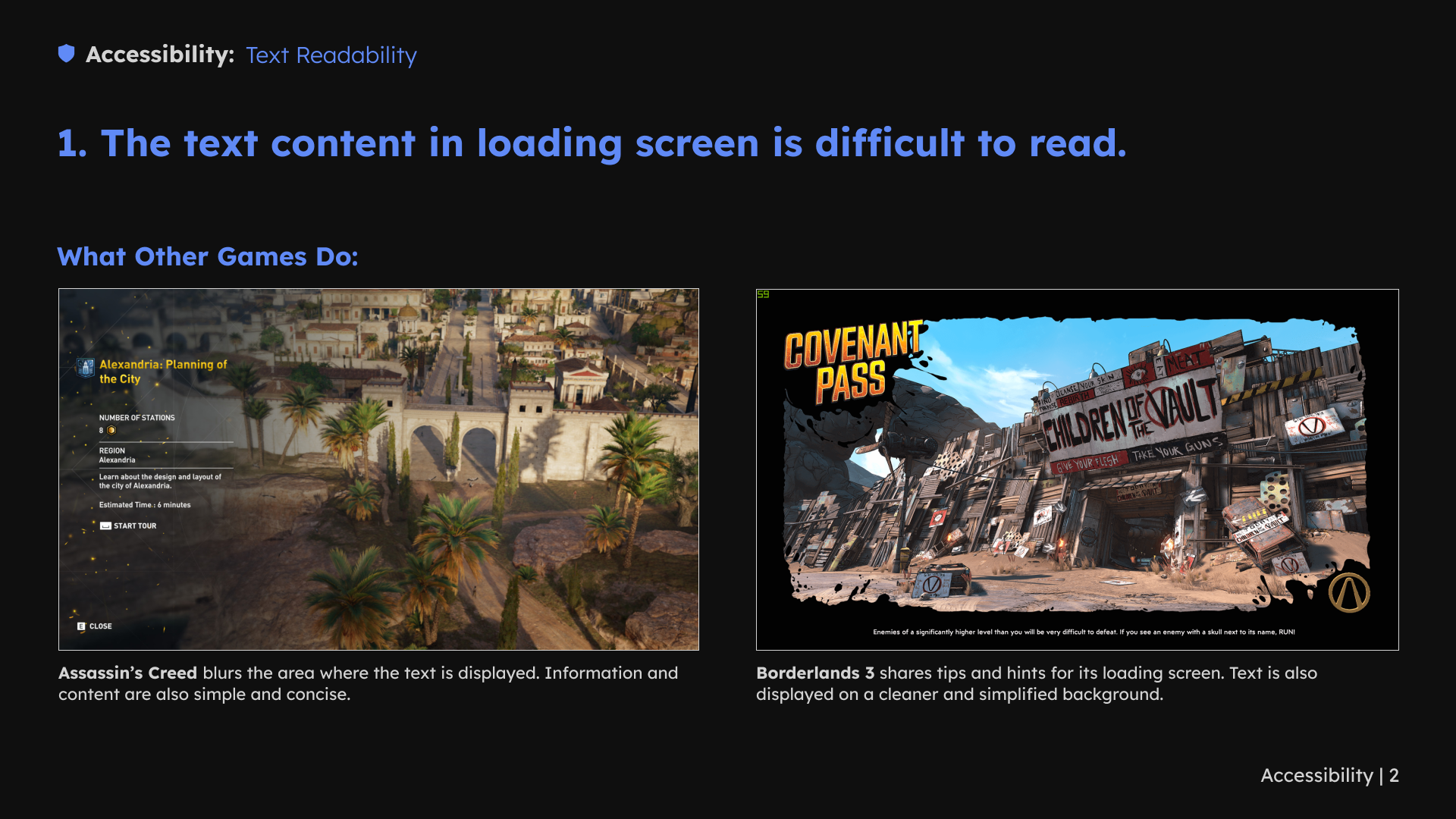
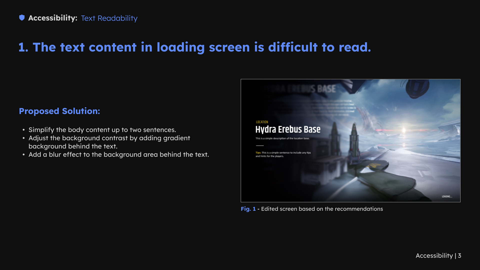
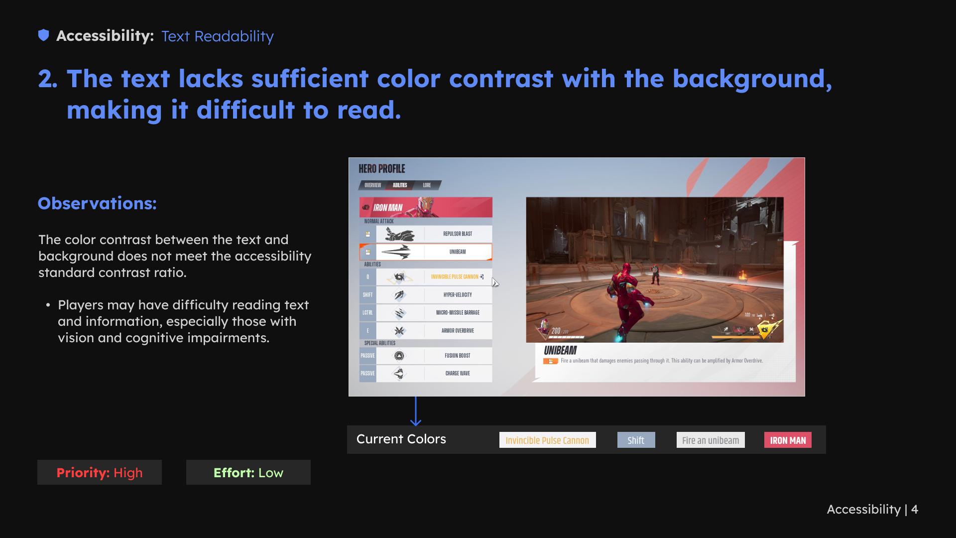
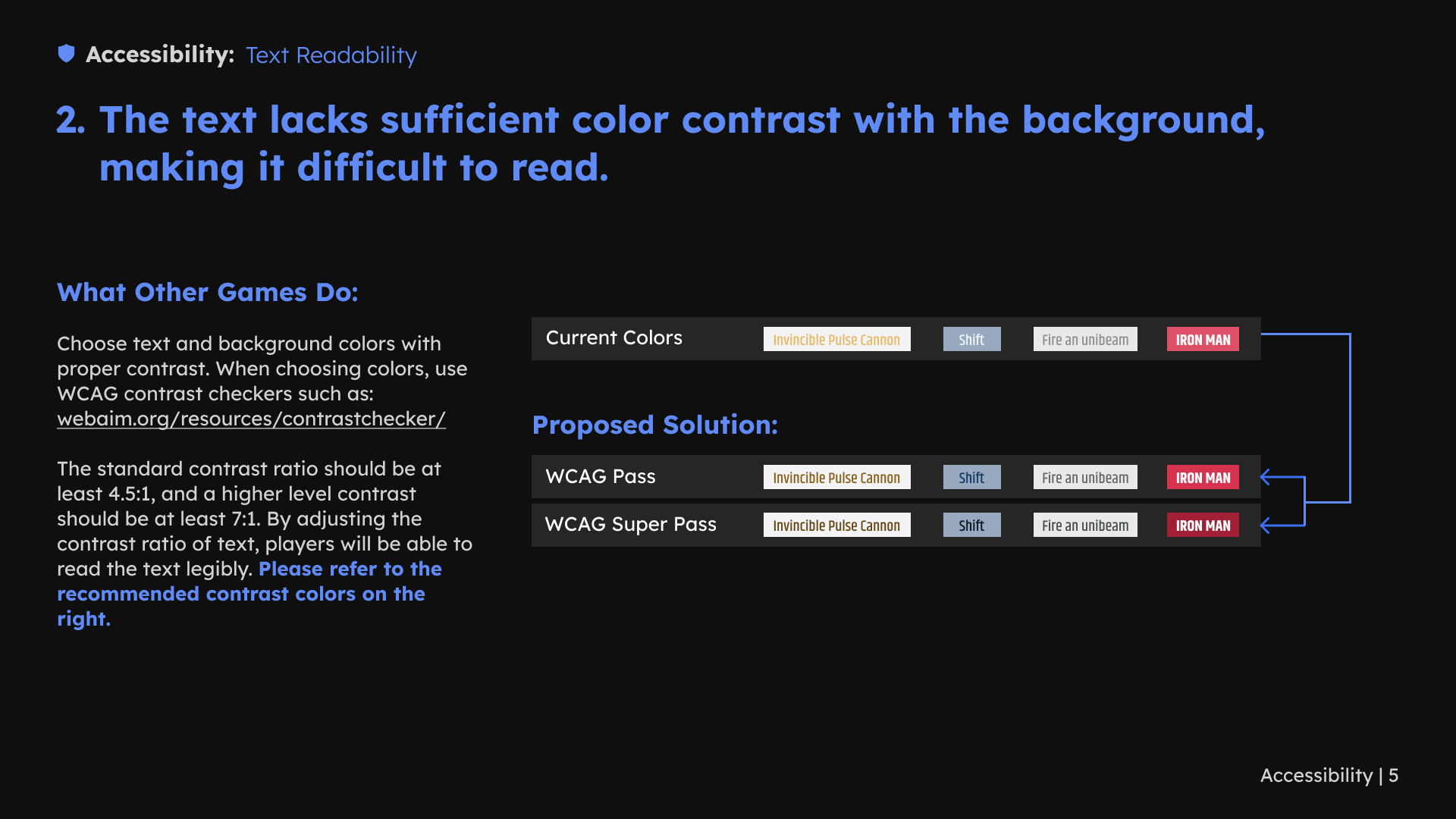
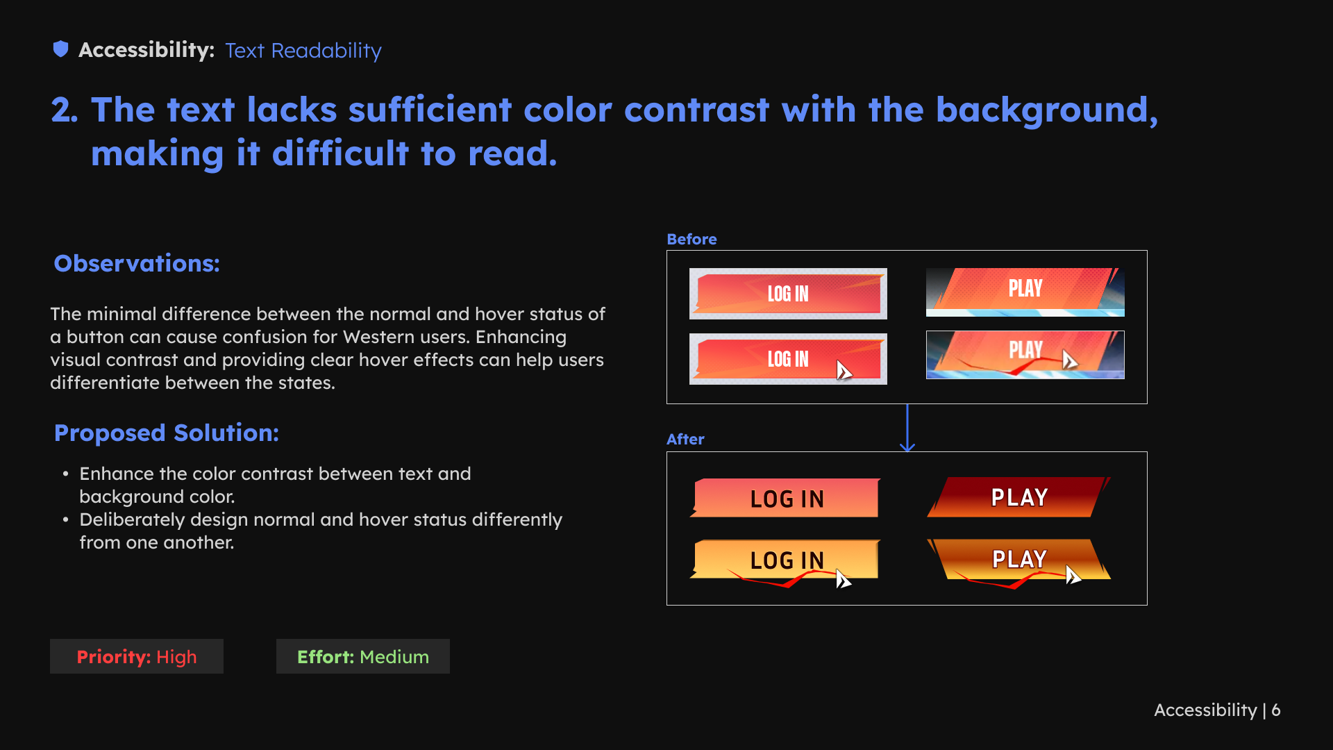
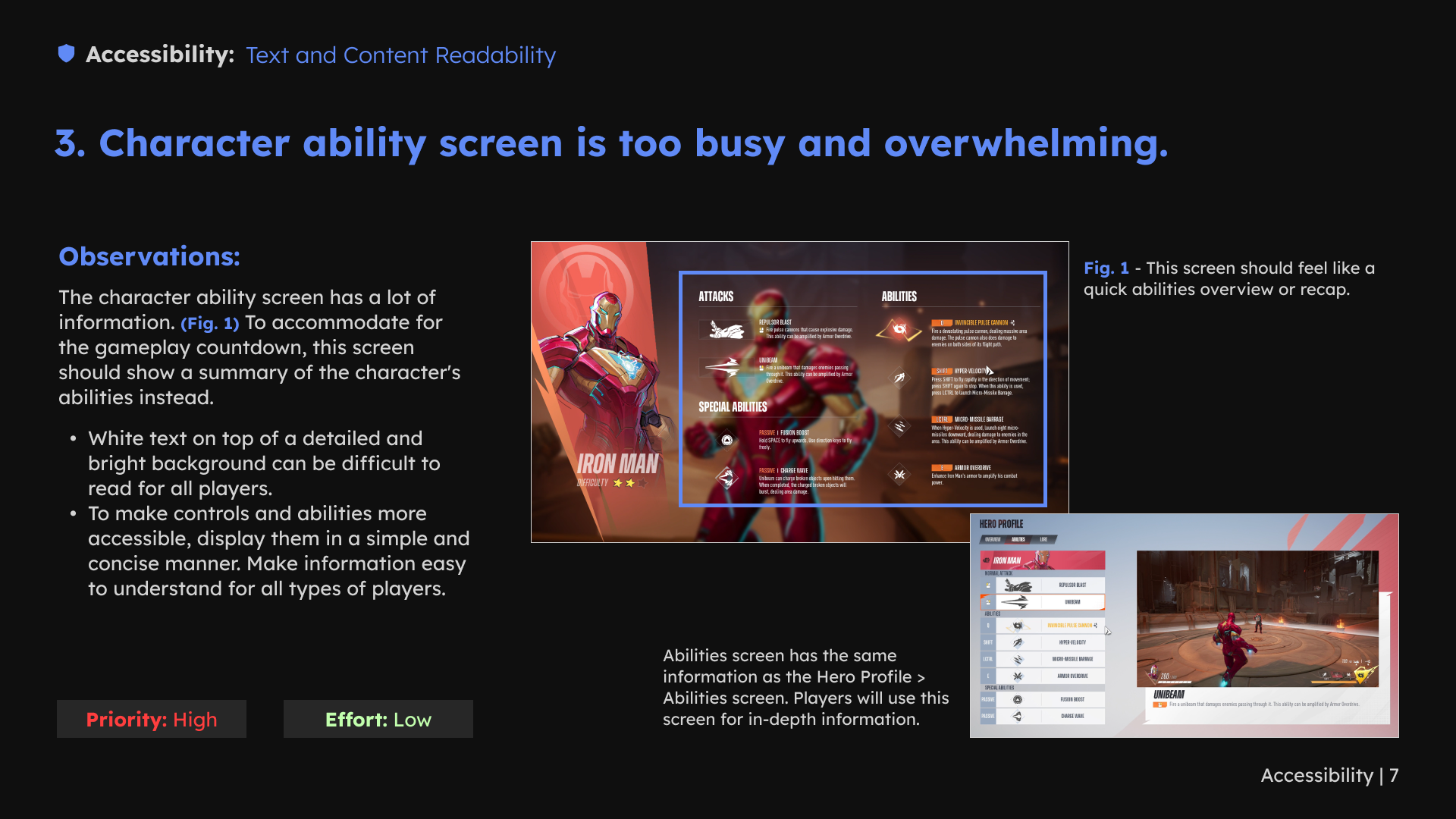
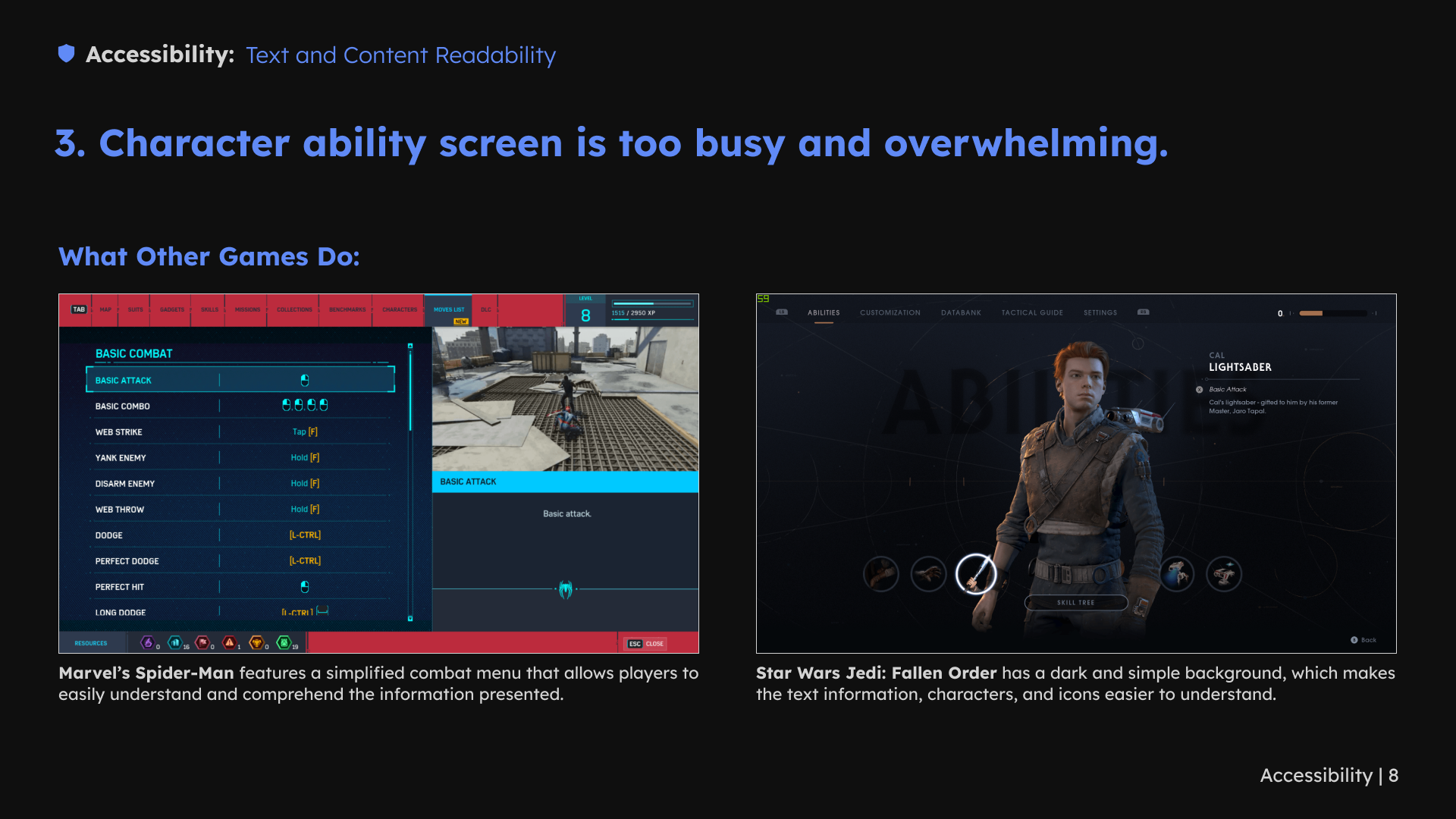
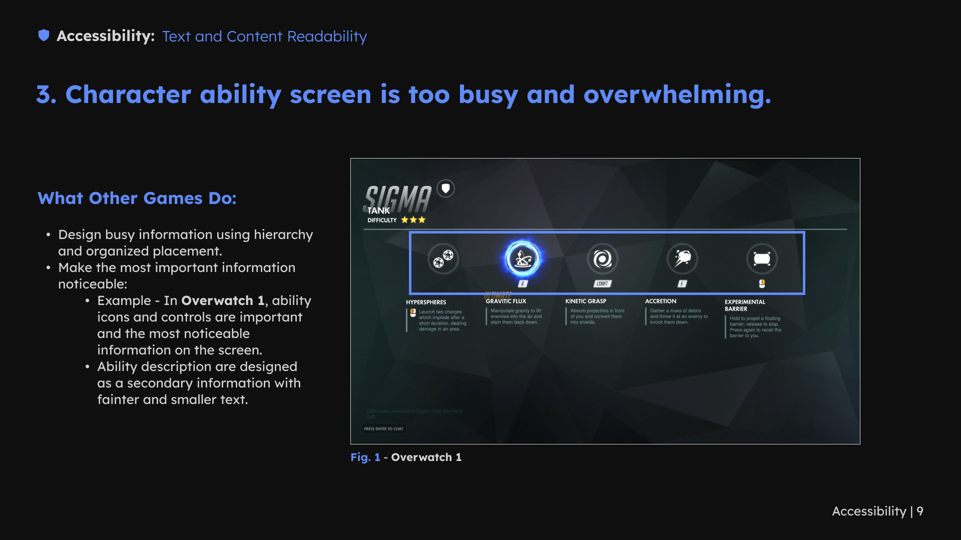
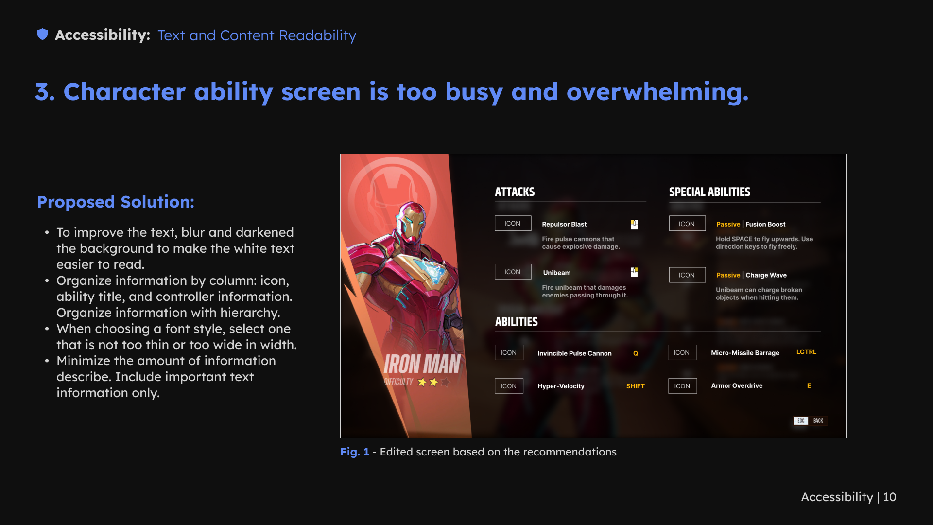
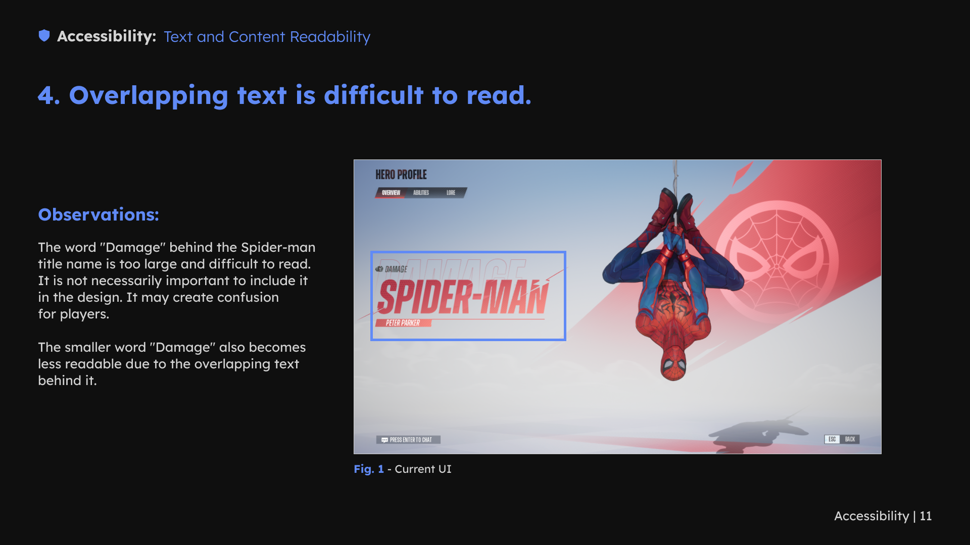
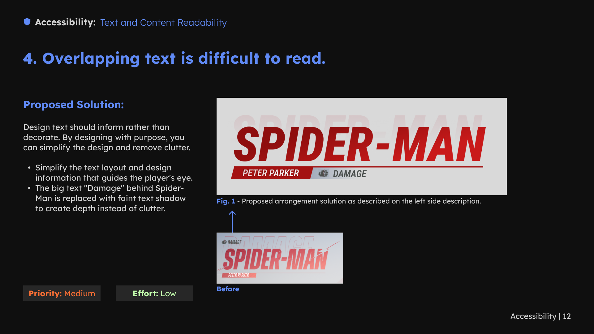
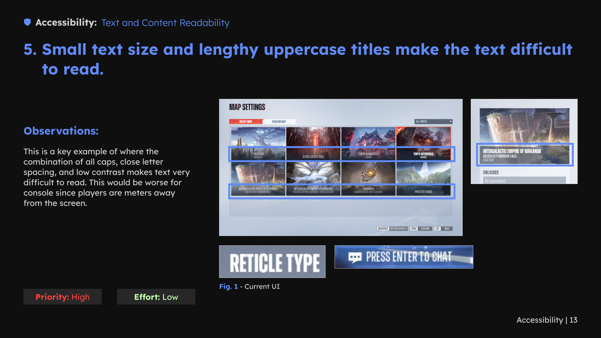
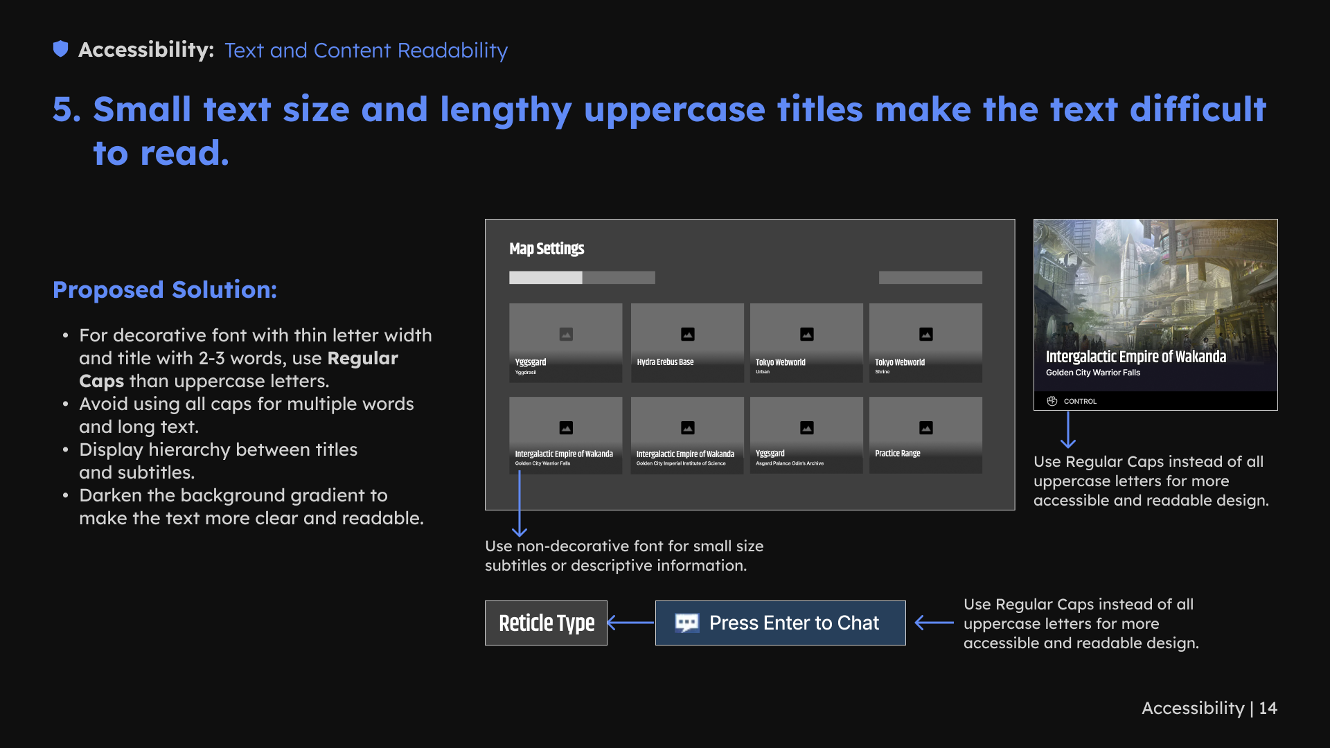
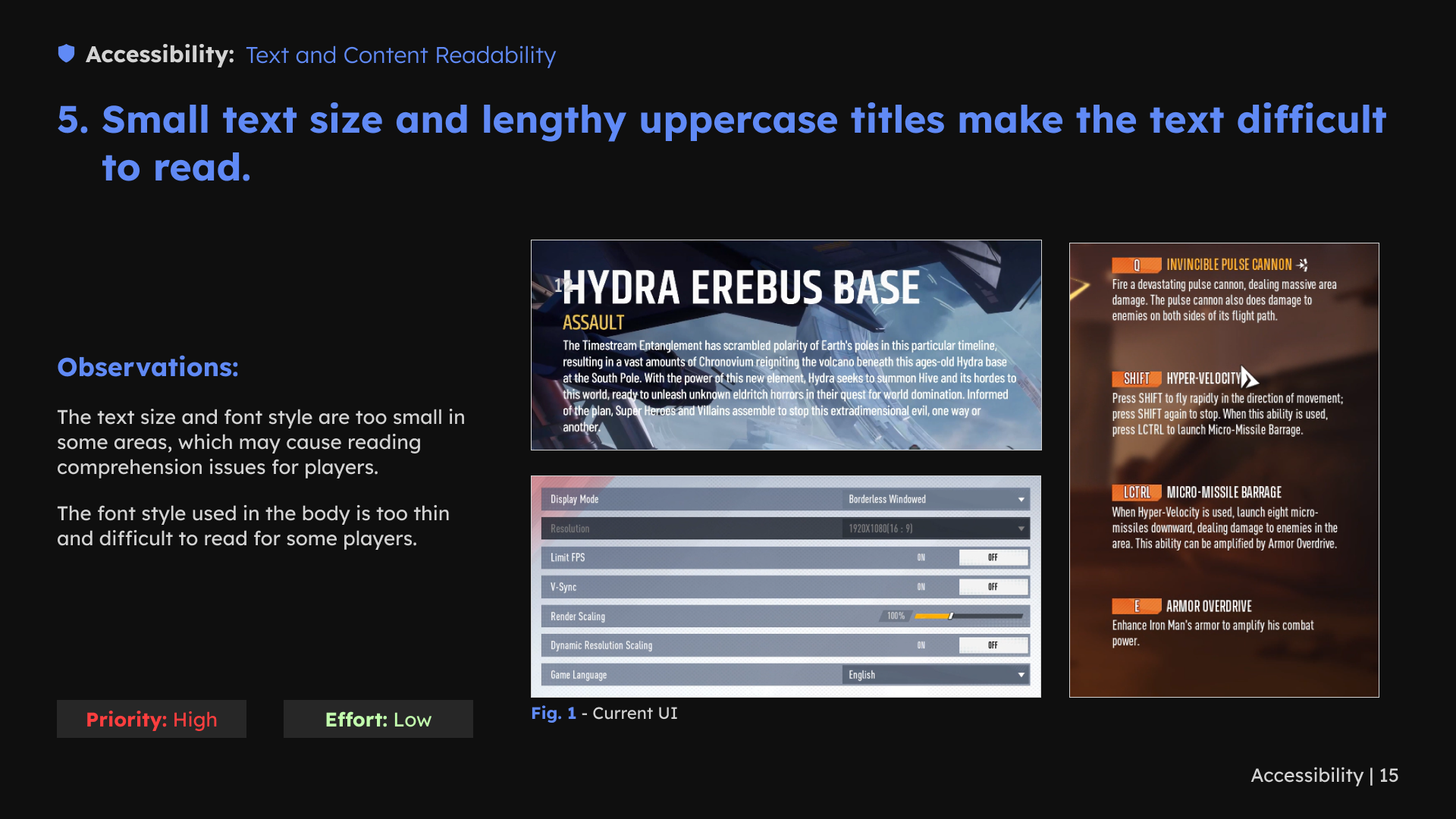
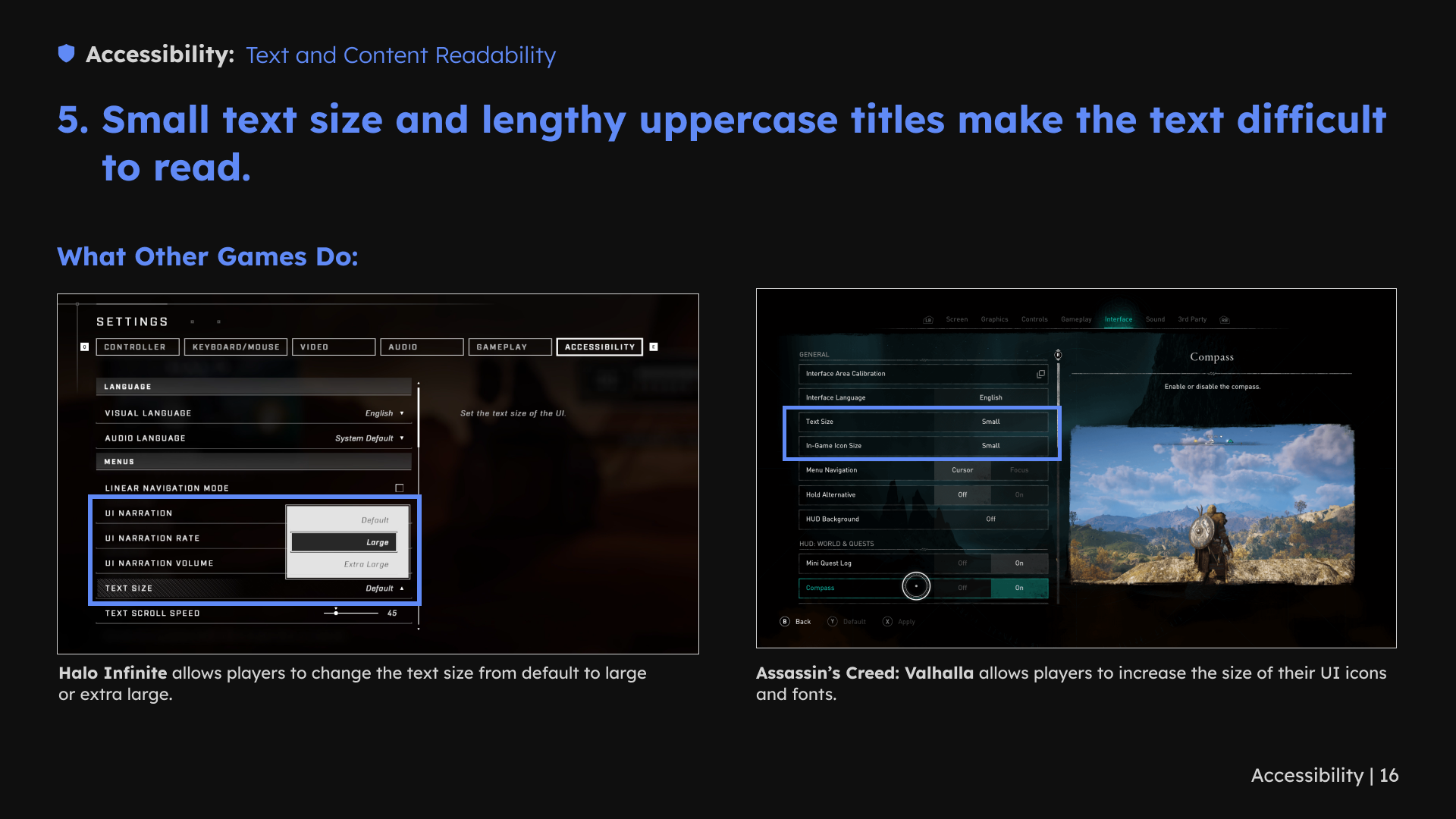
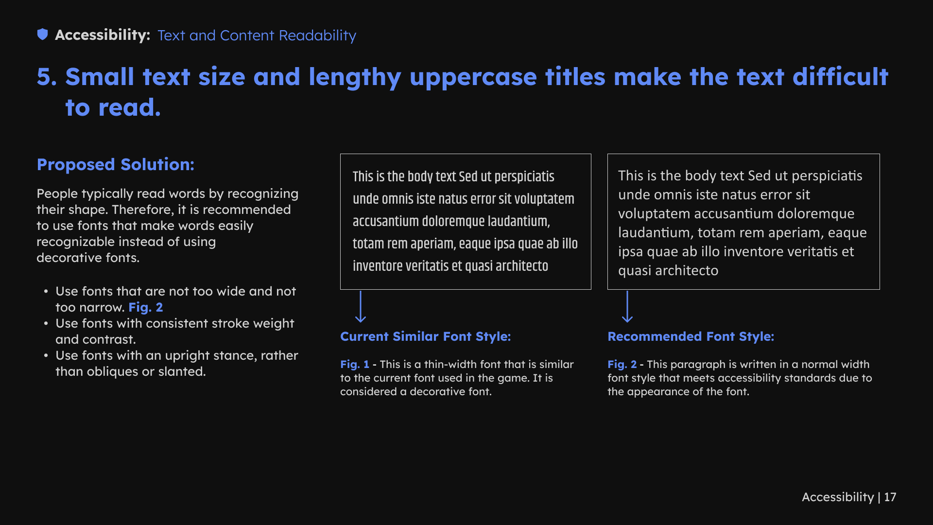
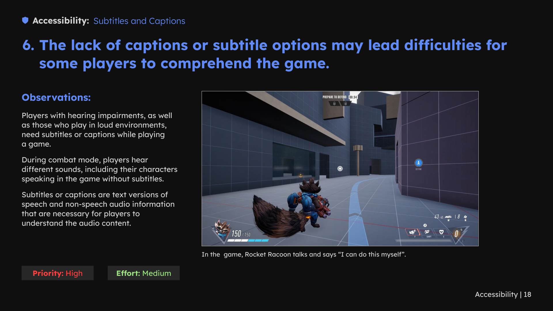
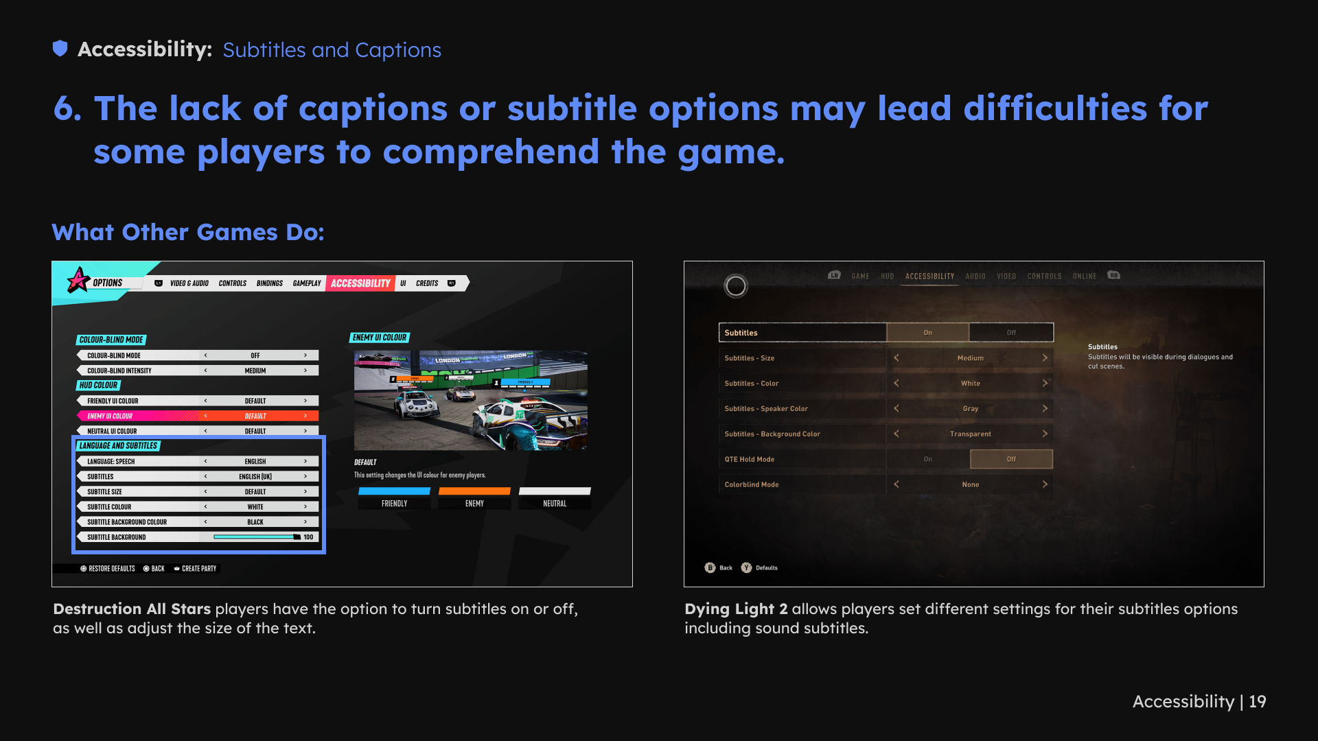
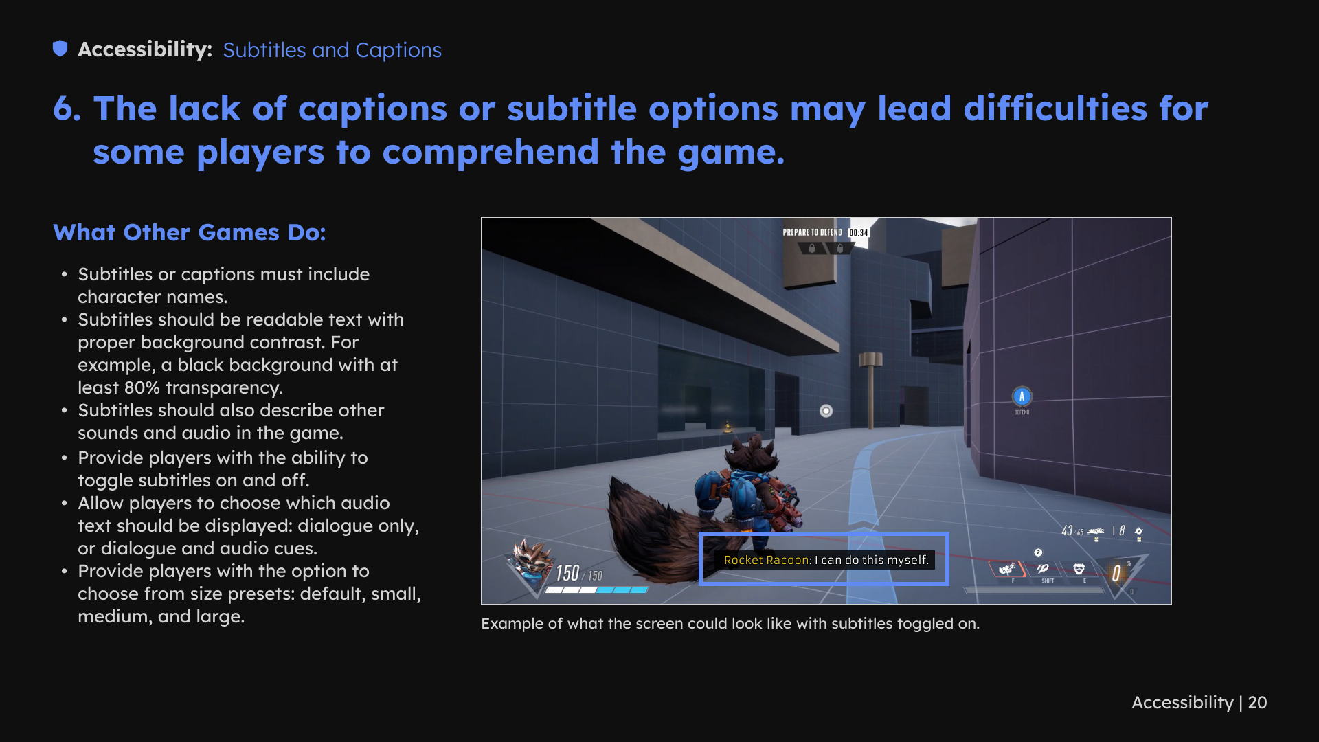
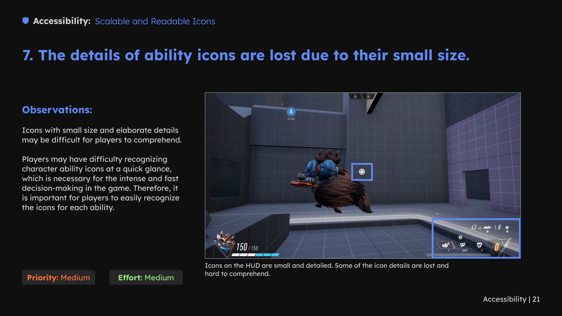
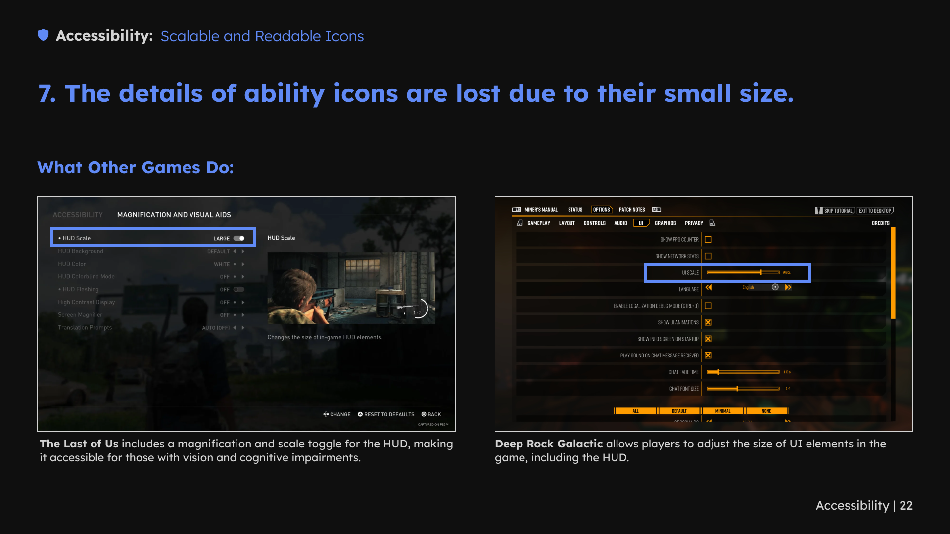
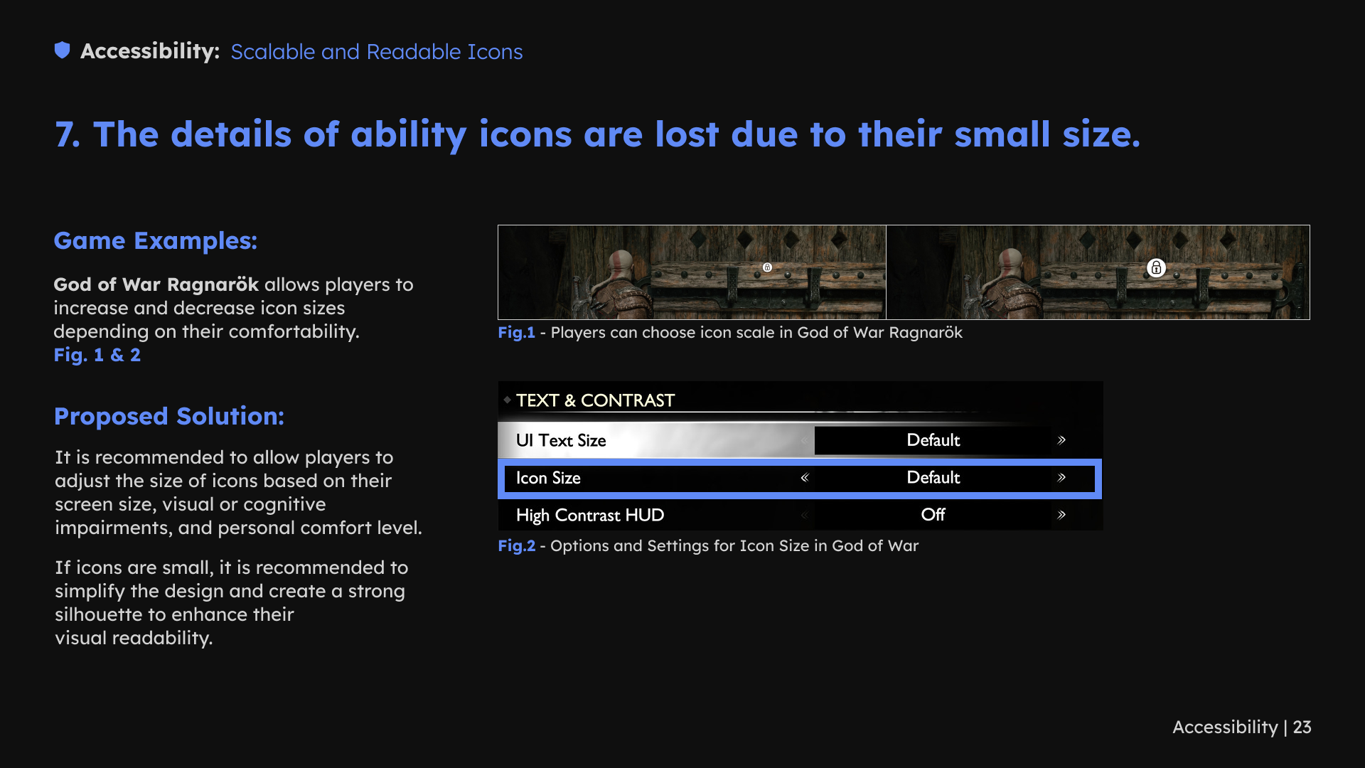
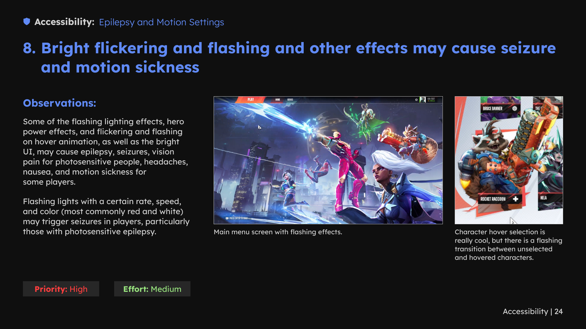
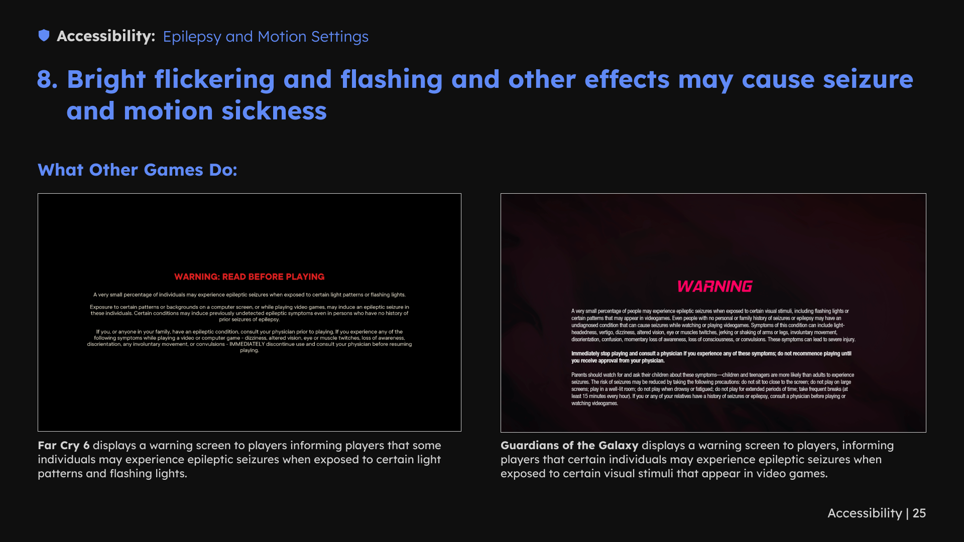
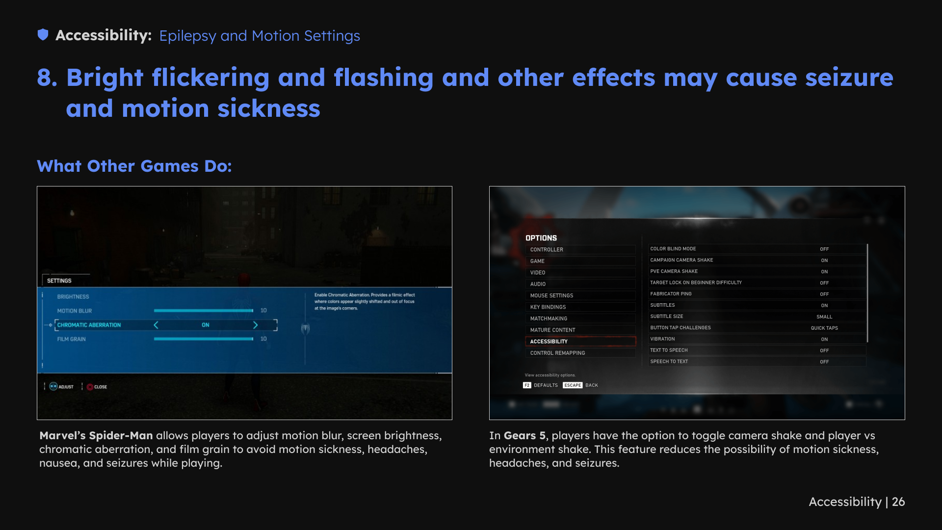
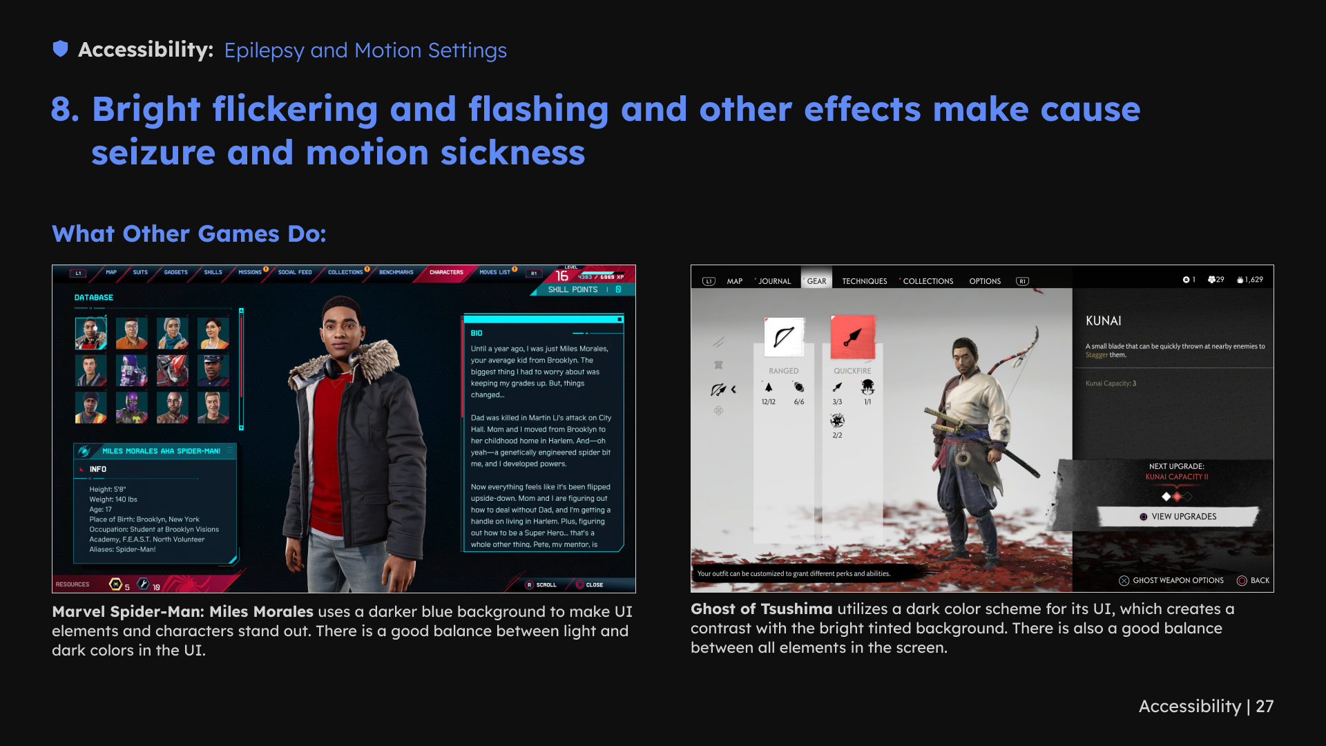
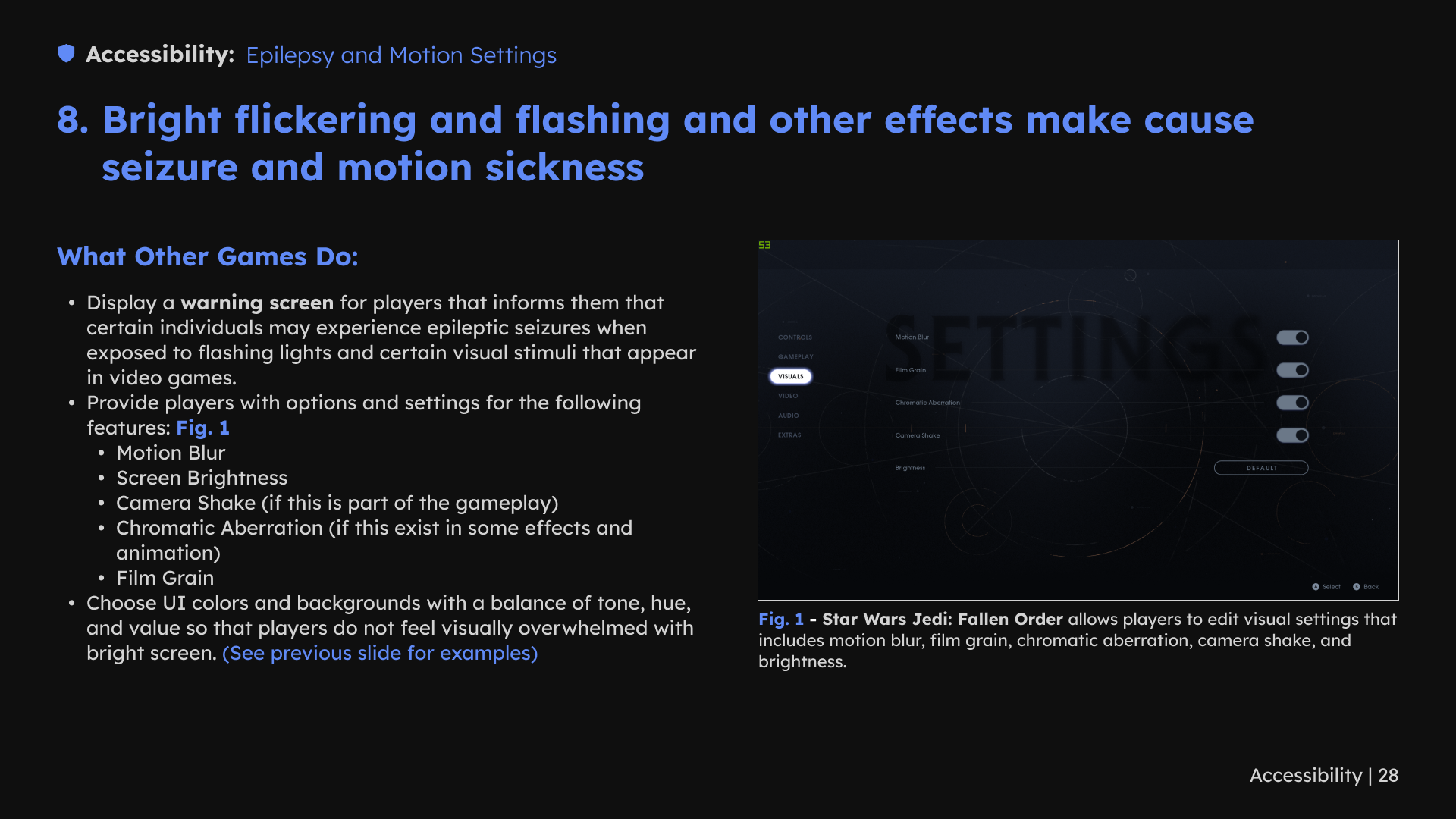
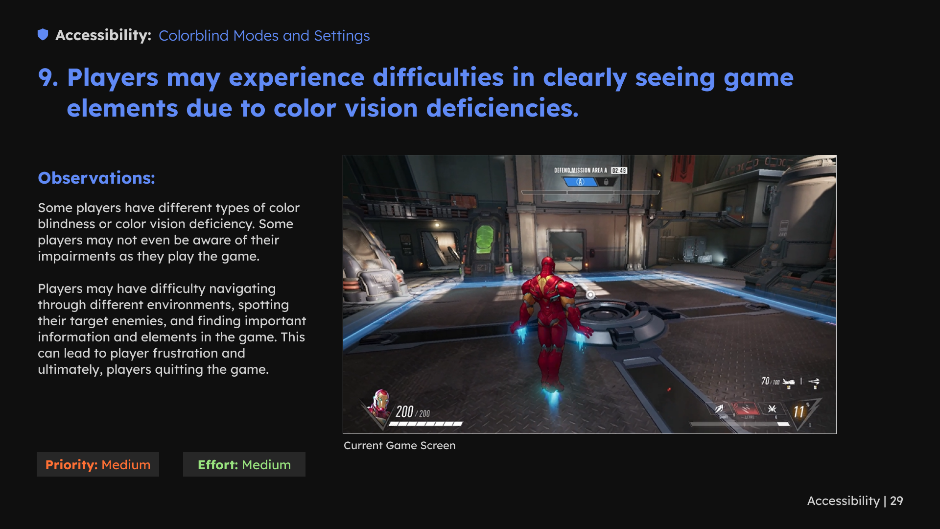
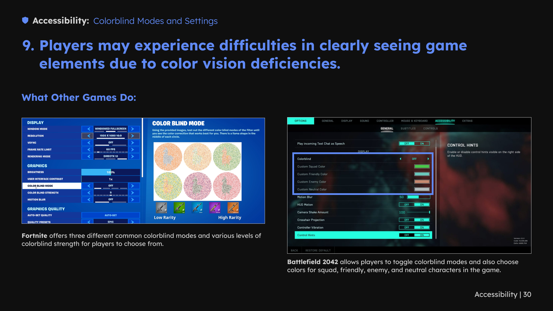
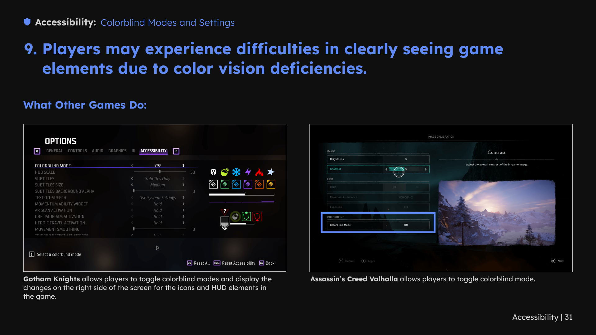
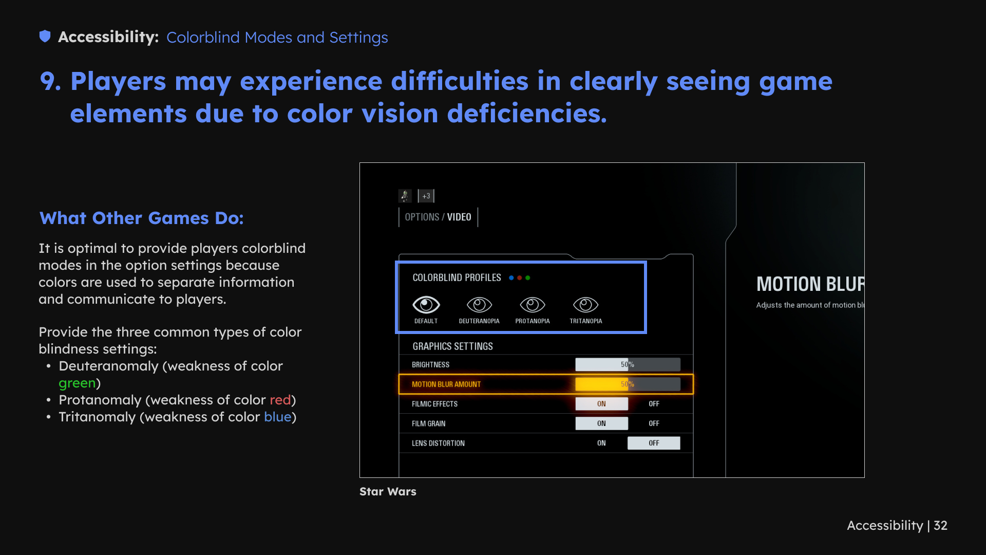
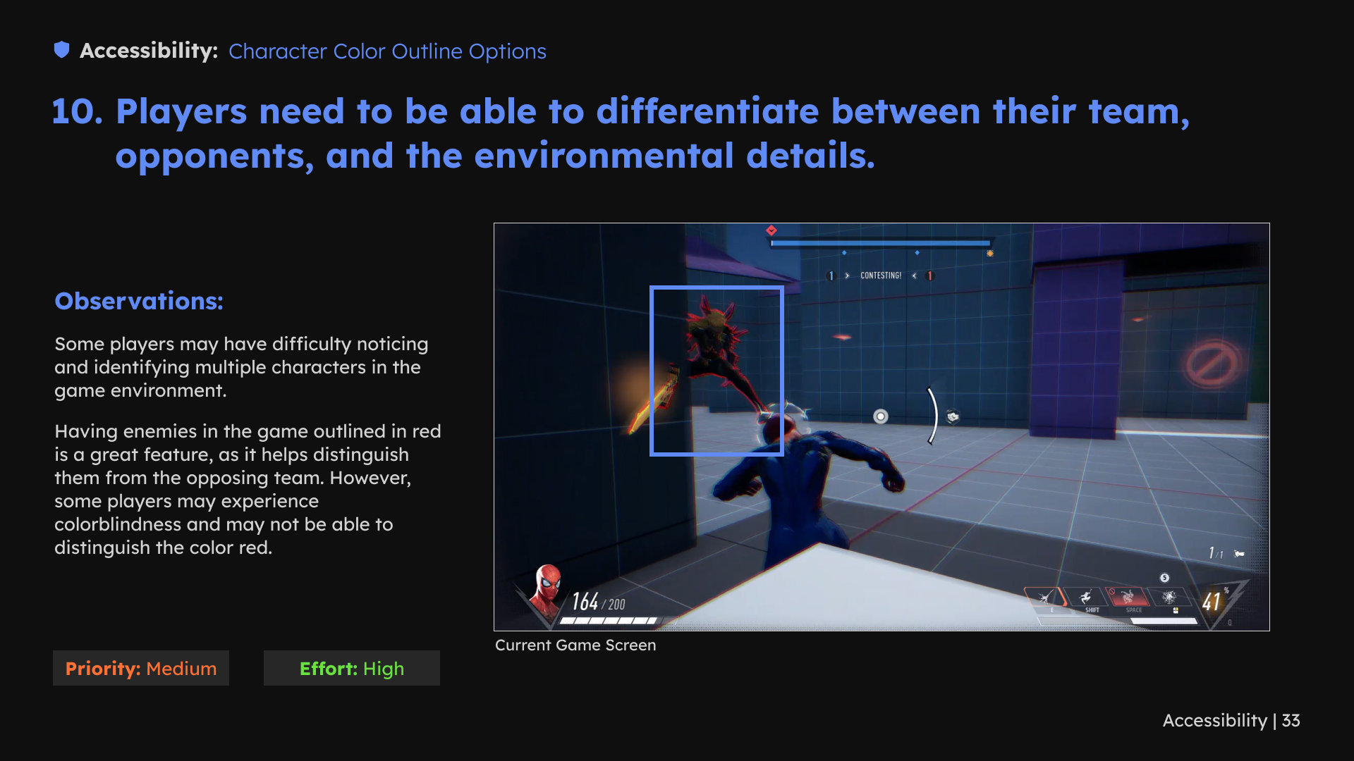
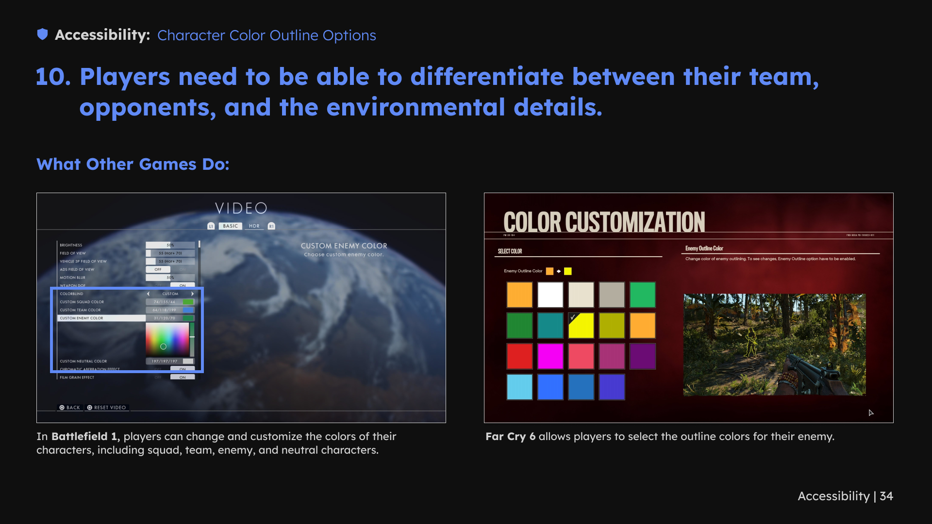
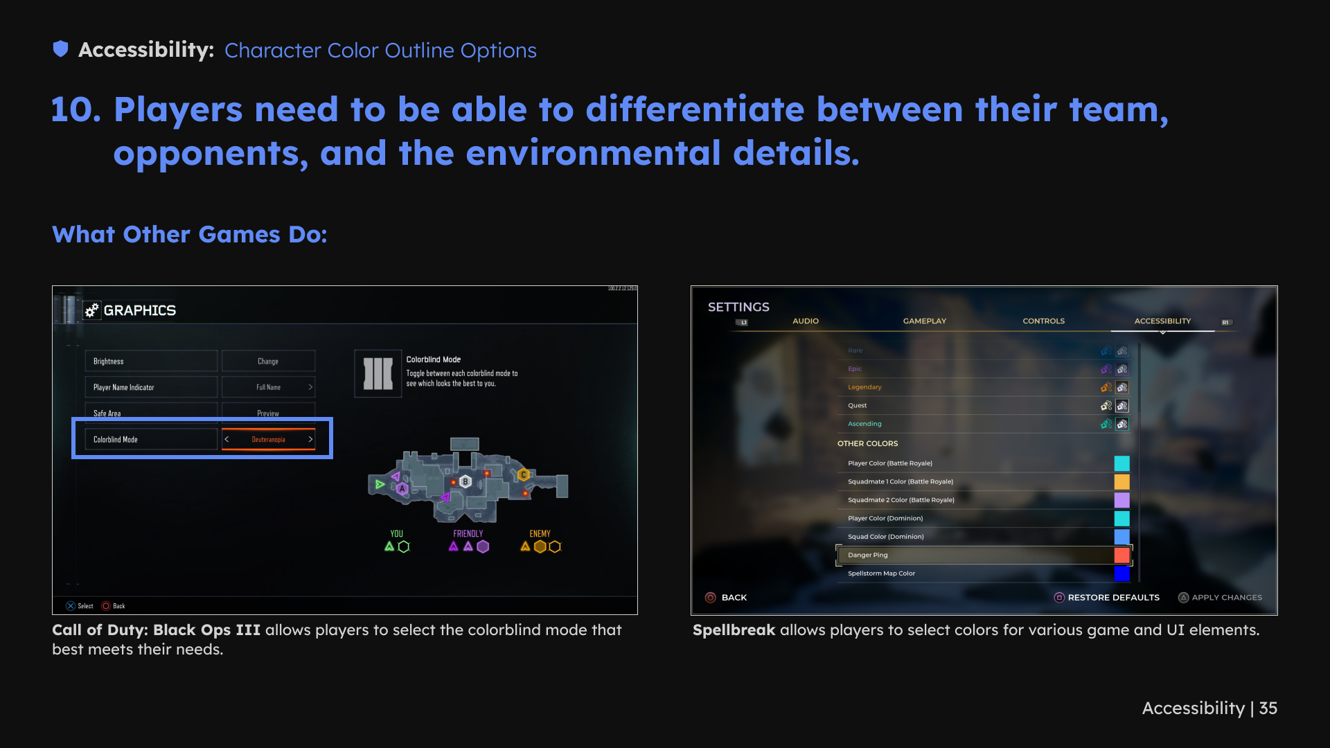
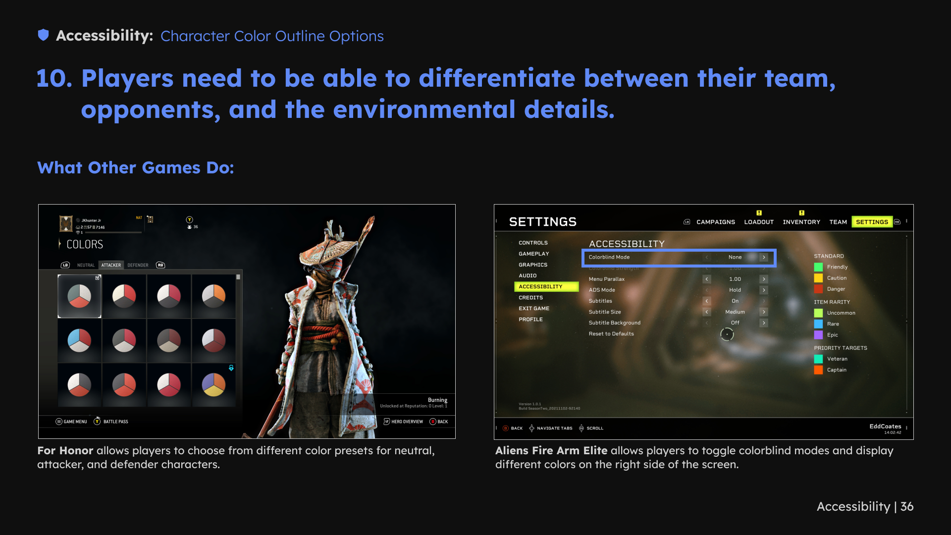
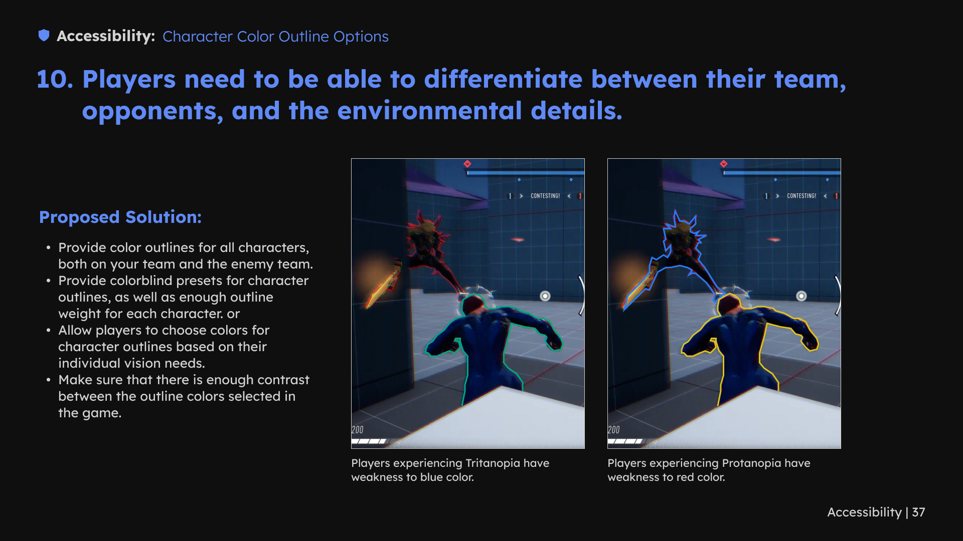
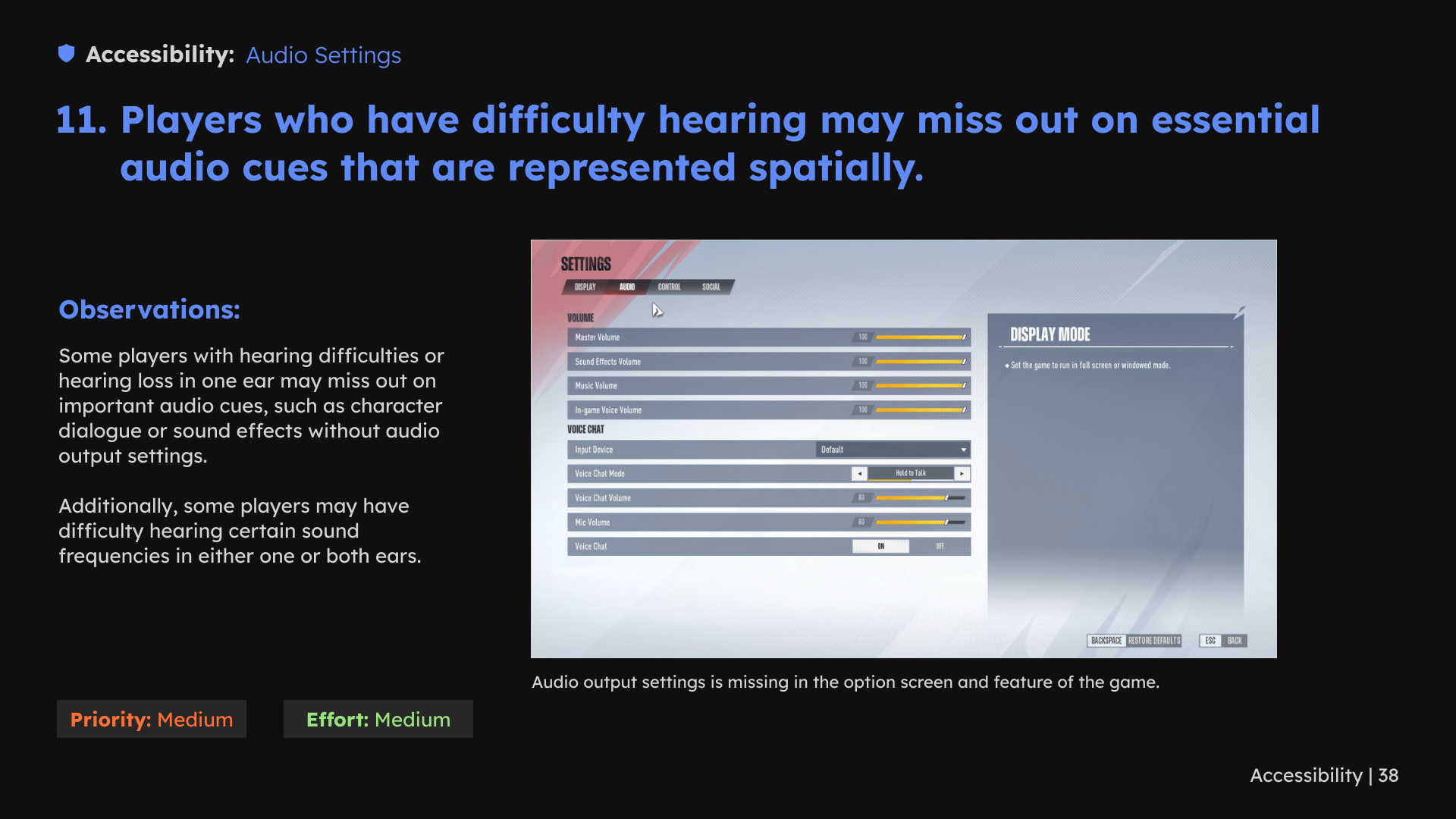
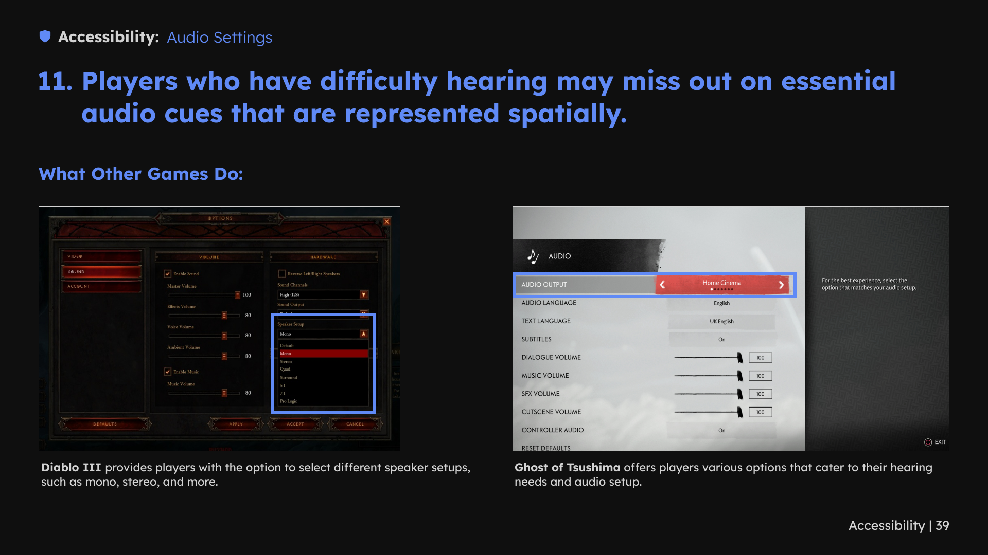
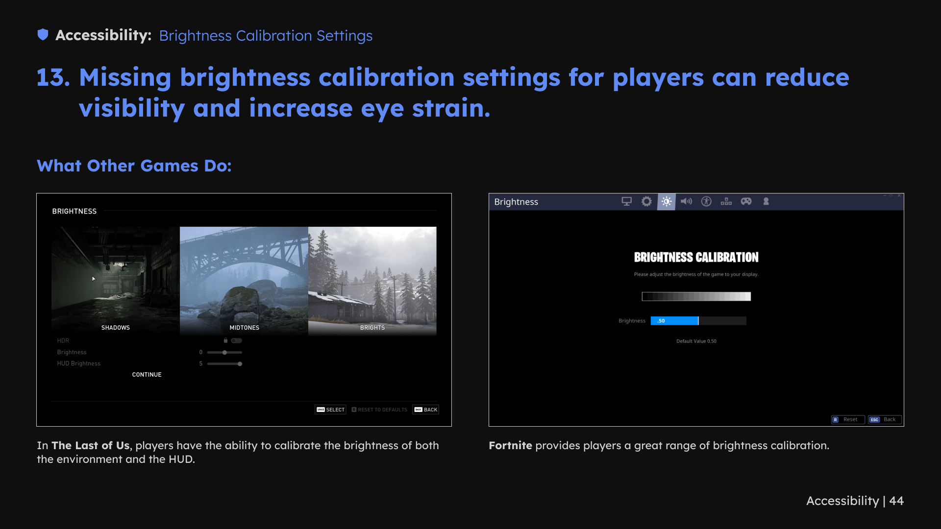
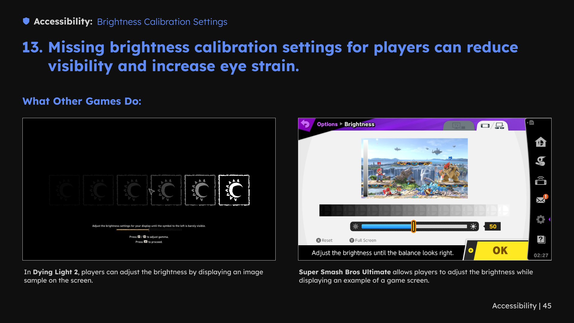
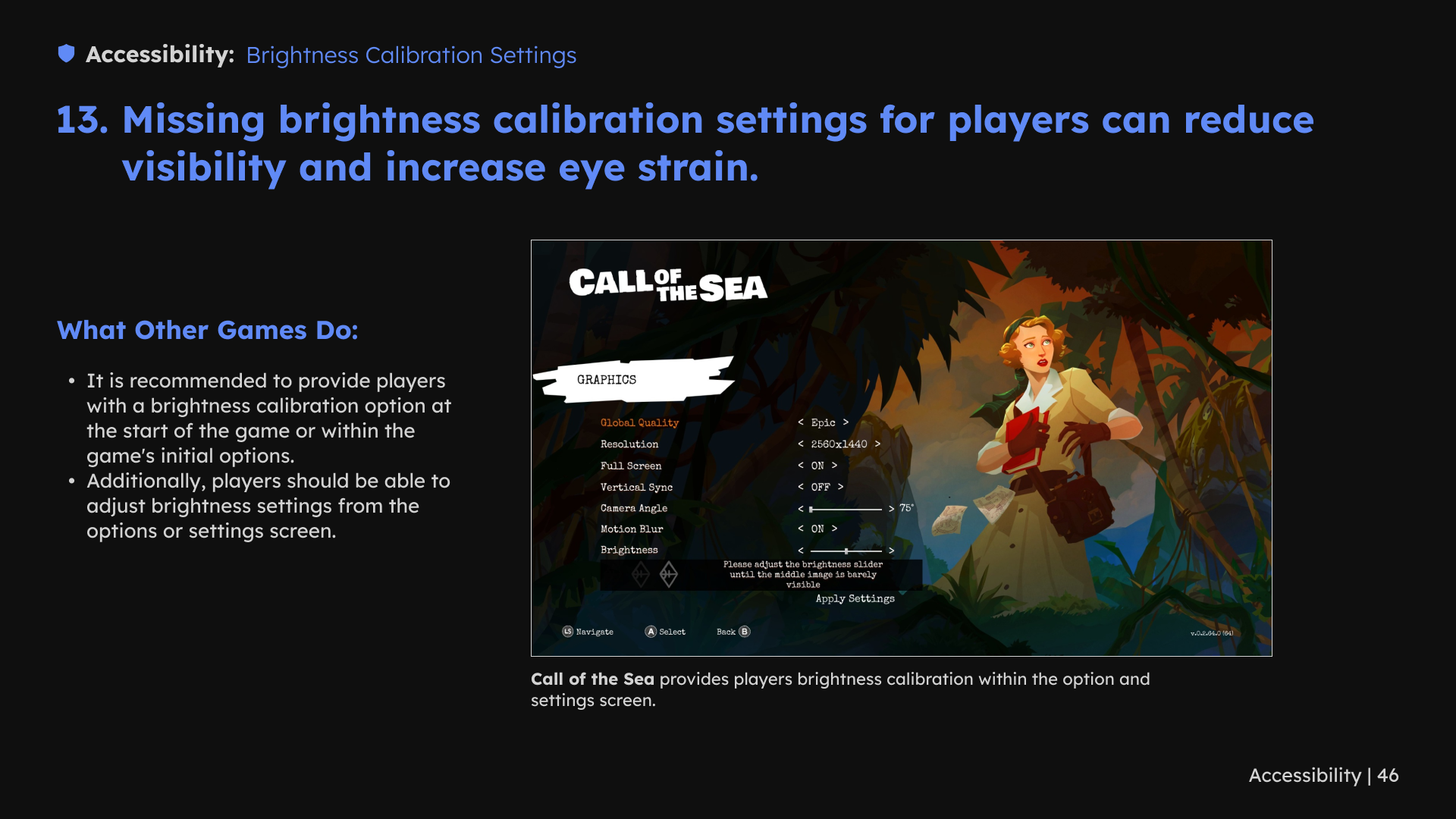
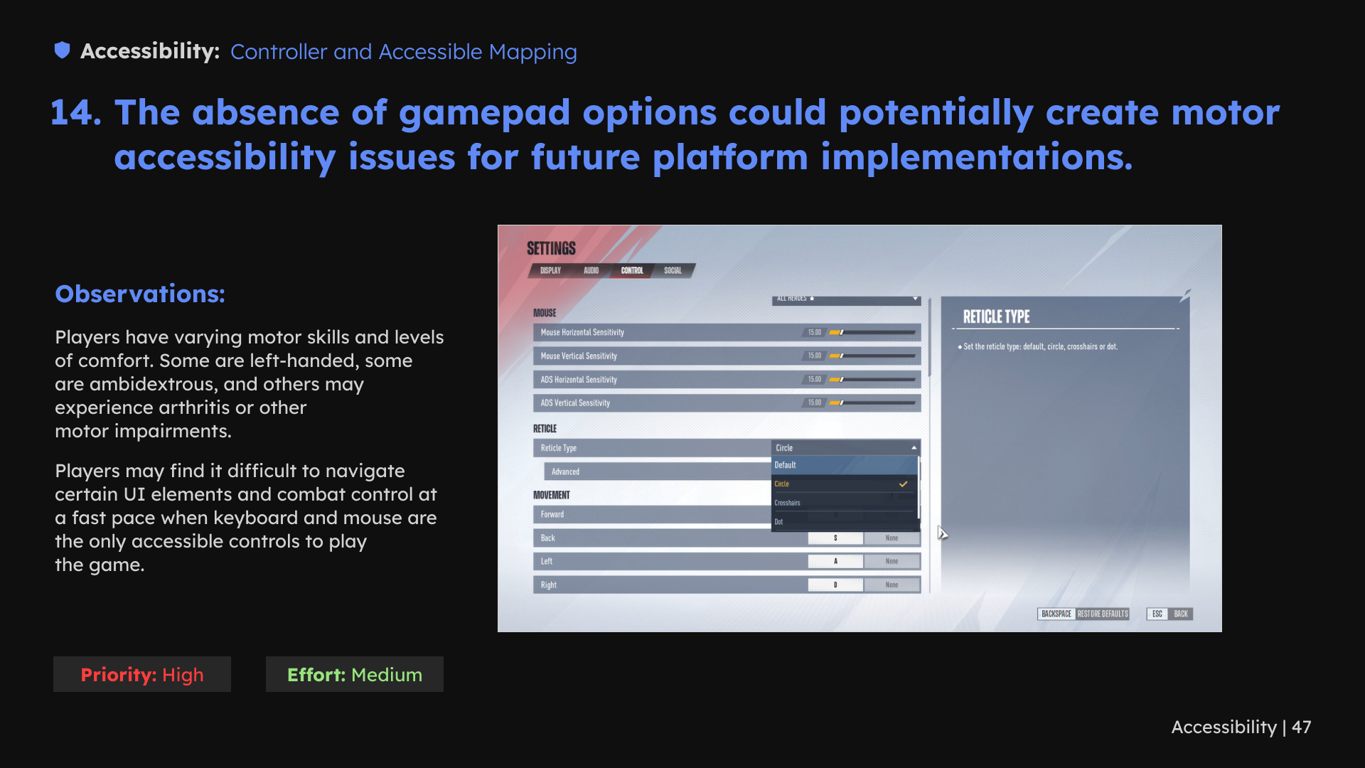
I reviewed text readability, captions, UI scaling, color differentiation, motion and flashing effects, audio options, brightness and controller settings. For loading-screen text, the review used examples of quieter backgrounds and clearer separation between text and imagery.
The review identified areas for design exploration and further accessibility testing. Comparative examples informed the recommendations alongside the game’s own interaction needs.
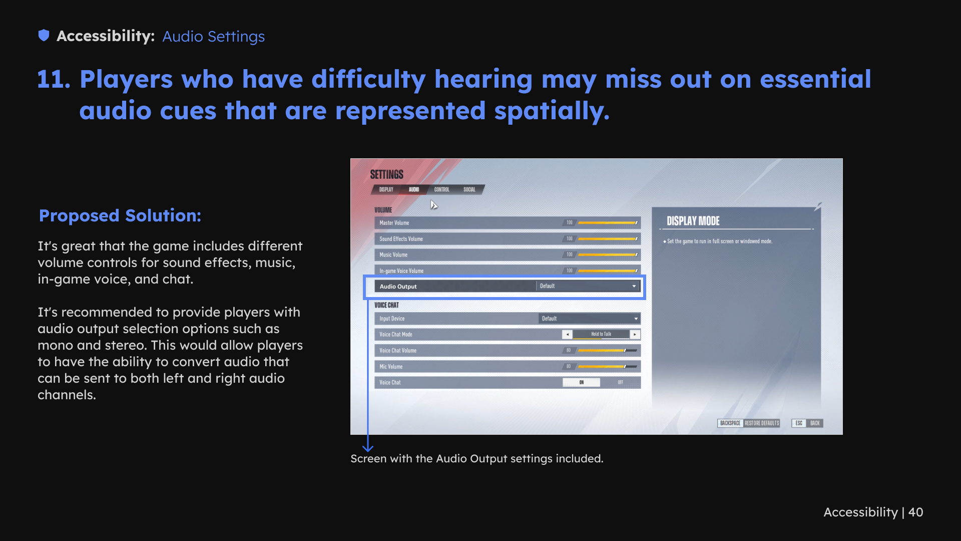
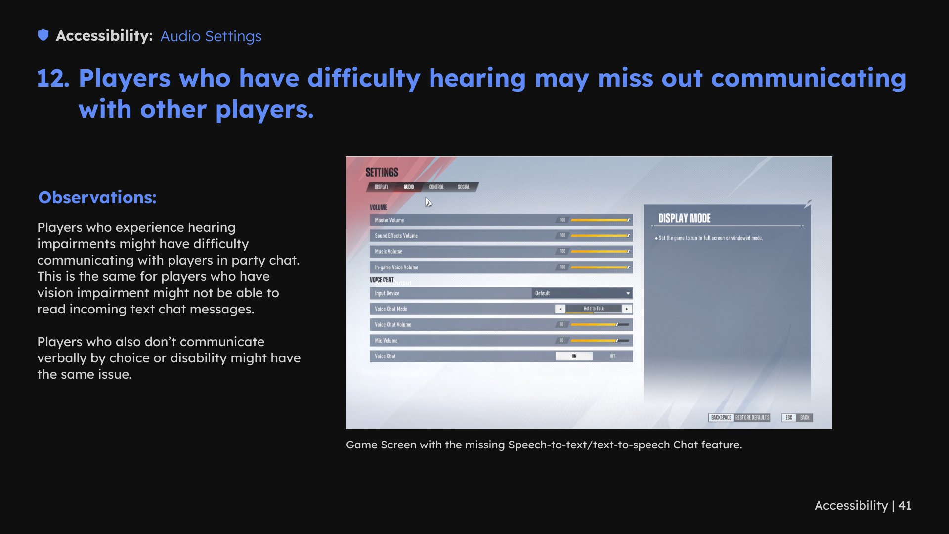
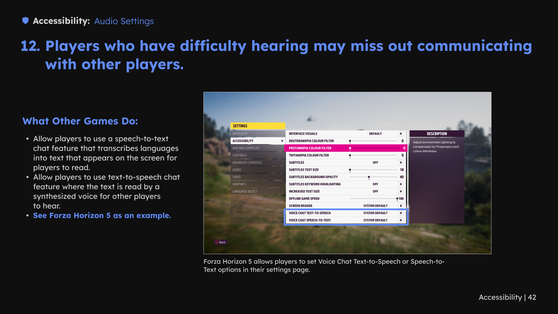
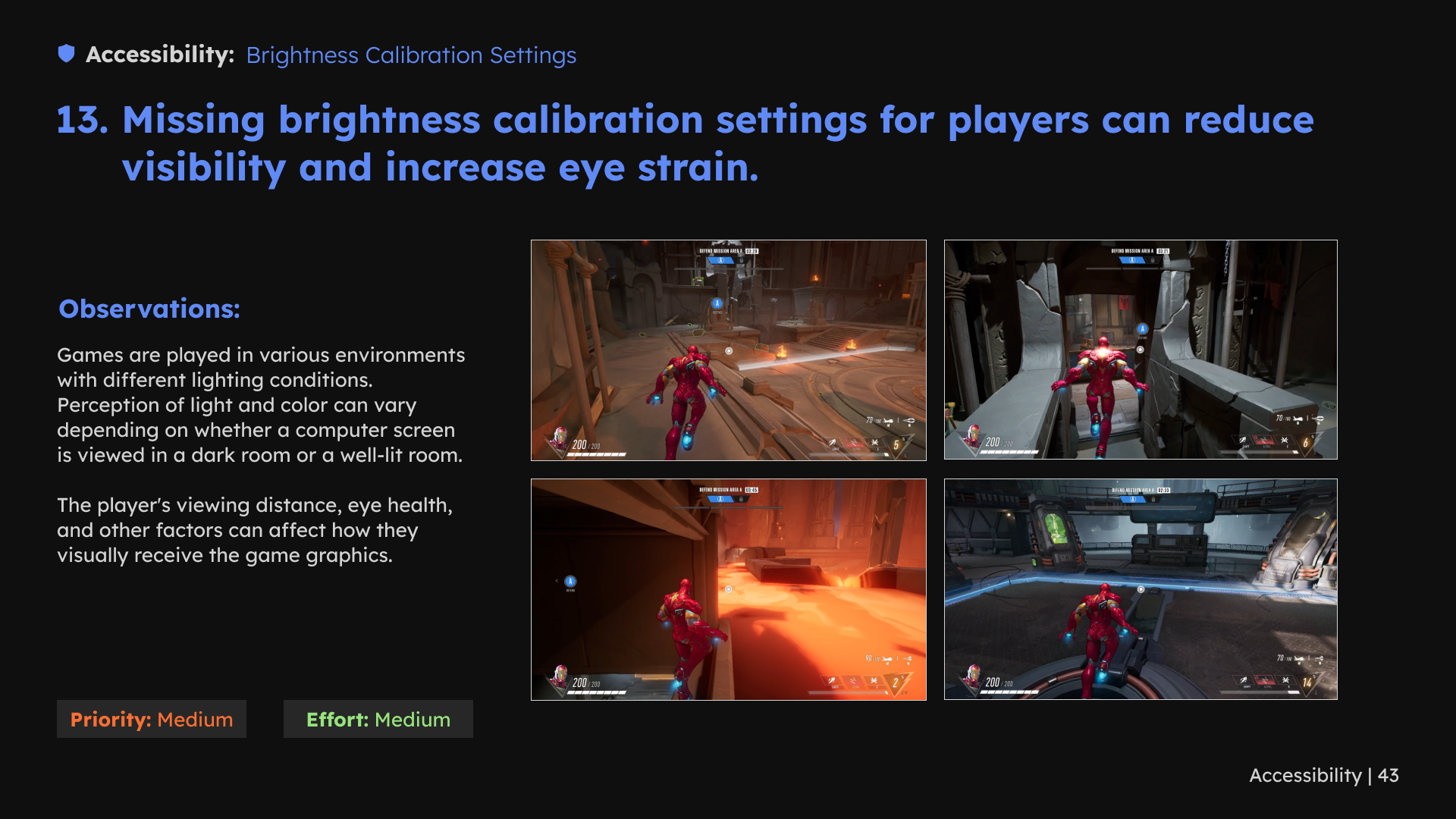
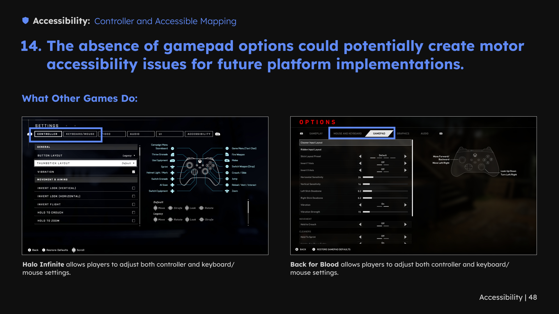
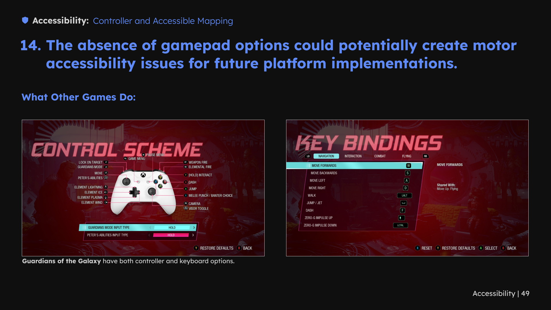
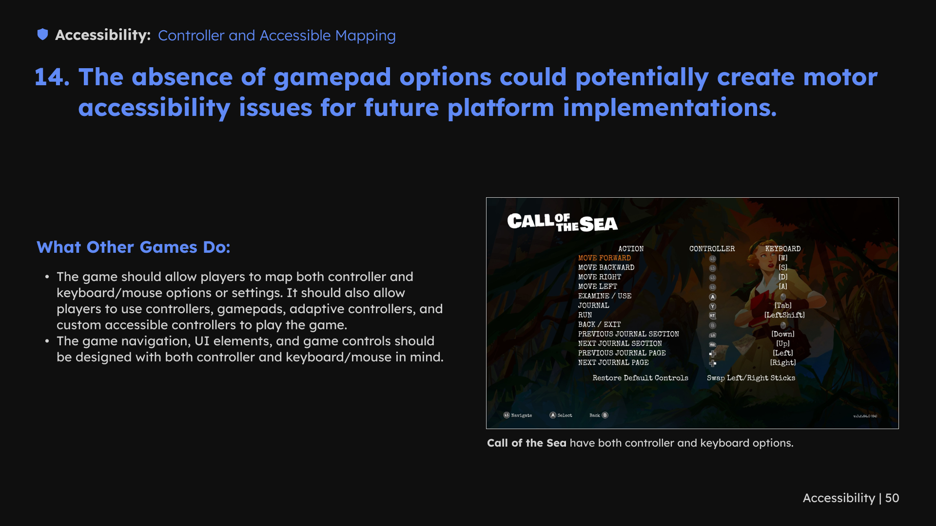
1 / 50 · Select a slide to view full size
5. Support social play and platform adaptation
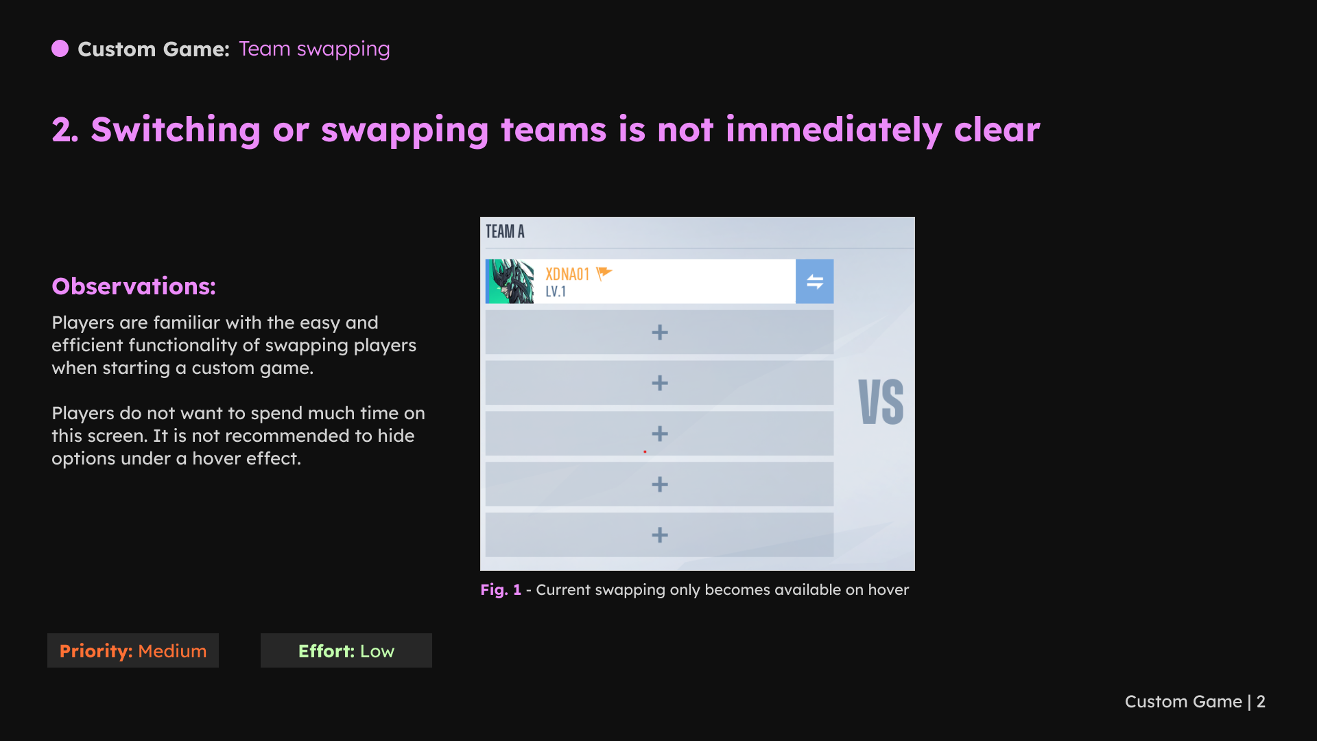
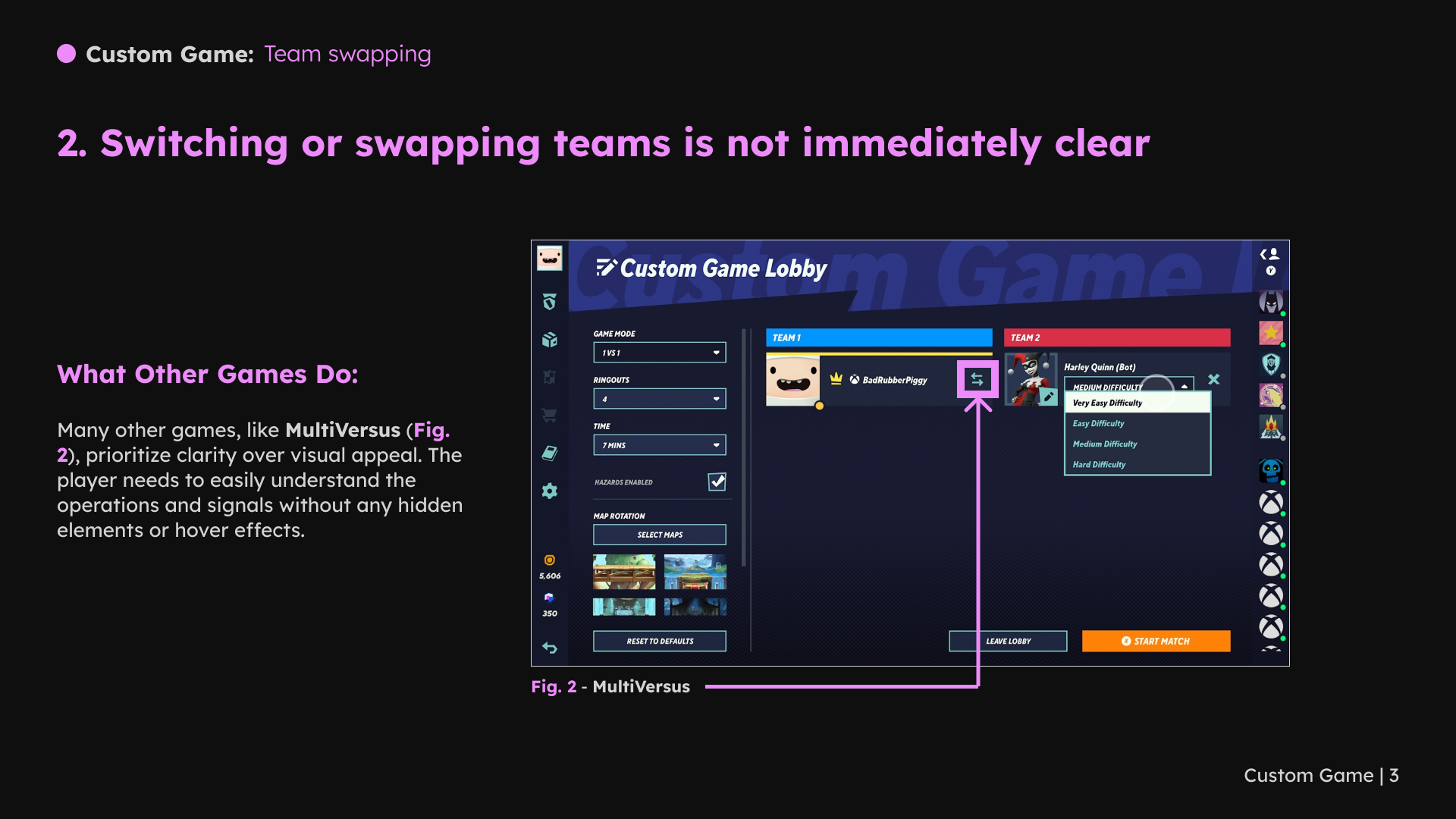
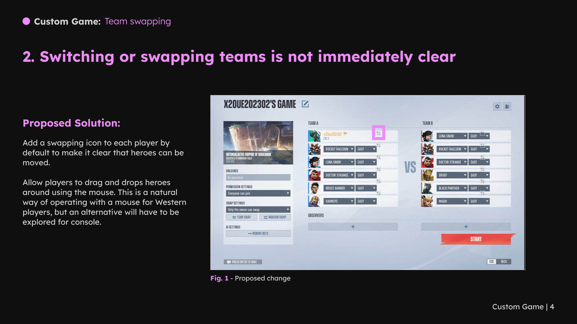
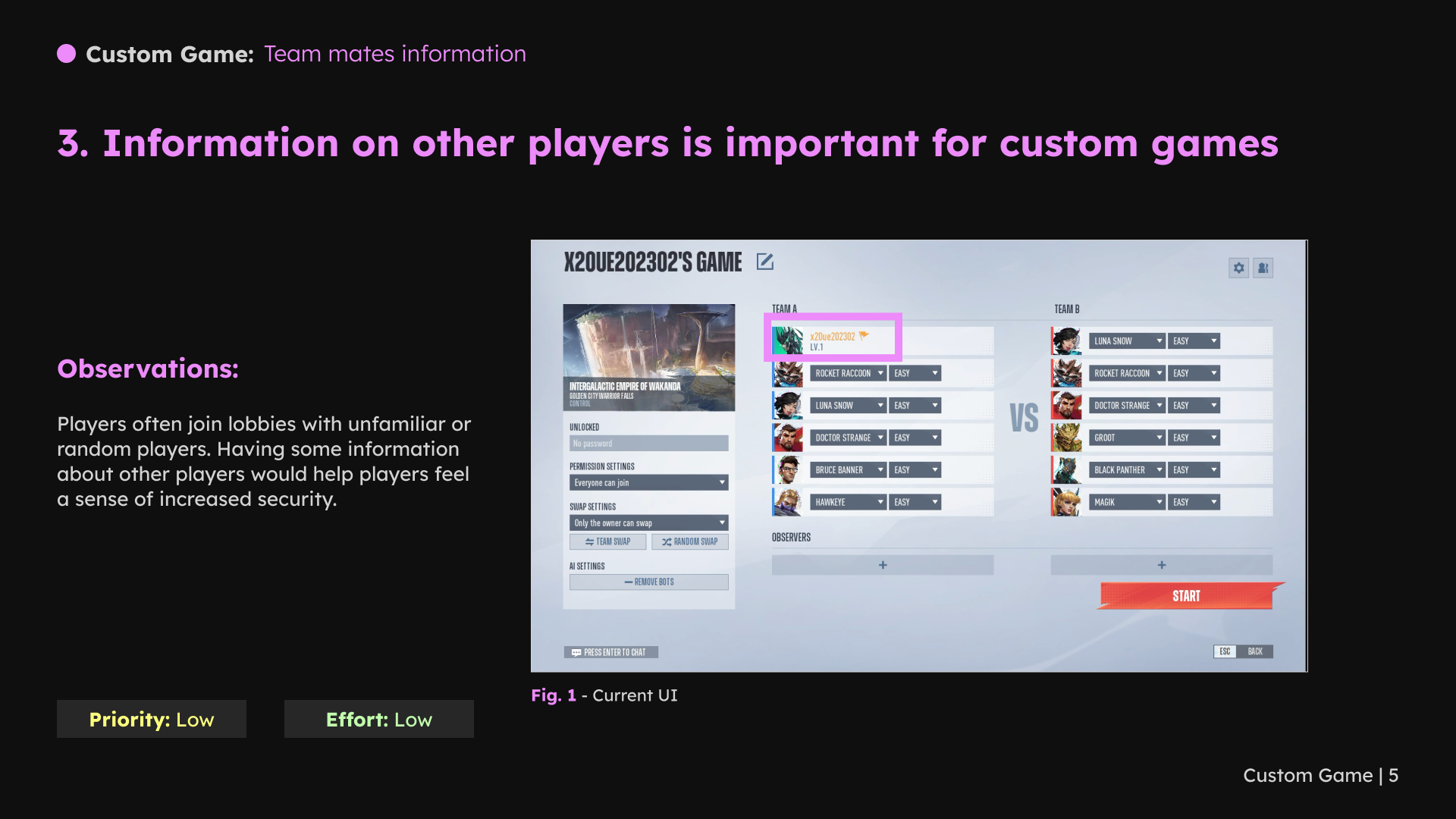
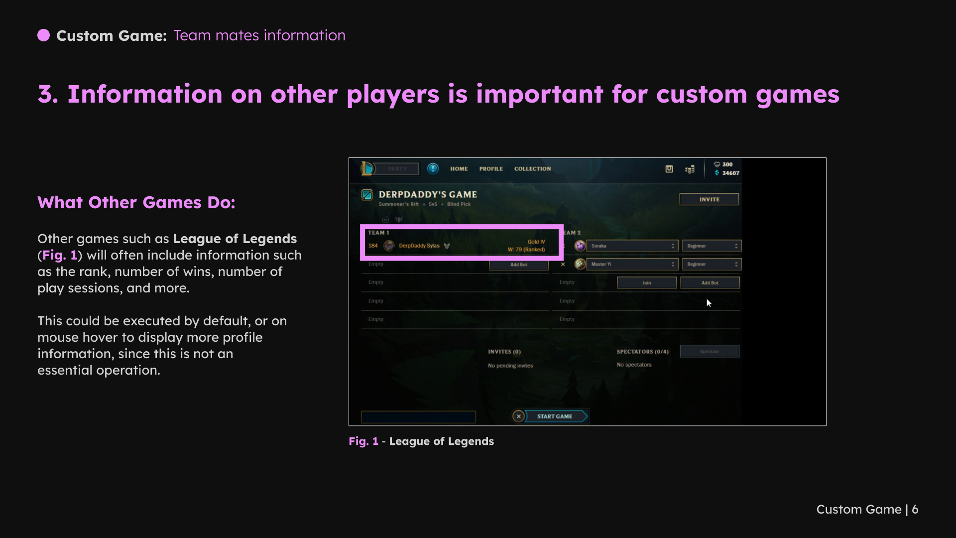
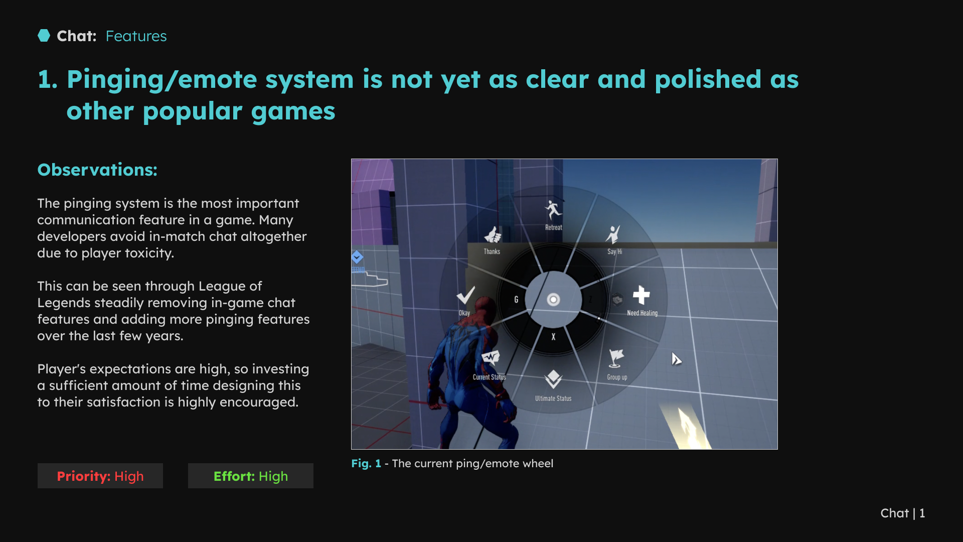
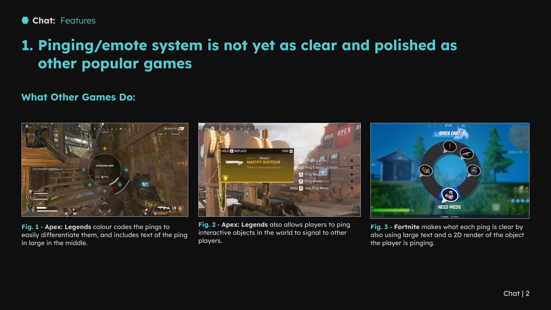
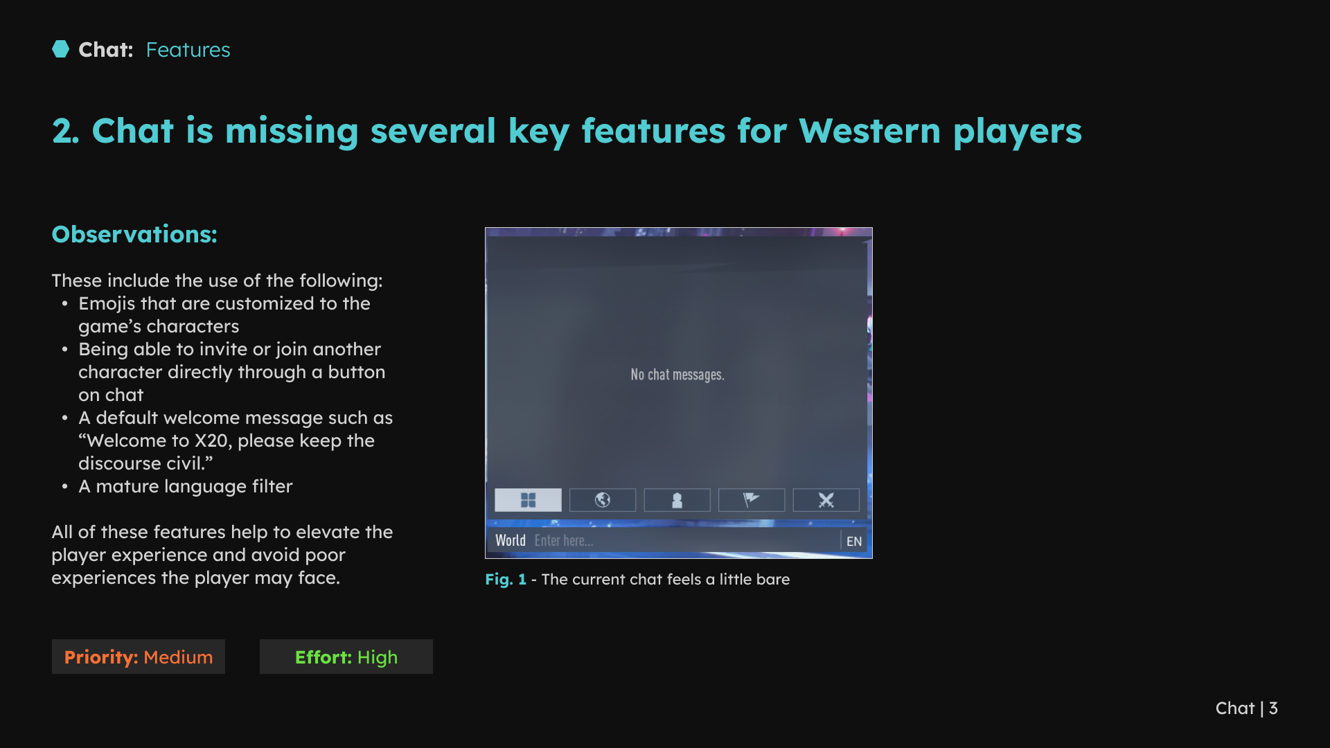
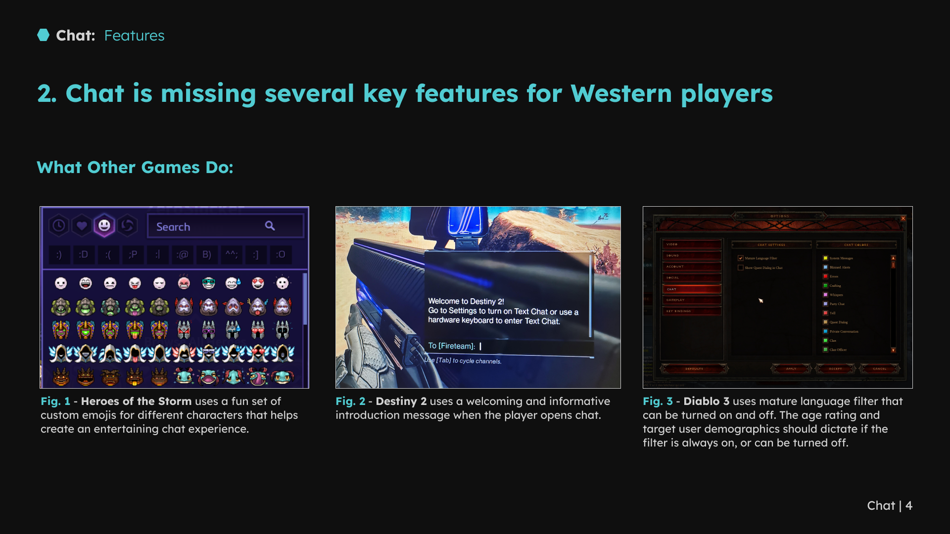
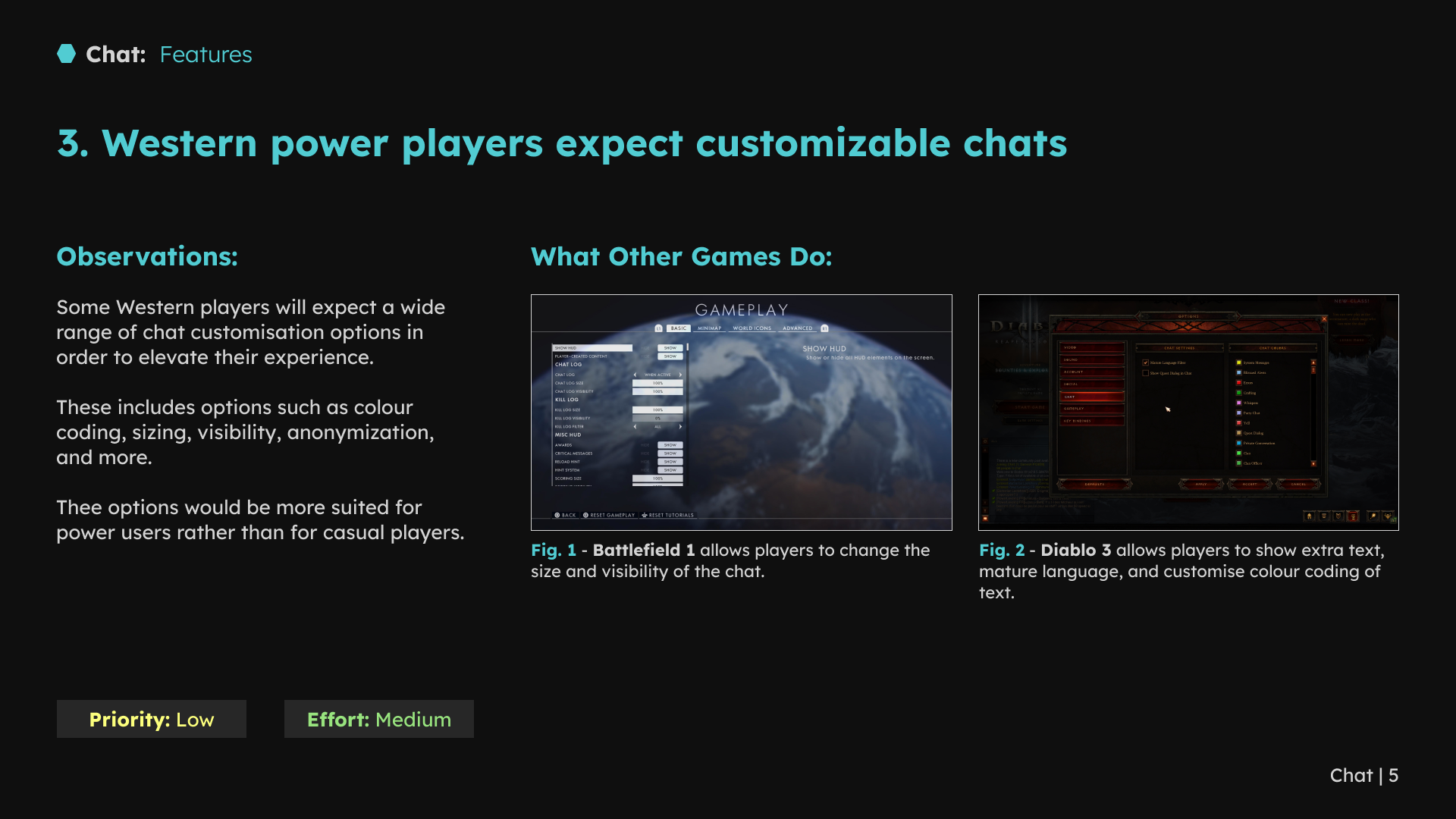
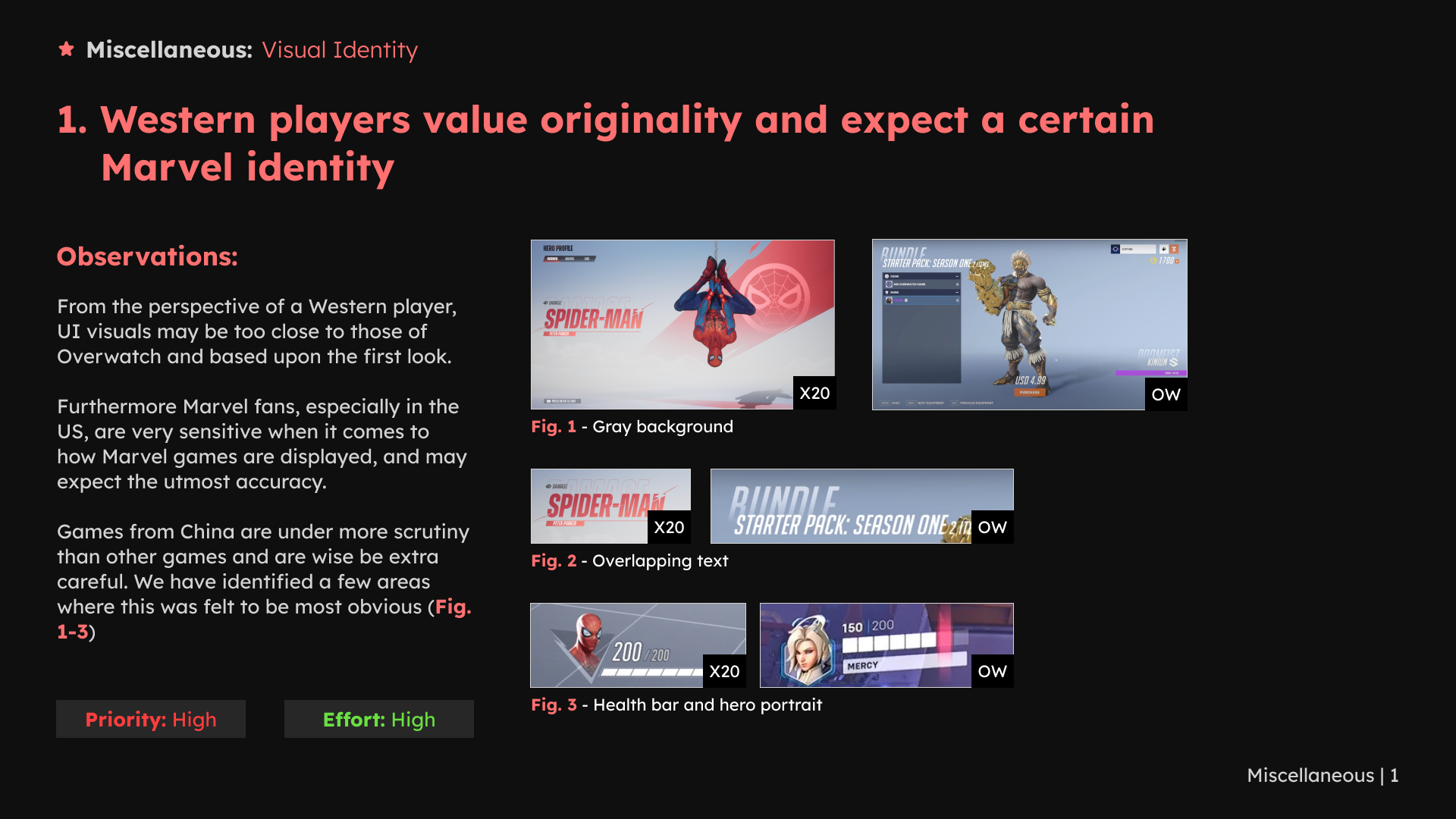
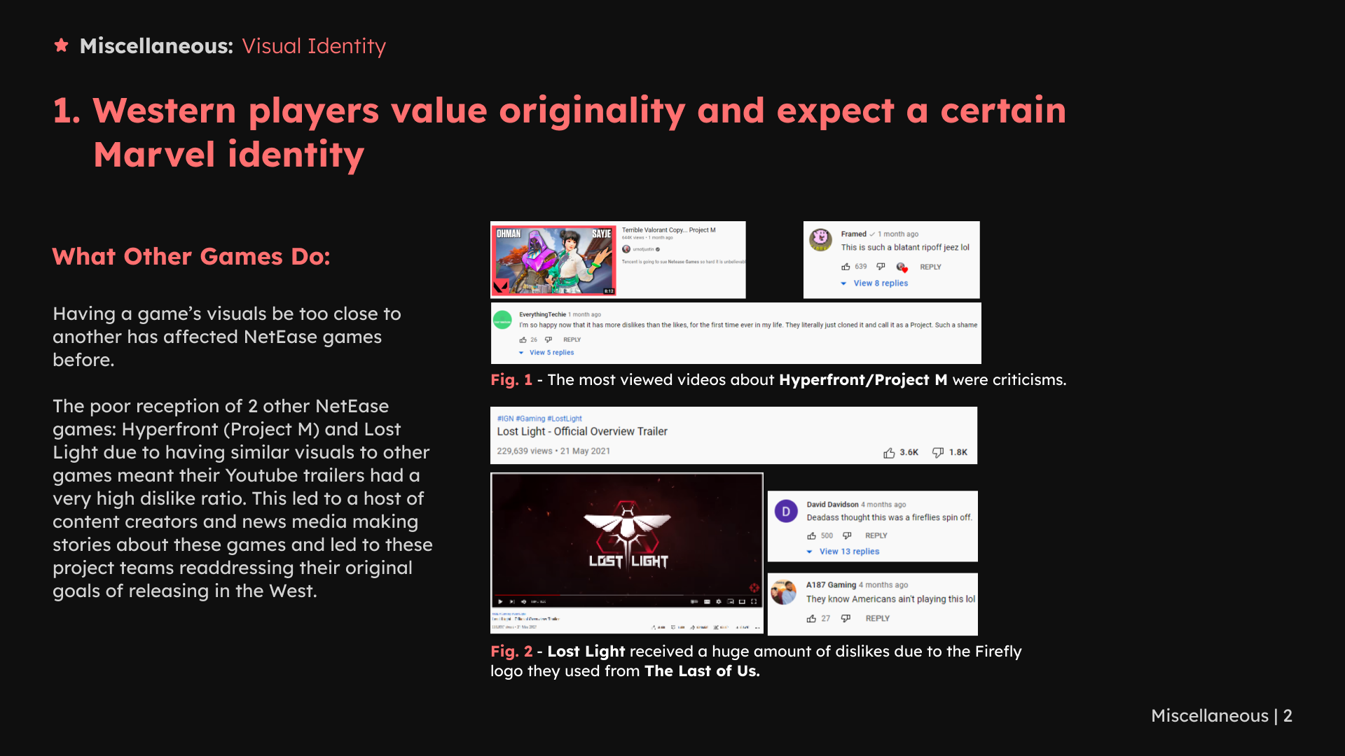
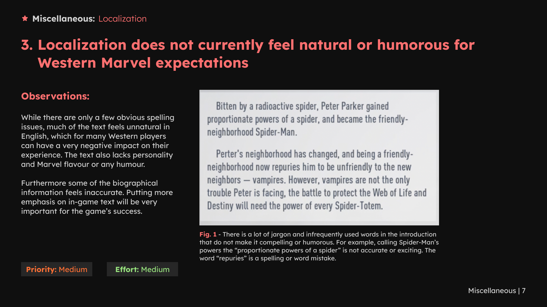
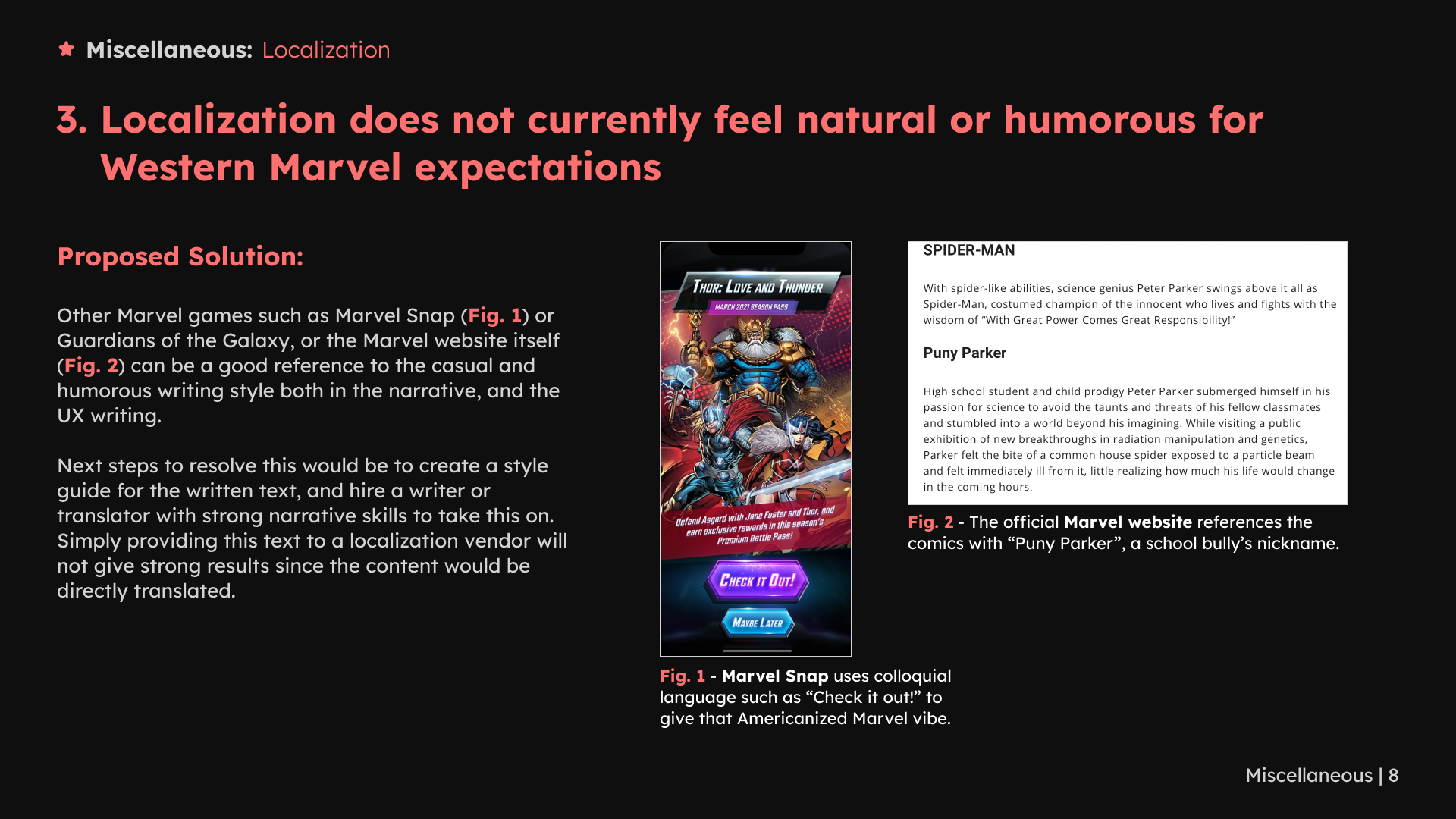
I also reviewed custom-room team information, swapping positions, friend indicators and chat behavior. Other recommendations addressed visual consistency, localization and console adaptation.
Custom games
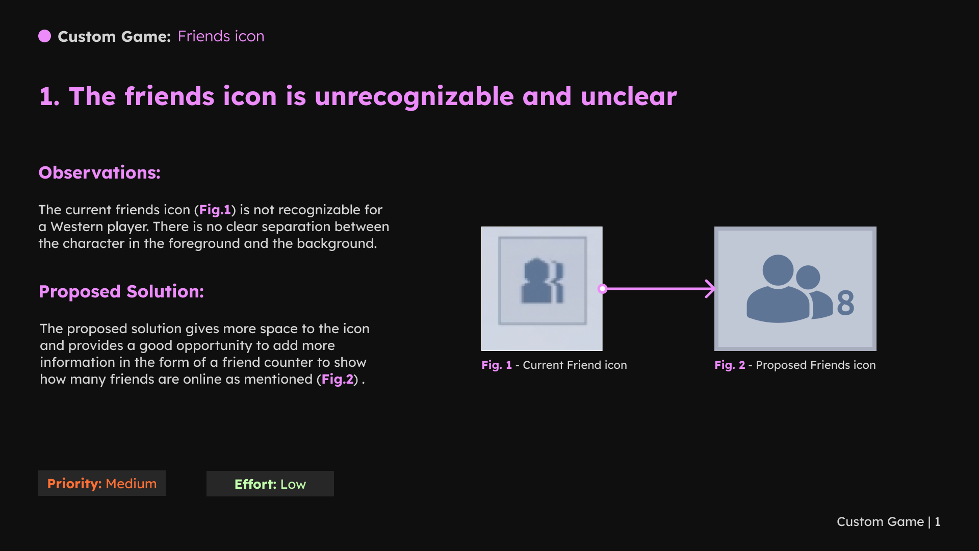
1 / 6 · Select a slide to view full size
Chat
1 / 5 · Select a slide to view full size
Localization and platform considerations
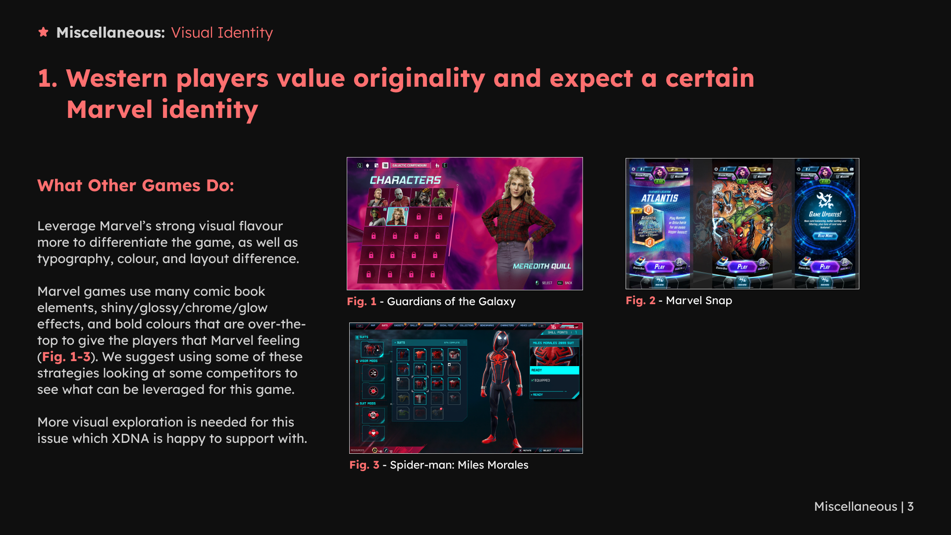
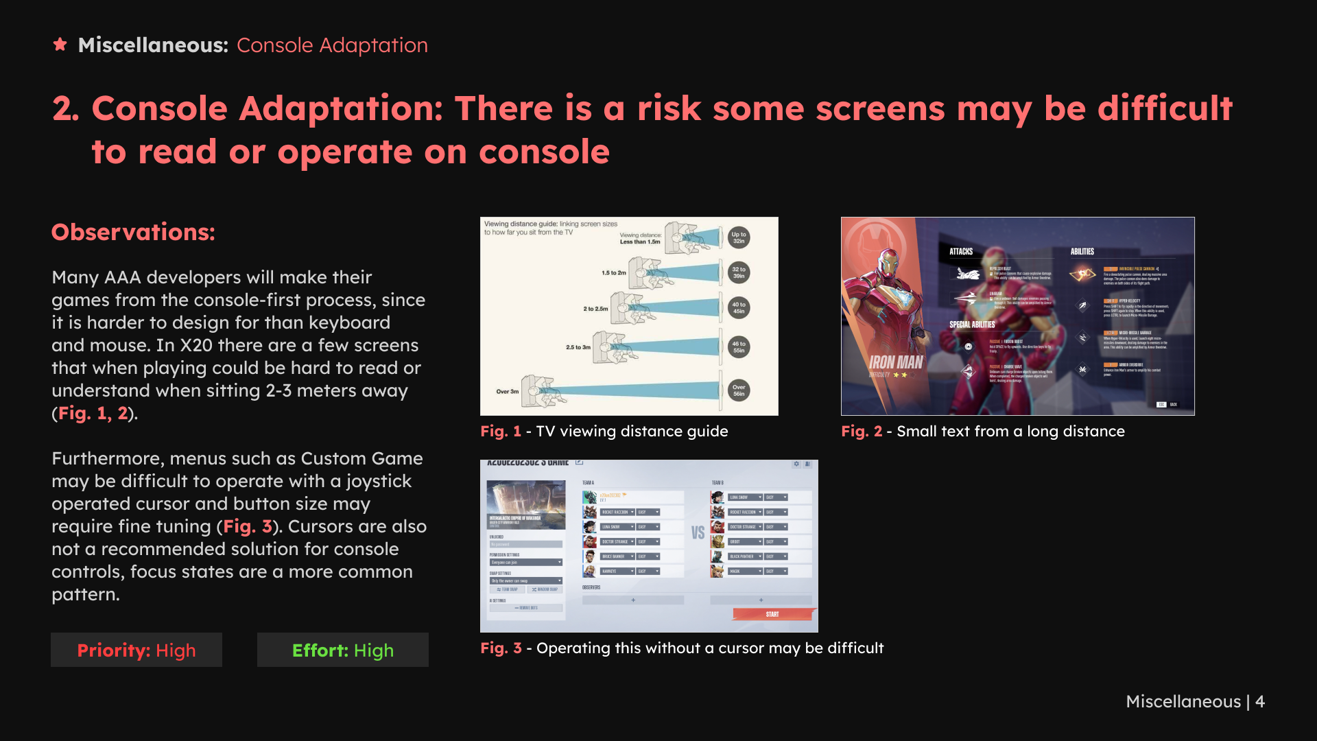
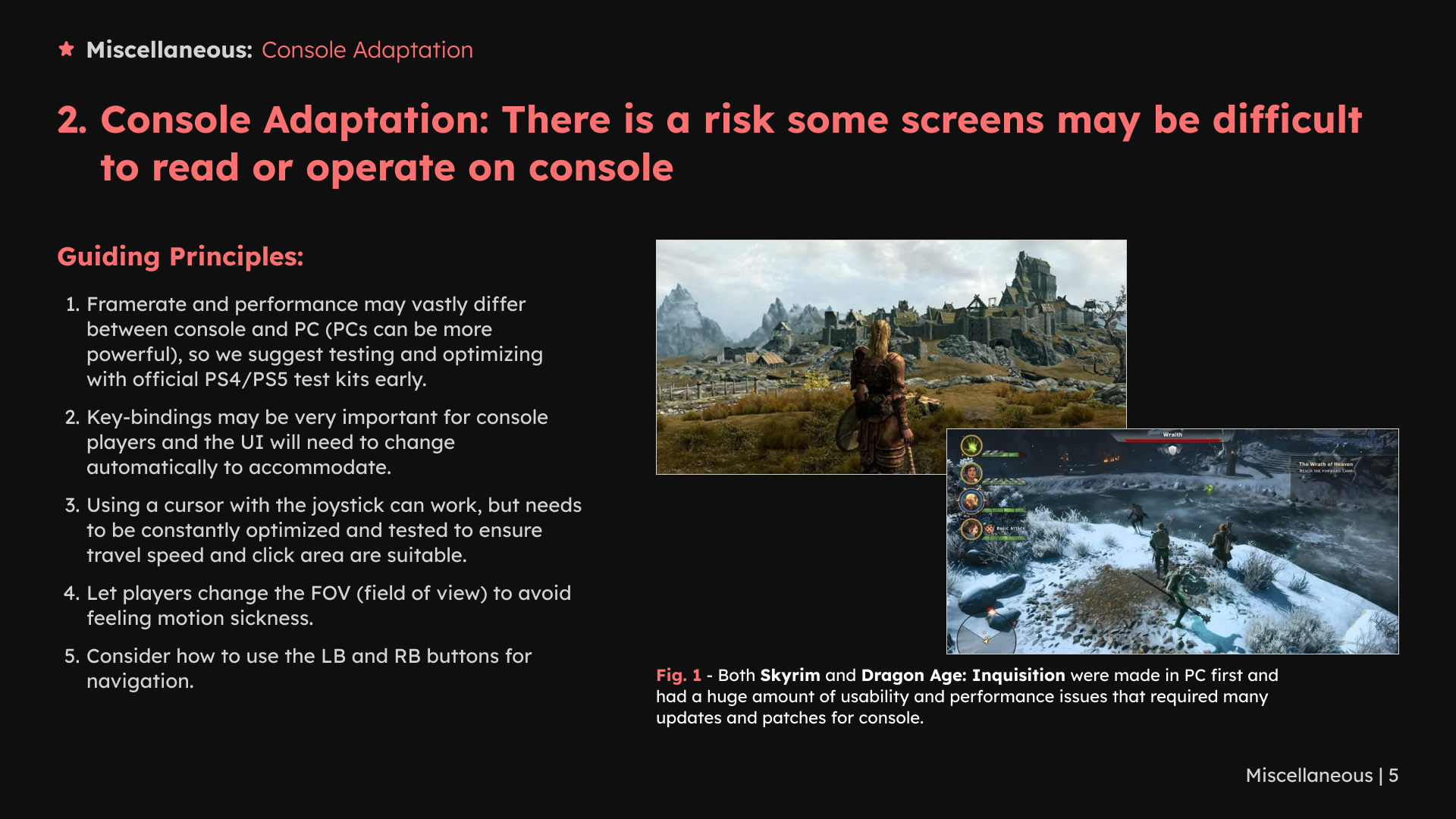
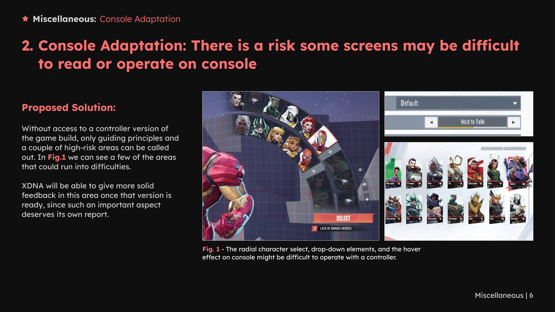
1 / 8 · Select a slide to view full size
What I delivered
I delivered recommendations across seven areas, supported by annotated comparisons. The work shows how I identify interaction risks, connect them to player tasks and explain alternatives for the development team to consider.
Game context
Game trailer. Game and reference imagery belong to their respective creators.